All posts by Tom Canfield

Part 1: Is your retirement portfolio at its peak value for the rest your life?

Last week I read this article “The Long-Term Forecast for US Stock Returns = 7.5%”. The article assumes 2.5% future inflation. That means the forecast translates to ~5% real return for stock vs. the historical average of ~7%. That’s 30% lower ((5-7)/7). I can find similar predictions – some from five years ago – that are much lower than the 5% rate. Wow! Those predictions are saying, “Throw away what you think is normal based on history. It’s a very different, worse normal in the future.” I’ve assumed that the future is close to the past, but we need to understand the implications of both of these scenarios. This post discusses what we might expect if the future is like the past: new normal = old normal. That’s clearly a more comfortable future. Next week I’ll discuss those studies that forecast a new normal that is much lower than 7% real return for stocks: that will be uncomfortable!


Here’s the answer to the question: assuming future real returns roughly match the historical real 7.1% return rate for stocks, your portfolio value today is NOT its peak value for the rest of your life. Your retirement portfolio will grow in real spending power over time, because the expected return rate for your total portfolio is greater than the percentage you withdraw each year for your spending.


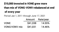
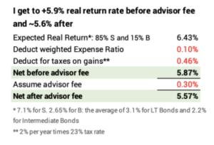
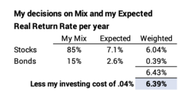
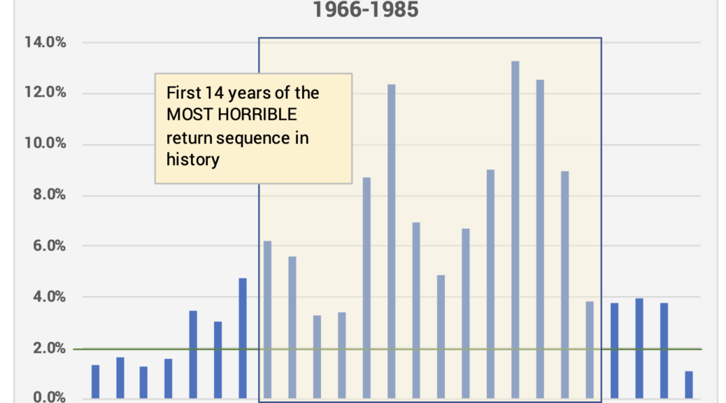
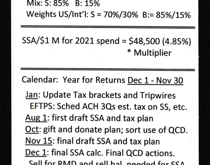
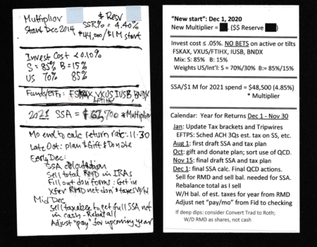
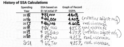
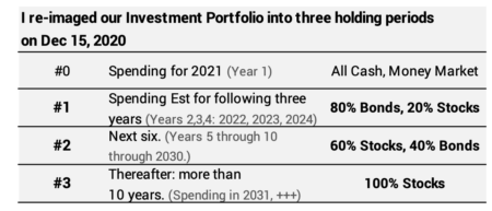
Example: the expected real return rate for our investment portfolio is 6.4%. Last December Patti and I withdrew 4.85% for our spending (We’re older! That’s zero chance for depletion in 15 years assuming we’re starting now on the Most Horrible return sequence for stocks and bonds in history.).


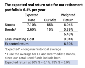
I expect this year to earn back what we withdrew in December and add 1.5% in real spending power. When I calculate for our Safe Spending Amount for next year, I’d expect that Patti and I will have more than enough for our current Safe Spending Amount (SSA; see Chapters 2 and 9, Nest Egg Care.)


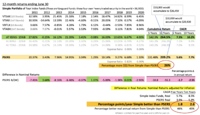
Obviously, annual returns and sequences of returns for stocks and bonds vary from their long-run average rate. Returns were such that Patti and I earned back more than we withdrew in four of the last six years. Those years resulted in a real increase in our SSA for the following year. We didn’t earn back enough for a real increase in two years. (See here and here.)


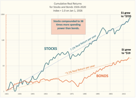
== The past is 7.1% real return for stocks ==


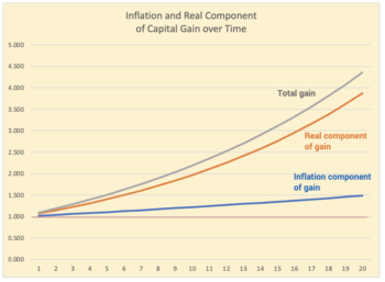
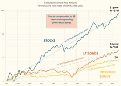
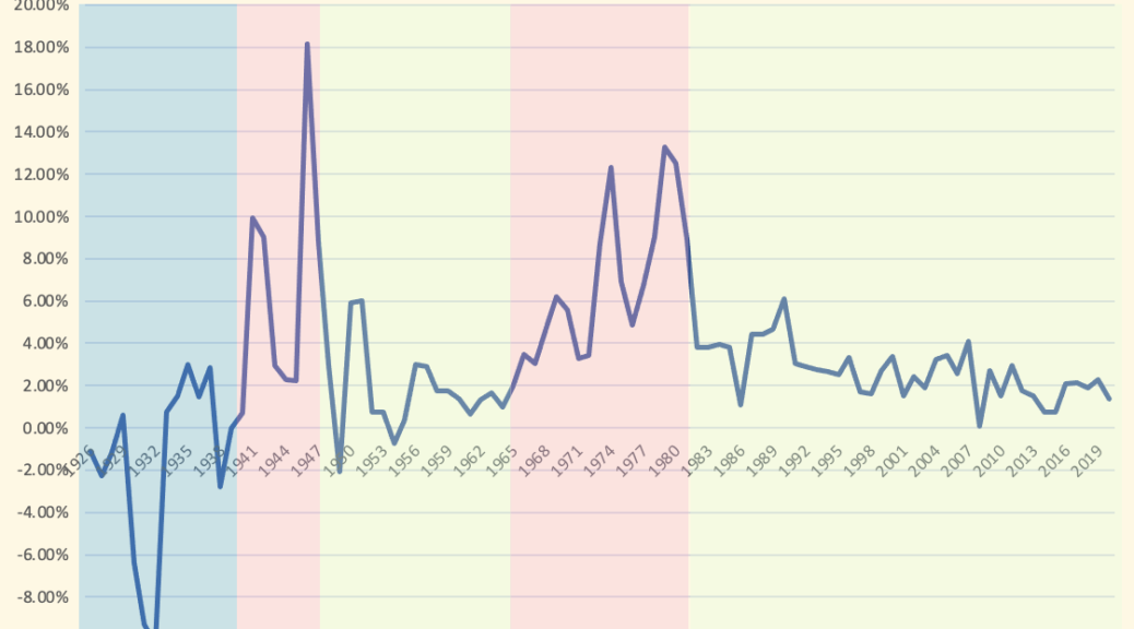
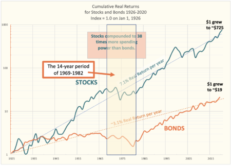
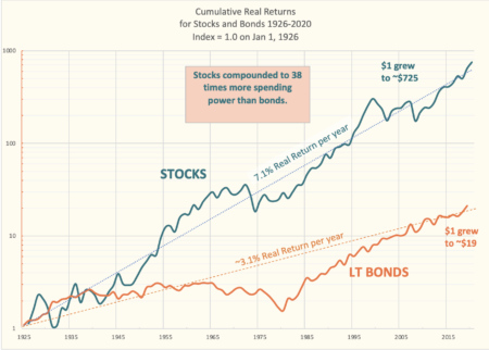
You’ve seen this graph before. The long-run average, real annual return rate for stocks is 7.1%. That’s the average from 1926-2020; the rate would be slightly greater if I added the data from 1871. Clearly 7.1% is not a law of physics, but that’s a lot of history that I’ve viewed that as a pretty darn accurate predictor of the long-term future.


If we think the future will be like the past, we’re making the underlying fundamental assumption that corporate profitability in the future will be similar to the past: profits provide the cash that companies invest back into their business to keep pace with the growth of the economy and to pay out cash to shareholders in the form of dividends or stock buy-backs; buy-backs today are greater than dividends. That seems to be a reasonable assumption.


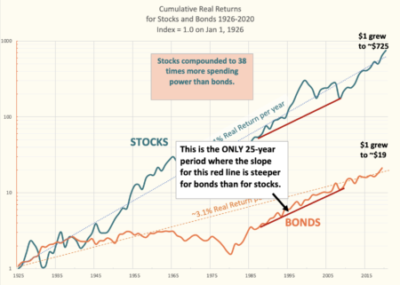
== Returns should migrate toward the 7.1% trend line ==


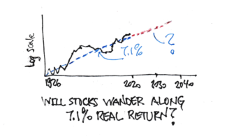
Points on the solid line of cumulative returns should migrate toward the 7.1% rate – toward that dashed trend line on the graph. When a point on the solid line is above the trend line, future returns will be lower than 7.1% to reach the dashed line. When a point on the solid line is below the trend line, future returns will be better.


== Where are we now and what does it mean? ==


The data point at the end of 2020 is slightly above the trend line. I calculate that it is 4% above the line.


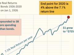
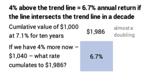
If the solid line hits that 7.1% trend line ten years from now, the cumulative return from the end of 2020 to the end of 2030 will be 4% less than value of 7.1% return compounded for 10 years. That works out to 6.7% real return over that holding period. That’s going to translate to a an expected return for our total portfolio that’s still above our withdrawal rate until we are well into our 80s: our portfolio is not at its peak value.


For those in the Save and Invest phase of life, I’d assume the long-term 7.1% real return rate applies for each year’s savings that you hold for long holding periods. Following the Rule of 72, investors in stocks can expect a doubling in spending power about every ten years. I’d still think of it this way: a 40-year-old person who saves this year (2021) will spend that in the 25th year from now (2046). The amount then would be about 6X in today’s spending power, the result of 2½ doublings.


Conclusion: If you believe the future is similar to the past, you believe the long-run future real return rate for stocks is ~7% per year. Stocks dominate your portfolio, and the expected return rate on your total portfolio is less than you are withdrawing each year for your spending. At expected return rates, your portfolio will grow in real spending power and you will calculate to a greater Safe Spending Amount in future years.


The cumulative return for stocks from 1926 to the end of last year is slightly above its long-run trend line. The future return rate to get back to the trend line is slightly less than 7.1%.

I switched financial advisors this week. What was my thinking?

Several of my friends have separated from their financial advisors and became a self-reliant investor. It’s pretty simple for us nest eggers, since our total portfolio is only four index funds. I have never hired a financial advisor for our money. But I separated this week from an advisor I hired almost nine years ago for a Trust where I am trustee. In essence, I’m the Trust’s financial advisor now, and that’s the responsibility that the Trust agreement assigns to the trustee. The key advantage of the switch is that I won’t pay myself the advisory fee that I have been paying. The purpose of this post is to describe my thinking as to why I made that change: what appears now as a small, almost inconsequential advisor fee results in a MUCH SMALLER portfolio value over the very long run.


== Trust and trustee ==


Patti’s brother and his wife set up the Trust in 2006. It held option shares in a privately held company. He was CEO. I agreed that I would be trustee. It had no dollar assets. The option shares just sat there. The trust is a structured as a generation skipping trust, meaning the objective isn’t to provide money to the three children but to their children. The trust will have a very long life; it terminates on the death of the last of the three children. That’s likely more than 60 years from now: the youngest daughter is 24.


The company was sold in 2012, and the option shares turned into real money! I had to invest it. I was concerned that I might have a liability, and I wanted an advisor to provide some sort of check on my decisions. I hired a very good guy, Mike, who agreed with a low-cost index fund approach: he recommended a fairly complex portfolio that a study he cited said would outperform the market. Everyone wants to beat the market, and I bought into this in 2012. The Trust’s portfolio had a total of 13 moving parts – individual securities (ETFs). This splitting of the total market of stocks and bonds into many segments is fairly standard fare for advisors. I show the ten slices for stocks.


== Portfolio tilts and rebalancing ==


The US stock portfolio was weighted or tilted to value stocks and to mid- and small-cap stocks, for example. Over the past nine years, the exact opposite tilts would have returned more. No tilting would have returned more.


At least once a year, Mike would rebalance the portfolio to get close to the design percentages for each of the 13 securities. For example, the design mix of large-cap value (ETF = VONV) is 52% relative to 48% for large-cap growth (EFT = VONG). If VONG’s returns were greater than VONV’s, Mike would ask and I would agree that he should sell VONG and buy more VONV to bring the portfolio mix back to the original design mix. The thinking is that you want to sell when something has grown faster than its long-run average (“sell high”) to buy something that has grown slowly (“buy low”). That’s a lot of moving parts that one is trying to bring back to a design mix each year.


This approach sounds great, but in practice – ignoring the impact of paying taxes on capital gains incurred – that rebalancing tactic is no improvement over just holding the blend fund ETF = VONE that holds all the stocks held by VONV and VONG. I summarize the returns from a spreadsheet I made that tracks returns over the past +ten years. The Trust would have slightly more today if it just held VONE rather than the mix of VONV+VONG rebalanced at the end of every year.


== Capital gains taxes ==


The annual rebalancing meant that the trust incurred capital gains taxes every year: we were always selling some ETFs – and in some years a bunch of ETFs – and incurring gains just to rebalance. Those gains would be analogous to gains distributions that you can get from actively managed funds: you aren’t getting any more money from them; you are simply paying gains taxes now and not deferring the tax when you actually sell your holdings for your spending. Paying gains taxes earlier than you otherwise could lowers your ultimate after tax proceeds: I calculated in this post that this is not a big penalty – a small fraction of one percentage point per year – but it is a penalty that is not being offset from greater return.


== My liability as trustee and the fee ==


When I first thought about switching from Mike, I reread the trust agreement. I have NO personal liability as to how the money is invested or the fees charged! I think this is standard language in trusts like these: “No Trustee shall be liable for any mistake or error in the administration of the Trust which does not amount to gross negligence or willful misconduct.” I really did not need whatever I thought a financial advisor offered as liability protection.


Mike’s fee to be advisor was at the very low end of what most in the industry charge. I certainly can’t complain about the small percentage. To heck with the percentage. I kept looking at the increasing amount of the fee; it’s not a tax-deductible expense to the Trust.


Mike took on the trust account for a dollar fee that I presume made him happy in 2012. Over the +eight years, the Trust has more than doubled in value, and therefore Mike’s fee has more than doubled. Has the work effort doubled? No. Does he have some sort of greater financial responsibility now that merits a greater fee than then? I don’t think so.


I think about the effect of compound growth and fees over the lifetime of the Trust. The Rule of 72 tells us the portfolio – based on its mix of stocks and bonds – will double in today’s spending power roughly every 12 years, and therefore Mike’s fee is doubling in real spending power every 12 years. The trust will exist for 60 more years or five doublings from now – a factor of 32. Mike has one doubling of fee under his belt. Does it make sense for Mike (or his firm, since the trust will outlive me and Mike) to be eventually be paid 64 times the spending power the original fee? No.


== The right way to look at it ==


Looking at the fee is not the right way to look at it. It isn’t the amount of the fees; it’s fact that fees lower the net return rate for the portfolio. The compounding of a slightly smaller net return rate spells a big difference in portfolio value. The question is: does a small difference in return rate from the advisor fee have a significant impact on portfolio value over time? Spoiler alert: it’s HUGE given the long life of the trust.


I first have to get to the expected after-tax return rate difference: it works out that I need to compare portfolio growth at ~5.9% real return per year vs. ~5.6%.


Given the mix of stocks and bonds, the expected return rate for the portfolio is ~6.4%. The ETFs have a weighted expense ratio of .1%. (That’s higher than the .04% for my portfolio, because the small segments are more costly to manage.) I’ll deduct another .5% for the annual taxes the trust will pay on dividends and interest: my simple estimate is 2% dividend rate and 23% tax rate. I get to ~5.9% return rate. Now I’ll subtract a REALLY LOW advisor fee of just .3% to get ~5.6%. I now can compare the effect of two return rates.


== It’s A BIG DIFFERENCE over the life of the Trust ==


The difference in portfolio value from .3% difference return rates is almost inconsequential for many years. If the portfolio had $100,000 at the start of this year, the difference in value at the end of the year – assuming the expected return rates – is just $300 in today’s spending power: this isn’t worth worrying about. At five years the difference is $1,900; still no big deal. If the start was $100,000, I can easily overlook the cumulative $2,000 difference in value.


The difference in portfolio value keeps growing to MUCH MORE than the $2,000. In 40 years when the when the children are roughly retirement age – their children might be in their 30s – the difference in portfolio value equals today’s value in spending power. If the Trust has $100,000 today, that means there would be $100,000 less in real spending power from the advisor fee. In 50 years, it’s twice that. It’s more than four times in 60 years. It’s a HUGE difference.


= My discussion with Mike ==


I called Mike. I wanted to visit him at his office and tell him face-to-face, but he said he really wasn’t going into the office and wouldn’t go in for a while. I erred in telling him what I was thinking of doing without the preliminary of telling him what a good guy he has been over the last nine years. He was not happy with my decision, and placed a mild guilt trip on me. “Your account is one of the very best performing accounts I have. It is by far the best performing portfolio relative to other trust accounts that I have with banks as trustees.” Yep, I’m sure all that is true. But that’s not the point. The difference is portfolio value without his fee is HUGE. And my calculation ignores the effect of added gains taxes from all the rebalancing.


I think we parted on somewhat friendly terms. I followed up with a nice email of thanks after I opened the account for the trust at Fidelity. (That was a simple. The whole process to transfer all the holdings will take about five business days.)


Conclusion: If we think we are a self-reliant investor, we can invest without the aid and expense of a financial advisor. I recently decided not to use a financial advisor for a trust where I am trustee. This post discussed the basic reasons: but the simple reason is that the impact of what anyone would agree is a small advisor fee has a very outsized effect on future portfolio value. Without the fee, the trust will grow – in today’s spending power – to several added multiples of its current value.

What’s the effective capital gains tax rate? Isn’t it really more than 15%?

The capital gains tax rate is really is more than 15%, because the calculation of gain does not adjust your cost basis for inflation. When you pay tax on capital gains, you are paying tax on the real component of gain and on the inflation component of gain. How much are we hurt by paying tax on inflation? In this post I conclude that the federal tax rate on the real component of capital gains is about 19%. Over time, this effective rate declines.


== Ordinary tax brackets and inflation ==


You pay tax once on ordinary income – wages, interest and withdrawals from your traditional IRA as key examples – for your spending or for money that you save and invest in your taxable account. Income tax brackets adjust for inflation. If you earn the same real amount of dollars, you won’t be pushed into a higher marginal tax bracket; you aren’t paying more real tax just because of inflation.


For example, the start of the 22% tax bracket for 2021 for married joint filers is about $81,050, and it was $80,250 for 2020. The IRS announces these changes to the start of tax brackets every November. The IRS uses a different method for inflation than used for Social Security’s Cost-of-Living-Adjustment for gross benefits, and the IRS’s percentage change for tax brackets is less.


== It didn’t used to be this way ==


I’m old enough to remember that the tax brackets for ordinary income did not adjust for inflation for many years: Patti and I would get pay increases that might not total to more than the percentage that inflation increased. But because tax brackets did not adjust for inflation, more of our income would be taxed at a higher marginal tax rate. Inflation, not real increases in our earnings, simply pushed more and more of our income into higher tax brackets.


The IRS took a greater percentage of income from all taxpayers prior to 1977 without real increases in their earnings, leaving them all with less real spending power. This is NOT A GOOD THING, and I think this decline in real spending power for families factored into this period of the most horrible sequence of stock returns in history.


Here’s an example: A couple who earned the right at the top of the 19% tax bracket in 1968 and earned that same real amount for the next nine years found that about 40% of their income was taxed at 22% or 25% marginal rates in 1976. (See here for history of tax brackets.)


Here’s the detail: our couple had $8,000 in taxable income in 1968, right at the top of the 19% marginal tax bracket. I restate the $8,000 in 1968 to $58,700 spending power last December. Assume our couple earned that same real amount, $58,700 each year. The top of the 19% tax bracket did not adjust for inflation; it was really lower year after year. By 1976, the start of the top of the 19% bracket had fallen 39% in real spending power to $35,800 in today’s dollars – 45% of what it is today. Taxes were unfair and high!


== Capital gains don’t adjust for inflation ==


I’m sure you’ve got this: you paid income tax once to get the money that you invested in a mutual fund, ETF or stock. You pay tax on the gains when you sell for your spending. When you calculate your gain, amount you paid for an investment does not adjust for inflation. Your gain therefore includes two components: the real return component and the inflation component. You’re paying tax on both.


How much is the penalty of paying tax on inflation? Is it as bad as it was for wage earners in the late 60s and early 70s?


== My conclusion: you’re paying perhaps 19% not 15% ==


I think I’ve thought this through correctly. I use a simple example of a stock with no dividends, 7% real return from increase in price, and 2% inflation. I’ll assume those add to 9% nominal total return per year. That means 2/9 of your total gain is inflation; you are paying 29% more (2/7) than you would if there were no inflation or if your cost basis was adjusted for inflation. In effect, you are paying 19% rate on your real return.


The effect of inflation on your real tax rate is smaller with longer holding periods. You are paying less than 29% more over time. That’s because 2% inflation compounds more slowly than the 7% real. Inflation is a smaller portion of total gain. You are paying less than 19% tax rate on your real return over time.


Inflation at 2% grows more slowly than 7% real return. The inflation component is less of the total return over time.


I played with the inputs to the table to see how that 19% rate changes: lower inflation lowers the effective tax rate: inflation has averaged about 1.7% over the past ten years. If inflation is more than 2% in the future, the effective tax rate will be higher. If your real return rate is lower, inflation becomes a larger percentage of the total and the effective tax rate is higher. But as I play with the numbers, you have to assume extremes – lousy real returns or very high inflation, as examples – to move very far off the generalization that your effective federal tax rate on the real component of capital gains is roughly 19%.


Conclusion: The calculation of capital gains tax does not adjust your cost basis for inflation. You are paying tax on the real component of gain and an inflation component of gain. You are paying more than the 15% rate you’d pay if there was no inflation. I calculate in this post that you are paying roughly 19% on your real return.

What does PSERS do to improve its investment returns?

I went CRAZY this week thinking about PSERS – Pennsylvania’s School Employees Retirement System. I wrote about PSERS two weeks ago, but I couldn’t get it out of my head this week. Why? PSERS is committed to an investment strategy that we nesteggers would not AT ALL attempt. PSERS attempts to beat a simple benchmark of index funds for their $60 billion (!) portfolio. I dug into the details of PSERS relative performance this week and found it to be much worse than I thought. The purpose of this post is to show what happens if you don’t set a clear benchmark for performance and measure your performance against it. The post shows another example of the folly of trying to outperform what the market gives to all investors over time.


== Set a benchmark ==


We nesteggers understand the concept of benchmark. The simplest benchmark for a portfolio has to be the average that the market gives to all investors for stocks and bonds. Heck, the purest nesteggers hit that benchmark year after year because we only invest in stock and bond index funds that gives us what the market delivers – less a tiny investing cost.


I illustrate the benchmark for stocks and bonds in the graph; you’ve seen a this graph before. The real expected return – the average, long-run nominal returns adjusted for inflation – is 7.1% per year for stocks. For this post I average the real return rates for long-term and intermediate-term bonds and get 2.6% real return rate.


The long-run average real return rate for stocks is 7.1%; 3.1% for long-term bonds and 2.2% for intermediate-term bonds


Your benchmark for your portfolio is determined by your decisions on your mix of stocks vs. bonds. (See my logic and decisions in Chapter 8, Nest Egg Care [NEC]). Using the 7.1% and the 2.6% and my decisions on investing cost, the expected return for my portfolio mix is 6.4% real return per year.


We nesteggers understand that actual returns we’ll get over time wiggle around those straight trend lines on the graph. The actual historical return rate for stocks, for example, for a number of years is the slope of a straight line drawn between the two years on wiggly line. The straight line you draw between two points rarely parallels the 7.1% line; steeper slope is greater than 7.1% and shallower slope is less than 7.1%. I wrote about my 8.7% real return rate on the steeper slope from 1985 to 2021 here.


== PSERS trailed by 2.6 percentage points/year ==


All investors should annually compare their performance to a benchmark. This post has the benchmark I suggest you use for calendar 2020 for your portfolio. If you are invested in similar index funds as mine, of course you nearly match this benchmark.


To compare with the returns for PSERS, I constructed the returns for index funds that match my benchmark portfolio for 12-month periods ending each June 30; that’s the fiscal year end for PSERS. (I use Morningstar to find returns for any security for any period in the past.) My detailed spreadsheet compares PSERS’ annual returns to the returns for the benchmark. PSERS trailed the benchmark return in seven of last 10 years and trailed by an average of 2.6 percentage points per year. UGH.


Yep. It’s busy and tiny, but it shows PSERS lags its benchmark by 2.6 percentage points per year over the past decade. That deficit means its portfolio ten years ago is 26% smaller than it should be: perhaps $15 billion shortfall.


That deficit adds to a 26% deficit in cumulative returns for the portfolio at the start of the 10 years. When you are working with a portfolio the size of PSERS’, that translates to perhaps a $15 billion shortfall over a decade! (That’s the calculation using time-weighted returns. With the additions from current employees and employers and withdrawals for retiree benefits, the money-weighted return and dollar impact will be different.)


== Benchmark return worth $20? billion ==


PSERS is a defined benefit retirement plan and has a large unfunded pension liability. (It’s another story as to how that happened.) Accountants forecast the future stream of payments PSERS will make over the lives of all their participants and then discount them to the present value using, in PSERS case, a real return rate of 4.5%. That rate calculates the total needed was $107 billion as of last June 30; PSERS had $58 billion and therefore was $49 billion short. That $107 billion is sensitive to the assumed discount rate used. The accountant’s report shows that one percentage point more – 5.5% real return – would slash $10 billion from the unfunded portion, and the 6.4% benchmark is another .9 percentage point. The benchmark is slashed by ~$20 billion if PSERS just matches its benchmark.


== Evidence: Can PSERS outperform? ==


PSERS is committed to an investment strategy geared to beating the returns it would obtain from a simple portfolio of stocks and bonds. We nesteggers don’t try to do this, but let’s ask again, “Will this strategy work?” I think the one can only conclude, “NO”. Here are the problems:


• There is no long-term data to set the expected return from certain of PSERS asset classes and therefore there is no overall expected return rate for the portfolio. This report lists its assets classes, and several of those  would throw me for a loop if I was trying to figure out the expected return: its asset classes: “risk parity” is 8% of assets; absolute return” is about 10% of its assets; commodities 8%; infrastructure 3% that is separate from real estate, “master limited partners” is 2%. If you can’t set a benchmark for the expected return rate for an asset class, you can’t possibly construct your overall expected return rate, and you can never judge how well your choices within each asset class are performing.


• The evidence from ten years of PSERS’ performance shouts, NO. Underperformance is consistent. There is no pattern – no hint, I’d say – to suggest the portfolio will outperform. If this were your portfolio, you’d stop and change direction. If you were on the investment committee for any investment fund, you’d stop and change direction.


• The evidence from the results of 705 college and university endowment funds loudly shouts, NO. These endowments have a lot of smart people trying to beat the performance of index funds. The recent report by NACUBO shows that the better of them – those at the 75th percentile of performance – lag the benchmark of index funds by 2.2 percentage points per year. That is just UGLY in my opinion.


The top (75th percentile) of endowments lag a simple benchmark by 2.2 percentage points/year over the past ten years.


It’s some sort of group-think for PSERS and all those endowments that results in their sticking with broken investment strategies.


PSERS has to get off its broken investment strategy. The start is that any new investments have to be invested in a portfolio that matches the benchmark. It may take years to unwind much of its illiquid investments, but that’s the only way to bring its fund back to health.


Conclusion. I was obsessed thinking about PSERS this week even though I wrote about it two weeks ago. A detailed comparison of PSERS’ performance shows it lags a simple-to-match benchmark of performance by 2.6 percentage points per year. That deficit is costly: a shortfall in what it could be now of perhaps $15 billion and what it could be in the future of another $20 billion. $35 billion. I see NO EVIDENCE to suggest that PSERS or 700 university or college endowment funds should be trying to beat simple benchmark that we nesteggers hit every year.

What’s the history of inflation, and might history foretell the future?

I posted last week about the latest calculation of 4.2% annual rate of inflation, May 2020 to May 2021. This is greater than the Federal Reserve’s long-term objective of expectations of annual inflation to be “well anchored at 2 percent”. Is 2 percent a reasonable objective? The purpose of this post is to describe the patterns of inflation over the 95 years from 1926 through 2020.


Inflation has averaged 2.9% per year, but that’s not been a steady rate. We had a long period of deflation – inflation below 0% – and two other periods where inflation averaged 2½ times the long-run average. The key takeaway for me, though, is the long, stable period of inflation for the past 39 years. Does this mean we have learned how to control inflation? I’d like to think so, but perhaps that’s wishful thinking.


== Average inflation, 1926 through 2020 ==


What’s the history of inflation? I gather the calendar-year inflation data from this site. Inflation for the 95 years from 1926 through 2020 has averaged 2.9% per year: both the simple average and compound average growth rate round to 2.9%. It took ~$14.50 at the end of 2020 to equal the spending power of $1 at the start of 1926.


== I divide the history into five periods ==


I show a summary table and a graph of annual inflation rates.


What does the summary table and graph show? I highlight five periods: one is a 15-year period where we averaged deflation; two periods – adding to 23 years – are high inflation, averaging over 7.5% per year; and two periods – adding to 54 years – are modest-to low inflation, averaging less than 2.7% per year. The last 39 years is the longest period of stable inflation, and the last 13 have been low inflation.


1. The 15-year period from 1926 through 1940 was a period of deflation. The cumulative deflation over this period was about 20%. Three straight years in the Great Depression – 1930, ’31 and ’32 – added to -24% deflation! If you were lucky to be employed in those years and received a 20% pay cut, you were ahead in real spending power!


2. The seven-year period 1941 through 1947 was high inflation. Inflation averaged 7.6% inflation per year. These are the War years. The peak year for inflation was the first year after the end of the War, 1946: 18%; three years later, deflation was -2%!


3. The 18-year period 1948 through 1965 was low inflation. Inflation averaged 1.7% per year.


4. The 16-year period 1965 though 1981 was high inflation. Inflation averaged 7.5%. Inflation added to 25% for the two years 1979-80. You would have needed more than 25% increases in pay just to get ahead in real spending power.


1965 also was the start of the worst sequence of real stock returns in history. Stocks did not exceed their 1965 level, measured in real spending power, for 17 years. The MOST HORRIBLE sequence for combined stock and bond returns started in 1969: we nesteggers always use that worst case to determine our Safe Spending Rate (SSR%; see Chapter 2, Nest Egg Care [NEC].)


5. The 39-year period from 1982 through 2020 is modest to low inflation. Inflation averaged 2.7% over this 39-year period. Inflation exceeded 6% in one of the 39 years. This is the longest period of modest to low inflation. Inflation in the last 13 years has averaged 1.8%.


== What’s this mean? ==


Heck, I don’t know what this means. I do know that I don’t want events that rock the boat, and a sharp increase or decrease in inflation – actually the long-term expectation for inflation – would be an event that rocks the boat. Spending habits change based on the outlook on future inflation:


• Folks tend not to spend if the outlook is deflation – money is getting more valuable; prices are falling; things are going to cost less if we wait. That drop in spending is going to hurt the economy.


• The opposite is true if the outlook is high inflation – folks tend to buy anything NOW since money is rapidly losing value; prices are increasing; things will cost a lot more in the future. That increase in spending is going to artificially fuel or overheat the economy, and it will crash later when folks run out of new things to buy.


I’d like to think this past 39-year run of modest-to-low inflation – and especially the last 13 years – is a good predictor of the future: I’d like to think “they” – meaning the Federal Reserve, I guess – know to control inflation. But I’m not an economist and have no insight as to whether that might be true.


The good news: with our worst-case planning and decisions following the steps in NEC, we know our annual Safe Spending Amount at least maintains its real spending power over time. We also know our spending rate is safe: we should be confident that we will NOT RUN OUT OF MONEY no matter what hits us in the future.


Conclusion. This post looked at the long history of inflation, 1926 through 2020. Inflation has averaged 2.9% per year, but we’ve had long stretches of deflation and high inflation – average rates 2½ times the long run average. Inflation has been the most stable in the last 39 years, and has been consistently low in the last 13. We investors like stable and low inflation. I’d like to think that the last 39 years tell us that “they” know how to avoid big changes inflation, but I have no idea if that is true.

How bad must inflation be to be worrisome?

We all have read about recent increases in inflation; the annual inflation rate in April was 4.2%, the highest in 13 years. How concerned should we be? The purpose of this post is to simply remind us of how bad inflation was in the period of the MOST HORRIBLE sequence of real returns for stocks and bonds in history: the sequence of returns starting in 1969. That’s the sequence of return we nesteggers use to get our age-appropriate Safe Spending Rate (SSR%) and then our annual Safe Spending Amount (SSA). (See Chapter 2, Nest Egg Care [NEC].) Inflation was a contributor to those poor returns: but the damage then was from from inflation that averaged 9% per year for many years and reached a peak of more than 13% in one year.


I contend that we’d have to lose complete control of inflation, and it would have to triple or quadruple to have a SERIOUS impact on our financial retirement plan: by SERIOUS I mean that inflation and other economic events put us on a sequence of return that could lead to depletion of our portfolio. That’s SERIOUS!


== The Federal Reserve anchor of 2% inflation ==


Last September the Federal Reserve announced its target of inflation of greater than 2% since inflation has not reached 2% for several years. The Social Security increase for cost-of-living adjustment has averaged 1.3% over the past six years, for example. The Fed’s goal is for “longer-term inflation expectations [to] remain well anchored at 2 percent”.


The annual inflation rate 0f 4.2% in April raised some alarm bells. This rate may adjust downward and even if it didn’t, a 4.2% rate is FAR LOWER than the rate of inflation that damaged both stocks and bonds in the MOST HORRIBLE sequence of stock and bond returns in history.


== The MOST HORRIBLE sequence of returns ==


The MOST HORRIBLE sequence for stocks started in 1969. I’ve displayed the worst sequences of returns here and discussed the 1969 sequence here and here. That sequence is so bad that a retirement portfolio declines to its tipping point: withdrawals for spending combine with poor returns; portfolio value declines so much – less than half its initial value in spending power – that higher-than-average returns can’t heal it. A portfolio spirals in value to the point it can no longer support a withdrawal for annual spending.


That 1969 sequence in a Retirement Withdrawal Calculator drives the most critical decision for our financial retirement plan. For example, at the start of our retirement plan in December 2014, Patti and I picked 19 years for ZERO CHANCE of depletion. This led to our Safe Spending Rate of 4.40%: an annual withdrawal of $44,000 in constant spending power relative to $1 million initial portfolio value. (See Part 1, NEC.)


I highlight the first 14 years of the MOST HORRIBLE sequence of returns starting in 1969 in the graph below. I show a table of real returns and inflation for the 21-years 1962-1982 here.


Here are my observations from the graph and table:


The cumulative returns for both stocks and bond were below 0% for the 14-year period starting in 1969. Stocks declined 10% in real spending power and bonds declined almost 20%. This period is most unusual because it contains the steepest sustained declines for both stocks and bonds in history.


This period also contains the period of the most rapid increases and highest levels of inflation in history: inflation averaged 2.1% in the six years 1962-1967; inflation doubled to average 4.6% in the five years 1968-1972; inflation doubled again to average 9.3% in the nine years 1973-1981.


== What’s this mean to me? ==


We retirees DON’T WANT TO RUN OUT OF MONEY. We can’t control the stock and bond markets, and we may suffer a decline in our portfolio. I’m personally not concerned about a decline in our portfolio. A bigger and bigger portfolio was never an objective, although we do have more after six years of withdrawals for our spending. But we all should fear a sequence of returns that duplicates the effect of the MOST HORRIBLE sequence of returns in history. That would really hit hard. Increasing and high inflation was a contributor to those HORRIBLE returns, but I think we are far, far from those levels.


Conclusion: We’ve had a long period of low inflation. Last fall the Federal Reserve announced a target of more than 2% inflation and the long-term anchor of 2% per year. Inflation increased in April to 4.2% annual rate; some have raised alarms. This post looked at inflation during the period of the worst real returns for stocks and bonds in history: inflation increased from about 2% to a peak of more than 13%. That’s been the steepest increase and highest level of inflation in history. We’re not anywhere that rate of increase or high levels now. I’m not going to be concerned about inflation for a good while.

Is it possible to mismanage a retirement portfolio any worse than Pennsylvania’s pension fund for teachers?

This article in the New York Times (FBI Asking Questions After a Pension Fund Aimed High and Fell Short) prompted me to look at the performance results for Pennsylvania’s Public Schools Employees’ Retirement System (PSERS) pension fund. What a mess, and I CANNOT BELIEVE the low, low investment returns of this pension fund relative to the performance of simple index funds recommended in Nest Egg Care (NEC). The fund may be HALF the size it should be if it had followed the basic portfolio that we nesteggers follow. This post compares the 10-year performance of PSERS to a simple portfolio of index funds. The miserable performance of PSERS and the impact on Pennsylvania tax payers and schools is a disgrace.


== $30 billion difference from equity returns? ==


This link shows the performance of PSERS over the ten years ending June 30, 2020: The highlight of the components of the fund is the annualized 10-year return for equity of 9.93%. This is the combination of the 10-year returns for public equity and private equity.


How does 9.9% compare to the portfolio recommended in Nest Egg Care? I show the results for US and International stock index funds for the same 10-year period. (Patti and I own FSKAX, which is basically the same as VTSAX, but does not have the same 10-year record to compare; and we own VXUS, which is the ETF of VTIAX.) I use the weights for US and International that I recommend in Chapter 11, NEC. The annualized return is 11.2%. That’s from just taking what the market gave. That’s more than one percentage point better than PSERS.


What does that difference translate to dollar return? The June 2010 statement for PSERS says it had $12 billion in public equity – publically traded securities; that’s out of the total of $26 billion in total equity.  The 1.2 percentage point difference cumulates in a decade to a difference of  about $3.5 billion. (I’m glad I didn’t start with the total $26 billion that underperformed!!!)


== Who pays the cost? ==


The pension fund is a defined benefit plan. Its obligations to retirees have to be paid from the contributions of current employees and from the growth of the pension fund over time. Because of the poor performance, $ billions have to come from revenues that schools would otherwise use to better education. The plan now requires current teachers to contribute at least 8% of gross pay to PSERS and requires school districts to contribute more than 34% of each employee’s gross pay. A total of 42% of employee pay goes to PSERS. And employee costs are about 70% of school spending.


Where does that money come from? Taxpayers. That high 8% employee contribution likely results in greater teacher pay, since that is a big bite out of take-home pay. The higher pay and 34% school district contribution is largely paid by local property taxes, and our property taxes are near highest in the US.


== Your annual “pay” would be $375,000? ==


Can you imagine how well off you’d be if your employer had contributed 34% of your pay to your 401k pension plan year after year? YEOW. It’s almost unbelievable:


I’ll inflation-adjust $60,000 in today’s pay; that’s close to the average teacher salary here. That would have been about than $25,000 in 1985. A 34% contribution by an employer would have been $7,500. It’s easy to look back and see how much that would have grown with a simple portfolio of index funds. I take that snapshot every January, and my contribution to my IRA in 1985 grew 50 TIMES by the start of this year: $7,500 contributed would be $350,000 to spend in 2021. And I would have had a similar amount – in the ballpark of $375,000 – in prior years and in future years! From a salary of no greater than $60,000 a year!!!


Conclusion: A New York Times article this week states that the FBI is investigating the Pennsylvania Public Schools Employees’ Retirement System (PSERS) plan. I looked at the performance of the pension fund, and it’s hard to imagine WORSE performance. Returns for equity investments lag a simple stock portfolio by almost nine percentage points per year. I don’t think ANY of the 3,600 stock mutual funds that exist today managed to underperform the market that much. This miserable performance by PSERs is a HUGE drain on current teachers, schools, children and Pennsylvania taxpayers.

How do you use the money you have in a Roth IRA to avoid paying tax?

With proper use of a Roth IRA, retirees with higher retirement income can avoid paying taxes that they just don’t need to pay. This post describes how to use your Roth IRA to avoid paying tax of about $850 per year (single taxpayer) or $1,700 per year (married, joint taxpayers). You can avoid paying increased Medicare Premiums – effectively an added tax – typically deducted from your Social Security benefits.


I entered the data from this year’s Form 1040 on the spreadsheet I’ll use in early August for my tax plan for our 2021 return. This led me to think more about my Roth IRA and the best way to use it to avoid taxes. I’ve written about Roth and increased Medicare Premiums before (here, here, and here), but this post is more specific on how you use Roth to best tax advantage.


== It’s a bit of effort for $850 per taxpayer ==


This post applies to those retirees with higher retirement income. Your Adjusted Gross Income (AGI) – that’s line 11 on your Form 1040 for 2020 – has to be close to, or greater than, $90,000 for a single taxpayer and $175,000 for married, joint taxpayers. At those AGIs you are close to crossing or have crossed a tripwire for higher Medicare Premiums – a tax, in effect, that you may be able to avoid.


The potential payoff is about $850 per taxpayer per year – $1,700 for married, joint taxpayers. The effort is to plan the tax that you’ll pay your 2021 tax return. I formally do this in early August; for one I need to be close to the amount I’ll withhold from our RMD distribution in December for our total taxes for 2021. I also decide the sources I’ll use for the cash for our Safe Spending Amount for the following year (SSA; Chapter 2, Nest Egg Care [NEC]), and my choices will determine our total AGI and how much tax Patti and I will pay.


== Basic Economics: Roth = Traditional IRA ==


We need to start on the same page, and many people are confused about this: a Roth IRA has the same basic economic benefit as a Traditional IRA. Let’s just focus on converting Traditional to Roth: if the tax rate at the time you convert from Traditional to Roth is the same as when you withdraw from Roth for your spending, both give you the same after-tax dollars to spend.


Assume a couple, Herb and Wendy, pay 22% marginal tax when they convert an amount from Traditional to Roth. They will NEVER LOSE MONEY when they use Roth for their spending rather than their Traditional IRA; their increasing RMD almost guarantees that they’ll never be in a lower marginal bracket. They MAKE MONEY if they use their Roth and avoid more than the 22% tax that they paid.


== Get more from Roth than you paid for it ==


Herb and Wendy will earn more than 22% in two ways, but they get the biggest bang for their buck now by avoiding higher Medicare Premiums.


• They can use their Roth IRA to avoid withdrawing from their Traditional IRA at a 24% or higher marginal tax bracket in the future. Two factors drive all retirees toward a higher marginal tax bracket in the future: 1) at normal returns, RMD will double in real spending power in about a decade or so; and 2) (unfortunately) at some time just Herb or Wendy will be alive and pay taxes as a single filer; the start of 24% and other tax brackets will be half as distant as now for married, joint filers. This post describes that some retirees will find themselves paying A LOT of tax in the 32% marginal tax bracket when they are in their 80s.


• They can use their Roth IRA now to avoid paying higher Medicare Premiums. Assume both Herb and Wendy are on Medicare and receive Social Security. Medicare Premiums are deducted monthly from their gross Social Security benefit. The base deduction this year for each is $148 per month. The amount deducted increases – that’s really an added tax – as their AGI crosses tripwires of income. Cross the first tripwire by $1, and it will cost $860 or more per taxpayer. It’s more for other tripwires.


== Avoid higher Medicare Premiums ==


How can Herb and Wendy use Roth to avoid paying higher Medicare Premiums? They use some Roth for their spending and not their Traditional IRA. That lowers their AGI to stay below a Medicare tripwire.


The assumption is that in a normal year, Herb and Wendy withdraw more than their RMD for their spending: SSA is always greater than RMD for all of us retirees. Almost all of us will withdraw more from our retirement accounts than RMD at some point. Patti and I already do.


Here’s the example: Let’s assume Herb and Wendy have $170,000 AGI on their 2020 tax return. That’s in the 22% marginal tax bracket and below the first Medicare tripwire at $176,000. They estimate AGI to be $185,000 on their 2021 return. This includes withdrawing $30,000 more than their RMD from their Traditional IRA.


The $185,000 AGI remains in the 22% marginal tax bracket (Their Standard Deduction of $27,700 lowers Taxable Income to $157,300.), but it crosses that first Medicare tripwire. They would pay $1,720 higher Medicare Premiums. They’ll see that as lower net Social Security monthly payments in the calendar year after they file their 2021 return – 2023 since their 2021 return will be filed in 2022.


Instead, Herb and Wendy decide to withdraw $15,000 from Herb’s Roth IRA and $15,000 less from their Traditional IRAs. That’s the same total gross amount withdrawn for their spending, but it lowers AGI by $15,000 to $170,000, below the tripwire.


What have they saved? They avoided the same 22% marginal tax that they paid when they converted plus another $1,720. They saved, in effect, 33% marginal tax. This is the best immediate use of Roth IRA.


== Tripwires come every $25,000 or $50,000 ==


Herb and Wendy cross the next three Medicare tripwires every ~$50,000 of added AGI. A single taxpayer crosses a tripwire every ~$25,000 of added AGI. That means, on average, prudent use of Roth of about half those amounts each year could lower AGI to avoid a Medicare tripwire. If Herb and Wendy wanted to have enough in Roth to make sure they could use it to avoid a Medicare tripwire for the next ten years, they’d want roughly $200,000 to $250,000 in their Roth account.


== The plan to convert Traditional to Roth ==


If you don’t have enough in your Roth IRA, it’s similar planning to figure out how much to convert from Traditional to Roth in a year.


Let’s assume Herb and Wendy want to add to their Roth IRA by converting from Traditional this year. They have to estimate their AGI for 2021. The amount they convert would increase their AGI, but that amount must keep then in the same 22% marginal tax bracket and not cross a tripwire of higher Medicare tax.


It’s hard to successfully convert Traditional to Roth when you are subject to increased Medicare Premiums. In the example of estimated $170,000 AGI, Herb and Wendy can’t convert any significant amount to Roth without crossing that first Medicare tripwire. Lesson: build enough in your Roth account when you are younger and not subject to the penalties of increased Medicare Premiums.


Conclusion: I normally plan our taxes for the year in early August. I filled out my spreadsheet for a quick estimate for 2021 this week and thought about ways to withdraw for our spending that resulted in lowest taxes. Patti and I typically withdraw more than our RMD at the end of the year for our spending in the upcoming year.


I conclude that best use of my Roth IRA is to control our Adjusted Gross Income (AGI) so that we don’t cross a Medicare Premium tripwire that will cost us $1,700 in annual pay from Social Security. I lower AGI when I withdraw from our Roth IRA and not our Traditional IRA. I’ll see how this really might work out for 2021 when I complete our tax plan for the year in early August.


Have you written down your financial retirement plan?

I updated my summary of our financial retirement plan a couple of weeks ago. I show our original written plan in Appendix B in Nest Egg Care (NEC), and I displayed my summary 3 X 5 card from December 2014 on the last page of the Introduction in NEC. I’ve made no basic changes in six years, but my original 3 X 5 card was getting a little dog-eared and out of date. The purpose of this post is to show you my current 3 X 5 card summary of our financial retirement plan. Our plan is basically unchanged; I list the small tweaks that I’ve made in the past 6½ years. I suggest that every now and then you should review your written plan and update your summary 3 X 5 card.


== My 3 X 5 card ==


I display my current 3 X 5 card and my new one. (I don’t show our Multiplier or the dollar amount of our Reserve; see Chapters 1 and 7, NEC.)


My original 3X5 card and my new one. Both summarize our financial retirement plan.


My new card is cleaner; I got fancy and typed it out. The top of my new card states that this is a “New Start.” That simply reflects the thinking in this post: all nest eggers earned back more in 2020 than we took out for our spending at the end of 2019. That means we all increased our Safe Spending Amount (SSA) for 2021 by more than inflation. We’re on a new path. (Most us also used a greater Safe Spending Rate (SSR%) from Exhibit D for that calculation.) (See Chapter 2, NEC for definitions of SSA and SSR%.)


== What has changed in the past six years? ==


The basics are unchanged. Patti and I hold the same securities and in the same percentages (See Chapter 11, NEC.) I updated our Appendix B to show the history of our SSA. I show the detail calculations for all years in the post the first week of each December.


Some details changed. The biggest change is my annual tasks. I added tasks in late January and early August for tax planning. I’ve learned a lot about taxes over the last four years.


Here is the list of changes.


• The ticker symbol changed on the Total US Stock fund that Patti and I both own. Fidelity lowered the expense ratioon many of its index funds in 2018, and that led to changes in ticker symbols. FSKAX is the same fund that I display in Chapter 11, NEC (FSTVX), but its expense ratio is much lower – .015% or $150 per $1 million invested.


That lower expense ratio dropped our actual weighted expense ratio from 0.07% to a shade under 0.05% or $500 per $1 million invested.


• I now own two almost identical International Total Stock funds: VXUS (mostly) and FTIHX (some). I bought FTIHX(current ticker symbol for my original FTIPX) to simplify my annual rebalancing task. This is a small detail to save me maybe 30 minutes of effort when I rebalance each December!


• My list of yearly tasks is more detailed. The biggest change is that I spend time in early August to plan our taxable income for the year. I didn’t do that before. Why spend that time? With a bit of planning, I might avoid – as distinct from defer – a few $1,000 in tax the current tax year and maybe much more in the future. (Here’s my post on this task from last August.)


– I want to plan our donations for the year to use QCD because we always get the tax benefit of donations even if we take the Standard Deduction on our tax. When I use QCD I’m always getting the full tax benefit the donation. I would get no tax benefit if my Schedule A expenses, with our donations, added to less than the $27,700 Standard Deduction Patti and me for 2021.


– I want to estimate and maneuver our Taxable Income for the year for three reasons:


1) I take our total RMD in December and withhold A LOT of taxes to get to the total taxes we’ll pay for the year. We gain when I withhold almost all our Federal taxes for the year in December: I’ve gotten the interest-free use of tax dollars that I would have otherwise been paid earlier in the year; on average, that benefit is in the range of $1,000 per year. I also want to be accurate to avoid any penalties from withholding too little.


2) I want to possibly avoid a tax. The tax (in effect) that I want to avoid is a possible increase in Medicare Premiums. Medicare Premiums are deducted from our monthly Social Security benefits. The total premiums can increase based on prior year Taxable Income. The premiums increase when you cross thresholds of taxable income. If I didn’t plan and accidentally crossed a threshold by $1 of Taxable Income, Patti and I would pay an added $1,700 in added Medicare Premiums the following year. I don’t want to do that!!! This post shows the current thresholds.


I have some control over taxable income, since I have to decide what I will sell to get our total SSA for 2022 into cash by the end of this December. I can’t control the taxable income from RMD (Use of QCD helps.). But SSA is always greater than RMD: I have to decide what to sell in our taxable accounts – highest cost securities for lowest capital gains – or what to sell in my Roth account – no taxable income.


3) A small note at the bottom of my new card relates to longer term tax planning – beyond the current tax year. I need to think about the future tax bracket Patti and I might be in as our RMD grows. At expected returns for stocks and bonds, RMD could double over time. We could be pushed into a marginal tax bracket that I’d hate.


I can manage RMD two ways: 1) pay tax earlier at a lower rate now than I would pay in the future now by converting Traditional to Roth and 2) take my RMD when the market dips rather than on every December first: I will have a smaller amount in our Traditional IRAs and smaller future RMD than if I waited to take RMD until after the rebound.


Conclusion: I don’t look at my written plan, Appendix B in Nest Egg Care, very often. I’ve kept a 3 X 5 summary card on my desk in the cup with pens and pencils. I don’t look at that very often either, but I like that I have that short of a summary at my fingertips. I’ve had the same card for six years. I’d erase and replace a few numbers each December. It was looking dog-eared and wasn’t quite up to date. I describe my updated, neatly typed 3 X 5 card in this post. Not much has changed, but I did add a key task for tax planning every August.

Does your brain have the correct financial model for your future?

This week I listened to two talks by Jeff Hawkins, author of a new book, One Thousand Brains. I haven’t read the book yet. The talks are here and here. My summary is that the thinking part of our brain builds models of the world. Correct models lead to intelligent decisions and behavior. If our brains have an incomplete or incorrect model of the world, we might not act intelligently, especially when we are stressed. You need a correct model or map for your financial retirement plan in your brain. In this post I describe the model and supporting story I use to embed it and its rules in my brain.


I’ve described my thinking on the correct way to view financial risk last month, but, as I learned this week, I need to embed my thinking as a model in my brain. An inaccurate model won’t correctly guide my actions, especially in times of stress. The worst incorrect decision – or behavior that is not intelligent – is to sell stocks and go to cash when stocks have declined. Also, an incorrect model leads to holding too small of mix of stocks, and that hurts your future financial well-being.


== Two brains ==


We have two brains. Our, older primitive brain is about 25% of the volume of our brain. It controls all movement, digestion, all emotions, and reflexes. It’s on automatic much of the time without our thinking about it; it controls our breathing without our thinking about it. Wildly abnormal events can trigger fear and reflexive fight or flight reactions.


Our neocortex translates to “new layer” that sits on top of our older brain. If it were flattened out it would be the size of a dinner napkin and about two dinner napkins thick. It’s folded and is about 75% of the volume of our brain. All mammals have a neocortex, and ours is the largest relative to our size.


All sensory input is processed by your neocortex: touch, vision, sound. Sensors from your eyes are connected to the rear of your neocortex. Touch and sound sensors are connected to the top and left side of your neocortex.


== Models in your brain ==


Your neocortex stores memories, builds models of the world, and continually predicts its perception of reality. For example, my neocortex takes the sensory information from 1000s of sensors in my eyes and compares it to models of faces it has remembered. It then predicts, “Tom, that’s Patti.”


Your brain continually anticipates the future, and you plan and act expecting that future to be correct. I have the map of Pittsburgh stored as a model in my brain. I’ve reinforced that model 1000s and 1000s of times over the years by looking a map and by traveling in it. When I have several errands to run, my mind accurately predicts where all the usual places are and predicts what I will see along the route. I can efficiently plan my route. I never make a mistake mixing up the location of the grocery store with the library.


Our neocortex has many 100,000s of models and many different kinds of models of the world. Many are concrete, like my map of Pittsburgh, and many are abstract. Your brain has a model for democracy, for example. Whether you know it or not, your brain has a model of future stock and bond returns and is continually making predictions as to what you should normally expect.


== Incomplete or incorrect models ==


A friend of mine – in the Save and Invest phase of life – told me that she sold all stocks in her retirement plan last October and went to cash. Something in the financial model in her brain predicted that stocks would crash. That set off alarms to her old brain that told her to ACT NOW, and she did. Maybe that was because her model told her something bad would happen if Trump won. Or if Biden won. That’s very different than the model in my brain: I would NEVER stop the potential for compound growth.


Her model or map is not complete enough or is incorrect for her future financial well-being. If I had a very sketchy map of Pittsburgh or pulled out the map of Cleveland to go to the grocery and library, I’d make many wrong decisions and likely never get to where I wanted to go.


She’s back in the market now, but if she just sat out the month of November, she likely lost – didn’t capture the growth of – about 9% of her portfolio. That’s a big dollar penalty that she can never recapture.


== A correct financial model ==


The graph below is the basic map that I want to store in my brain for our financial future. I want my brain to memorize this map as well as it has memorized the map of Pittsburgh. I want to pour over this map to understand what it is telling me about the world. I want the lessons learned to be part of the model that will direct my future actions. I described this map to my brain last month, but it’s always helpful to reinforce it to my brain again.


My map is the cumulative real return for stocks and long-term bonds plotted on a semi-log graph. The X-axis is the 95 years from 1926 through 2020. Each measure on the Y-axis equals the same rate of growth. 100% growth is the same unit of measure: 20 to 40 is the same distance as 100 to 200, for example. A constant rate of growth is a straight line on the graph: 1% growth rate is nearly horizonal and 20% growth rate, say, is much steeper than the 7.1% rate shown.


== The story I tell my brain ==


I study and read this graph just as I did with the street map when we first moved to Pittsburgh. I want to store this graph and, more specifically, what I learn from it in my brain, just as I did years ago so my brain knew the best routes to various locations.


I tell my brain to use the concept of holding period to best understand this graph: that’s how long I will hold on to an investment before I sell it for our spending.


Here’s the story I repeat to my brain frequently. I’ll use 25 years as the holding period for this walk-through.


“The difference in slopes of the straight lines mean, on average, stocks have grown six-fold every 25 years while bonds have doubled: money invested in stocks typically grows to three times the amount for bonds. (I roughly apply the Rule of 72 to get that.) The difference in the dollar amount of real spending power between the two grows dramatically with time.


“Stocks have always increased in spending power over every 25-year period. I ALWAYS come out ahead with stocks. Bonds declined in real spending power in ten 25-year periods; they lost more than 40% two times – the 25-year periods ending in 1980 and 1981. Bonds diverged from their long-run average more than stocks, roughly in 1980. Bonds have competed in returns for stocks – sloping upward toward their long-run average – only after that very long period of no return. The line for bonds wiggles less for bonds than for stocks.


“I can compare the steepness of a line between two points 25 years apart on the graph to find the number of times when bonds performed better than stocks. That obviously has to be in the period bonds were rising up to get back to the line for their long-run average. Bonds have outperformed stocks one time by a factor of 1.3 (1983-2008). In all other times, stocks outperformed bonds, and the best return for stocks was 13-times that for bonds (1941-1966). (I had to refer to the actual data for the graph to get all this detail.)


“I conclude my session with my brain: ‘Brain, I want you to embed the rule and behavior that I should hold 100% stocks for long holding periods’.”


== The conclusions for shorter holding periods ==


Since Patti and I are retired and older, a 25-year holding period isn’t a good example for us. I’ve walked through the same steps with shorter and shorter holding periods. I simplified what I learned into rules for the mix of stocks vs. bonds for three groups of holding periods. I want to embed these rules into memory.


== The story my brain remembers ==


It isn’t easy to memorize the table. I constructed a story as a memory aid. I play this story every December 15 after I’ve sold securities for our spending in the upcoming year. (This is the story from December 2018.) The story is that I am bottling wine that Patti and I will consume in the upcoming year. I’m emptying the nearest wine barrel that held the amount we’ll drink next year, and it’s one of a series of wine barrels. Each barrel has aged in a precise blend and number of years consistent with the table. The wine that we drink in 2021 has aged in a precise way for more than ten years.


It’s a story. I used the more rigorous steps in Nest Egg Care to decide our overall mix of stocks and bonds. But every time when I’m finished with my tasks and look at the bottles and those barrels in order for the following years, I conclude that Patti and I are logical, conservative investors. I think very few retirees have as conservative of mix of stocks each December for a our emergency reserve plus the next four years of spending, for example. I conclude that our overall mix of 85% stocks vs. 15% bonds makes perfect sense.


Conclusion: Our brains build models of the world. The models predict our future. We plan and act based on our understanding of the future. We want to embed the correct model of our financial future in our brain, so that we will act correctly in times of stress. This post describes the map and rules I want for the model in my brain. I tell a story to my brain at least once a year, so that it can most easily remember the model and rules.