All posts by Tom Canfield

Should you consider closed-end mutual funds for your portfolio?

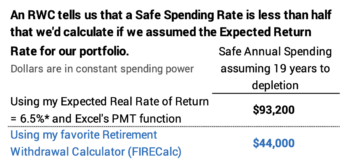
Reader Steven asked me in an email if I had looked at or considered Closed-end Funds (CEFs) for my retirement portfolio. I did not, and I haven’t looked at closed-end mutual funds in years. I found an article that listed the “Ten Best CEFs for 2021”; I use them as examples in this post. I conclude in this post that I would NOT consider Closed-end Funds for our retirement portfolio. I’ll stick with more boring – and more predictably better performing – total market index funds.


== What is a Closed-end Fund? ==


A Closed-end Fund raises initial capital like a new public company and thereafter its shares trade like a stock. No new money flows into the fund when an investor buys shares; no money flows out of the fund when an investor sells his shares. Depending on its organizing documents, these funds have an ability to borrow money to be able to invest more, invest in illiquid securities, and sell shares short – an investment that makes money when share price falls. The swash-buckling fund managers can swing for homeruns.


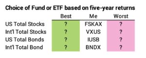
A traditional Open-end Fund trades at its end-of-day net asset value per share: new money flows into the fund when an investor buys new shares, and money flows out of the fund when an investor sells or redeems shares. Patti and I own FSKAX, a traditional Open-end Fund. FSKAX invests its assets in shares of publicly-traded companies; FSKAX owns shares in more than 3,500 companies. It does not borrow or sell shares short.


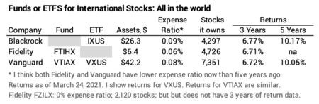
An Exchange Traded Fund (ETF) is a variation or hybrid of an Open-end Fund in that shares trade during the day like shares of companies. Patti and I own VXUS, which is the ETF for its sister fund, VTIAX.


I view an ETF as the same as a traditional open-ended fund although one can debate the small pluses and minuses of the two. The annual change in net asset value of VXUS basically is the same as VTIAX, and the price of VXUS tracks its net asset value over time. Over time the total return for VXUS – based on its price – closely tracks with the total return for VTIAX based on its growth in net asset value.


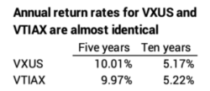
Why did I buy VXUS and not VTIAX? Our investment accounts are at Fidelity. VTIAX is not part of Fidelity’s network of no-transaction-fee funds. The transaction fee to buy VTIAX and other Vanguard funds is $75. It’s no fee now to buy VXUS. (I think it was $7.50 when I first purchased VXUS.) I hold VXUS in several accounts – Patti’s IRA and my IRA, for example; and I could be making annual purchases when I rebalance. I wanted to avoid the $75 fees.


== You want to focus on Total Return ==


The article I cited focuses on a higher payout to investors from CEFs than from a traditional mutual fund, but that that difference has no meaning to me: I want to compare total returns. Total return for a stock is the calculation of increase in value from change in price + dividends reinvested on the day they are issued.


How might these CEFs perform over time? We need to compare them to peer index funds, funds that very closely match what the market delivers to all investors because their investing cost – expense ratio – is so low.


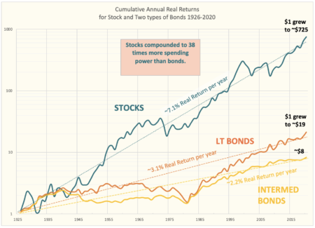
The difference in expense ratio gives us a good indication of how these CEFs might do in the future. The seven stock funds listed have an average expense ratio of ~1.15%. Patti and I pay .015% for FSKAX – about 1/75th.


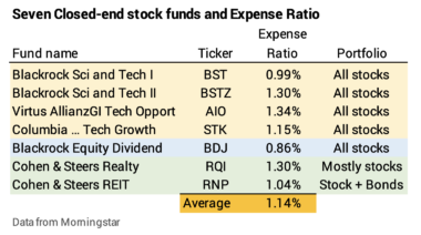
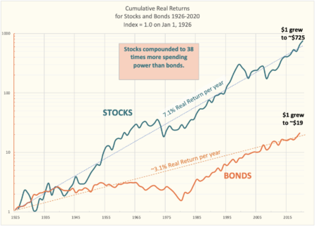
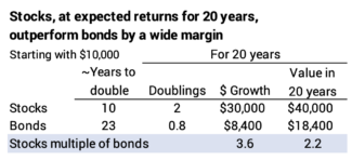
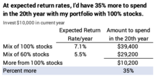
Expected real returns for stocks are 7.1% per year. The penalty of ~1.15 percentage points is a big hurdle to jump over: it’s draining 16% of future growth (1.15%/7.1%). The fund manager has to beat other actively managed funds by about 20% just to match the results of a peer index fund (1/(1-16%)). That’s a tough, tough task. A bet on one of these funds increases your chances of under-performance, and you don’t want to do that for your retirement portfolio.


== Only one of seven is a broad-based stock fund ==


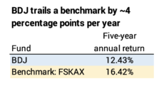
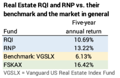
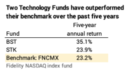
Only one of the seven stock funds is a general stock fund. Two are real estate funds and four are technology funds.


The general stock fund trails FSKAX, as an example, by FOUR percentage points per year over the past five years. UGH. I’m not sure how this performance tracks to a Top Ten rating.


== Narrowly focused funds ==


I don’t see any reason to suspect that funds with a narrow focus, such as real estate or technology, will outperform in the future. I have no desire to own more of those stocks than I already do.


The two funds that focus on real estate stocks have outperformed a peer index fund by more than four percentage points per year; the fund managers beat other fund managers to more than overcome their cost hurdle. But returns for the two trail the general market by three percentage points per year.


Large Cap Growth stocks have been the highest performing sector the last few years. I can only compare two funds, since two of the funds are less than two years old. The two have performed better than a peer index fund over the past five years. BST has dazzled. Sizzled. It’s in the top one percentile of technology funds over five years (and at the very bottom – 100th percentile – year to date!). Maybe it’s a good bet, but it would be a bet. We have no assurance that these funds will outperform in the future; the evidence tells us that we can’t predict future results based on the past.


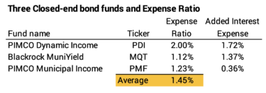
== Three bond funds. Sorta. ==


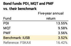
Three funds focus on bonds. They also have high expense ratio, about 25 times the .06% Patti and I pay for our IUSB.


Two borrow significantly to leverage the amount they invest. If those two earn more from their investments than the interest cost, they magnify returns. If they don’t, the leverage will magnify downturns. The two that borrow the most have beaten their benchmark by a wide margin.


I’m not swayed to consider these two:


• Bonds are my insurance against steep downturns in stocks. If stocks have cratered at the time I need to sell for our spending, I’ll want to sell bonds – mostly or solely – for our spending. I want bonds to be stable or decline far less than stocks.


• These two behave more like stock funds than bond funds in downturns. Morningstar displays a performance graph for each fund. PDI declined by 30% last February and March. That’s about five times greater than the 6% decline for IUSB. Both recovered, but that performance does not give me much confidence in PDI’s value as insurance against steep stock declines. I would not invest in PDI or MQT as a bond fund.


Conclusion: I looked at ten Closed-end funds in this post: seven stock funds and three bond funds. The one general stock fund underperforms by four percentage points per year. The returns on narrowly focused funds – real estate and technology – are mixed. The bond funds employ leverage to boost returns and appear to behave more like stock funds. They declined almost as steeply as stocks in the steep decline in Feb-March 2020. They aren’t providing the value I’d want when I would want to sell bonds, not stocks, for our spending.

How important is your decision as to which fund/ETF you own?

In recent posts, I’ve discussed your choices for US stock  funds, International Stock funds, and US bond funds. Pick any of four US total stock market funds, any of eight International stock funds and any of about seven or so US bond funds, and I think you have an excellent retirement portfolio. In this post, I look back over the last five years to see how much better off I would have been if I had picked funds that did better than the four I picked. I conclude that you really can’t make a mistake if you choose from the ones I’ve listed in those prior posts – the return difference from worst picks to best picks is small in my view. It turns out that the biggest difference in results for Patti and me stems from my choice of US bond fund/ETF.


== Chet vs. Tom ==


My friend Chet and I picked two different stock funds for our portfolio, and we compare at the end of each year. We assume we start the year with the same exact weights of US vs. International for stocks and bonds and mix of stocks vs. bonds. For US stocks, Chet owns ITOT while I own FSKAX. For International stocks Chet owns VEU while I own VXUS. Our choices of bonds are the same. I display the results over the past four years. Chet is just killing me by .02% in return per year. If we both started with $100,000, he is up by $145.


The point is that any four total market funds are going to give about the same result.


== The best and worst vs. my choices ==


I can look into the extremes of performance. I displayed funds or ETFs you can pick from in the prior posts. Some did better and some did worse over the past five years than my choices. Example: over the past five years for US total stocks, VTSAX was .03% better per year than FSKAK in annual return. FSKAX was .06% better per year than SWTSX. This table show the best and worst and my picks.


I then apply the percent Patti and I own of each. The percentages come from my decision on weights and mix in Chapter 11, Nest Egg Care.


Now I can calculate the total return rates for our portfolio. The result is that perfect picking would have been about .26% better return per year and least perfect would be about -.2% lower return.


Had I made the perfect choices, I could have had $2,100 more per each starting $100,000: 1.1% more. If I made other choices, I would have $1,500 less: 0.8% less. Am I going to beat myself up about my picks because they weren’t perfect? NO. I am almost certain that my choices mean I’m in the top 10% of all investors or will be in a few more years. There always will be someone who weights (US vs. International) or mixes (stocks vs. bonds) their portfolio differently than I do and will pick better funds than I do. I can’t worry about that.


== Choice of US bonds ==


The comparison shows where I could have gained the most: .20 percentage points out of the total .26 percentage point difference is from my choice of US bonds. I picked a US total bond fund – IUSB. IUSB has the characteristics – average maturity date of all the bonds it holds – of an intermediate bond fund. I could have done better with a similar actively-managed total bond fund FBND. That’s the ETF of FTBFX.


I could have even done better if I decided to narrow in on intermediate corporate bonds, LQD. I would have done even better than that by owning long-term bonds, BLV (total LT bonds) or VCLT (corporate LT bonds). That’s about the only tweaking that would make sense to me, but I’m not inclined to tweak.


Conclusion: You have a fairly narrow choices for US total stock market, International total stock market, and US bond funds. I’ve described your choices in recent posts. You’ll be fine if you pick any that I’ve listed. You’ll be in the top ranks of all investors over time.


Looking at the last five years, better picks for Patti and me would have resulted in about 1.1% more for our total portfolio, but I’m not going to beat myself up that I didn’t make perfect picks. I know I can never be perfect in our choices. Three-fourths of that 1.1% we could have earned is explained by my choice of US bond fund. I’m not driven to change my past choice – IUSB – but it’s the one area I could tweak.


What US stock funds or ETFs should you own for your retirement portfolio?

I’ve recently suggested choices for US bond funds/ETFs (also here) and International stock funds/ETFs . I thought I might as well complete the full story to lay out your best choices for US stocks. US stocks will be the biggest part of your portfolio. They’re almost 60% for Patti and me; that math excludes our Reserve (See Chapters 1 and 7, Nest Egg Care.) I hope your fundamental decision is obvious. The purpose of this post is to display four index funds for total US stocks. Own one of these and you’re done.


== Total US Stocks ==


Since you’re retired you must be low-cost investor; you can’t add uncertainty in returns by chasing after a fund – with higher costs – that might beat the market: history tells us that – over time – that game loses more than 90% of the time. Your choice has to be an index fund.


You want to own a total US stock fund. When you own every stock in the US in a total market fund, you own, in effect, a market capitalization weighted index fund for any style or subset of stocks: value; growth; large, mid and small cap; sectors like healthcare, technology and many slices of the total of about 3,700 stocks.


I list five choices for US total stocks in the table below. Pick from the top four and you’ll be fine. Patti and I own FSKAX. (You can print the pdf of three tables in this post here.)


WFIVX is the outlier. Its expense ratio is too high, and you see the direct result of that higher expense ratio in lower returns than the others. It’s the largest US total stock market index fund; it is pushed and sold by financial advisors who receive an annual commission of .25% of assets; that’s a component of its .63% expense ratio. (This is a good example of a fund that clearly is in the best interest of the financial advisor but costs the client roughly 9% of all future growth – .6% cost penalty/7.1% expected real return rate. That’s a big hit on future value over time.)


== S&P 500 funds ==


You could also pick a fund designed to closely match the S&P 500 Index. You already own this kind of fund in a US total stock market fund; if this were you only holding, you’d be excluding about 3,200 smaller capitalization stocks. Even Vanguard, which pioneered index funds in 1976 with its fund designed to track the performance of the S&P 500 Index – now ticker symbol VFAIX – thinks this too narrow of portion of the market to own. It no longer offers VFAIX as a choice for its employees’ retirement plan: it offers VTSAX, US Total Stock Market, instead.


SPY is the outlier for the same general reason that WFIVX is the outlier: its expense ratio is too high. You see the effect in lower return for the investor.


I don’t think you’ll be hurt by only owning one of these funds: the total value of the 500 stocks is about 75% to 80% of the total value of the stock market. Over the last 35 years or so, the returns for the 500 largest capitalization stocks have been virtually the same as for the added 3,200 or so smaller capitalization stocks.


The returns over the last five years have been about .4% lower per year than for the total stock market funds: that means smaller cap stocks have been a bit better over that period. The difference in three and five-year returns comes from last year. The 500 funds outperformed total market funds in three of the last five years, but US total market funds were more than two percentage points better in 2020.


== You can tilt, tweak and fiddle ==


You can tilt, tweak and fiddle. You can pick to own a bit more of some slice of the 3,700 than you already own in your US total market fund. Here’s an example: I’ve seen a number of articles recently that recommend retirees own dividend-growth funds – a theme for a value fund. Some funds focus on stocks that pay higher dividends or stocks that have a record of consistently increasing dividends. Oh, that sounds like the smart thing to do, doesn’t it? You already own these stocks, so you are already smart.


The sample of funds/ETFs I show in the table own a small set of all US stocks. Owning one of these would tilt your portfolio to a bit more of each of those 50 to 100 stocks than you already own in your total market fund.


This falls in to the “fiddling” category to me. Fiddling gives us a sense that we are at least DOING SOMETHING on the important task of managing our retirement portfolio. But I see two problems with this: 1) The higher expense ratio for these funds can only be made up if these are the winning set of stocks to own. 2) I don’t find any logic that would say these stocks are undervalued such that future performance will consistently be better than other stocks. They might do better than other stocks in the fuure, but that’s just a guess.


If you would have guessed this way in the past, the guess doesn’t look good so far. These funds have not outperformed over the last three, five or ten years as shown in the table. And as I posted last year, value stocks absolutely cratered in the market decline last February and March.


Resist the urge to fiddle!


Conclusion: Keep it simple for US stocks in your portfolio. Own a US Total Stock market index fund. This post lists four to pick from. One is all you need for your portfolio. That’s all Patti and I own. With just one of these, you are low, low in cost; you have invested to keep the most that the market will deliver to all investors. It’s the smart move.

What mutual fund or ETF do you want for International Stocks?

It’s easy to get confused as to the the correct choices of mutual fund or ETF for your retirement portfolio. There are about 8,000 mutual funds and 2,200 ETFs in the US. I’m a believer in Total Stock funds, and the purpose of this post it to describe a VERY SHORT list of stock mutual funds or ETFs that fit the bill for international stocks in your stock portfolio. Pick one from a list of three.


== You need international stocks in your portfolio ==


You need international stocks in your portfolio in my view. You want the diversification. International stocks are about 45% of the total value of all the world’s stocks. Over the very long run, US and International should perform exactly the same as US stocks. By holding some international stocks, you are narrowing the variability in your total portfolio value when it comes time to sell for your spending.


I also like owning the broadest range of international stocks to have in my head that Patti and I own nearly every stock traded in the world: if there is a hot stock somewhere in the world, I already own it. I think I’m a smart guy for owning it. Of course, if there is a stock in the world cratering to zero, I also own that, but I’m not going to think about that!


As I mention in Nest Egg Care (NEC), you can find recommendations of the percent of international stocks that you should own generally ranging from 20% to 40% of your total stocks. Vanguard recommends 40%; Fidelity recommends 30%. I picked 30% for Patti and me, and I’ll stick with that.


Over the past six years international stocks have underperformed US stocks in all but one year, but that says nothing about how they will perform in the future.


Should I be bothered that I’ve held too much International stocks? Our annual Safe Spending Amount (SSA; see Chapter 2, NEC) has marched up much faster than I would have expected. Like almost all retirees, we have more now than we’ve ever had in our lives – even after what I consider more than sufficient withdrawals for our spending.


Trend in our annual Safe Spending Amount relative to an assumed $1 million initial Investment Portfolio value in December 2014 at the start of our plan.


I guess I could beat myself up and calculate that our SSA might be a bit more now if I held less international and more US stocks, but I’m not going to do that. I could even extend this thinking to judge that I shouldn’t have held any bonds as insurance for a potential devastating decline in stocks, and I certainly wouldn’t do that.


== Picking a fund can be simple ==


I say, “Keep It Simple”. Simple is to hold a fund that owns almost everything. If you agree with that, the choices get narrow. I think it boils down to three. These three – IXUS, FTIHX, and VTIAX/VXUS – have the objective of replicating an index for the performance of all the stocks in the world: developed markets and emerging markets; large, medium and small cap stocks. The performance of all three is very similar.


They all use some sort of sampling method for the smallest stocks – the ones that aren’t going to have much effect on the total return for the fund. Vanguard holds at least 2,500 more stocks than the other two, meaning it doesn’t use sampling to any degree. IXUS has been slightly better in return. It may have lucked out on its sampling. Its prospectus shows it has bettered its benchmark index pretty consistently over the past decade, so maybe it has some special sauce that the other two don’t.


(Patti and I own VXUS and a smattering of FTIHX; we hold FTIHX because it made rebalancing a bit easier; I can do an exchange between FSKAX – my holding for US Total stocks – and FTIHX on the same day.)


== You can get more complex ==


Probably the least complex thing you can do is to leave out some kinds of stocks. I don’t think there is much logic in that, since you gain very little from a lower expense ratio from the reduction in stocks held and administrative complexity. The Vanguard fund/ETF of VFWAX/VEU owns 3,900 fewer stocks than VTIAX/VXUS, but the expense ratio is the same. The performance of the funds/ETFs that leave out small cap stocks is similar to the fund/ETFs that don’t.


You can find funds/ETFs that leave out emerging-market stocks. I would not suggest that. At times – most obvious is in the early 2000s – emerging market stocks dramatically outperformed US or other international stocks when they tanked. That says nothing about the chances of them repeating that feat. My friend, Chet, wanted to pick an index fund that left out stocks from emerging economies; I’m not remembering his reasoning. I find three funds/ETF that do that. The five-year performance of these three is a bit lower than the five fund/ETFs above, meaning recent past returns from stocks from emerging markets have been a bit better than from developed markets.


You can move beyond these eight and get very complex by trying to over- or underweight a part of the world, capitalization of stock, or kind of stocks (e.g., international real estate). That’s complexity for the sake of complexity in my view.


Conclusion: The bottom line is that you MUST BE a low-cost investor now that you are retired; that means you only own index funds. You want international stocks for some diversification. The simplest way to own your targeted percentage of international stocks is to own one of three funds/ETFs that hold bits of all international stocks in the world: stocks from developed and developing countries; large, mid and small cap stocks.

Do you earn back enough on your credit card?

It can be really hard to figure out what you earn back on your credit card purchases. The purpose of this post is to say, “If you aren’t clearly getting 2% back as cash value on all purchases, it’s time to switch.”


== How much is a point or a mile worth? ==


We’ve held a credit card for many years that pays us “miles” that we could use to buy American Airline (AA) tickets. AA is a main airline from Pittsburgh. We get 1 mile per dollar spent for most purchases, 2 miles on hotels and car rental, and 3 miles when we pay for an AA ticket with our credit card. Patti loves this since she’d tell me we had a free ticket for some of our trips – even business class Pittsburgh to Manchester, England.


A year or so ago, I tried to figure out how much a mile was worth. I think I calculated we earned the equivalent of more than two percent back on our cash purchases. That was not an easy calculation. This can get very confusing.


• I had to make some assumptions on the mix of our spending – how many total miles did we earn over, say, six months so I had a handle on the average miles earned per dollar spent.


• I had to sort out how much dollar value we were getting per 1,000 miles when we applied them to a ticket, and the dollar value of 1,000 miles applied to a free or upgraded ticket is not a constant.


In a case or two, Patti used miles that translated to a value of $17/1000 miles, and I think that meant we were getting a bit more than two percent value back on our purchases.


The bottom line was that Patti had to be able to get $17 of value for each 1,000 miles used toward a ticket. If she didn’t get that value, we weren’t getting the equivalent of 2% cash back on use of our credit card.


== Going simple with 2% cash back ==


This all came home about a week ago when Patti was considering buying tickets from Pittsburgh to Rome for October. She proudly told me that my ticket AA ticket would be free if purchased it with miles. I reminded her that she had to figure out the dollar value we would get for miles redeemed. She has to do that calculation every time, and that’s a headache. I had to dig to remember the target of $17 of value per 1,000 miles redeemed. Another headache.


The bottom line was if she had purchased that ticket with miles, she would have earned A LOT LESS than $17 per 1,000 miles used. That meant we would earn a lot less than 2% back on our credit card purchases. She charged the ticket to our credit card.


The other headache is that we have to build up a bank of miles to have enough to be able to redeem them on a flight. And now that bank is large. We obviously didn’t travel and redeem any miles in 2020. We won’t use any on our two big flights in 2021. I can imagine that I’ll die with a small mountain of unused AA miles and wasted potential cash.


We bit the bullet: no more miles; no more calculation of how much value we’re getting for the miles we redeem for a ticket. Just cash back.


We now have a new primary credit card. We’ll stop using the AA card; I’ll eventually use up my accumulated AA miles. We get 2% cash back on all purchases from a card offered by Fidelity. At the end of each statement period, cash goes straight to our taxable account at Fidelity: more money to spend! At a different point in life, I could have directed the 2% to an IRA or to a 529 account; that would have been a great way to build up savings that grow tax free.


You have quite a few options for cash-back cards. A similar card from Charles Schwab is 1.5% cash back. This site is lists a number of other cash-back cards. Most have different cash-back percentages for various categories of purchases. Some of those look very confusing to me. The top rated one from Chase might be good for us, since most all our discretionary spending is travel. That five percent on travel – airline tickets, hotels, and rental cars purchased through Chase – is three percent more than with our Fidelity card. But even with the amount we travel, that card isn’t going to be better by than a couple of $100 more per year for us, because it is .5% less on everything else. Patti’s our travel purchaser; she’s used to dealing directly with airlines and the car rental companies. I’m not sure she’d like the Chase portal for purchases, but she’ll explore how it would work for us.


 Conclusion: Most all of us earn points or miles on our credit card purchases. Patti and I have had a card for years that gave us miles we could use to buy American Airline tickets. It’s confusing to understand how to redeem them to get at least 2% value on our purchases. I concluded we don’t clearly get 2% value on the miles we earn. We’ll drop our current card and get a card that simply gives us 2% cash back at the end of every month. If you aren’t clearly getting the equivalent of 2% back, it’s time to change.

Are you getting ready to ENJOY NOW?

Have you shifted to thinking about what you are going to do to Enjoy More NOW? It’s almost a year since the first official stay-at-home requirements for here. Patti and I are more than two weeks past our second vaccination. We feel like we are breaking out. We’ve shifted into, “What’s fun to do?” mode. That’s travel for us. We spent NO MONEY on travel this last year. I wrote in November that we retirees had more money at any time in our lives, and we all have about 10% more now. Worry about money can’t hold us back. It’s time to spend to enjoy! This post mentions a few things we have planned.


== Gotta travel ===


We both like to travel and like to target two big trips each year. I spent most of this week renewing the plans we had for two big trips that we did not take in 2020: England and Italy. I really like to lock in dates and concretely plant those future markers on the calendar. Just thinking about them makes us happy. I can imagine we’re there already. Anticipation = happiness.


We usually go to England – the Lake District – for two weeks in late May-early June; I think we’ve gone there about five times now. Patti bought the tickets to leave late August; we’re thinking that there will be no travel restrictions then. I made all the room reservations this week; I basically renewed the ones we had for last May. We stay in three places and in the same rooms; two still had our deposit from last year. We already are replaying our favorite hikes in our head.


A stop along our hike up Wansfell Pike in Troutback, near Ambleside, England. 2019.


Patti bought the airline tickets and I renewed the reservations for a walking trip to Tuscany for mid-October. Many of our friends have been there, but we have not. Our friend, Tina, will join us, and that will be fun. I booked that trip through a company that we have used when we went to Sicily. I had them stretch their one-week walking itinerary to almost two weeks for us.


== Shorter trips ==


We’re up for smaller trips this year. I’d like to shoot for a short trip at least once a month. We have two coming up: one night with six friends at the Omni Bedford Springs. That’s a terrific place two hours from here. Of course, Patti had to get the bargain, bargain rate!


We have a time-share for a week every other year on Hilton Head Island; that will be the first full week of April. The weather is good that week when it usually is darn chilly here. Patti does not want to fly, so we will drive. It’s about 11 hours and that is A LOT of driving for us. We have high school + college friends that we’ll visit in Lexington, VA on the way back. That will break up the driving to amounts I may be able to stand.


Our niece’s family is in DC, and Patti booked a couple of nights close to the fourth of July weekend in DC. We’ll stay the 4th in the B&B we stayed in for the 4th in 2019. That was on the way back in Sharpsburg, MD near the Antietam Civil War Battlefield. The fourth of July parade in Shepherdstown, WV was a blast: a moving square dance in the parade was my favorite. We caught the Thursday night jam session at O’Hurley’s General Store. Our B&B as gave us a voucher for Nutter’s Ice Cream shop in Sharpsburg. The man in front of me bought this banana split; I think it was $6. I don’t think I’ll ever forget it.


We’ve talked about Montreal-Quebec and the eastern shore of Maryland, but we don’t have anything on the books. I’m leaning to the eastern shore. The weather would be terrific in May. Patti has a life-long friend in Columbia, MD. We’d visit on the way.


== Getting into shape ==


Our trips to Europe have always been active. We really like walking there. But I can no longer go and walk myself into shape there. I have to get in shape here to be able to comfortably walk six to eight miles. August is a long time from now, but the weather is better. We decided this was week to start to get into shape for walking. BOY, do I need to work to get into reasonable shape! We walked 1.5 miles, basically all downhill, to a park and had lunch with friends on Wednesday. Obviously, the return was basically all uphill. I was pooped. I pushing now to average three miles per day.


It also does not help that I am carrying more than a few extra pounds. I finally started to get back to the routine of weighing-in each morning. I’d guess I had a year hiatus. I was pleased at my first weigh-in and told Patti than I had only gained three pounds. I obviously misread, since the second reading said I was eight – maybe ten – pounds more than I weighed last year at this time. Not good. Bye-bye, Trader Joe’s coffee ice cream.


Conclusion: We all have to feel like we’re cautiously breaking out. It’s time to work at ENJOYING NOW. For Patti and me right now, that means planning trips. Whatever it is that you enjoy, GO FOR IT. You have more money now than you have ever had in your life; money worries can’t hold you back.

How do you invest with the appropriate level of risk?

All investors should be able to answer the question, “Have I invested with the appropriate level of risk?” This raises a basic question, “What is financial risk?” It turns out that I don’t think that’s easy to answer. In my mind the financial industry uses a bizarre measure of risk, one that makes little sense to me. I think I’m super conservative: I have NO thought that I am assuming risk from my choice of stocks and bonds. Yet, financial folks would label Patti and me at our ages as irrationally aggressive. The purpose of this post is to describe how I think about how to invest for the least chance of loss and highest chance for gain. I conclude my view is likely a 35% better financial future for many investors.


== Minimize downdrafts in your portfolio? ==


The conventional thinking is that financial risk is measured by the degree of annual variations in return or portfolio value. Stocks are more variable in one-year return than bonds and therefore are riskier.


Investors focus on declines – they think a decline in the value of their portfolio is a loss even though they won’t sell anything from it for perhaps decades. The goal therefore is to assemble a portfolio – its mix of stocks and bonds – that meets a criterion that the investor likely has in their head as to what is an acceptable, decline in portfolio value.


Example: I feel I will explode with fear and lose sleep if my portfolio ever declines more than 25% from its peak value over a year. Examining historical returns, I can now construct a mix of stocks and bonds that meets that criterion.


Anyone who looks at this graph of the real annual return for stocks and bonds from 1926-2020 as the basis for their thinking about future stock and bonds returns has to find this appealing. Whoa. Those ups and downs look random, dramatic, and frightening. The emotional part of our brain shouts, “Look at all those times the green and orange lines are below 0! Look at those negative spikes for stocks at more than -30%. I’ll lose sleep if I hit one of those. Can I minimize the downturns? I need help!” (Financial folks love those last three words.)


Modern portfolio theory (MPT) adds sophistication to the process. Its author won the Nobel prize in 1952. It’s the underpinning of how financial folks construct portfolios for investors. MPT provides the math of how to pick a specific mix of stocks and bonds for a portfolio. MPT calculates the mix of stocks and bonds that is the optimum balance of best return and lowest variability in returns. (That link shows the math. It’s beyond description to me.) Once one has the optimum mix, one uses historical returns to find the acceptable, historical maximum portfolio decline.


The optimum mix differs for each holding period. A holding period is how long you hold an investment before you sell it for your spending. I display several optimum mixes for stocks and bonds from a graph that displays MPT calculations of risk-return for a number of holding periods from Figure 6.4 in Stocks for the Long Run, Fifth Edition, by Jeremy Siegel.


I’ll focus on the result for a 20-year holding period in this post: MPT finds that the best mix is 58% stocks and 42% bonds. A person who invested $10,000 would have a real expected portfolio return of 5.5% per year. $10,000 would accumulate to $29,200 in the same spending power in 20 years. That would be a relatively steady year-by-year ride.


== Model portfolios ==


The financial industry recommends investment portfolios that are grouped by wider time horizons – a number of holding periods. The industry then assigns labels to each general time horizon: aggressive, moderate, or conservative. I don’t track the logic for these labels unless they are meant to reflect greater tolerance for annual variability – primarily the maximum decline from a peak value for a portfolio.


I get the monthly Journal from the American Association of Individual Investors (See aaii.com). The January issue discusses recent changes to three recommended portfolios to lower the recommended portion of stocks in two of the portfolios. Here’s the detail on the three. I’d guess most investors would focus on maximum percentage decline for a portfolio to judge if they are an aggressive, moderate or conservative investor.


I summarize the moderate portfolio for an investor generally between ages 35-55: 60% stock and 40% fixed income. That’s generally someone with a life expectancy between 30 and 50 years; they’ll hold on to some portion of their investments now for perhaps more than 30 years. And then their heirs may hold some portion for decades more.


OUCH. That mix is VERY DIFFERENT ­– far lower in mix of stocks – from what one would derive from Nest Egg Care (NEC). Patti and I in our 70s; we clearly have a shorter time horizon than someone decades younger. I think I’m super-conservative, meaning I know we will NEVER run out of money; we are also best positioned for More over time. Our portfolio mix is about 80% stocks when I include the effect of a Reserve. (See Chapters 7 and 8, NEC.) What gives?


== Investing with the probabilities in your favor? ==


This approach is to construct a portfolio with the most obvious probabilities of the winning combination of stocks and bonds for a holding period. For some holding periods, the tradeoff of potential gain vs. loss is obvious. In others, the tradeoff is more difficult.


To try to figure this out you look at a graph that shows cumulative returns over time. Last week’s post shows a graph that includes intermediate bonds.) This graph hopefully engages the thinking part of your brain. It has the same ups and downs of the previous graph. They don’t look as frightening, and you can clearly see that stocks will outperform bonds by a wide margin over time.


The data is plotted on a semi-log scale. Each unit of distance on Y-axis is the same percentage change. The distance from 1 to 2 (a doubling or 100% increase) is the same distance as from 10 to 20 or 100 to 200. That also works for a decline: a 50% decline is the same distance on the graph: 2 to 1 is a 50% decline and that’s the same distance as for 200 to 100 or 80 to 40 as examples.


== The task ==


The task is to see how both stocks and bonds perform over different holding periods. Let’s assume I’m investing this year for money that I – at least in concept – will spend in the 20th year from now. I want to know which one – stocks or bonds – declines less and which one grows more from the beginning to the end of a holding period. I don’t care about the wobbles or maximum percentage decline of my portfolio at any time in those 20 years: I want to know the mix of stocks and bonds that gives me the best chance for more in that 20th year and least chance for loss.


I display a red horizonal bar at the bottom of the graph you can print from here. It’s 20-years long. I cut a 3X5 card to that length and slide it along points of the two curves to help answer key questions.


== What will outperform over the next 20 years? ==


I want to know: what’s the worst return for stocks and for bonds over 20-year segments? How many times do bonds outperform stocks and by how much? If returns are average over 20-years, how much do I have from stocks and how much from bonds?


Here’s what I conclude when I look at the two curves and use my 20-year measuring stick.


• I don’t need my measuring stick for this: stocks beat bonds by many multiples of return over the long run. The long-run or expected return rate for stocks is 7.1% and it’s 3.1% for bonds. (Intermediate bonds would be 2.2%.) .


Following the Rule of 72, stocks double every ~ten years and bonds double every ~23 years. In 20 years, stocks will have two doublings in the same spending power. Stocks will grow by 400% – from $10,000 to $20,000 and then $20,000 to $40,000. In 20 years, bonds will be about 90% of the way to their first doubling and will grow by 80%. Growth from stocks will be 3.6 times more, and I’d have more than twice as much to spend from stocks than bonds.


• The line for stocks is more wobbly – more variable in short-term returns – than the line for bonds.


• Stocks have several steep one to three-year declines, and bonds don’t decline that steeply over any one to three-year period. The four periods of steep declines for stocks are 1930-31, 1973-1974, 2000-2002, and 2008.


• Bonds have a similar decline from a peak as stocks. Bonds declined from a peak by 50% from 1964 to 1981. The biggest decline from a peak for stocks was 54% from 1929 to 1931.


• Bonds departed below their expected return line far more than stocks. Bonds had to increase by ~300% to get back to their long-run, expected return line, while stocks had to increase by ~80% from their greatest departure.


• Stocks have never declined for a 20-year holding period; they’ve always increased in real spending power. The worst 20-year period was 1969-1989; that was 3.8% real annual return, and that’s .7 percentage points better than the average return for bonds. Bonds declined in real spending power in each of the 14 consecutive 20-year periods from 1952 to 1965.


• The only times that bonds outperformed stocks over a 20-year period were during their Great Recovery, starting in 1982, after their 44 years of cumulative 0% return. The Great Recovery for bonds parallels the Great Squashing of inflation. Bond prices increase as interest rates fall; interest rates fall as inflation falls; inflation in 1979 was more than 13%; inflation has averaged less than 2% per year since 2009.


You have to slide the measuring stick along the two curves connecting points at the end to judge the relative steepness of the upward slope for bonds and for stocks. How many times is the slope steeper for bonds than it is for stocks? The candidate years start in the late 1980s. I can eyeball and find one example where bonds have outperformed stocks over 20 years.


I have to go the actual data to find that there were four cases where bonds outperformed stocks. In two of those periods, returns from bonds were about one percentage point more per year. In the other two, the return difference was small. Stocks outperformed bonds in the other 71 20-year periods, again, by an average of four percentage points per year.


== What does one conclude? ==


What’s the logical conclusion from this? I can’t construct a logical reason to hold ANY bonds for a 20-year holding period. Stocks have never declined in 20 years. The worst return rate for stocks was better than the average return rate for bonds. Bonds rarely beat stocks in return – and only in unusual times and then only by a small amount. In the OVERWHELMING number of cases stocks outperform bonds by a wide margin. Hold ONLY STOCKS for that long of holding period. Accept the annual variability. Accept the declines in your portfolio value along the 20-year ride. The alternative, focusing on how much annual downdraft you might accept, gives up 35% of your future.


== How do I sort this all out? ==


I go through all this same thinking using shorter and shorter holding periods and this is how it shakes out for me. I group the future into the cash for spending in the upcoming year and three holding periods; each holding period has a different mix of stocks and bonds. I don’t have one pile of money. I have three piles.


If I were in the Save and Invest phase of life, this is exactly how I would think about how I would construct my portfolio. I might even set up accounts with these groupings of holding periods and mixes of stocks and bonds. I’d forecast future spending needs. I might may very well have a need to sell from my portfolio in three to five years: money needed for the kids’ educational expenses would be a good example. I’d – at least conceptually – put the money I’m saving for that into the account with the appropriate mix of stocks and bonds.


Even in our Spend and Invest phase of life, I find it useful to think about our portfolio this way: I don’t have our accounts arranged by these holding periods, but every December I recast our returns for three holding periods.


Conclusion. When you are in the Save and Invest phase of life, you should think of your future spending as falling into different holding periods – I suggest three – and forecast your spending needs for each holding period. You’ll want a very high portion of bonds for the money you will spend in a year or two, but you’ll want 100% stocks for the longest holding period. I’d have 100% stocks for a holding period of seven and more years.


If you derive your total portfolio mix this way, you are engaging the thinking part of your brain. You are not being ruled by the intuitive, emotional part of your brain that focuses almost solely on avoiding temporary, deep downdrafts in the value of your total portfolio.

What are the pros and cons of long-term bonds vs. intermediate-term bonds?

Two weeks ago I wrote about potential choices for bonds and displayed a number of options. The purpose of this post is to look at the pros and cons of intermediate-term vs. long-term bonds in more detail. In particular, I wanted to confirm the insurance value of intermediate-term bonds.


Whew! With the last post and this one, I think I’ve exhausted about all I could say about bonds. My conclusion is as before: any of the choices on the sheet I included two weeks ago will work out fine for your financial retirement plan. Intermediate-term bonds offer the same – and maybe slightly better – insurance protection as long-term bonds. Expected returns are about one percentage point lower for intermediate-term bonds than long-term bonds: when we don’t face a Most Horrible sequence of returns, we’ll accumulate less from intermediate-term bonds.


== The pattern of returns ==


I like to look at the pattern of returns. What does a graph tell me? I plot the cumulative real returns of stocks and the two types of bonds from 1926-2020. An obvious difference is the ~one percentage point difference in return between the two: roughly 3.1% expected real return for long-term bonds and 2.2% for intermediate-term bonds.


Data source: Stocks, Bonds, Bills and Inflation (SBBI) Yearbook. Ibbotson, et al. Long-terms bond are 30-year US Treasury bonds. Intermediate bonds are goverment bonds with ~five year maturity.


It’s hard to see that one pattern is better than the other in insurance value. The line for intermediate-term bonds looks less variable; I’d expect that: prices of bonds move in the opposite direction of the changes in interest rates. The prices of shorter-term bonds are not as sensitive to changes in interest rates: prices don’t fall as much when interest rates increase; prices don’t rise as much when interest rates decrease.


Both have a very long period of 0% cumulative return. It took took 48 years for the cumulative return for both to clearly surpass their level in 1936! Both decline fairly steadily in the period 1976-1981 when interest rates increased because inflation increased. (Inflation peaked at 13.3% in 1979.) Both show sharp recovery starting in 1981 as inflation and interest rates fell, and both have been fairly stable in return since about 2000.


== Compare performance in the ten worst years ===


This table shows that both long-term bonds and intermediate-term bonds provide similar insurance value in the ten worst years for stocks since 1926. I’m judging insurance value by the spread between stock and bond returns. Both average 27 percentage points BETTER than stock returns for those ten years.


I highlight in green which was better: Long-term bonds or Intermediate-term bonds.


Intermediate term bonds were equal or slightly better than long-term bonds in eight of the ten years, meaning that they gave a bigger percentage point spread. My eyeballs focus on are the two back-to-back devasting years of 1930-31 and 1973-74. Long-term bonds were better insurance value in the most recent worst years, 2000 and particularly in 2008.


From this display, I’d conclude intermediate-bonds clearly are no worse in insurance value than long-term bonds, but I wouldn’t conclude solely from this that they are better.


== The effect on ZERO CHANCE years and SSR% ==


We use a Retirement Withdrawal Calculator (RWC) to lead us to the decisions that lock in the number of years we want for ZERO CHANCE for depletion of our portfolio. For, example, at the start of our plan Patti and I decided on 19 years for ZERO CHANCE for depletion. We found our Safe Spending Rate (SSR%) = 4.40% (See Chapter 2, NEC). That’s the conclusion derived from FIRECalc, the only RWC I trust.


FIRECalc uses a measure for long term bonds – described as “Long Interest Rate” – as its default for the fixed income portion of our portfolio. I want to know: Would I change any of the three design decisions for our plan, particularly our SSR%, if I used intermediate-term bonds?


I choose to use the spreadsheet that I built for this post to compare the effect of long-term and intermediate-term bonds. I want to use my spreadsheet rather than FIRECalc for this since I know the source of data, and I’m not clear on the data sources for FIRECalc: I don’t think “Long Interest Rate” is the same as real annual returns for long-term bonds that I get from my data source that is an industry-standard source.


When I input my three planning decisions in December 2014 to the spreadsheet – using long-term bonds – I got 20 years to depletion; that actually was one more year than I get from FIRECalc. Here’s the pdf of that spreadsheet. When I change and use intermediate bonds, I get 21 years to depletion. Not much difference. Here’s the pdf of that spreadsheet.


I conclude that intermediate bonds clearly are not worse than long-term bonds. One could argue that they are slightly better. But I’m not substituting them as the default for the fixed income portion that I originally used in FIRECalc. In other words, I’m not going to increase the age-appropriate Safe Spending Rates (SSR%s) that I show on Graph 2-4 and in Appendix D in NEC. I might judge that the age appropriate SSR percentages that I calculated in NEC are a shade conservative – low – and I’m fine with that.


== Seek about 1% greater return per year? ==


You may be inclined to chase a bit higher potential return than I get from my choice IUSB – iShares Core Total USD Bond Market ETF. You could choose one of the intermediate-term corporate bond or long-term bond funds on the sheet. You might earn one percentage point per year better return over the long haul: 3.1% real return, not 2.2% real return. That would add ~.2% on the expected return on our total portfolio.


I’m not inclined to chase: I’m more comfortable owning a total US bond fund. I like saying, “Patti and I own almost every traded stock and bond in the world. More than 26,000. You can’t get more diversified than that.”


Conclusion: I examined in this post the pros and cons of intermediate vs long-term bonds for our portfolio. Long-term bonds average about one percentage point better in real return per year. Both give very similar insurance value – meaning they both had had far greater returns than stocks in years when stocks cratered. Intermediate bonds might offer a shade better insurance value – a bit longer stretch of ZERO CHANCE years to the first possible chance of depleting a portfolio.


I’m not changing from IUSB that Patti and I hold to a different kind of intermediate bond fund or to a long-term bond fund to chase after that one percentage point. I feel much better knowing that I am highly diversified – IUSB owns a bit of the vast majority of bonds traded in the US. I like saying ­– in combination with the stock funds we own – “Patti and I own a bit of almost every stock and bond traded in the world. More than 26,000. You can’t get more diversified than that.”


Has your financial retirement plan anticipated the WORST?

Texas! Wow, what a mess! No heat, light, or water for millions. Did Texas plan for the WORST or is this just much worse than anyone could logically expect? I don’t know the answer, but I do know I feel really good about our financial retirement plan. Total failure in Texas was complete loss of power. To me that’s analogous to depleting our portfolio in our lifetime. We nest eggers should know: that cannot happen. We’ve planned properly to avoid that disaster. This post contains nothing new. All this is in Nest Egg Care, but the purpose of this post is to go down the checklist that runs through my head in times like this. I’ve gone down this list enough times that I can check them off in my sleep.


== TODAY is the start of the Most Horrible ==


Our plan is built on the assumption that TODAY is the start of the Most Horrible sequence of financial returns for stocks and bonds in history. That’s a sequence that contains a two-year period with 49% real decline real stocks. They dropped in half in 24 months! That sequence is 14 years with cumulative -10% real return for stocks. It’s twice as bad for bonds over those years. Oh, that’s miserable.


We calculate our Safe Spending Rate (SSR%; Chapter 2) using that Most Horrible sequence in our Retirement Withdrawal Calculator. Those horrible returns drop our spending amount to LESS THAN HALF had we assumed, for example, expected or normal returns. (The opposite of this: when returns aren’t horrible, we will calculate to much greater safe spending over time.)


== Steps to take when stocks go COLD ==


Our spending rate is already set to be at a safe level, but we nest eggers know we can act during retirement to futher protect our portfolio – extend the years for ZERO CHANCE of depleting our portfolio. I think of four levels of protection.


• I never forget to Rebalance back to my design mix of stocks vs. bonds at the end of each year. Bonds are a major form of insurance to protect our portfolio. When stocks return less than bonds in a year – that’s happened in about one-fourth the years since 1926 – we disproportionately sell bonds. That’s just how the math works out when we rebalance. We’re using some of our bond insurance to buy time for stocks to warm up and get back to their normal temperature.


When stocks get back to normal temperature – outperforming bonds in about three-fourths of the years – we’re disproportionately selling stocks for our spending and, in effect, buying more bond insurance. That makes sense: our portfolio is bigger and there is more we want to protect.


• When stocks turn DANGEROUS, RECORD COLD, we just pull out the stops and don’t sell any of them for our spending. Texas: go to your underground storage of diesel fuel and the small generators you have stored there; take the fuel and small generators to warm the bigger generators at the power plants that are not operating; fire them up to unfreeze the pipes and valves; and get the power plant back on line. Our Reserve (Chapter 7, NEC) – typically one year of spending – is like that underground diesel fuel and our store of small generators. We hope we never use that fuel, and it’s pretty much a dead cost ­– we don’t earn much on it. But is unbelievably valuable when it’s really bad.


• We all should have another deeper layer of Emergency Reserves, and that’s the unused balance of our HELOC. It would have to be an almost life-threatening event to use that for our spending, but we should gain comfort knowing that it is there if we need it. Patti and I have one year of spending available we could tap from our HELOC. My friend, Alice, has close to five!


• The final action is to spend just a little less. Spending less has a big impact on the safety of our portfolio. Lower spending stretches the years of ZERO CHANCE for depleting. Patti and I have built up a pretty big safety cushion that translates to being able to stretch the NO CHANCE years for us to well past age 100.


Good market returns have given us that safety cushion. We have 19% bigger Investment Portfolio – stated in constant spending power – in December 2020 than we had in December 2014 at the start of our plan. That’s despite increasing withdrawals for our annual Safe Spending Amount (SSA, Chapter 2, NEC). If we chose this past December to withdraw the same $44,000 of spending power we withdrew in December 2014, our withdrawal rate would be 3.7%. That SSR% equates to more than 30 years for the first chance to deplete. See Graph 2-4 and Appendix D, NEC. I’ve annotated on our most recent calculation sheet here.


Conclusion. The power outage in Texas reminds me how important it is that our financial retirement plan always has have the WORST case in mind. We nest eggers have a plan that assumes we will face the Most Horrible sequence of stock and bond returns in history – starting today. We make the right decisions at the start of our plan. We know the actions we can take during our retirement to further protect our portfolio. We should be very confident that we will NEVER deplete our portfolio during our lifetimes.

What’s the best choice for bonds in your retirement portfolio?

In Nest Egg Care (NEC) I recommend two bond funds for your retirement portfolio. One for US Total Bonds (Patti and I own IUSB; you have a number of options.) and one for International Total Bonds (Patti and I own BNDX the ETF of the index fund VTABX; I still think that is about the only option). The purpose of this post is to look at US bond funds that are options to IUSB – iShares Core Total USD Bond Market ETF. IUSB is still at the top of my list of funds, but you might want to consider alternatives.


== Bonds are INSURANCE against DEVASTATION ===


We retirees – in the invest and spend phase of life – are selling securities for our spending each year. All of us should have a mix of stocks and bonds. Stock returns have been greater than bond returns in all but one of the last ten or so years. We are disproportionately selling stocks in those years to get the cash we need for our spending and then to rebalance to our design mix of stocks vs. bonds.


This pattern has repeated: we sell a lot of something that has done well and seems to be on track to do well – stocks – and we don’t sell much of something that hasn’t done as well and likely won’t do as well – bonds. Heck, in three of the last six years I’ve solely sold stocks to get the cash we will spend in an upcoming year, and then I sold more stocks to buy bonds to correctly rebalance. That seems very crazy, but that’s how rebalancing can work. Bonds can seem to be a heavy weight we are dragging along.


But we retirees can’t lose sight of why we hold bonds. We cannot forget how a year or two of HORRIBLE stock returns can DEVASTATE our portfolio. The odds are high that we’ll experience at least one really horrible year during our retirement. (See Chapter 7, NEC.)


We need to remember what HORRIBLE can look like. This chart from this post shows the periods of the most HORRIBLE stock returns. Here’s a snapshot:


Wow. I forget how Horrible these sequences have been. The longer sequences of decline are worst for us retirees. We’re magnifying the declines because year after year we must sell securities – withdraw from our portfolio – for our spending needs.


Bonds are insurance against DEVASTATION when stocks crater. When we are hit with HORRIBLE returns for stocks, we sell LOTS of bonds our spending. If returns are really HORRIBLE, we use our Reserve (Chapter 7 NEC) and sell NO stocks. We sell bonds for our spending to buy time for stocks to recover.


== Criteria for our Insurance ==


The key criterion for insurance is that we want it to be there when we REALLY want it. Bonds are good insurance because their returns down follow the exact same pattern of the ups and downs of stocks. Stocks usually outperform bonds, but bonds outperform stocks when they crater.


The benefit of bonds is most clear in the years of MOST HORRIBLE returns for stocks. In the ten worst years for stocks, bonds averaged 27 percentage points greater return. 27 PERCENTAGE POINTS! Bonds have “been there for us” in each of those years, especially for the very worst ones.


Bonds have been 27 percentage points better, on average, than stocks in their ten worst years. Bonds were far better in two very bad back-to-back declines: 1930-1931 and 1973-1974.


== What to pick? ==


I think your buying decision for your bond insurance is similar to your buying decision for car insurance. Do you want GEICO, Allstate or Progressive? You may find some differences, but you know your choice will there when you need them. I think any choice of a diversified mix of bonds is going to have the same effect: their return will be MUCH BETTER in a year or years when stocks crater.


You have excellent alternatives for your bond insurance. I picked IUSB – iShares Core Total USD Bond Market ETF – in December 2014 and I won’t change that choice.


Why did I pick IUSB? I favored a Total US Bond fund (See Chapter 11, NEC). I like a total bond fund because it is the ultimate of diversification. With the two bond funds that we own, I can say, “Patti and I own almost every bond traded in the world. We’re not betting on a specific type or maturity of bond. We have the ultimate in diversification.” (I can say the same for our two stock funds.)


An article in Morningstar described IUSB as having a shade higher credit risk in its portfolio than other total bond funds; its credit profile was similar to portfolios of actively managed funds; it would outperform other total bond funds; and almost NO actively managed bond funds had better return.


Because of its mix of short, intermediate, and long-term bonds, the average maturity of all of IUSB’s bonds – ~6 years – falls into the Morningstar classification as intermediate bond.


Morningstar now describes IUSB as “Intermediate Core – Plus.” As I read this article, Core means no more than 5% of holdings are less than investment grade, while Core-Plus is no more than 8%. That seems like a small difference to me, but apparently that spells the return advantage.


The Retirement Withdrawal Calculator we should use, FIRECalc, uses Long Bond as its default for fixed income. I replaced Long Bond with intermediate bond (“5 Year Treasury” is close enough) and got the exact same Safe Spending Rate (SSR%).


This is small screenshot of FIRECalc’s Your Portfolio page. FIRECalc’s default for bonds is the sequence of real annual returns for Long-term bonds, which includes corporate and government bonds with more than 10-year maturity. (I think the label of “Long Interest Rate” is not an accurate description.) If I change the choice to “30 year Treasury” or “5 year Treasury”, I will still get the same result for Safe Spending Rate (SSR%).


== Some good alternatives for Total US Bond ==


This recent Morningstar article , “The Best Bond ETFs,” has a good list. On this chart, Choices for Bond Fund,  I focus on ones similar to IUSB, and I added a few I found on this site. Three are Core-Plus, four are Core, and three are intermediate-term corporate bond funds. Three are long-term bond index funds/ETFs.


Here are my highlights:


• FBND – Fidelity Total Bond ETF – was just two months old when I was first making decisions for our plan December 2014. FBND is actively managed with a higher expense ratio than IUSB, but it has returned about one percentage point more per year than IUSB over the last three to five years.


• The largest US total bond market ETF is AGG – iShares US Aggregate Bond ETF. BND – Vanguard Total Bond Market EFT – is also large. The crowd likes these two.


• You can narrow in on corporate bonds. This choice will also have no effect on the Safe Spending Rate (SSR%) you get from FIRECalc. The three corporate intermediate bond ETFs all have higher returns in the past years than my more diversified IUSB.


• I display four choices for long-term bonds, all index funds. I think BLV – Vanguard Long Term Bond ETF is closest to the default choice for fixed income in FIRECalc. All four have had greater historical returns than any of the intermediate-term bond funds, but price will be more sensitive to changes in interest rates.


Bond prices move in the opposite direction to interest rates. An increase in interest rates means lower bond prices: the bond is less valuable for the stated dollars of interest that it pays. Interest rates are as low as they’ve been in our lifetimes. They can’t go lower. (I think I’ve said that to myself four years in a row now!) They can only go higher. That means greater chances that bond prices will fall. Rates have increased slightly this year, and long-term bonds have declined more year-to-date than intermediate-term bonds.


Conclusion: We retirees own bonds as insurance against devastation of our portfolio from HORRIBLE stock returns. We pull out our insurance policy and disproportionately – and maybe solely – sell bonds for our spending when stocks crater. History tells us bonds have been very good insurance in the ten worst years of stock returns. I think almost any widely diversified bond fund or ETF is fine for your retirement portfolio. I like a total bond fund, which is the ultimate in diversification. This post displayed alternatives to the one I rely on – IUSB – iShares Core Total USD Bond Market ETF.