You win the tax game with Roth when you are retired, assuming you stay in the 22% marginal tax rate when you contribute or convert to Roth. You come out ahead by perhaps $1,000s per year in retirement. You want to get to roughly 80% of your retirement accounts as Roth by the time you retire and start Social Security.
Only a small amount of distributions from Traditional IRAs – I argue it’s less than $15,000 per year for a single filer (double that for married, joint filers) – is low tax when you are retired and on Social Security. For simplicity, you can assume that all distributions greater than $15,000 are taxed at more than 22%. This post shows that some distributions from Traditional can be taxed at 25% to 30%.
You want to pay up to 22% tax now (Roth) so you don’t pay 25% or 30% tax later (Traditional). Those are the $1,000s in tax that you do not have to pay. Those who know they will have very large IRAs win by paying 24% tax now, and they will save even more.
== What’s this mean? ==
If you are in the Save and Invest phase of life, I’m assuming you can stay in the 22% marginal tax bracket when you implement these actions:
• If you are a single filer, target to have less than $300,000 in Traditional, pre-tax IRA before you start Social Security with the balance in Roth. (Married, joint filers target no more than $600,000.)
• Contribute to Roth, not Traditional (pre-tax), to your employer’s plan and to your own IRA.
• Convert to Roth. Convert all the Traditional IRA you have now to Roth before age 59½. Convert most all your Traditional in your employer’s plan (e.g., your employer’s contribution) to Roth when you become eligible at age 59½ and before you start Social Security.
If you are older, in or near the Spend and Invest phase of life, your actions are limited.
• Folks, like Patti and me, roughly age 65 and older have no or very little Roth. We did not make a mistake. All or many of our prime work years were before the flattening of marginal tax rates in 2018. Marginal tax rates before 2018 were as many as eight percentage points higher. Roth made no sense then. The tax rate we now pay when we distribute from Traditional is much lower than the tax rate we avoided. We win the tax game when we distribute despite our headaches of trying not to pay taxes we can still avoid.
We’ll never get much into Roth. We really can’t convert to the top of the 22% tax bracket. Those over 65 lose a portion of the Enhanced Senior Bonus deduction before the top of the backet. Those on Medicare bump into an IRMAA tripwire roughly in the middle of the bracket. Our hands are really tied after we start paying RMD.
Details:
I explain why so little of distributions from Traditional are low tax by walking through the details of a tax return for someone age 65 or older and on Social Security. This is a lot of numbers!
== Bob: our example ==
Bob is a single filer and over age 65. He has started Social Security (SS). His gross benefit is $35,000.
Bob’s sole source of cash for spending other than SS is from sales of securities from his $1.5 million financial portfolio. He has $1.2 million in his retirement accounts and $300,000 in a taxable brokerage account.
Bob’s sells 4% or $60,000 from his portfolio for his spending: $48,000 from his retirement accounts and $12,000 from his taxable brokerage account; he’s held the same index funds for decades; his gain on this $12,000 is $8,000.
Bob has some interest and dividends from his taxable holdings that reinvest. He uses the standard deduction when he completes his 1040.
== Case 1. $48,000 from Roth: NO TAXES ==
All Bob’s IRA is Roth. I assume he paid 22% tax when he contributed or converted. He distributes $48,000 from Roth. (See here for PDF of four charts.)

Bob pays NO tax. He has no taxable income. Bob has $95,000 for spending. Bob will never pay tax when retired since he prepaid taxes when he contributed and converted; he’ll never have enough taxable income to trigger tax on his dividends and capital gains.
== Case 2. $12,120 from Traditional: NO TAXES ==
Let’s now assume Bob has a different mix in his retirement accounts: he has a mix of Roth and Traditional. He distributes $48,000 from his retirement accounts, but $12,120 is from his Traditional and $35,880 is from Roth.

The added $12,120 income from Traditional bumps the amount of SS that is taxed by $8,830. His total income increased by $20,950 to $24,150.
Bob pays NO TAX. After his standard and enhanced deduction, taxable ordinary income is $0. His total taxable income is below the threshold that triggers 15% tax on dividends and capital gains.
Bob wins the tax game big time on this $12,120. He did not pay tax on the amount that he contributed years before and pays no tax on this $12,120 distributed. You can’t beat that!
Note: This means Bob lost the tax game in Case #1 by $3,420. He paid 22% tax when he contributed to Roth that he did not have to pay to wind up with $0 tax when he distributed the first $12,120 in the year. The 22% tax that he paid when he contributed was 28.2% of the net amount he had in his Roth then and today. That tax that he did not have to pay would have grown to $3,420 today.
== Case 3. An added $6,700 from Traditional: 18.5% tax ==
Bob distributes $6,700 more from Traditional and $6,700 less from Roth. This bumps taxable SS by $5,700. Total and taxable income increased by $12,400 to reach the top of the 10% marginal tax bracket.
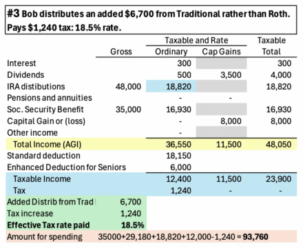
Bob pays an effective tax rate of 18.5% on this $6,700. He paid $1,240 tax on the $6,700. Each $1 distributed increased the amount of SS that is taxed by $.85. The 10% marginal bracket is effectively 18.5%. Bob has $93,760 for spending.
I don’t consider 18.5% as low tax. The difference between 18.5% and 22% on this $6,700 is $235. I judge this as insignificant in the grand scheme of things.
== Case 4. Added from Traditional: 22.2% rate ==
Added distributions are taxed at 22.2% until 85% of SS is taxed. The next $1,000 from Traditional increases the amount of SS that is taxed by $850. Taxable income increases by $1,850. Taxes on $1,850 in the 12% bracket are $222. The 12% marginal tax bracket is effectively 22.2% on this distribution.

== Higher taxes and more headaches ==
If Bob distributes another ~$28,000 from Traditional to get to $48,000 solely from Traditional, he pays an effective tax of 25%. That’s three percentage points more than if he were distributing Roth; that’s an added $850 tax per year. He pays more tax because taxable income crosses the threshold that increases the tax rate on capital gains from 0% to 15%; taxable income reaches a point where Bob starts to loss part of the $6,000 Enhanced Deduction for Seniors.

==It can be worse ==
If Bob had added ~$20,000 of distributions from Traditional – to total $68,000 – he crosses the first IRMAA tripwire that costs ~$1,300 in added Medicare premiums. Bob would have paid an effective tax rate of 30% on that added $20,000. That’s about eight percentage points or $1,600 greater tax per year than if he were distributing Roth.
Conclusion. Very little of distributions from Traditional IRAs are low tax. Less than $15,000 of distributions in a year are not taxed (single filer). About another $7,000 is taxed at 18.5%, but I don’t consider that low tax. Further distributions are effectively taxed more than 22%.
If you are in the Save and Invest phase of life, you want to wind up with roughly 80% of retirement accounts as Roth to avoid higher tax rates in retirement. Assuming you can stay in the 22% marginal tax bracket, you should …
• Only contribute to Roth
• Convert Traditional to Roth: convert your own Traditional before age 59½. Convert your employer’s Traditional to Roth when you are eligible at age 59½ and before you start on Social Security.
Older folks, like Patti and me, in our Spend and Invest phase of life are stuck with very little Roth, but we were correct to contribute to Traditional. Marginal tax rates then were much higher than they are now. We are winning the tax game when we distribute even though it doesn’t feel like it. We still get headaches trying not to pay taxes we can still avoid. IRMAA is the big one. None of us would ever get close to IRMAA if we had a lot more Roth than we do.