All posts by Tom Canfield

What’s the best choice for bonds in your retirement portfolio?

In Nest Egg Care (NEC) I recommend two bond funds for your retirement portfolio. One for US Total Bonds (Patti and I own IUSB; you have a number of options.) and one for International Total Bonds (Patti and I own BNDX the ETF of the index fund VTABX; I still think that is about the only option). The purpose of this post is to look at US bond funds that are options to IUSB – iShares Core Total USD Bond Market ETF. IUSB is still at the top of my list of funds, but you might want to consider alternatives.


== Bonds are INSURANCE against DEVASTATION ===


We retirees – in the invest and spend phase of life – are selling securities for our spending each year. All of us should have a mix of stocks and bonds. Stock returns have been greater than bond returns in all but one of the last ten or so years. We are disproportionately selling stocks in those years to get the cash we need for our spending and then to rebalance to our design mix of stocks vs. bonds.


This pattern has repeated: we sell a lot of something that has done well and seems to be on track to do well – stocks – and we don’t sell much of something that hasn’t done as well and likely won’t do as well – bonds. Heck, in three of the last six years I’ve solely sold stocks to get the cash we will spend in an upcoming year, and then I sold more stocks to buy bonds to correctly rebalance. That seems very crazy, but that’s how rebalancing can work. Bonds can seem to be a heavy weight we are dragging along.


But we retirees can’t lose sight of why we hold bonds. We cannot forget how a year or two of HORRIBLE stock returns can DEVASTATE our portfolio. The odds are high that we’ll experience at least one really horrible year during our retirement. (See Chapter 7, NEC.)


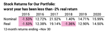
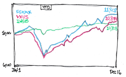
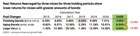
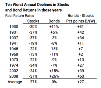
We need to remember what HORRIBLE can look like. This chart from this post shows the periods of the most HORRIBLE stock returns. Here’s a snapshot:


Wow. I forget how Horrible these sequences have been. The longer sequences of decline are worst for us retirees. We’re magnifying the declines because year after year we must sell securities – withdraw from our portfolio – for our spending needs.


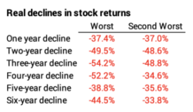
Bonds are insurance against DEVASTATION when stocks crater. When we are hit with HORRIBLE returns for stocks, we sell LOTS of bonds our spending. If returns are really HORRIBLE, we use our Reserve (Chapter 7 NEC) and sell NO stocks. We sell bonds for our spending to buy time for stocks to recover.


== Criteria for our Insurance ==


The key criterion for insurance is that we want it to be there when we REALLY want it. Bonds are good insurance because their returns down follow the exact same pattern of the ups and downs of stocks. Stocks usually outperform bonds, but bonds outperform stocks when they crater.


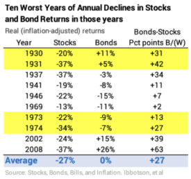
The benefit of bonds is most clear in the years of MOST HORRIBLE returns for stocks. In the ten worst years for stocks, bonds averaged 27 percentage points greater return. 27 PERCENTAGE POINTS! Bonds have “been there for us” in each of those years, especially for the very worst ones.


Bonds have been 27 percentage points better, on average, than stocks in their ten worst years. Bonds were far better in two very bad back-to-back declines: 1930-1931 and 1973-1974.


== What to pick? ==


I think your buying decision for your bond insurance is similar to your buying decision for car insurance. Do you want GEICO, Allstate or Progressive? You may find some differences, but you know your choice will there when you need them. I think any choice of a diversified mix of bonds is going to have the same effect: their return will be MUCH BETTER in a year or years when stocks crater.


You have excellent alternatives for your bond insurance. I picked IUSB – iShares Core Total USD Bond Market ETF – in December 2014 and I won’t change that choice.


Why did I pick IUSB? I favored a Total US Bond fund (See Chapter 11, NEC). I like a total bond fund because it is the ultimate of diversification. With the two bond funds that we own, I can say, “Patti and I own almost every bond traded in the world. We’re not betting on a specific type or maturity of bond. We have the ultimate in diversification.” (I can say the same for our two stock funds.)


An article in Morningstar described IUSB as having a shade higher credit risk in its portfolio than other total bond funds; its credit profile was similar to portfolios of actively managed funds; it would outperform other total bond funds; and almost NO actively managed bond funds had better return.


Because of its mix of short, intermediate, and long-term bonds, the average maturity of all of IUSB’s bonds – ~6 years – falls into the Morningstar classification as intermediate bond.


Morningstar now describes IUSB as “Intermediate Core – Plus.” As I read this article, Core means no more than 5% of holdings are less than investment grade, while Core-Plus is no more than 8%. That seems like a small difference to me, but apparently that spells the return advantage.


The Retirement Withdrawal Calculator we should use, FIRECalc, uses Long Bond as its default for fixed income. I replaced Long Bond with intermediate bond (“5 Year Treasury” is close enough) and got the exact same Safe Spending Rate (SSR%).


This is small screenshot of FIRECalc’s Your Portfolio page. FIRECalc’s default for bonds is the sequence of real annual returns for Long-term bonds, which includes corporate and government bonds with more than 10-year maturity. (I think the label of “Long Interest Rate” is not an accurate description.) If I change the choice to “30 year Treasury” or “5 year Treasury”, I will still get the same result for Safe Spending Rate (SSR%).


== Some good alternatives for Total US Bond ==


This recent Morningstar article , “The Best Bond ETFs,” has a good list. On this chart, Choices for Bond Fund,  I focus on ones similar to IUSB, and I added a few I found on this site. Three are Core-Plus, four are Core, and three are intermediate-term corporate bond funds. Three are long-term bond index funds/ETFs.


Here are my highlights:


• FBND – Fidelity Total Bond ETF – was just two months old when I was first making decisions for our plan December 2014. FBND is actively managed with a higher expense ratio than IUSB, but it has returned about one percentage point more per year than IUSB over the last three to five years.


• The largest US total bond market ETF is AGG – iShares US Aggregate Bond ETF. BND – Vanguard Total Bond Market EFT – is also large. The crowd likes these two.


• You can narrow in on corporate bonds. This choice will also have no effect on the Safe Spending Rate (SSR%) you get from FIRECalc. The three corporate intermediate bond ETFs all have higher returns in the past years than my more diversified IUSB.


• I display four choices for long-term bonds, all index funds. I think BLV – Vanguard Long Term Bond ETF is closest to the default choice for fixed income in FIRECalc. All four have had greater historical returns than any of the intermediate-term bond funds, but price will be more sensitive to changes in interest rates.


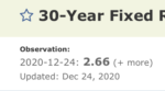
Bond prices move in the opposite direction to interest rates. An increase in interest rates means lower bond prices: the bond is less valuable for the stated dollars of interest that it pays. Interest rates are as low as they’ve been in our lifetimes. They can’t go lower. (I think I’ve said that to myself four years in a row now!) They can only go higher. That means greater chances that bond prices will fall. Rates have increased slightly this year, and long-term bonds have declined more year-to-date than intermediate-term bonds.


Conclusion: We retirees own bonds as insurance against devastation of our portfolio from HORRIBLE stock returns. We pull out our insurance policy and disproportionately – and maybe solely – sell bonds for our spending when stocks crater. History tells us bonds have been very good insurance in the ten worst years of stock returns. I think almost any widely diversified bond fund or ETF is fine for your retirement portfolio. I like a total bond fund, which is the ultimate in diversification. This post displayed alternatives to the one I rely on – IUSB – iShares Core Total USD Bond Market ETF.

What’s the length of your Retirement Period?

We retirees want to spend to ENJOY retirement, but we are governed as to how much is safe to spend by our over-riding concern: DON’T RUN OUT OF MONEY. Nest Egg Care (NEC) argues that you start your plan by choosing a number of years you want for ZERO CHANCE of depleting your portfolio. I’d consider those years as your “Retirement Period,” and the number of years you pick relate to your life expectancy. The purpose of this post is show how you can use the Social Security Life Expectancy calculator to pick the number of ZERO CHANCE years that will lead you to your annual Safe Spending Amount (SSA) .


== ZERO CHANCE years and Safe Spending Rate (SSR%) ==


I discuss the logic of how you pick the number of years you want for ZERO CHANCE of depleting your portfolio in Chapters 2 and 3, NEC. A plot of the risk of depleting a portfolio looks like a hockey stick. You have many years of ZERO CHANCE of depleting your portfolio; that’s the shaft length of the hockey stick. You have a rising risk in the years thereafter – typically when you are in your late 80s and 90s; that’s the blade of the hockey stick. NEC leads you through the decisions as to How Much to Spend and How to Invest to LOCK IN the shape of your hockey stick and describes how to lengthen the shaft of your stick if you need to or want to during retirement.


Example: at the start of our plan, my choice for ZERO CHANCE years – the shaft length of the hockey stick for Patti and me – was 19 years; that’s the life expectancy I got for Patti from the calculator I used at the time. With our decisions as to How To Invest, I knew that our Safe Spending Rate (SSR%) was 4.40%. (See Chapter 2, NEC). Our 4.40% times our Investment Portfolio value in December 2014 gave us our our annual Safe Spending Amount (SSA) for 2015.


We’re older now and Patti’s life expectancy is fewer years, and we play with a hockey stick with shaft length of 15 years. We see no reason to lengthen that becuase we now have LOTS of flexibility to lengthen it whenever we want. 15 years equates to 4.85% SSR%. About 10% more than at the start of our plan. Bigger SSR% = MORE $$$ TO ENJOY.


For this post I’m assuming you made the same decision I did. You have picked 1) your life expectancy; or 2) the life expectancy of your spouse if his/her life expectancy years is more than yours as the number of years you want for ZERO CHANCE of depleting your portfolio.


== The Social Security Life Expectancy calculator ==


When I wrote Nest Egg Care, I used the Vanguard Probability of Living Calculator – it’s no longer available – to find our life expectancies and to draw the graphs of our probability of being alive in any future year (See Chapter 3 and Appendix E, NEC). I now use the Social Security (SS) Life Expectancy Calculator to find Patti’s life expectancy as of each November 30. That’s the date I use to calculate our SSA for the upcoming calendar year.


As I tuned up my calculation sheet that I use every November 30, I found the SS calculator gives a different answer for Patti’s life expectancy than I got from the Vanguard calculator. The Vanguard calculator said that Patti’s life expectancy at her age this November 30 was 14 years. The SS calculator says it’s 15 years (rounding 14.9 years). The SS Calculator gives one added year of life expectancy.


I’m not sure why the Vanguard calculator gave one year less life expectancy than the SS calculator does now. Life expectancy calculators are driven by life expectancy tables and perhaps the most recent tables reflect slightly longer life expectancy. Example: the IRS used updated life expectancy tables that reflected almost two years longer life expectancies as the basis for the schedule for Required Minimum Distributions.


== Finding Life Expectancy on November 30 ==


Reader Ben sent me an email and said, in essence: “My birthday is in early June. I’m going to use November 30 as my calculation date. I’m almost exactly six months from that date. Do I round my age up or down for the calculation? My rounding will have an effect on the SSR% I test each year to see if I can increase my SSA.” (See Chapter 9, NEC.) The answer to Ben’s question shows how I now use the SS calculator.


I’ll assume Ben’s birthday is June 15, 1955. I can use Excel and find that June 15 is 168 days from November 30. Last November 30, Ben was 65 years and 168 days old.


What’s the life expectancy for a male age 65 and 168 days old? I can find that from the SS calculator, but I have to fiddle using today’s date. I’ll use today’s date, February 3, as I write this. I convert that to the number format in Excel and today’s date is 44230. I subtract 168 to find day 44062 in Excel, and then I put that in date format to find that was 8/19/20.


I then use 8/19/55 as Ben’s birthday and find life expectancy is 18.7 years. That was his life expectancy last November 30. I can repeat using 8/19/54 to find his life expectancy next November 30 = 17.9 years. And so forth. Ben can build a table for the next five or more years, rounding his life expectancy to whole years. The schedule I built adds the age-appropriate SSR% for each year from Appendix D.


== I adjusted our November 30 calculation sheet  ==


I followed this same approach to update Patti’s life expectancy and the age-appropriate SSR% I should be testing each year. I mentioned this change here. I repeated her life expectancy as 15 years; I previously had it at 14 years. The result is that I used 4.85% for our calculation of SSA this last November 30 and not 5.05% that I previously planned to use.


Excerpt of our detailed calculation sheet. See post of December 4, 2020.


Since our portfolio return for the 12 months ending November 30 was far greater that the percentage we withdrew last year, Patti and I clearly were going to have a real increase in our SSA. Using 4.85%, our increase in our SSA was 9% – from $57,500 to $62,700; that’s stated in terms of an assumed original $1 million starting portfolio in December 2014. Had I used 5.05% the increase would have been to $65,300. That would have been 4% more, but I can’t consider that as a loss of some sort. I’m happier knowing the calculation is more precise.


Conclusion: When I wrote Nest Egg Care, I used the Vanguard Probability of Living Calculator to find the life expectancy that I use as the setting for the years I want for ZERO CHANCE of depleting our portfolio. Those years link to a Safe Spending Rate (SSR%) that I test each November 30 to find our annual Safe Spending Amount (SSA) for the upcoming calendar year. (See Chapters 2 and 9, NEC.) The Vanguard calculator no longer exists. I now use the Social Security Life Expectancy Calculator. It gives about one year longer life expectancy than Vanguard’s gave me six years ago. I show in this post how you can use the SS calculator find your years of life expectancy on your calculation date.

How much does $2,000 saved and invested in 1985 translate to in 2021?

The purpose of this post is to tell the story that I repeat in my mind every January. I look back to see the impact of the money Patti and I saved and invested decades ago. The story this year is the $2,000 that I put in my IRA on January 1, 1985 compounded to $100,800 on the January 1 this year. (The $2,000 I invested in my IRA in the early 1980s is roughly the same spending power as $6,000 allowed now for IRA contributions.)


I’ve replayed this story for a number of years. You’ll find a similar post the last three Januarys. Here is this year’s story:


I invested $2,000 in my Traditional IRA on January 1, 1985; I was compulsive then about getting that money invested on the first possible day of the year. Conceptually I put that $2,000 in an envelope at the start of 1985, invested it solely in a stock index fund, and sealed the envelope and let it sit touched all those years with all dividends automatically reinvested. Patti and I open an envelope like this one each January 1 with great anticipation: we are sure that there is more than $2,000 in the envelope, but we don’t know exactly how much. We do know is that whatever is there is what Patti and I should FULLY spend in the year.


It was another really pleasant surprise this year: the envelope this year contained another fantastic gift in a series of really great gifts: we have +$100,000 to spend in 2021. The money in the envelope swelled 20 times in spending power. And there’s another gift envelope waiting for us next January!


(Note: in Nest Egg Care (NEC), we use a different and correct logic and steps to find what’s safe to spend in a year. We always assume we will face the MOST HORRIBLE sequence of market returns in the future. See Chapter 2. That assumption drives down the amount we judge as safe to spend from our total nest egg.)


== A series of annual gifts to the future you ==


Most people think they save for retirement with the goal of building a big nest egg. That’s good way to think about it, and clearly the amount you accumulate is the starting point for your financial retirement plan in Nest Egg Care.


But I think you should think differently when you are in the Save and Invest phase of life. You probably have a good guess as to how much spending ­– in today’s spending power – will make you happy in retirement. You want to think of the amount you save and invest this year as the amount that predictably – well, reasonably predictably – grows to what you want to be able to spend in a future year.


I certainly didn’t have this logic concretely in my mind when I was in my 30s saving and investing for retirement when I’d be in my 60s. But I did have the general concept that the money I saved and invested in the year I turned 30 would grow for decades.


Let’s assume I had this concept of a series of annual gifts to the older me. Let’s assumie I had a veiw that retirement was age 65 when I was 30. That would have meant the amount saved and invested that year year would sit there and then be spent in the year I turned 65. The money I saved and invested in the year I turned 31 would grow to an amount I would spend in the year I turned 66. And so on. In concept Patti and I have had a series of envelopes that we’ve opened and will continue to open each New Year’s Day well into our 90s: at some time in our 50s we stopped adding to our IRAs.


== The math of 12 times=


If you are in the Save and Invest phase of life, the amount you save and invest this YEAR could be the amount you have to spend each MONTH in a future year. That means the money you save this year grows 12 times in spending power. Admittedly this statement is based on a long time horizon like I used in the story Patti and I tell ourselves each year.


The math for 12 times comes from two numbers: 7.1% real return rate for stocks and the Rule of 72, which says stocks will double in real spending power roughly every ten years. (That 7.1%, less a bit of Expense Ratio, means your money doubles in real spending power a bit more than ten years, but “doubling in ten” years is a lot easier to remember.)


I use 36-year time horizon in each of my New Year’s Day envelopes – Jan 1, 1985 to December 31, 2020 for the one this January 1st. That’s roughly 3.5 decades and therefore 3.5 doublings. That mean the amount I saved in 1985 should have increased about 12X: 3 doublings are 8X, and five more years is roughly half the way to 16X. I then get a Rule of thumb for ~35 years: THE AMOUNT YOU SAVE THIS YEAR IS THE AMOUNT YOU CAN SPEND EACH MONTH IN A FUTURE YEAR.


== This year was better than 12X ==


Is this how my $2,000 on January 1, 1985 worked out? Nope. BETTER. I have to adjust to inflation to get the change in spending power. From this CPI calculator, I find that my $2,000 then is the same as $4,900 in today spending power. Therefore, my multiple of spending power = 20 times. ($100,100/$4,900). The amount I saved in all of 1985 is money I can spend every ~2½ weeks in 2021.


Why did this work out that way? Our returns depend on where the year falls on the graph of real cumulative returns over time. The 7.1% annual rate of return plots as a straight line on semi-log paper. If the year we invest is below the 7.1% line and our current year is on the line, the line from those two points is steeper than the 7.1% return line. Steeper upward slope = higher return rate. The line from early 1985 to the present is a steeper line. The 20 times over 36 years works out to average real return rate of 8.6%.


You can also interpret from the graph that includes bond returns that those who saved and invested in the early 1980s could hardly make a mistake with their investment. Bonds were waking from their ~45 years of zero percent cumulative real return, and any line for bonds in the early 1980s to the present is just as steep as it is for stocks – maybe steeper for some years.


An investor could have made two mistakes: they could have invested in Actively Managed mutual funds that did not overcome their higher expense ratio; they could have invested in too narrow set of securities that did not keep pace with the market as a whole. One percentage point lower in return per year – the expected result from one percentage point of expense ratio, for example – would cumulate to about 30% less to spend now. $2,000 wouldn’t grow to $100,000. It would have grown to $70,000. $2,500 per month less to spend. OUCH: that is a big difference from something that most folks ignore.


== Lessons ==


• If you are in the Save and Invest phase of life, start saving for retirement EARLY. If you’re older and not in this phase of life, get your children and grandchildren to invest for their retirement. The EARLIER the BETTER. The MORE YEARS OF COMPOUNDING the BETTER.


• ONLY invest in stocks. NOTHING can compete with a 7.1% expected real per year over the many years you have until you will spend what you have invested. There will be periods that vary from that average, but your return from stocks is going to be very close to 7.1% over your lifetime.


• Think MULTIPLES of spending power. 7.1% per year compounds to ~doubling of real spending power in a decade. Decade after decade. $1 to $2. $2 to $4. And so on.


• Think that the amount you save and invest this year is a gift that you will spend in a future year. The money you save and invest THIS YEAR could be the amount you could spend PER MONTH in a future year.


• DO NOT GIVE UP ANY of the expected 7.1% away to high investing costs (Expense Ratio): only invest in total market index funds. (You’ll give up just a tiny bit of Expense Ratio.)


Conclusion. Each January I look back to judge the impact of the money Patti and I saved and invested many years ago. I invested $2,000 in my IRA at the first of January in 1985. I can view that as putting $2,000 in an envelope that has been invested solely in a stock index fund for 36 years. Patti and I opened that envelope on New Year’s Day and found it increased more than 20 times in spending  power. (With inflation, the initial $2,000 I invested was more than $100,000 that we could spend in 2021.)


We don’t know future market returns. But the chances are that an amount saved and invested wisely this year will compound to MANY MULTIPLES of spending power. Save and Invest wisely if you are younger. If you are older, you can dramatically improve lives of those you love by helping them save and invest at a young age.

What taxes will you pay in 2021?

I added a January task to my annual work plan for our financial retirement plan. I display in this post the information I gathered on 1) 2021 tax brackets for Ordinary Income and 2) important income tripwires on a 2021 tax return that can be very expensive: cross a tripwire by $1 of too much income and your taxes – in effect – increase dramatically.


This information is more important for us retirees in the spend and invest phase of life. We have some degree of control over the taxes we pay each year unlike most folks in the save and invest phase of life. We get our cash to spend by selling securities from different kinds of accounts, each with a different impact on taxes we pay. And we have an ugly set of tripwires that younger folks don’t have. I’ll take my first cut at my decisions that will determine my taxes for 2021 in August. You can see my thinking last August here.


== Tax brackets for 2021 ==


I show the tax brackets for Ordinary Income for Married, Joint filers and a Single filer for 2021. The brackets adjust for inflation each year. That means in real terms, they are unchanged. (You also have income subject to Capital Gains Taxes, generally taxed at 15%; the point where that 15% rate kicks in increased slightly for 2021.)


As Married, Joint filers, this is the 2021 tax table for Ordinary Taxable Income that applies to Patti and me.


I highlight two brackets with big increases in marginal tax rate. You get to keep more – pay less tax – if you can plan the sources of your Safe Spending Amount (SSA, Chapter 2, Nest Egg Care) to stay in a lower tax bracket now and in the future. Two brackets have big jumps in marginal tax, meaning you get to keep more if you can manage to not cross into those higher tax brackets: the ten percentage-point jump from the 12% bracket to the 22% bracket or the eight percentage-point jump from the 24% bracket to the 32% bracket.


== Medicare Tripwires ==


Tripwires are sneaky and important: cross a tripwire by $1 and your tax – in effect – jumps by a BIG amount. I want to be careful if I ever get close to a Medicare Premium tripwire that I could otherwise avoid. I show the tripwires for Married, Joint files and a Single filer here.


As an example, if Joint, Married filers accidentally cross a tripwire from too much income that they could otherwise avoid, they could see their Medicare Premiums increase by as much as $2,600 – they could lose more than $200/month in Social Security benefits because of $1 of too much income! Here’s more detail.


Those with higher income can stumble across a tripwire that results in higher Medicare premiums deducted from monthly Social Security benefits. A stumble by Married, joint filers could cost more than $2,600 per year.


The tripwires that trigger much greater Medicare Premiums in the future did not adjust for inflation this year and that means they are really closer than they were before. The penalty when you cross a tripwire increased roughly in line with inflation, though.


Your MAGI – modified adjusted gross income – determines if you cross a tripwire that results in higher Medicare Premiums. For most all of us retirees MAGI is the same as Adjusted Gross Income (AGI): the sum of Ordinary Income and income taxed at Capital Gains tax rates before your Standard or Itemized deductions. That’s line 8b on your 1040 tax return.


There is a lag in effect as to when you incur higher Medicare Premiums as a result of the MAGI on your tax return: for example, you will file your 2020 return in April this year; your MAGI on this return will determine the added monthly Premiums, if any, that you pay throughout calendar 2022. That’s when you’d see lower monthly Social Security benefits.


Conclusion: I added a routine task in January for my retirement financial planning. I enclose in this post the tax brackets for Ordinary Income for 2021. I also enclose the tripwires of income that could result in a big increase in Medicare Premiums, a deduction in the monthly Social Security benefits that Patti and I receive. I’ll refer back to these two tables when I take my first cut of our 2021 tax plan in early August.

Why do financial advisors structure portfolios that are overly complex?

If you look at a portfolio structured by a financial advisor, it will have MANY different securities. For example, Patti and I own one security for US Total Stocks (FSKAX), but most financial advisors will have at least six securities for US stocks. Why is this? Is there some advantage to holding separate segments of the market that basically add to the whole rather than just owning whole? The purpose of this post it to suggest that an investor gains NOTHING by holding individual segments rather than the whole of the US Total Stock market.


== You already own it all ==


You already own the segments of the market when you own a Total Market fund like FSKAX. Morningstar has a feature called X-ray that its Premium members can use. The X-ray looks at the detailed holdings of a fund or group of funds to tell you what percentage you own of each of the boxes in a style box. Morningstar defines the parameters of each box. Here is its breakdown for FSKAX.


The style box for VTSAX, VTI, ITOT and other US Total Stock Market funds/ETFs would be identical: they all own the same ~3,500 stocks in proportion to their market value to the total market value of all stocks.


The X-Ray tells you that 72% of the value of FSKAX is Large Cap Stocks: 15% + 30% + 27%; that’s in line for the rough estimate of the value of the S&P 500 stocks as a percentage of the total value of all US stocks. The box says 29% is smaller company stocks: 20% is Mid-Cap and 9% is Small-Cap. (The boxes don’t add to 100% due to rounding.)


The box tells you that 34% of the value of FSKAX is Growth Stocks and 25% are Value stocks and the balance is in stocks that fall between the parameters Morningstar uses for Value or Growth.


== Example of a more complex portfolio ==


A number of years ago Patti’s brother put stock options in his privately-held company into a generation skipping Trust. The money in that Trust will not be in his estate at death; he’s by-passed estate tax on the amount in the Trust at his death. The ultimate value of the Trust flows to grandchildren (children of his three children). None of his children have children yet, and, assuming they will, the life of the Trust ends MANY decades from now. I volunteered to be Trustee. (Clearly this Trust will outlive me as Trustee.)


There was no money in the Trust – just stock options – for a number of years, so I had nothing to do. No tax return. Nothing. Then the company was purchased in 2012, and the stock options turned into REAL MONEY that had to be invested.


As Trustee of REAL MONEY, I got serious. I wanted advice on investing and some liability protection as to how the money was invested. I interview several firms and hired a local firm as the Trust’s investment advisor. Mike heads the firm: good guy. Mike suggested a portfolio developed by a king of asset allocation, now a part of Morningstar. The document I reviewed in 2012 stated that the model should outperform the market by two percentage points per year.


The total portfolio was 14 securities that covered US and International stocks and bonds. Quite an array. I show the portfolio design of six securities for the portion that was US stocks. The portfolio was all in low cost, passively managed ETFs with less than .2% total Expense Ratio, and Mike agreed to a REALLY LOW advisor fee. The total costs for the Trust are very low. I like that.


In 2012 I didn’t know about the Morningstar X-ray and how US stocks in total would fall into a style box. It took me some time to figure out what this splitting apart of the total was all about. The portfolio design was saying that it would outperform by 1) heavily over-weighting smaller company stocks and 2) heavily over-weighting value stocks. Compared to the current weights for FSKAX above, this portfolio was double-weighting the Smallest-Cap stocks, overweighting Mid-Cap by about 1.5X and underweighting Large Cap by about 30%. It flipped the weighting of Value with Growth.


I allocated Core (blend) 50-50 to Value and Growth for FSKAX for this comparison.


== It has under-performed ==


The chart below is from my recent post. Over the past five years, the model’s over-weights have been EXACTLY WRONG. Value lagged Growth by roughly eight percentage points per year. Smallest company stocks lagged Large-Cap stocks by more than one percentage point per year.


I could construct how much the Trust should have now if I didn’t follow the model, but that would just depress me. I don’t want to do that. I’ll just leave it that the overweighting that I bought into was COSTLY.


== It makes no sense to me ==


As I learned more, I concluded that overweighting suggested by the PhD experts made no sense. You definitely don’t want to over-weight smaller company stocks: I find no logical basis or evidence of smaller company stocks outperforming over the past 40 years. I don’t have the same kind of data to explore the logic of why some recommend over-weighting Value, but clearly the recent evidence says that’s not a strategy to outperform.


== The model is more balanced now ==


The Morningstar model changed over time, and the 2019 allocation of the six segments shifted much more to Growth but still favors Value. It shifted more to Large Cap but still favors smaller company stocks. The results for 2020 say the model choices in 2019 were again on the exact wrong track! You guessed it: I’m not going to calculate how much more I would have had.


== Does splitting and rebalancing increase returns? ==


I asked Mike, “I notice the model’s allocation between Value and Growth is almost 50-50. What’s the advantage to holding 51% Value and 49% Growth and then rebalancing to that same 51-49 at the end of each year?” “Because you are always selling high and buying low. You’ll do better over time.”


This sounded logical, but I wasn’t sure. “Do you know of any studies that explain why this works?” “No.” Hmmm. I wanted to dig into this. I did not like the thought of the Trust paying tax just to rebalance. Trusts pay taxes at the highest marginal tax rate – 20% on all long-term capital gains, for example; 37% on short-term gains. The Trust is giving up some potential growth if it pays taxes earlier than it otherwise could.


Here’s my analysis: ignoring tax effects, the rebalancing argument does not hold water. Plug in tax effects, and the argument sinks like a rock.


The example here is for Large Cap stocks, but the result would have been the same had I picked Mid-Cap or Small-Cap. In this example, I start with a total of $10,000 ten years ago. I start with a mix of 51% for Value (VIVAX) and 49% for Growth (VIGAX). At the end of the year I rebalance to 51-49. Result: at the end of ten years I have less from the effort to rebalance back to 51-49 than if I had just held the fund that’s a blend (VLCAX). Rebalancing would look worse if I figured out this out on an after-tax basis.


== So why do they put you into six? Or more. ==


Cynical Tom thinks the added complexity just means financial advisors make more money. It’s about the optics: you think they are earning the amount you are paying them. (And you really haven’t translated the amount you pay to the amount of growth you are giving up over time: the added ~1% cost that you pay deducted from ~6% expected, real annual growth before the added cost = 15% less for you. Per year.) Why do folks pay?


• Six looks a lot more sophisticated than one. Your retirement financial plan is very important. The story is that it’s complex task to assemble a portfolio. You deserve the most precise, sophisticated plan our PhDs have developed. Talented PhDs and portfolio designs like this were only in the reach of the mega-rich years ago. A plan with lots of moving parts and a beautiful pie chart showing a bunch of slices supports this story. Our brains question a portfolio with just a few moving parts.


• You advisor and company can find data, if they stretch back to more than 40 years ago, that indicates that smaller company stocks will outperform. They can cite data and studies that say value will outperform growth. Overweighting in those two directions sounds like the very smart thing to do. Everyone wants to beat the market and these experts are telling you they can. You want to believe this. It’s a story that’s hard to resist.


• The rebalancing argument – always sell the high one to buy more of the low one – sounds perfectly logical. Obvious almost. All that rebalancing for the moving parts takes time and effort every year that you don’t want to spend. It’s worth paying your advisor and his firm to do this for you.


Conclusions: Financial advisors construct portfolios that are far more complex than they should be. I think they do this because it makes them look smart, talented, and hard working. The evidence suggests that their cost and the added complexity of your portfolio merely results in lower returns for you; that’s the same as more money for them. The optics and arguments for complexity are powerful. Don’t buy into them.

What segments of US stocks outperformed in 2020?

I like looking at the Vanguard Style Box (I call it a Nine Box.) at the end of the year to get a snapshot of what outperformed and what underperformed the US stock market as a whole. This post shows 2020 results. Large-Cap Growth again led the pack and by a WIDE MARGIN in 2020. Value lagged again but by MUCH WIDER MARGIN than in the past. I’ve displayed the Nine Box before: for 2017, and 2018 and 2019.


== Total US Stocks = +21.0% ==


I use the Vanguard index fund that focuses on each of the nine segments. I display for reference the 21.0% return for VTSAX – the index fund that holds ~3,600 all traded US stocks. (Patti and I hold the Total US Stock fund FSKAX = +20.8% in 2020; it was a bit more than VTSAX in 2019; I would expect the two to be virtually identical in return over time.)


The columns are Value, Blend, and Growth stocks and rows are Large-Capitalization (Cap), Mid-Cap, and Small-Cap stocks. The nine boxes aren’t equal in market value of the stocks they hold. Large-Cap represents about 80% of the total value of all US stocks, for example.


== Each very close to the actual index ==


I check the data that Vanguard provides as to how well these funds perform against their peer index. We’d expect each index fund to return just a shade less than the index Vanguard is trying to mimic – basically by each fund’s Expense Ratio. The Expense Ratio for these nine averages .06%, but on average these funds only trail their peer index by .02%. Vanguard has figured out a way to overcome a bit of their Expense Ratio.


One would expect VTSAX to trail its index by its Expense Ratio of .04%. But in 2020 it overcame its expenses to match its index.


== Relative to VTSAX = 21.0% ==


I show the percentage point difference in each box relative to VTSAX – the Total US Market fund.


Large Cap Blend was the same as VTSAX. The three growth boxes were FAR BETTER than VTSAX. The three value boxes were FAR WORSE. The mid- and small-cap blend boxes didn’t match VTSAX.


Large-Cap Growth was BY FAR the winner in 2020: +19 percentage points better than VTSAX. Wow, that is a big difference. It was the winner in the prior three years in 2020.


Large-Cap Value was almost 17 percentage points worse and Mid-Cap Value was about 19 percentage points worse. That spread between Large-Cap Growth and Large-Cap Value is a staggering 36 points.


== Five years: Large-Cap Growth leads ==


Large-Cap growth has led the pack over five years, but not nearly so dramatically as this year. That five-year difference compounds to a significant difference, however, about 20% more from VIGAX than VTSAX.


Every year I look at the Nine Box and think, “I really missed the boat by not tilting to Growth.” Then I say, “Would I have really bet on Growth after last year? Maybe I would have bet on Value, and I would have REALLY BEEN UNHAPPY.” And, “Could I possibly pick which box or boxes will outperform in the next five or ten years?” “No.” I’m happy just hitting the average of all those boxes. Betting on a box or tilt is adding uncertainty and risk to my financial retirement plan, and that’s the last thing I want to do.


== World stocks = 16.82% =


For reference: the total world market stock index, MSCI All Cap World Index = 16.82% for 2020. US stocks are roughly 55% of the total value of all stocks in the world. Total International Stocks (VTIAX) = 11.28% in 2020. (Patti and I own the ETF of this = VXUS = 10.69%.)


Conclusion: 2020 was another terrific year for US stocks. Total US stocks were +21%. That follows +31% last year. Every year some segments of the market outperform and some to underperform. All growth stocks outdistanced the average by a wide margin in 2020: Large-Cap Growth beat the market average by 19 percentage points. Value stocks lagged by a wide margin: Large-Cap value lagged by about 17 percentage points. We all wish we could predict the future and pick the box that will outperform the average. I don’t think anyone can. I’m sticking right in the middle with a Total Stock Market fund.

What’s the benchmark you use to judge your portfolio return for 2020?

It’s the time of year that most of us judge how well our portfolios performed for the past year. To judge your portfolio correctly, you want to compare your results to a benchmark comprised of an appropriate mix of peer index funds. The purpose of this post is to suggest that the basic structure – and performance – of my portfolio is a good benchmark for you to compare to your results for calendar 2020. Your retirement portfolio did well if you are close to 16.2% return. In my opinion, something is amiss if you are more than one percentage point less than this.


Obviously if you only invest in index funds, like I do, you’ll be right on your benchmark. Unfortunately, far too few folks do that. They have portfolios that are complex and costly. The task to compare to a proper benchmark is very, very difficult for those folks. They give up trying to understand relative performance. They’re stuck. They have no good idea of the value or of their complexity and cost. The financial industry LOVES those folks.


== Compare RELATIVE performance ==


I’m surprised that many people I know have DON’T REALLY KNOW how well their portfolio performs over time. A friend of mine, Fred, told me he was very happy to pay his financial advisor and firm .75% fee, because his advisor and firm are pros. That’s .75% on top of fund fees ­– the expense ratios of the funds he owns – that are not clear in Fred’s mind. My guess would be that Fred pays more than 1.25% in fees relative to the .05% that Patti and I pay. Those pros better be good!


Fred said he was very happy with 20% return in 2019. On an absolute scale, 2019 was a very good year – returns were well above average. He can be happy with that, but that return is NOT GOOD on a relative scale. Patti and I earned +25% in 2019 from just four index funds. Fred earned five percentage points less: that’s way more than one might expect from the inherent cost difference. Part of that difference may be from a lower mix of stocks, but I’d guess stock picking by the pros was poor. I asked, “Fred, does your advisor structure a benchmark for your mix of stocks and bonds so you can compare relative performance?” “No.”


We earned +25% in 2019. A mix difference for Fred might explain two percentage points less. Cost difference another 1.2 points. Doesn’t add to five.


== How did Patti and I do in calendar 2020? ==


This morning Morningstar posted the 2020 returns for the four securities that Patti and I own. We earned 16.2% for the year. I suggest that’s a good benchmark to use for your portfolio. If you invest in the market as a whole without big tilts – a tilt to small cap; a tilt to growth; a tilt to value, as examples ­– you should be close to our results. If you are more than a bit more than one percentage point less than this – less than 15.1% – I suggest you have work to figure out how to get closer to your appropriate benchmark.


You can construct a more precise benchmark for your choice of weights of US vs. International and mix of stocks vs. bonds. The design mix of our portfolio is 85% stocks = 16.2% return in 2020. The benchmark for 80% stocks = 15.6%. The benchmark for 75% stocks = 15.1%. I describe in Chapter 8, Nest Egg Care that a mix of less than 75% stocks makes little sense to me. Therefore, 15.1% is the rock bottom benchmark for your portfolio.


== Figuring your return ==


Figuring your return on your total portfolio return isn’t easy if you own a lot of securities. You want to track your time-weighted return that removes the confusion of the changes in total dollar amount from adding or subtracting money during the year.


I’d guess that most folks own A LOT more securities than the four that Patti and I own, but wind up owning a lot fewer than the 26,500 stocks and bonds that our four own.


These folks have a DEVIL of a time even understanding the structure of their own portfolio – weights and mix – and then assembling an appropriate benchmark of peer index funds to use to compare their results. It could be a MONSTER spreadsheet. It’s so much work that they just don’t spend the time to properly calculate their total return. If they have an advisor, I bet he or she isn’t going to calculate it. They’re locked in to roughly understanding their absolute results – not their relative results to an appropriate benchmark. That’s just not acceptable for a financial retirement plan – really a plan at anytime in life – in my view. WAY TOO SLOPPY.


== The last six years for us ==


The real return for our portfolio has been 8.5% real return per year relative to 6.5% expected return on our portfolio. That’s two percentage points more per year and about 30% greater. That growth has fueled the 32% real increase in our annual Safe Spending Amount that I describe here.


Real returns for our stocks have averaged 9.5% per year relative to their expected, long run average of 7.1% per year. That’s 2.4 percentage points more.


Real bond returns have averaged 2.7% per year relative to their expected, long run average of 3.1% per year. That’s .4 percentage points less.


Conclusion: 2020 was another really good year for stock and bond returns. On an absolute scale, we all have to be happy. Patti and I earned 16.2% on our Investment Portfolio. I think that 16.2% is a very good benchmark that you can use to judge your relative results. You should be no lower than a bit more than one percentage point less than that ­­– no less than 15.1% in total. If your portfolio return is less than this, something is amiss. You should be figuring out how to get closer to an appropriate benchmark of performance for your portfolio.

How much should you worry about 2021?

Merry Christmas!!! A week or so ago, I Zoom-attended a talk by Stuart Hoffman of PNC. Stu was Chief Economist for PNC for decades. You’ve probably heard him on NPR or seen him on TV. Stu has been recognized as an accurate forecaster of our economy. Stu’s annual talk focuses on how the economy affects investors. At the beginning of the talk, the audience took a poll on their prediction of the stock market at the end of 2021. After two well above average years, I picked 0% increase for 2021. His talk changed my outlook for the upcoming year: Stu predicts +10% for the stock market in 2021.


== We don’t control the market ==


We nest eggers will ride along a future sequence of stock and bond returns that we don’t control. It will be what it will be. We can’t worry obsessively about something that we cannot control. We should worry about what it is that we can control: the two things that ensure we keep a healthy-enough portfolio throughout the rest of our lives. 1) We keep almost all that the market returns, and 2) we know what annual amount is safe to spend and we spend or gift that –  not a dime more.


== What I really worry about ==


I do worry, though, about how bad could one thing be that we can’t control. “Are conditions such that we might be at the start of a MOST HORRIBLE sequence of returns?”


I DON’T WORRY about one year of bad returns that fall in what I consider the normal range of variability: I define normal as anything better than roughly -15% real return for stocks (See Chapter 7, Nest Egg Care [NEC]). Since the start of our plan six years ago, our worst return for stocks has been less than -2% real return.  (The detail is here.) We have more now than we started with in December 2014. I clearly have not pulled out the worry beads.


THE WORRY is a sequence of returns that repeats that -15% annual return – or worse – several times over five or six years. Our withdrawal year-after-year magnifies the decline. Our portfolio value reaches a tipping point. It gets so sick that no rebound of returns brings it back to health assuming no change our spending. Our portfolio spirals down, and it ultimately depletes.


The MOST HORRIBLE historical sequence of returns that badly damages a portfolio would start with the six years of returns starting in 1969. That sequence started out badly – pretty steadily depleting portfolio value – and then hit two years that totalled -48% return for stocks. Killer!  I’ve described that sequence and the terrible shocks – recessions and inflation – that led to a long period of decline here. You can see other painful sequences here.


== Is 2021 the start of a MOST HORRIBLE sequence? ==


Stu says, “NO.” Well, maybe that’s an overstatement since he predicted for just 2021. Stu predicts +10% return for stocks in 2021. Why?


• Inflation and Interest rates will remain low. The Fed targets to get inflation to more than 2%, the previous target for the ceiling. Inflation now is about 1%. Higher inflation is consistent with faster economic growth and lower unemployment. That pulls us out of the mess we’re in now.


Increasing inflation from a more robust economy is a heavy lift for the Fed. The only tool the Fed has to boost our economy is to keep interest rates low. Stu predicts the Federal Funds Rate –  basically the rate banks lend or borrow among themselves – will stay close to 0% for the next three or four years. Those rates affect the rates for all borrowers. Stu thinks mortgage rates – lowest in our lifetimes – example won’t get much above 3%. They’re below 3% now. I’ve refinanced twice in the last 18 months, and I still missed the low point!


I get 30-year mortgage rates when I google “FRED 30”: https://fred.stlouisfed.org/graph/?g=NUh


Stu does not think all the recent deficit spending will lead to high inflation. In 2010 many predicted a big wave of inflation from the fiscal and monetary stimulus to get us out of the Great Recession, generally the period 2007-2009. High inflation never happened. In no case does Stu see inflation getting out of hand. “Getting out of control” means Fed would have to raise interest rates to cool the economy.


• Corporate profits will increase and stocks are not over-priced. The recovery in stocks from the decline in February and March is now broad-based. (Stu has to be very happy about the recovery of PNC and other bank stocks.) Stu forecasts 20% increase in corporate profits.


PNC. The low for the year in March was HALF! it’s value one year ago. (Screenshot from my iPhone)


Stu views stocks as fairly valued even though the current P/E ratio of stocks is high on an absolute scale. It’s not high on a relative scale. The 30-year bond rate – bond yield – is less than 2%. You can flip bond yield and say the price-earnings ratio (P/E) of bonds is greater than 50. That’s twice their historical average of bond yield of 4% or P/E of 25.


Conclusion: I was concerned about 2021: we’ve had back-to-back years that are well above average. Is this the year to come back to earth? After listening to Stu Hoffman from PNC, I’m not pessimistic about 2021. Stu predicts +10% for the market by the end of 2021: Low inflation; low interest rates; increasing corporate profits; stocks are fairly priced. Stu’s been reasonably accurate over many years. I hope he’s on target. That would mean another real pay increase – a real increase in our Safe Spending Amount – for Patti and me for our spending in 2022.

How many ways can you recast your portfolio?

This is the time of year I recast our portfolio, and you should spend the time to recast yours. Segment it and add it up in different ways. You’ll have a better view of the strength of your portfolio. You’ll know you can control risk in your portfolio. This post describes six ways I like to look at our portfolio.


== It’s not one big pile of money ==


I think most folks think of their portfolio as one big pile of money. Those folks see the whole pile move up and down with the variations of stock and bond returns. The swings in stock returns can be dizzying. Stocks declined -35% in 34 days starting in late February; all of us saw our portfolios shrink. Dramatically. It would DRIVE ME CRAZY if I thought about our portfolio as one BIG PILE. It’s not. Some parts are a lot less variable than others. Some parts are more valuable than others. Here are the six ways I like to segment and look at our portfolio.


== 1. Segment returns by stocks and by bonds ==


I segment our portfolio by 1) stocks and 2) bonds. I really don’t do anything special on an annual basis, because that’s the basic way our accounts are set up at Fidelity. (See Chapter 12, Nest Egg Care (NEC).) It’s easy to see our total this way, since Patti and I only hold two stock funds/ETFs and two bond ETFs. Patti sees the mirror image of my portfolio page when she logs in at Fidelity.


I can use the Morningstar interactive performance graph to track how well bonds perform over any period where stocks dived: bonds are almost always MUCH better. That dip for bonds (represented by IUSB in green) in late February and early March this year was nothing like the nosedive for US (blue) and International (red) stocks.


My sketch of Morningstar interactive performance chart for three securities 2020 Year-to-date. US Stocks (blue). Int’l stocks (red). US bonds (green). Stocks cratered in late Feburary and March: -35% from peak. Tiny dip for bonds. Over this period US stocks +18.1%. Int’l stocks +8.7%. US Bonds +7.1%.


== 2. Calculate Stocks/Total < Stocks/Investment Portfolio ==


85% is closer to 75%. Our total mix of stocks is less than implied by my decision to have 85% stocks and 15% bonds for our Investment Portfolio. (See Chapter 8, NEC.) That’s because our Investment Portfolio is less than our total portfolio. (See Chapters 1 and 7 and “The Patti and Tom File” at the end of Part 2, NEC.) To get our total, I need to add back our Reserve and, right now, all our 2021 spending that’s in cash. When I calculate, I really have an overall mix of 74% stocks.


== 3. Segment the total by holding period ==


This is the most important annual recasting of our portfolio. It reinforces that, to me, our overall mix of stocks and bonds for our Investment Portfolio – 85% stocks and 15% bonds – makes perfect sense.


I recast our portfolio into groups of holding-periods. A holding-period is the length of time one holds on to an investment before selling it and using the net proceeds for spending. Every December 15 I recast our most recent 12-month returns by three – actually four – different holding periods ranging from very short to very long. Each holding period has a different mix of stocks and bonds. Shortest holding period = all cash. Short holding period = almost all bonds. Longest holding period = all stocks.


The returns by holding-period are what I’d expect: lower returns and less variation in annual returns from mixes with more bonds.


Some folks group their portfolio into buckets with each bucket representing a different holding period. I like the analogy that our portfolio is divided into ten wine barrels and a large vat. Each barrel holds one year of spending. The vat holds the balance. I’ve described this on the blog post nearest to December 15 in the past. Here’s the post from last year.


In early December I sell securities for all out spending in the upcoming year. That’s analogous to bottling the wine that we’ll drink next year from wine barrel #1. As I bottle it, I am thinking that the wine has aged in a precise way for more than a decade. I’ve described my day when I imagine I go out to the garage, set up the contraption to bottle the wine, bottle the wine from barrel #1, rotate the positions of the barrels, and change the mix of stock-wine and bond-wine in two of the barrels. It’s a busy day!


Whenever I look at this segmentation of our portfolio, I’m convinced that Patti and I have a very low-risk portfolio for the next three years, a very conservative mix of stocks and bonds for the next six or seven years, and an appropriate mix for the longest holding period: it’s a VERY high probability that stocks will outperform bonds in a decade – and most likely by a long shot. Lumping it all together, though, leads some to categorize my total portfolio as “aggressive” – implying “risky”. I don’t relate to that categorization at all.


== 4. Add up our years of insurance ==


I add up the number of years of insurance coverage. Patti and I basically have six years of insurance to lower the health risk to our portfolio. In the EXTREME, we could sell bonds for our spending, not stocks. That’s a hefty amount – a lot of time to give stock to recover – in my mind.


Cash and bonds are insurance for our portfolio because they allow us to totally avoid selling stocks when they nosedive. Nest Eggers solely or disproportionately sell bonds when stocks crater. Because I just sold securities to get our 2021 SSA into cash before the end of the year, I have an added, full year of insurance at this time of year. That seems to be waaay more than adequate insurance to me: lots of time to let stocks recover if they crater.


I’m willing to pay for that insurance, just like any other insurance. But I don’t write a check to an insurance company; I pay for that insurance by accepting lower returns Patti and I earn on cash and bonds relative to stocks over the years.


Like all insurance, it’s not valuable if you never need it, but it’s very valuable when you do need it. The insurance for our portfolio potentially is VERY VALUABLE because bonds, on average, have outperformed by 27 percentage points in the ten worst annual nose-dives for stocks. You sell bonds, not stocks, to avoid potential DEVASTATION of your portfolio.


On average bonds have outperformed stocks by 27 percentage points in the ten years of MOST HORRIBLE declines for stocks


I’ll be VERY HAPPY to tap our insurance – sell bonds and not stocks (or a much smaller amount than usual) – if and when I’m hit with a year like one of those worst ten. (I point out in Nest Egg Care, Chapter 7, that over our retirement period, it’s 90% probable that we’ll see at least one year of very HORRIBLE returns for stocks. I’m hoping all we retirees beat those odds and never have to use our insurance.)


== 5. Add up our after-tax spending power ==


I restate our total in terms of after-tax spending power. Patti and I withdraw our annual Safe Spending Amount (SSA, Chapter 2, NEC), but we have to pay taxes on that to get the net we can spend. I want to know the approximate total we have in after-tax spending power. Most of our money is in our Traditional IRAs, and we pay about 20% tax overall. When I go through the rough math, I find our after-tax spending power is about 83% – 5/6ths – of the total that I see for all our accounts that Fidelity displays on my portfolio page.


I can also see that I have sources for part of our our SSA that are essentially zero tax cost. Our RMD distribution is part of our SSA, but SSA always greater than our RMD, so I want low-cost sources for the added we want. Even though I have used up low cost sources for that added cash over the past six years, I still have a healthy amount I can tap.


== 6. Add up our donation power ==


I add up our donation power. This is the flip side of the above. Patti and I are getting to the point that we know we have More-Than- Enough. (See Chapter 10, NEC.) Returns have just been too good over the last six years! We want to donate now, and we’ll donate from our estate at the death of the last of us to die. I reorder our total portfolio in in terms of best tax advantage for donations. The best to donate clearly is from our Traditional IRAs: I never paid Federal tax on my contribution and charities pay no tax when we donate to them. These are also the least valuable to leave to heirs. Because more than 80% of our money is in Traditional IRAs now, we have solid donation power.


Conclusion: Your portfolio isn’t one big pile of money. Parts of your portfolio are much less variable in return, and parts are much more valuable than others. You should recast your portfolio to look at it differently once a year. You’ll have a better view of the strength of your portfolio. You’ll know you can control risk in your portfolio. This post describes six ways I recast our portfolio.


The recast that is most important to me is the division of our total portfolio into three ­– maybe four – groups of money with different holding-periods. A holding-period is the length of time you hold on to securities before you sell them to get the net for your spending. I conclude we have a very appropriate level of risk in our mix of stocks and bonds in our portfolio.

Use this calculation sheet to find your Safe Spending Amount next year.

You must recalculate to see if your annual Safe Spending Amount (SSA) increases (See Chapters 2 and 9, Nest Egg Care.) You need a spreadsheet for this calculation. The purpose of this post is to provide you with a simpler spreadsheet than I have previously provided. You can download it here and I also provide it for download under the Resources tab.


== Detail, detail, detail ==


Last week I updated my calculation sheet for our Safe Spending Amount for 2021. That sheet shows A LOT of detail. I want to track the year-by-year history from our beginning in December 2014. It’s an extremely busy sheet when I annotate it! I can see and you can see what happens to our original Investment Portfolio (Chapters 1 and 4, NEC) and our annual SSA. You don’t need that level of detail for your calculations.


== Recalculate ==


You must recalculate your SSA because IT CAN ONLY GET BETTER. It can only increase. It gets better because with more years you have a better chance that market returns will add up such that you have earned back more than you’ve withdrawn for your spending. Also, your increasing Safe Spending Rate (SSR%, Chapter 2, NEC) aids in the calculation; your SSR% increases as the years pass because you logically are planning on a shorter retirement period. (“Retirement period” is the euphemism for life span.) You don’t quite have to earn back all that you withdraw to calculate to a bigger SSA.


I recalculate every year. Because of one-year variations in return, I’ll find years when I can’t calculate to a greater SSA the next year. That’s happened in two of the last six years. In those years – December 2015 and 2018 – the detail that I show on my sheet says that I had too little portfolio value to support my current SSA. I show those shortfalls in the detail on my calculation sheet.


I calculated I had shortfalls – too little to support my current SSA – in Decembers 2015 and 2018. In other years, I had More-Than-Enough that led to real increases in SSA.


When I can’t calculate to a greater SSA – and see that I have too little to support my current SSA – I just keep the same real SSA. I don’t lower it. I trust the logic that has calculated the SSR% based on the Most Horrible sequence of returns that stretches for more years. I simply wait for next year’s recalculation and hope that stock and bond returns trend back to their expected levels.


If you calculate yearly, you will have years that don’t recalculate to a greater SSA. That means you have a current shortfall in your portfolio value, and you could calculate to see how big that shortfall is. If shortfalls make you uncomfortable, I’d suggest you recalculate every three years. I’d bet you’d NEVER see a shortfall and ALWAYS calculate to a greater SSA. (All bets are off on that statement if it turns out that we all find that we are riding along a Most Horrible sequence of returns.)


== A real increase in SSA starts a new series of calculations ==


Every time you calculate to a greater, real SSA, you can basically throw away your current spreadsheet and start anew.


This is analogous to throwing away your original (or current) FIRECalc graph of results and replacing it with a new one. Example:


• I started our plan with the graph for 19 years of ZERO chance of depleting our portfolio: that was SSR% of 4.40%. (See graph 2-4, NEC.)


• It took two years, but the calculation then told me that I should throw that graph away, in essence, and replace it with the FIRECalc graph for 17 years of ZERO chance of depleting our portfolio. (Patti’s life expectancy [rounded] was two years less.). The SSR% associated with 15 years is 4.60%, and that’s the percentage I withdrew in December 2016.


All of us who use the 12-month returns ending November 30 are starting anew. We all calculated to a greater SSA. We also can use the much simpler spreadsheet. The calculation of SSA for 2022 is also simpler because I added an excel formula that tells me directly if I calculate to a greater real SSA or keep it the same.


This is WAY SIMPLER than the spreadsheet I previously provided to help with the annual calculation of your SSA.


The sheet shows my new start. You have to change a few numbers to make it your sheet. Next December 1 I’ll spend ten minutes to enter the 12-month return data and find our SSA for spending in 2022.


Conclusion: You must recalculate to see if you can increase your annual Safe Spending Amount (SSA). I recalculate each year based on the 12-month results ending each November 30. I assume that’s the same for you. In this post I provide a simpler calculation spreadsheet than I previously provided. I set this sheet up for my calculation the first week of December 2021. You have three numbers to change to set it up for your calculation. You have a few more data points to enter after November 30. You will quickly and clearly find your SSA for 2020.