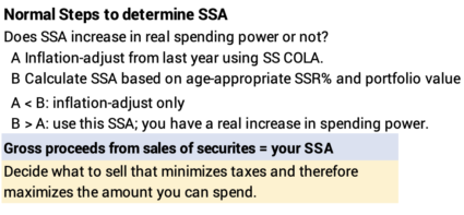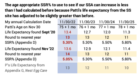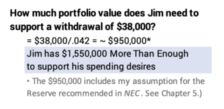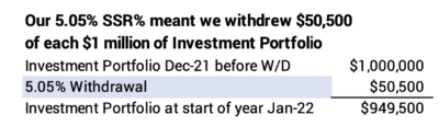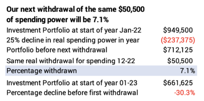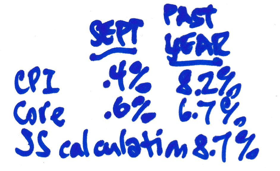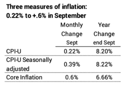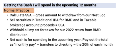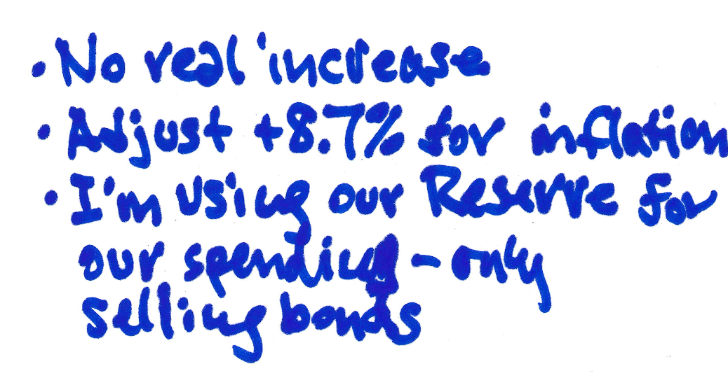
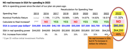
This is my ninth year of calculating our annual Safe Spending Amount (SSA; Chapter 2, Nest Egg Care [NEC]). Our portfolio return was -18% real return over the last 12 months, clearly the worst since the start of our retirement plan, and it was the worst since 2008. None of us following the steps in NEC calculate to a real increase in our SSA; your amount for 2023 is your 2022 amount increased by 8.7% for inflation. This post displays my detailed calculation sheet: the biggest change from a normal year is that Patti and I use our Reserve – selling only bonds – for our spending in 2023: my sheet shows our that our Investment Portfolio is almost the same as it was at the start of our plan nine years ago.
== Minus 18% real return ==
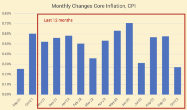
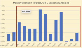
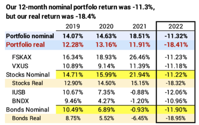
Our real – inflation-adjusted – portfolio return was -18% real return for the 12 months ending November 30. This was about -18% for stocks and -19% for bonds. This follows three years of very good stock and portfolio returns. Bonds have NEVER performed so badly relative to a year with lousy stock returns.
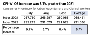
== SSA: 8.7% nominal increase ==
None of us will calculate to a real increase in our SSA. We’ll adjust last year’s SSA for inflation. This is the third of eight years that I’ve not calculated to a real increase in our SSA.
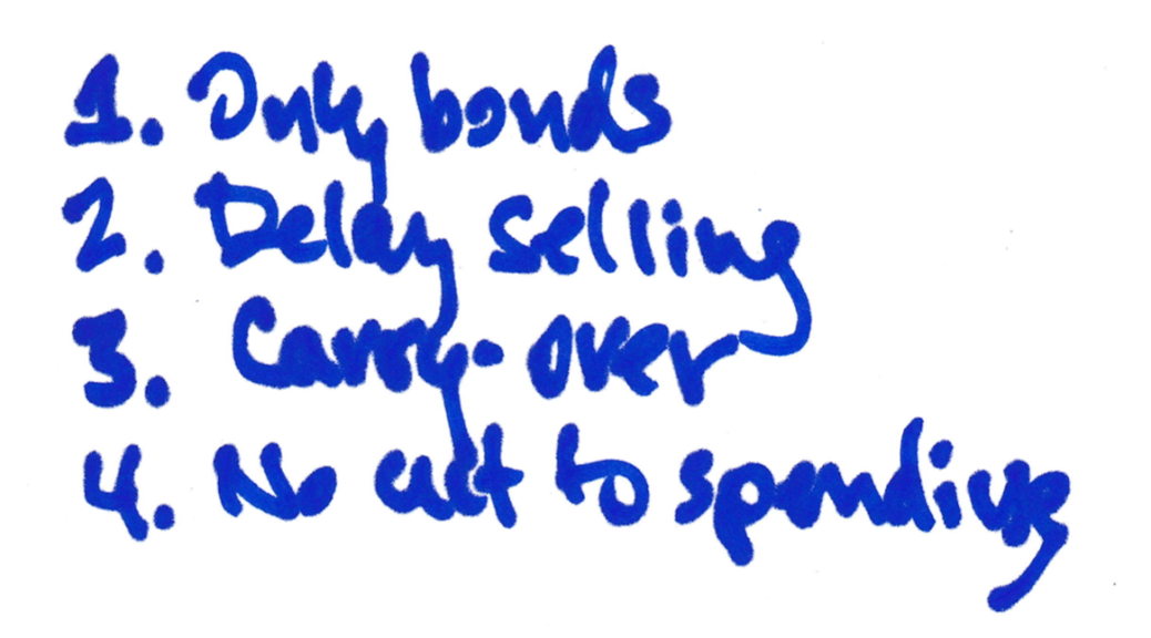
== I’m using our Reserve ==
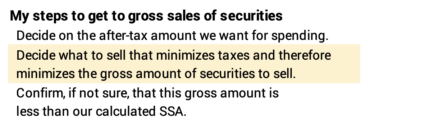
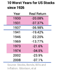
The -18% real return for stocks ranks as roughly the tenth worst annual return in the last 100 years. I hoped we would never see a year like this, but we have. What do we do? Chapters 1 and 7 NEC spell out the remedy: sell our Reserve for our spending: I have to sell securities now for the cash for taxes to withhold from our RMDs (a form of spending), and I’ll earmark the net value of securities that I’ll sell monthly throughout 2023 for our spending.
I describe in this post a slightly different tactic. View our total holdings of bonds as insurance; that’s why we’ve accepted low returns for bonds relative to stocks for years. Adopt the tactic of using your insurance – selling only bonds for your spending – in years when stock returns are this bad.
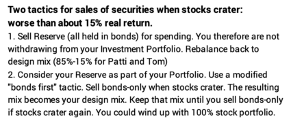
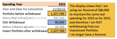
I’m displaying the first tactic in my calculation sheet. I display that I’m using our Reserve for our 2023 spending. Our Reserve has been apart from our Investment Portfolio. My calculation sheet therefore shows that I am not withdrawing – further depleting – our Investment Portfolio for our spending for 2023. (See annotation.) My calculation sheet shows our portfolio is the same value for the start of this upcoming year (December 1) as it was at end of the last year value (November 30).
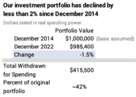
== Same portfolio value as 8 years ago ==
I can get frazzled if I look at the how much our portfolio declined in dollar value over the last 12 months. It’s a lot worse if I focus on the decrease in real spending power.
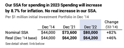
I don’t feel frazzled, however. The picture from the start of our retirement isn’t alarming. I’d rather look at that. My calculation sheet shows that our investment portfolio now is 1.5% less than it was in December 2014 and this is after seven years of withdrawals that total 42% of its initial spending power. And my SSA now is +46% greater in spending power than at the start.
== Tasks on Thursday, December 1 ==
What did I do on December 1? I prepared last week and here for the tasks this first week of December, so these tasks were simple.
• I went to the Morningstar site and looked up the 12-month returns ending November 30 for the four securities in our portfolio. I entered four numbers on the spreadsheet displayed at the start of this post to find our nominal returns for our stocks (-11.22%) and our bonds (-11.90%).
• I entered those two returns in the highlighted yellow cells on the calculation sheet. I previously extended the cells that calculate the rest of the spreadsheet. I manually entered the cell “NO”, our $80,000 SSA, and changed the cell that normally would have deducted our withdrawal for our SSA from our Investment Portfolio. Our investment portfolio is $985,400 for the start of the next 12-months. I won’t touch this sheet until next October when I enter the COLA from Social Security that I use as the measure for inflation.
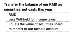
• I sold bonds (a mix of IUSB and BNDX) in our retirement accounts to get the cash I want to withhold for taxes for our 2022 return.
• I transferred shares of FTBFX that I bought last week with a sale of IUSB to our taxable account equal to the balance of our RMDs. I’ll sell the bonds from our Reserve and FTBFX throughout 2023 for our spending: I’m hoping bonds bounce back during the year, and I’ll have some left over this time next year.
• I rebalanced our portfolio, the part that I did not earmark for our spending in 2023. The return differences between stocks and bonds and between US and International were small this year. The task was almost trivial this year, but I’ve returned our portfolio back to its exact design. I therefore can use 12-month returns ending next November 30 to calculate accurately calculate my portfolio returns to enter in my calculation sheet next year.
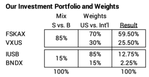
Note: My final rebalancing is in our IRA accounts; I do not want to incur taxable gains – pay taxes – to rebalance.
== Remaining Tasks ==
I have to wait two business days – until Monday – for the sales of bond ETFs to settle before I can ask Fidelity to send the amount to be withheld to the IRS.
I have to change the monthly amount that I will transfer to our joint checking account. I’ll do this after our December payment that comes from last year’s sale of securities.
Conclusion: I calculate our Safe Spending Amount for the upcoming year based on our 12-month returns ending November 30. None of us who follow the steps in Nest Egg Care calculate to a real increase. We inflation-adjust last year’s amount. Returns were so poor this year that I decided to use our Reserve for our spending for 2023. The math of my calculation sheet shows that I did not withdraw from our Investment Portfolio this year: I start on December 1 with the same portfolio value that we had on November 30.