All posts by Tom Canfield

Do you have the right health care insurance?

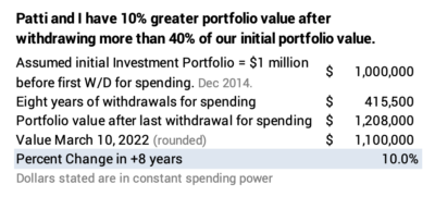
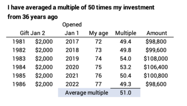
This is something last I thought about in detail when I first went on Medicare, but the purpose of this post is to pass on some of my thinking on supplemental insurance coverage to Medicare. The key criterion was to be able to go to any doctor – or almost any doctor – in the US for care. That’s consistent with my worst-case thinking. If the worst happened, could I go to the best doctor and place in the US for care?


I was first motivated to think about this from the book, The Checklist Manifesto, by Atul Gwande. Or it may have been from his book, Better. I read these books over ten years ago, but this is what I remember as the key points of the books. Checklist is about the effort to instill the process of using a checklist before surgery, not unlike the checklist that airline pilots use before taking off. Surprisingly, this was not an easy and fast process for hospitals and surgeons to accept. His key point in Better is that surgeons will make mistakes, and if you want to ensure fewer mistakes you go to a surgeon and hospital that have repeatedly performed the surgery you are going to have. Where do you want to go for hernia surgery? You ideally want to go to one hospital in North America – in Canada, as I remember – since the surgeons and hospital team do the most hernia repairs in the world and have the lowest surgical complication rate.


I followed this advice when I needed surgery to repair a bunion on my left foot maybe ten years ago. I made sure I did my research to find a surgeon here in Pittsburgh who had performed the most surgeries, over 1,000 of them.


For my Medicare insurance, I made sure I have coverage that provided the widest access to doctors and hospitals in the US. That was either Medicare + Supplemental or a Medicare Advantage Plan from an insurer that had negotiated contracts with the biggest range of hospitals and doctors. I liked a Medicare Advantage Plan, while Patti opted for Medicare + Supplemental.


This was a pretty simple decision for me when I first decided on my supplemental coverage about ten years ago. Our large hospital system, UPMC, was at war with our large insurer Blue Cross/Blue Shield and stated they would no longer accept patients insured by BC/BC at some time in the future. As I remember, they did not reach agreements with some other national insurers. The choice of an HMO plan offered by UPMC did not make sense; if I wanted to go to a doctor in the hospital network four miles away, I would be “out of network”.


As I remember, I had only one clear choice that allowed me to use most any doctor or hospital in Pittsburgh or elsewhere: the Medicare advantage plan from United Healthcare. I have United Healthcare’s “AARP Medicare Advantage” with national coverage. If United has an agreement with a hospital and therefore the doctors it employs, I can get my healthcare there. I think almost all hospitals and doctors are part of United’s network. I pay $400 per year. My co-pay for specialist visits is $35. I pay more co-pay for expensive imaging.


Some of my friends here have an HMO plan that limits them, I think, to a much smaller network of doctors and hospitals. If they want a second opinion or care option, they could be “out of network” and pay much greater fees. They might have $0 cost per year, but they are limiting their choices for almost no financial difference in annual or out-of-pocket costs.


My choice of paying $400 more per year was the right choice this year. I had to have surgery earlier this year. I had a benign, enlarged prostate gland that constrained my urethra and bladder. After two years my symptoms became worse, clearly affecting my quality of life. My urologist recommended surgery to debulk my prostate to reduce the pressure on my urethra and bladder. I chose him as my surgeon, and that surgery in February was fairly straightforward with a fast recovery time. Terrific!


I had a pre-operative CT scan to make sure my problem wasn’t a kidney stone or caused by another anomaly. An incidental finding from the image was a worrisome aneurysm in an artery near my pelvis. It was bigger than the vascular society’s guideline for elective surgery, and it only will get bigger in time. The risk of rupture increases as it grows, and I was told that rupture was 100% fatal.


I visited the Chief of Vascular Surgery at the Cleveland Clinic. The Cleveland Clinic does the most cardio and vascular procedures in the world – something like 11,600 each year. It is the top center for cardio-vascular surgery by one evaluation. It’s the closest of the top ten to Pittsburgh. The surgeon recommended open surgery in my case. This is a big surgery with maybe 3% risk of death from the surgery. Friends said, “Gee, that seems low.” That didn’t seem that low to me!


I had this surgery on March 15, and the care at the Cleveland Clinic was terrific. You lose blood in a surgery like this. You lose energy and strength until your body grows back red bloods cells, the same way as it grows back red blood cells when you donate blood. You lose more blood from this kind of surgery than you would from donating, and therefore the loss of strength and endurance is obvious.


I’m slowly rebuilding strength and endurance. When I walked arm in arm with Patti for 200 yards after the surgery, I’d have to take a nap. Three weeks after the surgery I walk two miles a day, one mile at a time. I took no naps after my walks yesterday. I’m starting to take a third walk of the day today. I have very little discomfort from the incision.


My out-of-pocket co-pay for the surgery was $260. The financial disclosure form from the Cleveland Clinic said the cost or charges for the surgery would be $120,000. I also had about $140 co-pay for each of two or three images (a second pre-operative CT scan; heart images).


Conclusion: This post asks the question, “Do you have the right healthcare insurance?” I clearly am not an expert on this, but I think you want a Preferred Provider plan with your supplemental insurer to Medicare, and you want an insurer with the widest contractual agreements with doctors and hospitals. That means, in worst case, you can go almost anywhere in the US with the top doctors or surgeons if you have a serious medical decision or need for surgery. The very small added amount I pay each year relative to some HMO plans is well worth it. I am able to at least get a second opinion from world-class doctors or surgeons and don’t have to hassle with or pay out-of-network fees.

What do we do about the lousy returns for bonds?

Bonds have declined steeply since last September, by roughly -13% real return. Our brokerage statement shows that Patti and I are barely above water on our total bond holdings: the current market value for our bonds is only a shade better than the cost basis of my initial purchase +seven years ago, interest income reinvested, and my subsequent purchases of bonds. You should see the same result on your brokerage statement; you may even see that your cost basis for your bonds is greater than your current value if you started your nest egg plan within the last several years. The purpose of this post is to explain why Patti and I have such a low cumulative return for bonds and what I plan to do about the current poor prospects for bonds.


== The nose-dive ==


Bonds have nose-dived: inflation soared, especially in the latter half of 2021; interest rates rose; bond prices move in the opposite direction of interest rates and therefore the total return for bonds – the change in value from price and reinvested interest ­– has been negative. The recent decline is worse than the nominal decline. (You find the detail on our portfolio value and returns on this sheet that tracks our history.)


I can look back in time and find the cumulative return I earned from when I first invested, from interest reinvested, and from added purchases of bonds. The cumulative real return is below 0% for all holding periods with the exception of the amount invested in in late 2014 and for interest that was reinvested in 2015.


== I’ve bought a lot more bonds ==


I’ve bought a lot more bonds. You have, too, if you follow the steps to rebalance your portfolio after you take your withdrawal for spending for the upcoming year. For Patti and me, the negative returns on the most recent investments basically outweigh the small positive return we have earned on our initial investment in December 2014.


On the basis of an initial $1 million Investment Portfolio in December 2014, we had $143,400 in bonds after our first withdrawal for our Safe Spending Amount (SSA; see Chapter 2, Nest Egg Care). After our withdrawal and rebalancing this past December, I had $207,700 in nominal value in bonds. That’s 45% more in nominal dollars and 25% more in real spending power.


No period of return is close to 25% return and therefore the real increase is mostly – or even solely – from the added purchases I’ve made over the last seven years.


Why have I purchased that much more in bonds? The culprit, if you want to call it that, is the excellent returns for stocks over this period. Stocks returns far outdistanced bonds in four of the last seven years, highlighted below. When stock returns are that much greater than bond returns, I solely sell stocks for our Safe Spending Amount for the upcoming year, and then I have to sell more stocks to purchase more bonds to maintain a 15% mix for our total portfolio when I rebalance. You’ve clearly experienced this in the last two years if you’ve been following the process steps at the end of each year.


Here’s the example from this past December. It’s the most dramatic case, because the return difference was 23 percentage points. I solely sold stocks for our $73,600 for our spending and then sold another $24,900 of stocks to buy more bonds to maintain 15% bonds for our total portfolio.


== What to do? ==


I can bemoan the decline, but what should I do? I have two options:


• Switch to shorter-term bonds or even cash. Shorter-term bonds will decline less as interest rates rise. (The average duration of bonds for IUSB is 6.5 years. A short-term bond fund like VBIRX/BSV has an effective duration of 2.7 years.) Then I should switch back when interest rates have stabilized to earn a greater return.


• Ride it out.


You can guess, I think, what I will do: I will just ride it out. I may find this November 30 that I’ll again be buying more bonds to maintain our 15% design mix. But I just don’t think I’m smart enough to know when to switch to short-term bonds and then back to longer-term bonds.


Conclusion: Bonds returns have been very poor, especially over the last year or so as inflation accelerated throughout 2021: the cumulative real return over the last six months or so is about -13%. The nose dive means I have just two holding periods, 2015-present and 2016-present with positive real returns. The real returns on interest reinvested and any purchases in 2017, 2018, 2019, 2020 and 2021 are all below zero.


I’ve purchased more bonds in the years, especially in 2020 and 2021, and this does not help the overall picture. In years when stocks have dramatically outperformed bonds: I sell stocks solely for our spending, and I then have to sell more stocks to buy bonds to get back to 15% total for our portfolio.


While bonds are down, I’m not changing our bond holdings, primarily US Total Bond Market – IUSB. I could switch to shorter term bonds, since they would not decline as much as IUSB. Nor would they rebound as much. If I switch now, I judge I would not be good at knowing when to switch back to IUSB.

What is your life expectancy and therefore your Safe Spending Rate (SSR%)?

Patti and I use her life expectancy as the number of years we want for Zero Chance of depleting our portfolio. I use the number of years to get our age-appropriate Safe Spending Rate (SSR%). I use that rate the first week of December to test to see if we can or cannot increase our Safe Spending Amount (SSA) for the upcoming year. (See Chapters 2 and 9, Nest Egg Care (NEC).) The purpose of this post is to describe details of life expectancy calculations and show how I build a table of future SSR%s. I provide a spreadsheet you can use. I find that life expectancies have increased over time. I need to check my table at least every few years. This post is an update on this topic from about a year ago.


== Life Expectancy ==


Your life expectancy is the number of years (or years and months) that 50% of those your current age are no longer alive (or are still alive). I now use the Social Security (SS) Life Expectancy Calculator. (I originally used the Vanguard probability of living calculator; that no longer exists.)


Calculators use a mortality table. The table contains data collected in one year  of the one-year death rates for those who for those turned a certain age – from those just born to those who turned 119 as an example. This is the current table that Social Security uses, dated 2019.  When they publish the data for 2020 and 2021, COVID deaths may result higher death rates for older folks.


The one-year death rates change over time. The table dated 2014 shows that 3.60% of males age 75 died in a year. The current table dated 2019 shows that 3.46% of males age 75 died in a year. The death rate declined by 3.8% over those 5 years.


The SS calculator estimates the life expectancy of those born the same year. All those born in 1957 would be in the same cohort and would turn 65 in 2022. To get its estimate of life expectancy the cohort of 65-year-olds, SS uses the current mortality data and predicts how the one-year death rates may change in the future; it estimates that death rates will continue to decline. It then cumulates its predictions of annual death rates and finds the number of years and months where 50% of a cohort have died and 50% are alive. The number of years and months to reach that point is your life expectancy. That’s what it is displaying when you enter your birth day and year into the SS calculator.


I’ve gained an appreciation as to why Vanguard likely no longer provides a probability of living calculator. It can’t get the data – or at least I can’t find it – for SS’s predictions of future, lower one-year death rates. Without those estimates, Vanguard’s (or any) calculation for life expectancy would not agree with SS’s calculation: the Vanguard calculator would show fewer years or months of life expectancy.


== I’ll use the SS calculator ==


I judge the SS calculator is best to use for our planning. It has the sophistication of the predictions of how annual death rates may decline in the future. A weakness is that it does not segment the data based on current health condition – the annual death rates for smokers or non-smokers; for those who have diabetes and those who don’t; or by socio-economic status. I’ve seen an actuarial table for “white collar” vs. “blue collar” that suggests the average “white collar” life expectancies might be two or so years more than one gets from the SS calculator.


You can search the web and find calculators that predict your life expectancy based on your race, income, exercise habits and so forth; some will predict many more years of life expectancy than you get from the SS site. I don’t find the underpinnings and therefore don’t trust those calculators. Even though Patti and I are in good health, I see no reason to use a longer life expectancy than I get from the SS calculator. That’s what I’ll use in the future.


== A table of future life expectancy ==


I build the table below of Patti’s future life expectancy so I know the Safe Spending Rate (SSR%) that I’ll use for our calculations of our Safe Spending Amount (SSA) each November 30. You can download this spreadsheet to build a similar table.


#1. I use November 30 as our calculation date. Let’s assume Patti will be 75 years + 1 month this November 30. On the SS site (March 8, 2022) I input her birth date as February 8, 1947) to get the resulting of age 75 and 1 month.


#2. The result is her life expectancy of 13.5 years. I round that to 14 years for the table. From Appendix D, NEC I find the SSR% for this November is 5.05%. That’s the same SSR% I used last November 30.


#3. I repeat step #2, but I input her birth year to 1946 to get age 76 and 1 month for November 30, 2023. I get 12.8 years as life expectancy. I round to 13. I find the appropriate SSR%. I repeat this for two more years in this table.


The results are roughly one more year of life expectancy for all years that I display in Appendix G, Nest Egg Care. I understand now that that the data for life expectancy is not static. Death rates decline. Life expectancies increase. I now suspect that Vanguard did not use SS’s predictions of declines in death rates. I now know to use the SS calculator and I know to refresh my table of future life expectancy every several years to account for revisions. (I see in my table that in 2025 I currently have life expectancy as 11.4 years and that I round down; that’s one I’ll check for sure; I may find I greater life expectancy and that I should round up.)


Conclusion: In Nest Egg Care (NEC), Patti and I settled on her life expectancy as the number of years we wanted for Zero Chance of depleting our portfolio. That number of years determines our Safe Spending Rate (SSR%) that I use shortly after November 30 to calculate to see if we can or cannot withdraw a greater, real Safe Spending Amount (SSA) for the next 12 months.


I find that our Life Expectancy is not static. Over time, death rates at any age have declined and life expectancies have increased. The Social Security Life Expectancy Calculator uses this fact in its estimates of life expectancy.


I learned two lessons: stick with the SS calculator and refresh my calculations of future life expectancy every few years.

Do the results from Vanguard’s Retirement Nest Egg Calculator make sense?

No, the results one gets from the Vanguard Retirement Nest Egg Calcuator do not make sense. The results lead you to FAR TOO LOW of Safe Spending Rate (SSR%; see Chapter 2, Nest Egg Care (NEC)). I wrote about the shortcomings of the Monte Carlo method to assemble sequences of return here. This post adds: in this post I try to logically build a sequence of returns – more harmful than the actual most harmful in history – that matches the results from the Vanguard calculator. I conclude that I cannot logically do it. I conclude the most harmful sequence of returns that Vanguard assembles is NOT CREDIBLE. Stick with the Safe Spending Rates (SSR%s) that you get from the FIRECalc and that I show in NEC. (See Chapter 2 and Appendix D).


== Sequences of return ==


One has to assemble sequences of stock and bond returns to test in a Retirement Withdrawal Calculator (RWC). I think you have an understanding of the two methods. I described the two methods here.


• FIRECalc uses the sequences of return as they occurred in history. For 20-year sequences, as an example, FIRECalc tests the sequence 1871 trough 1890; the sequence 1872 though 1891, and so forth: 151 of them, in essence.


This post showed that the most harmful sequence in history started in 1969. A portfolio will deplete fastest on that sequence, and therefore the low spending rate that is safe on that sequence – the one that gives you a full withdrawal for spending for the number of years you desire – is your Safe Spending Rate (SSR%). You always use your age-appropriate SSR% to calculate annual withdrawals for spending from your nest egg: you’re following a worst-case plan. All the other 150 sequences of return in history are less harmful. The chances are 150 out of 151 that all of us can increase our safe spending in retirement (See Chapter 9, NEC).


I showed in that same post that the Safe Spending Rate (SSR%) for 20 years is 4.4% using FIRECalc’s data source for returns and its default assumptions stock mix and investing cost.


• Vanguard assembles sequences of return using a statistical method that results in sequences with returns in random order. Inputs to a computer program are statistical measures of returns for stocks and bonds (average returns and a statistical measure of the variations from the average) and not the actual returns. The program can assemble 1,000s to 100,000s of sequences and test each in a fraction of a second.


The program also finds the most harmful sequence – the sequence that depletes a portfolio in the fewest number of years. The Vanguard RWC finds that sequence is much worse than the historical (1969) sequence that one finds with the FIRECalc method.


For the same spending rate and mix of stocks and bonds, the Vanguard RWC says that a portfolio will provide full withdrawals for 13 years, not 20: more than one-third fewer years than FIRECalc. Vanguard’s RWC tells you should use 2.9% spending rate to get to 20 years of Zero Chance for depleting a portfolio: more than one-third less spending.


== What does Vanguard’s sequence look like? ==


Vanguard does not display the annual returns for stocks and bonds for its most harmful sequence (or any other sequence). It’s all wrapped up in the big simulation. I want to understand what it looks like to understand how much worse it is than the worst actual sequence in history. I want to judge, “Does Vanguard’s most harmful sequence make sense?”


To answer that question, I assemble sequences that piece together segments of actual harmful sequences. Can I rearrange actual periods of returns to find a sequence that fails in 13 years and not 20 years? Here is my sequence of tests: I use returns since 1928 for this exercise. (I have three data sources that track returns for this period.) I want to stack several-year patterns of returns – I don’t want to stack the worst three year return periods for stocks in descending order, for example.


I settled on two patterns as assembly units: the worst six-year return period for stocks (1969 through 1974) and the worst nine-year return period (2000 though 2008). Can I stack them and match the 13 years of full withdrawals that Vanguard shows? Is the stacked sequence one that we should judge as more realistic worst case?


== The tests ==


I find I CAN stack returns that results in just 13 years of full withdrawals. I have to start with the worst six years in history and then repeat it and repeat it again. The question is, “Is that a credible worst case to assume for your planning?” (Spoiler alert: NO WAY.)


Test #1. The worst actual 20-year sequence starts in 1969. I build a sequence that starts with its first six years – the worst six-year return period for stocks in history: 1969 though 1974. (The two years 1973-74 are the second worst in history). I then repeat those six years and repeat again. See here.


The stacking of sequences results in a six-year period of -47% real return for stocks; 12-years -72% cumulative return and -85% for 18 years. (The worst 12-year cumulative real return for stocks in history is -25%; there is no 18 years of less than 0% return.)


Does this sequence result in 13 years to depletion and not 20? YES. Stacking the worst six years in history one after the other is harmful enough. This results in 13 years of full withdrawals for spending.


Test #2. I build a sequence that starts with the worst nine years in history: 2000 through 2008; this sequence starts with the third worst three-year sequence of returns for stocks in history and contains the second worst one-year decline in history. I then repeat those nine years. See here.


Does this result in 13 and not 20? NOPE. This results in 18 years of full withdrawals for spending. (I’m surprised that this can get that close to the actual 1969 sequence.)


Test #3. I start with the six years of the 1969 sequence and follow that with the nine years of the 2000 sequence. That stacks, starting in the fifth year, the second-worst two-year return for stocks in history followed by the third worst three-year return for stocks in history. This is a five-year -69% decline; the actual worst in history is -38% real return. See here.


Does this result in 13 years and not 20? NOPE. The result is 15 years of full withdrawals.


== Is the Vanguard sequence credible? ==


NO. I conclude that Vanguard’s most harmful sequence of return – the one that provides a full withdrawal for spending for 13 years in our example – IS NOT CREDIBLE. I can match the 13 years, but to do so I have to stack returns such that I get -69% cumulative return for stocks over 12 years as compared to -25% in history. The -69% approaches triple the actual worst in history. I view that is beyond a reasonable assumption of what could be worst case.


Conclusion: The Vanguard Retirement Nest Egg Calculator gives a much more pessimistic result for a safe spending rate than FIRECalc: it cuts years of safe withdrawals by about a third; it cuts the safe spending rate for a given number of years by about a third.


In this post I tried to logically stack patterns of actual returns to see if I should view that Vanguard is constructing a most harmful sequence that should we should use for our worst-case planning. I find I cannot: I matched Vanguard’s result only if I used a sequence of stock returns that cumulated to -69% real return for 12 years. That’s roughly triple the actual worst 12 years in history. I conclude the Vanguard results are NOT CREDIBLE. Stick with the results from FIRECalc and the Safe Spending Rates I provide in Nest Egg Care.


Are you holding up with the year-to-date decline?

Obviously, this is a stressful time. We’ve had two years of COVID that could have ruined our economy; inflation has not been this high for 40 years; and we have a war in Europe. I can’t make sense out of what it means for our retirement portfolio. Can you? This post describes what’s in my head about the recent decline that we’ve all seen.


My conclusion is that, so far, this decline is not extraordinary. I am emotionally detached. I can’t get worked up. I feel no urge to change my portfolio or sell securities earlier than my next scheduled sale for our spending, the first week in December. Even if I felt an urge, I would RESIST.


== Year to date: -9.9% ==


The decline year to date has been about 9.9%. That was as of Thursday; the market is down a bit so far today, Friday. Yes, this is a fairly steep decline. We’re in correction territory; we’re 10% below the peak in early January for stocks. Our brains extrapolate that 9.9% decline and automatically project that into the future: that projection can be disconcerting. (I get return data from the Morningstar site.)


== My nominal decline: -7.2% ==


The 12-month period I use as the basis for calculating our Safe Spending Amount (Chapter 2, Nest Egg Care) runs December 1 – November 30. The market was up in December. My portfolio is down 7.2%.


== Other recent declines ==


Patti and I have experienced two other periods of steep decline since the start of our plan on January 1, 2015. I calculate our portfolio decline for those periods. I tried to make the periods the same length; they’re at least close. The current decline (year to date) roughly matches the decline in 2018. The decline in 2020 was much steeper. I’m guessing all of us rode though those declines without panic – whether we were retired or not.


== Longer- term returns: good ==


I display the inflation-adjusted returns for our Investment Portfolio for one, three and five years. I should be very pleased about the three- and five -year returns; you should, too. Those return rates are greater than the expected real return rate I would expect on our portfolio: about 6.4% annual real return.


I can look back at our calculation sheet that I complete each December and see that today we have 10% more spending power in our portfolio than we did in December 2014, and that’s after withdrawing more than 40% of our original portfolio in +seven years. That makes it harder to get worked up about this decline. (See December post and the annotated calculation sheet.) If you weren’t making withdrawals like we did, you’re better off.


Conclusion. A portfolio of stocks and bonds has declined about 10% year to date. Is this a major concern? We don’t know how this is all going to shake out. We all can make a long list of uncertainties. I am not anxious, and I have no thoughts of changing my mix of stocks vs. bonds or selling earlier in the year for our spending than I would normally do: the first week next December.

How many harmful periods of return have we had since 1871?

Last week I compared historical return data for stocks and bonds from three sources. I had not looked in detail at the Shiller data for stock and bond returns which date back to 1871. I plotted the data and find four sequences of return that are most harmful to a retirement portfolio: steep declines from stocks and many years to recover. This post examines a fourth harmful sequence that I had not examined before, the sequence of returns that start in 1916. It’s harmful, but it doesn’t match the 1969 sequence. I now know the 1969 sequence is THE Most Harmful Sequence in the last 151 years, not the 96 years since 1926. The safe spending rate we find for that sequence is the Safe Spending Rate (SSR%) that we use throughout our financial retirement plan. (See Chapter 2, Nest Egg Care (NEC).)


==FIRECalc uses the Shiller returns ==


Last week I described three sources of data for historical stock and bond returns: Ibbotson, Shiller and Stern/NYU. Shiller is the longest history. He reconstructed returns from 1871 for stocks (S&P 500 stocks in essence) and long-term bonds (10-year US treasury bonds). This is the return sequence that FIRECalc uses in its default case. It’s definitely appropriate to use Shiller data to find THE Most Harmful Sequence of returns in history.


== I find four, not three harmful periods ==


I can plot the Shiller data from 1871 and find four steep, multi-year declines of roughly 40% for stocks starting in 1916, 1930, 1973 and 2000. In all cases, declines were so steep that it took many years for stocks to rebound back to their initial level. (When I look in greater detail at the 1973 series, I find the initial decline in 1969 is the start of a more harmful sequence than one that starts with the very steep decline in 1973-74. Similarly, 1929 is the correct start before the steep decline in 1930-31.)


Plot of cumulative real returns on semi-log graph. Each unit of distance on the Y-axis is the same percentage change.


== The 1916 sequence is harmful ==


The 1916 sequence has to be a contender for Most Harmful. It started with a steep decline in both stocks and bonds – the steepest five-year decline for stocks in history, for example. Later, the sequence contains the 1930-31 48% decline for stocks.


Is it worse than the 1969 sequence? I have to test the two. I use my spreadsheet. I input a spending rate, mix of stocks, investing cost and a sequence of stock and bond returns. It tracks portfolio value year-by-year. It’s a Retirement Withdrawal Calculator for one sequence of return. I have to manually input a different sequence of returns to compare results.


I can use the goal setting feature in Excel to find the spending rate that ensures the exact a full withdrawal for the number of years: I set the goal to exactly match the amount at the end of the 19th year to match the constant dollar withdrawal amount for the prior 19 years. That’s the safe spending rate for that return sequence. We, of course, consider the Safe Spending Rate (SSR%) as the lowest one we find on THE Most Harmful Sequence. We nest eggers always use the lowest rate we find for any target number of years as our worst-case spending rate assumption.


You can see the comparison spreadsheets here. I find the safe spending rate on the 1916 sequence is 5.49% and the safe spending rate is 4.44% on the 1969 sequence. 4.44% is the lowest spending rate I can find and therefore is Safe Spending Rate (SSR%) for 20 years.


(When I use FIRECalc, as I note at the bottom of the sheet, I find the SSR% is 4.42%. I won’t quibble over the 0.2 percentage point difference. Note: I use 85% mix of stocks for Appendix D and Graph Graph 2-7 in NEC to give a more conservative – slightly lower – SSR% that one can use at any mix of stocks less than 85%; my spreadsheet and FIRECalc result in the same 4.3% SSR% for 20 years [rounded].)


Just to confirm, I also show the result of the other two candidate sequences: 1929 and 2000 here. I had not done this with the Shiller data before. The summary is that the 1969 sequence gives us our Safe Spending Rate (SSR%) – the safe spending rate on the most harmful sequence we can find in history.


The safe spending rate for the 1969 sequence is quite a bit lower than for the others. It is the WORST CASE.


Conclusion: I plotted the Shiller data for returns for stocks and bonds from 1871. I find four periods of steep, deep declines for stocks; it was roughly a decade or longer for stocks to recover from these declines. I looked at the 1916 sequence that I had not looked at before. Of the four most harmful sequences (1916, 1929, 1969, and 2000), the 1969 sequence is THE Most Harmful. A portfolio will deplete faster on that sequence for all periods greater than ten years: it results in the lowest safe spending rate than any other sequence. That’s true for a wide range of mix of stocks vs. bonds. The safe rate we find for that sequence is the Safe Spending Rate (SSR%) that we assume in our planning.

Why don’t we have a precise record of historical stock returns?

I spent time this week trying to understand the historical record of stock and bond returns. I mentioned last week that FIRECalc uses one source for stock and bond returns (Shiller) while I’ve used another for my spreadsheet calculations (Ibbotson). I looked at the detail of three sources of historical returns for stocks and bonds. I was surprised to find no year that the three report the same annual total return for S&P 500 stocks; two of the three report real returns for for 10-year US Treasury bonds, considered as long-term bonds. This post describes the differences in reported historical returns and the implications for our calculation of Safe Spending Rate (SSR%) that I discussed last week.


The bottom line is that the differences don’t really affect our calculations of Safe Spending Rate (SSR%). The SSR%s that you get from FIRECalc – that I display on Graph 2-7 and in Appendix D in Nest Egg Care – are from the data source that has the most conservative – worst – returns for stocks for THE Most Harmful Sequence that starts in 1969: that means the calculation for Safe Spending Rate (SSR%) will therefore be lower – more conservative.


== Three providers of historical returns ==


I find three publicly accessible sources of historical returns. Ibbotson (data from 1926), Shiller (data from 1871), and Stern/NYU (data from 1928). All three provide real – inflation-adjusted – returns for S&P 500 stocks. Two provide data for 10-year and one for 20-years US Treasury bond; both are considered as long-term bonds.


All three follow the same procedures to find annual total returns for S&P 500 stocks: they assume reinvestment of dividends and account for the change in price of the S&P 500 stocks; they then adjust total return for the year for inflation. For bonds, they also reinvest interest and calculate the impact that a change in interest rate has on bond price: bond prices predictably move opposite to the direction of change in interest rates; they similarly adjust total return for inflation.


We have a published record of monthly inflation from 1913 (accessible here), so the math to translate nominal returns to real returns is straight forward from 1913; Shiller had to reconstruct the inflation index for the years prior.


== The three don’t precisely agree: stocks ==


The S&P 500 index as we know it today was first published in 1957. The S&P Composite index started in 1923 with 90 stocks and expanded to 500 by 1957. In 1957 the S&P 500 stocks were about 90% of the total market value of all stocks; they are about 80% of the total value of all stocks today.


Returns prior to 1957 must be reconstructed, and I could understand that the three could be different for those years. I would think the three would provide the exact same returns since 1957, but there is no year that all three report the same return rate for S&P 500 stocks. None of the three report the same return from the nominal returns published on S&P’s web site for the past ten years. (You can download a fact sheet.)


Shiller in particular seems to waver the most. I find a number of years where Shiller varies in return by more than five percentage points from at least one of the other two.


Example: Shiller varies by five percentage points for three of these six years


Cumulatively since 1928, Ibbotson and Shiller are very close in result. Stern/NYU trails in compound average growth rate (CAGR) by about 0.2 percentage points per year. That cumulates to a fairly large difference.


Stern lags the other two in cumulative real return. This likely is from it annual calculation of dividends reinvested rather than monthly calculations of dividends reinvested.


== It’s the 1969 sequence that’s important ==


I want to focus on the sequence that starts in 1969. This is THE Most Harmful Sequence of returns that drives our Safe Spending Rate (SSR%) to a low level. This sequence is most harmful to portfolio value for all periods greater than ten years and leads to the earliest potential depletion for a given spending rate.


The three vary in returns for both stocks and bonds for this sequence, but the implication is clear. FIRECalc uses the Shiller data which is lower in returns for S&P 500 stocks for this sequence. It’s cumulatively three percentage points lower for the first six years – the steepest six-year decline for stocks in since 1871 – and that difference is enough to result in lower portfolio value over all subsequent years as compared to the other two. Shiller’s returns result in lower SSR%.


Shiller’s cumulative return for LT 10-year bonds is ~2 percentage points better than Ibbotson’s returns fore LT 20-year bonds for those six years. That’s to be expected since long term bonds are more affected by changes in interest rates, and this was a period of high and increasing inflation. But that two point better result does not offset the ~3 points worse for stocks in the calculations of SSR% at what I consider to be the proper range of stock mix: 75% to 85%.


Ibbotson’s returns are lower over these first six years, primarily in 1973 and 74. One would expect this, since the price of 20-year bonds will decline more in price than 10-year bonds as interest rates increased from increasing inflation in those years.


(Note: On its Your Portfolio page, FIRECalc calls its default input for fixed income as “Long Interest Rate”. That’s befuddled me for years. It’s really Shiller’s measure of real annual returns for 10-year US Treasury bonds.)


This really is real return for 10-year US Treasury bonds


My spreadsheet calculations using Ibbotson’s returns found that FIRECalc was a shade conservative (see here). I understand why more clearly.


Conclusion: I examine the history of total real returns for S&P 500 stocks and long-term bonds in this post. I find three sources of historical data: Ibbotson, Shiller, and Stern/NYU. I would think the three would have nearly identical records of annual returns for stocks, particularly after 1957 when the index as we know it today was first published. The three report a slightly different return each year. Shiller seems to vary more from the other two. Cumulatively from 1928, Ibbotson and Shiller nearly agree in cumulative return while Stern/NYU trails.


Returns for the harmful sequence that starts in 1969 are important:  that’s THE Most Harmful that sequence leads to earliest potential depletion of a portfolio and therefore our Safe Spending Rate. The Shiller sequence for stocks leads to a steeper decline of a portfolio with what I consider to be a proper mix of stocks: range of 75% to 85%. FIRECalc uses Shiller returns for its calculations, and therefore FIRECalc’s year-by-year portfolio values will be lower – yielding a more conservative SSR%. 

Are the Safe Spending Rates I’ve published accurate?

I spent time this past week reviewing my calculations of the age-appropriate Safe Spending Rates (SSR%s) that I display in Graph 2-7 and in Appendix D in Nest Egg Care (NEC). This post concludes the SSR%s that I first calculated in 2014 are accurate to use for our planning but they are not precise. They are a shade conservative: the SSR%s that I display for a specific retirement period is a fraction of a percentage point too low; I can state this in a different way: the SSR% that I display for a specific number of years is safe for at least two more years. I conclude I should not revise the SSR%s that I calculated and provide in Appendix D. I will stick with the ones I published; I’ll use them in my calculations each December for our upcoming Safe Spending Amount (Chapter 2, NEC). I’m just going to know that Patti and I have a greater margin of safety than I may have thought before. You, too, have a safer plan than you thought!


== What is Safe Spending Rate (SSR%)? ==


I define the Safe Spending Rate (SSR%) as the spending rate (an amount in constant spending power divided by initial Investment Portfolio value) that results in full withdrawals from your nest egg for as many years as you pick (Chapter 2, NEC); we get to that spending rate because we test it against the worst-case scenario for stock and bond returns in history. In the “years thereafter”, you have less than 1-in-50 chances of being alive and not being able to fully withdraw (Chapter 4, NEC).


== SSR%s that I calculated in 2014 ==


I used FIRECalc as my go-to Retirement Withdrawal Calculator. In Appendix C, NEC, I explained that I used the Vanguard RWC to confirm the results from FIRECalc. The Vanguard results don’t exactly match the results from FIRECalc, but, over time, it yields the same chances of failing to withdraw from a portfolio. (I have less favorable views of Monte Carlo simulations and the Vanguard RWC than I did in 2014; the results from FIRECalc stand on their own two legs; they don’t need help from the Vanguard RWC to give added credibility to results.)


I use FIRECalc to find the greatest spending rate that results Zero Chance for depleting a portfolio for a number of years. I keep increasing the spending rate until I find less than 100% “Success Rate” on FIRECalc’s Results Page. I assume an investing cost of 0.18% (FIRECalc’s default assumption) and, for a tougher test, set the mix of 85% stocks; that’s tilting the result to be more conservative.


I alter the spending rate I directly find for two factors to get to the Safe Spending Rate. 1) I modify (raise) the rate assuming one starts with a 5% Reserve (Chapters 1 and 7, NEC). (FIRECalc has a feature I can use for “Manual Entry of Spending Changes”.) One uses the Reserve and does not withdraw from the balance – I call that your Investment Portfolio – when stocks crater; you’re using the Reserve to give added time for stocks to recover; 2) For some periods, I modify (lower) the spending rate to get to a low chance of depleting a portfolio for at least ten years “thereafter”.


== FIRECalc’s results are conservative ==


My efforts to independently verify FIRECalc tell me that it gives too low of Safe Spending Rate – or, a given spending rate gives more years of zero chance of depleting a portfolio.


• FIRECalc tracks how portfolio value changes on all complete sequences of return that it assembles. You see the plot year-by-year results ranging from the most harmful sequence (fewest years to depletion) to the best (fabulous growth). In theory the most harmful sequence could be different for a 15-year period than for a 20-year period. In practice is it just one sequence that is THE Most Harmful Sequence for all return sequences that are longer than ten years.


The sequence that starts in 1969 is the worst-case sequences out of 151 complete and partial sequences of returns in history. (We can conclude that none of the partial sequences of return through 2021 cannot be more harmful than the one that started in 1969). It’s really bad. For all sequences greater than ten years, that sequence always leads to the lowest spending rate that allows for a full withdrawal for a retirement period.


• I built a spreadsheet – an RWC – that duplicates FIRECalc’s math, and I test that 1969 sequence. I confirm the basic accuracy of FIRECalc. But my spreadsheet found FIRECalc is a shade conservative for three reasons.


1) I use a different data series for stocks and for bonds in my spreadsheet. I use a published source (Ibbotson) while FIRECalc uses a source available on the internet (Schiller). Both Ibbotson and Shiller are reconstructing historical returns for stocks and bonds. The reconstructions differ slightly in annual returns for both. I believe Ibbotson’s reconstruction of historical returns is more widely accepted as the most accurate reconstruction. (Ibbotson reconstructs returns back to 1926; Shiller reconstructs back to 1871.)


2) I use what I think is a better definition of “bonds” that I can assemble from the Ibbotson data. Shiller has one measure for long-term bond returns; Ibbotson provides return data for four types of bonds. I assemble returns with a mix that is 70% Intermediate bonds and 30% long term bonds as more representative of what an investor owns with a “bond fund”.


3) My spreadsheet allows me to more clearly see the effect of the Reserve on the safety of a plan. The Reserve adds more to the starting SSR% – or gives us more years of added safety – than I had calculated in 2014.


== More in my back pocket ==


I still have one more adjustment that I could make to my spreadsheet that would further increase the SSR% for any time period or add more safety: I could add small cap stocks to the mix as the definition of “stocks”, but I choose not to do this. FIRECalc also uses Large Cap (S&P 500) returns for “stocks” for its base case. That gives the proper result for our planning in my opinion.


Small cap stocks would boost – to the point that I think they distort – the results one finds on THE Most Harmful Sequence of returns in history. Both Large Cap and Small Cap stocks had their worst six-year return period in history, 1969 to the end of 1974. But small caps fairly quickly recouped the decline. For the nine years 1975 to the end of 1983, they outperformed large caps by a factor of four. They averaged 26% real annual return for those nine years; statistically, that’s almost impossible. Those nine years account for almost all the outperformance of small cap stocks since 1926. I judge that period for small caps to be an anomaly, and I don’t want to publish a greater SSR% that includes the effect of that anomaly.


We do benefit from a smoothing effect by owning a US Total Market Stock fund, but we do not benefit to the extent I would calculate for the 1969 sequence. We also benefit from the smoothing effect from owning an International Total Stock Market fund, but that one is impossible to quantify: we don’t have good enough historical data.


== What’s all this mean? ==


I can express the effects in two ways. I use the example of Patti and me at the start of our plan. We picked 19 years as the number of years for No Chance of depleting our portfolio and therefore used 4.40% as our Safe Spending Rate (SSR%) for our withdrawal for our spending in 2015.


1. I easily could argue that I could have used 4.70% as the Safe Spending Rate for 19 years of zero chance of depleting our portfolio. That’s 0.35 percentage points greater or about 8% greater than the 4.40%. We could have spent $47,000 per initial $1 million investment portfolio and not $44,000.


2. I could easily argue that our 4.40% gave us 23 years of zero chance of depleting our portfolio – an added four years. That moves the inflection point on our hockey stick beyond the expected years for “at least one alive”; that lowers the chances of being alive and failing to be able to withdraw for our spending to be much less than 1-in-50.


Our actual hockey stick had a shaft length of 23 years. Zero chance of depleting for 23 years: 2037.


I come out it this way: I’m not going to increase the SSR%s that I show in Nest Egg Care. They are just fine as they are. They are accurate to use for our planning. But I appreciate the nuance. The SSR%s are safer than I previously had calculated. That gives me more confidence in my choice of 85% mix of stocks for our plan (Chapter 8, NEC). I’m going to be better off with that mix in 150 out of 151 chances – sequences since 1871. That high mix of stocks has helped Patti and me get to a 46% real increase in our Safe Spending Amount from the start of our plan. We obviously have not suffered by starting a shade too low.


Conclusion. In this post I summarized my views on the Safe Spending Rates (SSR%s) that I published almost five years ago in Nest Egg Care. I’ve tested the results one gets from FIRECalc. I find results I originally got from FIRECalc are a shade conservative. I could increase the SSR%s that I display in Nest Egg Care or keep using them knowing that they are buying me more safety than I originally thought. I want to emphasize added safety – particularly if that allows me to be more confident in my decision of a relatively high mix of stocks for our retirement plan. That greater mix is going to pay off with greater portfolio value – a greater annual Safe Spending Amount – in 150 of 151 chances.


How much was in the envelope that I opened this past January 1?

I imagine on the morning of each January 1 that Patti and I open a gift envelope from the much younger Tom to the older Tom and Patti. I imagine we open the gift envelope that held the $2,000 that I contributed to my Traditional IRA 36 years ago. It sat there invested in the same security for all those years. This year’s envelope had $98,500 for us to spend and enjoy. This growth, 49 times my investment, is not unusual over that period for someone who followed very simple investing rules. The purpose of this post is to reconfirm the rules for those in the save and invest phase of life (Tell your children! Tell your grandchildren!): save and invest; hold only stocks for long holding periods; you will do VERY WELL by investing in a general stock index fund.


== Six envelopes: all about 50X ==


I’ve written about our gift envelope each of the last several years. This is the sixth envelope like this that I’ve opened. 1981 was the first time all workers could contribute pre-tax to an IRA. Prior to that only workers without an employer pension plan could contribute pre-tax. Pre-tax was a big incentive to contribute: my contribution was treated as a deduction from income on our tax return, and tax rates were high then. I was compulsive about contributing and made sure my contribution was invested on January 2 of each year. (That means I mailed my $2,000 in December to arrive the first business day of the new year so that it would be invested that day.)


I invested $2,000 in the equivalent of the obvious stock index fund at the time, VFIAX – Vanguard’s 500 Index fund. (I actually did better than VFIAX, but let’s ignore that for this story.) The envelope was sealed. I didn’t touch it.


It’s straightforward to find how much my investment has grown over the decades. I use the interactive chart of performance on the Morningstar site. I input the start date and end date, and the chart shows me the multiple I earned on my investment.


The amount I was eligible to contribute did not inflation-adjust for a number of years. (The contribution limit has been adjusted to $6,000 now; an added $1,000 for those over age 50.) So far since 1981 I’ve had six contributions of $2,000. I’ve averaged about 50 times my initial $2,000 for these six.


== Real Growth about 20X ==


I need to inflation-adjust to get a more accurate story of what happened in terms of real spending power. I have averaged about 20 times growth in spending power for each 36-year holding period.


Using the long-run average annual return rate for stocks of about 7.1%, the Rule of 72 tells me I would have expected my $2,000 to have doubled in spending power every ten years. 35 years is 3½ doublings. I would have expected $2,000 to grow 12 times in real spending power, not 20 times.


I’ve averaged 8.6% real return for these last six envelopes. The plot of real cumulative returns plotted on a semi-log graph shows why. My six point-to-point rides have started from below the long-term trend line and ended at or above the line. The steeper the slope of a point-to-point line, the greater the return rate. That 1.5 percentage point difference in annual return resulted in a lot more spending power.


My point-to-point return (when I bought and when I sold) has been a steeper line on this semi-log plot of cumulative real returns: my return rate has been greater than 7.1%.


== Stocks earned 4.6 times more than bonds ==


The point-to-point slope for bonds also has also been steeper than its long-term trend line. The inflation-adjusted multiple for bonds was 4.2 for this period 1986-2022. The 19.3 multiple for stocks was 4.6 times that of bonds. I had 4.6 times more money from stocks than if I had invested in bonds.


== Tolerance to ignore the bad ==


I always thought that my gift was in a sealed envelope. I did not think it was proper to open it beforehand: I never opened Christmas presents I saw under the tree ahead of time.


What did I ignore over the years? I ignored: the steepest one-day decline in stocks in history (23% in 1987); the second-worst three-year decline for stocks in history (-42% over 2000-01-02); the second-worst one-year decline (-34% in 2008); the worst nine-year return period for stocks (-42% cumulative return 2000-2009); the third longest stretch of zero cumulative real return for stocks (13 years 2000-2013). Ah, the ability to translate the knowledge that it’s a looong game into inaction.


Conclusion: At the end of every year, I look back to see how well we did from our save and invest phase of life. I consistently contributed to my Traditional IRA for many years. I held the same security for decades, I can go back and see how my contributions have fared. Every January 1, I calculate what happened to the contribution that I made to my Traditional IRA 36 years ago. Pre-tax contributions began in 1981. This January 1 was my sixth look back. My $2,000 invested 36 years ago grew to more than $98,000 – growth greater than 49 times. This is the same as anyone would have earned had they followed very simple investment advice: only invest in stocks for long holding periods; invest in a general stock index fund. You will do Very Well over time.


Here is some information for your 2022 tax return

I’ll complete my first draft of our tax plan for 2022 the first week of August, and I’ll finalize it by the end of November before I’ll sell securities to get cash for our spending in calendar 2023. I gather some information this time of year. The purpose of this post is to share three pieces of information than may be helpful in your tax planning for 2022. Keep them and follow along with my planning in early August.


== Tax rates for Ordinary Income ==


Here are the tax brackets for ordinary income for 2022. The tax brackets for 2022 adjusted 3% for inflation. That’s less than the ~7% inflation for 2021 year because the IRS calculates its inflation-adjustment in August and it uses a different measure, set by congress, than CPI. (It’s called Chained CPI. I’m clearly not understanding the calculation since I calculate 5% as the change in C-CPI-U from July ’20-July ’21). If you were right below the start of a bracket in 2021, that means inflation could push some of your income – a portion of your Social Security income as an example – in the next bracket. You’d be paying marginally greater tax on inflation, not on the real change in your income.


The standard deduction increased by 3%. The standard deduction for 2022 is $12,950 per person and $1,400 more for those over age 65.


= Medicare Tripwires ==


Tripwires of income can trigger Medicare Part B and D premium surcharges. Surcharges are deducted from your Social Security benefits. Medicare will publish the amount of premium surcharges and the income tripwires for calendar 2023 this November. MAGI used will be from your 2021 tax return, the one you will file shortly.


MAGI on your 2022 tax return will determine your Medicare premium surcharges in calendar 2024. (You’ll file your 2022 return in early 2023; the IRS will provide your MAGI on that return to Social Security; Medicare will announce premiums and tripwires for 2024 in November; Social Security will use those two pieces of informaton and send your statement of your gross and net benefits that they will pay in 2024.)


A key part of the game is to plan our 2022 taxable income to make sure we don’t inadvertently stumble across a tripwire that affects our Medicare premiums in 2024. $1 of too much income can trigger about $1,000 in added premium surcharge per taxpayer. $1 too much for Patti and me can cost us about $2,000.


The best information we have for our tax planning now is last year’s table of Medicare Part B and D premiums and the income tripwires – the table they published this past November. Here’s that table.


Note: If you submit your 2021 return late this year or if the IRS does not close out your return for some reason, Social Security would use MAGI from your 2020 return to calculate premium surcharges. (You can ask for a revision if using your 2020 return would result in too great of premium surcharge.)


== Sheet I will use to estimate 2022 taxes =


I provide a PDF of spreadsheet that I will use the first week of August. I’ll provide the actual spreadsheet you can download then. I find this sheet helpful.


Conclusion. Tax planning for 2022 seems very far away, and it is. I do my first draft in the first week of August and finalize it toward the end of November. I gather some of the basic information I’ll need now. This post shows the 2022 tax brackets revised for inflation and the most recent information we have for the MAGI tripwires than can trigger Medicare Part B and D surcharges from income we report on our 2022 tax return.