How many harmful periods of return have we had since 1871?
Posted on March 4, 2022
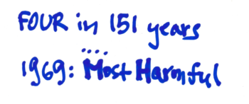
Last week I compared historical return data for stocks and bonds from three sources. I had not looked in detail at the Shiller data for stock and bond returns which date back to 1871. I plotted the data and find four sequences of return that are most harmful to a retirement portfolio: steep declines from stocks and many years to recover. This post examines a fourth harmful sequence that I had not examined before, the sequence of returns that start in 1916. It’s harmful, but it doesn’t match the 1969 sequence. I now know the 1969 sequence is THE Most Harmful Sequence in the last 151 years, not the 96 years since 1926. The safe spending rate we find for that sequence is the Safe Spending Rate (SSR%) that we use throughout our financial retirement plan. (See Chapter 2, Nest Egg Care (NEC).)
==FIRECalc uses the Shiller returns ==
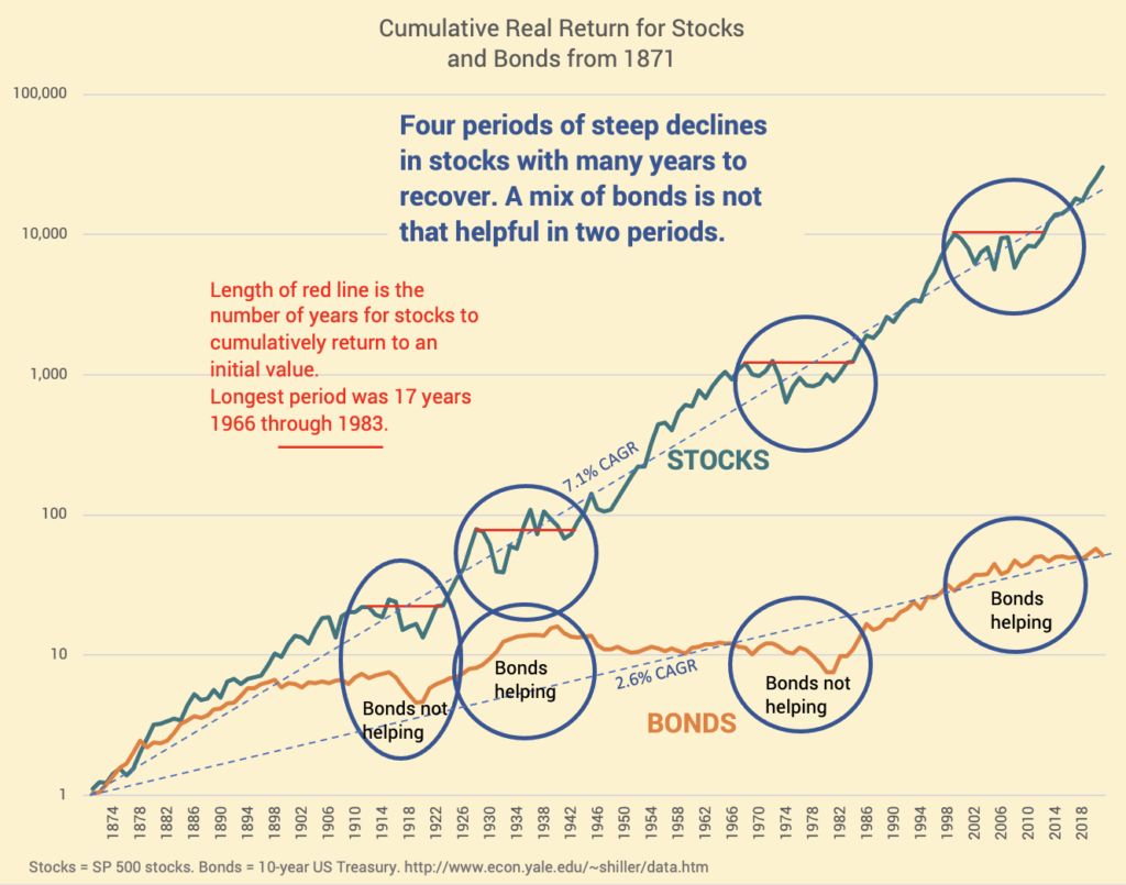
Last week I described three sources of data for historical stock and bond returns: Ibbotson, Shiller and Stern/NYU. Shiller is the longest history. He reconstructed returns from 1871 for stocks (S&P 500 stocks in essence) and long-term bonds (10-year US treasury bonds). This is the return sequence that FIRECalc uses in its default case. It’s definitely appropriate to use Shiller data to find THE Most Harmful Sequence of returns in history.
== I find four, not three harmful periods ==
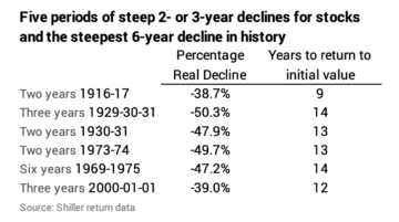
I can plot the Shiller data from 1871 and find four steep, multi-year declines of roughly 40% for stocks starting in 1916, 1930, 1973 and 2000. In all cases, declines were so steep that it took many years for stocks to rebound back to their initial level. (When I look in greater detail at the 1973 series, I find the initial decline in 1969 is the start of a more harmful sequence than one that starts with the very steep decline in 1973-74. Similarly, 1929 is the correct start before the steep decline in 1930-31.)
== The 1916 sequence is harmful ==
The 1916 sequence has to be a contender for Most Harmful. It started with a steep decline in both stocks and bonds – the steepest five-year decline for stocks in history, for example. Later, the sequence contains the 1930-31 48% decline for stocks.
Is it worse than the 1969 sequence? I have to test the two. I use my spreadsheet. I input a spending rate, mix of stocks, investing cost and a sequence of stock and bond returns. It tracks portfolio value year-by-year. It’s a Retirement Withdrawal Calculator for one sequence of return. I have to manually input a different sequence of returns to compare results.
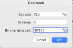
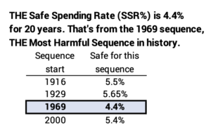
I can use the goal setting feature in Excel to find the spending rate that ensures the exact a full withdrawal for the number of years: I set the goal to exactly match the amount at the end of the 19th year to match the constant dollar withdrawal amount for the prior 19 years. That’s the safe spending rate for that return sequence. We, of course, consider the Safe Spending Rate (SSR%) as the lowest one we find on THE Most Harmful Sequence. We nest eggers always use the lowest rate we find for any target number of years as our worst-case spending rate assumption.
You can see the comparison spreadsheets here. I find the safe spending rate on the 1916 sequence is 5.49% and the safe spending rate is 4.44% on the 1969 sequence. 4.44% is the lowest spending rate I can find and therefore is Safe Spending Rate (SSR%) for 20 years.
(When I use FIRECalc, as I note at the bottom of the sheet, I find the SSR% is 4.42%. I won’t quibble over the 0.2 percentage point difference. Note: I use 85% mix of stocks for Appendix D and Graph Graph 2-7 in NEC to give a more conservative – slightly lower – SSR% that one can use at any mix of stocks less than 85%; my spreadsheet and FIRECalc result in the same 4.3% SSR% for 20 years [rounded].)
Just to confirm, I also show the result of the other two candidate sequences: 1929 and 2000 here. I had not done this with the Shiller data before. The summary is that the 1969 sequence gives us our Safe Spending Rate (SSR%) – the safe spending rate on the most harmful sequence we can find in history.
Conclusion: I plotted the Shiller data for returns for stocks and bonds from 1871. I find four periods of steep, deep declines for stocks; it was roughly a decade or longer for stocks to recover from these declines. I looked at the 1916 sequence that I had not looked at before. Of the four most harmful sequences (1916, 1929, 1969, and 2000), the 1969 sequence is THE Most Harmful. A portfolio will deplete faster on that sequence for all periods greater than ten years: it results in the lowest safe spending rate than any other sequence. That’s true for a wide range of mix of stocks vs. bonds. The safe rate we find for that sequence is the Safe Spending Rate (SSR%) that we assume in our planning.
I’m wondering what this all means in relationship to the downturn in the market that we are seeing now. Do I need to adjust my holdings in any way?
Thanks very much.
Hi CL ====
No don’t change anything. We have no way to predict the short-term future. One year is short term IMO. This past 2-3 months is really short term. I’m not changing anything, and IMO it does not make sense for you to change anything. The amount you now are paid from Fidelity is independent of what’s happening in the market. You will not have to spend less ever and you will not run out of money in your life time. All we retirees may have more or we may have less than now, but we will not run out of money if we only spend our Safe Spending Amount (which is your “pay” from Fidelity). The next time you need to sell anything for your spending is next November. The decision would be to spend less (pay yourself less) if you are nervous then, but I don’t think the decision is to sell stocks and buy bonds or leave it in cash. Last year Stocks = +20% after adjusting for inflation and bonds -7% after adjusting for inflation.
Tom
Thanks very much for the message and reassurance.