Are the Safe Spending Rates I’ve published accurate?
Posted on February 18, 2022

I spent time this past week reviewing my calculations of the age-appropriate Safe Spending Rates (SSR%s) that I display in Graph 2-7 and in Appendix D in Nest Egg Care (NEC). This post concludes the SSR%s that I first calculated in 2014 are accurate to use for our planning but they are not precise. They are a shade conservative: the SSR%s that I display for a specific retirement period is a fraction of a percentage point too low; I can state this in a different way: the SSR% that I display for a specific number of years is safe for at least two more years. I conclude I should not revise the SSR%s that I calculated and provide in Appendix D. I will stick with the ones I published; I’ll use them in my calculations each December for our upcoming Safe Spending Amount (Chapter 2, NEC). I’m just going to know that Patti and I have a greater margin of safety than I may have thought before. You, too, have a safer plan than you thought!
== What is Safe Spending Rate (SSR%)? ==
I define the Safe Spending Rate (SSR%) as the spending rate (an amount in constant spending power divided by initial Investment Portfolio value) that results in full withdrawals from your nest egg for as many years as you pick (Chapter 2, NEC); we get to that spending rate because we test it against the worst-case scenario for stock and bond returns in history. In the “years thereafter”, you have less than 1-in-50 chances of being alive and not being able to fully withdraw (Chapter 4, NEC).
== SSR%s that I calculated in 2014 ==
I used FIRECalc as my go-to Retirement Withdrawal Calculator. In Appendix C, NEC, I explained that I used the Vanguard RWC to confirm the results from FIRECalc. The Vanguard results don’t exactly match the results from FIRECalc, but, over time, it yields the same chances of failing to withdraw from a portfolio. (I have less favorable views of Monte Carlo simulations and the Vanguard RWC than I did in 2014; the results from FIRECalc stand on their own two legs; they don’t need help from the Vanguard RWC to give added credibility to results.)
I use FIRECalc to find the greatest spending rate that results Zero Chance for depleting a portfolio for a number of years. I keep increasing the spending rate until I find less than 100% “Success Rate” on FIRECalc’s Results Page. I assume an investing cost of 0.18% (FIRECalc’s default assumption) and, for a tougher test, set the mix of 85% stocks; that’s tilting the result to be more conservative.
I alter the spending rate I directly find for two factors to get to the Safe Spending Rate. 1) I modify (raise) the rate assuming one starts with a 5% Reserve (Chapters 1 and 7, NEC). (FIRECalc has a feature I can use for “Manual Entry of Spending Changes”.) One uses the Reserve and does not withdraw from the balance – I call that your Investment Portfolio – when stocks crater; you’re using the Reserve to give added time for stocks to recover; 2) For some periods, I modify (lower) the spending rate to get to a low chance of depleting a portfolio for at least ten years “thereafter”.
== FIRECalc’s results are conservative ==
My efforts to independently verify FIRECalc tell me that it gives too low of Safe Spending Rate – or, a given spending rate gives more years of zero chance of depleting a portfolio.
• FIRECalc tracks how portfolio value changes on all complete sequences of return that it assembles. You see the plot year-by-year results ranging from the most harmful sequence (fewest years to depletion) to the best (fabulous growth). In theory the most harmful sequence could be different for a 15-year period than for a 20-year period. In practice is it just one sequence that is THE Most Harmful Sequence for all return sequences that are longer than ten years.
The sequence that starts in 1969 is the worst-case sequences out of 151 complete and partial sequences of returns in history. (We can conclude that none of the partial sequences of return through 2021 cannot be more harmful than the one that started in 1969). It’s really bad. For all sequences greater than ten years, that sequence always leads to the lowest spending rate that allows for a full withdrawal for a retirement period.
• I built a spreadsheet – an RWC – that duplicates FIRECalc’s math, and I test that 1969 sequence. I confirm the basic accuracy of FIRECalc. But my spreadsheet found FIRECalc is a shade conservative for three reasons.
1) I use a different data series for stocks and for bonds in my spreadsheet. I use a published source (Ibbotson) while FIRECalc uses a source available on the internet (Schiller). Both Ibbotson and Shiller are reconstructing historical returns for stocks and bonds. The reconstructions differ slightly in annual returns for both. I believe Ibbotson’s reconstruction of historical returns is more widely accepted as the most accurate reconstruction. (Ibbotson reconstructs returns back to 1926; Shiller reconstructs back to 1871.)
2) I use what I think is a better definition of “bonds” that I can assemble from the Ibbotson data. Shiller has one measure for long-term bond returns; Ibbotson provides return data for four types of bonds. I assemble returns with a mix that is 70% Intermediate bonds and 30% long term bonds as more representative of what an investor owns with a “bond fund”.
3) My spreadsheet allows me to more clearly see the effect of the Reserve on the safety of a plan. The Reserve adds more to the starting SSR% – or gives us more years of added safety – than I had calculated in 2014.
== More in my back pocket ==
I still have one more adjustment that I could make to my spreadsheet that would further increase the SSR% for any time period or add more safety: I could add small cap stocks to the mix as the definition of “stocks”, but I choose not to do this. FIRECalc also uses Large Cap (S&P 500) returns for “stocks” for its base case. That gives the proper result for our planning in my opinion.
Small cap stocks would boost – to the point that I think they distort – the results one finds on THE Most Harmful Sequence of returns in history. Both Large Cap and Small Cap stocks had their worst six-year return period in history, 1969 to the end of 1974. But small caps fairly quickly recouped the decline. For the nine years 1975 to the end of 1983, they outperformed large caps by a factor of four. They averaged 26% real annual return for those nine years; statistically, that’s almost impossible. Those nine years account for almost all the outperformance of small cap stocks since 1926. I judge that period for small caps to be an anomaly, and I don’t want to publish a greater SSR% that includes the effect of that anomaly.

We do benefit from a smoothing effect by owning a US Total Market Stock fund, but we do not benefit to the extent I would calculate for the 1969 sequence. We also benefit from the smoothing effect from owning an International Total Stock Market fund, but that one is impossible to quantify: we don’t have good enough historical data.
== What’s all this mean? ==
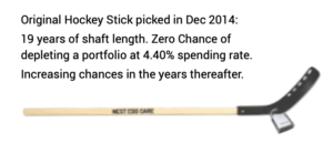
I can express the effects in two ways. I use the example of Patti and me at the start of our plan. We picked 19 years as the number of years for No Chance of depleting our portfolio and therefore used 4.40% as our Safe Spending Rate (SSR%) for our withdrawal for our spending in 2015.
1. I easily could argue that I could have used 4.70% as the Safe Spending Rate for 19 years of zero chance of depleting our portfolio. That’s 0.35 percentage points greater or about 8% greater than the 4.40%. We could have spent $47,000 per initial $1 million investment portfolio and not $44,000.
2. I could easily argue that our 4.40% gave us 23 years of zero chance of depleting our portfolio – an added four years. That moves the inflection point on our hockey stick beyond the expected years for “at least one alive”; that lowers the chances of being alive and failing to be able to withdraw for our spending to be much less than 1-in-50.
I come out it this way: I’m not going to increase the SSR%s that I show in Nest Egg Care. They are just fine as they are. They are accurate to use for our planning. But I appreciate the nuance. The SSR%s are safer than I previously had calculated. That gives me more confidence in my choice of 85% mix of stocks for our plan (Chapter 8, NEC). I’m going to be better off with that mix in 150 out of 151 chances – sequences since 1871. That high mix of stocks has helped Patti and me get to a 46% real increase in our Safe Spending Amount from the start of our plan. We obviously have not suffered by starting a shade too low.
Conclusion. In this post I summarized my views on the Safe Spending Rates (SSR%s) that I published almost five years ago in Nest Egg Care. I’ve tested the results one gets from FIRECalc. I find results I originally got from FIRECalc are a shade conservative. I could increase the SSR%s that I display in Nest Egg Care or keep using them knowing that they are buying me more safety than I originally thought. I want to emphasize added safety – particularly if that allows me to be more confident in my decision of a relatively high mix of stocks for our retirement plan. That greater mix is going to pay off with greater portfolio value – a greater annual Safe Spending Amount – in 150 of 151 chances.