All posts by Tom Canfield

Does the start of the worst sequence of returns start exactly in January 1969?

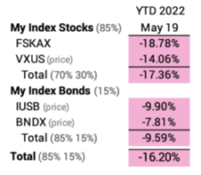
FIRECalc builds many historical sequences of stock and bond returns in history and displays how a portfolio will fare over time for all the sequences. Nest Egg Care uses THE Most Harmful sequence as the baseline assumption for determining a Safe Spending Rate in retirement – the rate that has Zero Chance of depleting a portfolio for the number of years you pick. FIRECalc builds its sequences to test using annual, calendar year return. This post examines the option of using an alternative start date for the test sequences of return, say, the 12-month returns starting on February 1, not January 1. This post finds that THE Most Harmful sequence of return started on January 1, 1969. Not a bit earlier or a bit later. This means THE Most Harmful sequence of return that one finds from FIRECalc is, indeed, THE Most Harmful sequence in history. Trust FIRECalc and the Safe Spending Rates displayed in Nest Egg Care.


== The question ==


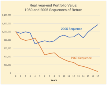
I examined THE 1969 Most Harmful sequence in history in greater detail. That sequence applies the greatest stress on a porfolio for all periods greater than ten years. A portfolio will decline to its lowest value over time on that sequence. The 1969 sequence is worse than the one that starts in 1968. It’s worse than the sequence that starts in 1970. But should we be using calendar year returns? Might a different start date earlier in 1968 or later in 1969 result in a more harmful sequence of 12-month returns and therefore a lower Safe Spending Rate (SSR%) that one would find by using FIRECalc or that I display in Nest Egg Care, Graph 2-4 and Appendix D? This seems to be a small issue, but I find that a lower the first 12-month return has a big effect on our calculation of Safe Spending Rate, even if the subsequent 12-month returns are better.


== Shiller data ==


FIRECalc builds its sequences of returns using data for stock and bond returns published by Robert Shiller, a winner of the Nobel Prize. You download the data series from the Yale site; it’s a big spreadsheet of returns for the S&P 500 and 10-year US government bonds. It displays monthly and cumulative returns since January 1, 1871. Wow! His choice of stock and bond returns are appropriate for our planning, and his data is the only source I find for returns prior to 1926.


FIRECalc builds sequences of return using calendar year returns that it obtains from the Shiller data. It builds and tests 132 20-year return sequences as an example. (We can separately examine 19 sequences that don’t run a full 20 years.)


FIRECalc did not have to use calendar year returns. Since Shiller’s spreadsheet displays the monthly returns for stocks and for bonds, FIRECalc could have tested all 132 20-year sequences starting with February 1871; all 132 sequences starting with March 1, 1871. And so forth. Rather than testing 132 20-year sequences of return, it could have tested 1,584 sequences (12 times 132)! One could find that THE Most Harmful sequence is different; it may not align with the one we find using calendar year returns.


I examine all the optional starts of sequences on before and after January 1, 1969. Might THE Most Harmful sequence start in a different month?


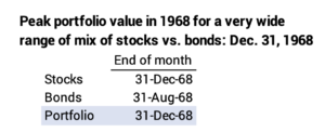
1. I examine the detail of monthly returns leading up to January 1, 1969. The annual return for stocks in 1968 was 10% and -1.5% for bonds. Perhaps, though, the peak of portfolio value was early in 1968 and then it declined very steeply the balance of the year. Perhaps stocks first rose 20% and then declined by roughly 10% for the total year return of 10%. That could mean the first 12-month return from that peak was worse than the -16.8% for calendar 1969.


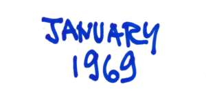
What’s the data tell us? The data show that a portfolio peaks on December 31, 1968. It does not have a peak in an earlier month. See here for the detail. THE Most Harmful sequence of return did not start earlier than January 1, 1969.


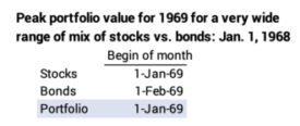
2. I examine the detail of monthly returns after January 1, 1969; the calendar year return for stocks was -16.8% and it was -10.5% for bonds. Again, perhaps the start of the year was good and the peak for that year came later than January 1. That would likely mean the 12-month return from the later start and steeper decline was worse than -16.8% for stocks.


What’s the data tell us? The peak portfolio value for 1969 was January 1 and not a later month. FIRECalc hit it on the nose: THE Most Harmful sequence of returns in history started in January 1969.


Conclusion: January 1969 is the start of THE Most Harmful sequence of 12-month returns in history. The start of the THE Most Horrible sequence isn’t a few months earlier or a few months later. We can trust the results from FIRECalc: it’s use of calendar year returns is correct. We can also trust the Safe Spending Rates (SSR%s) that I show in Nest Egg Care.

My bout with COVID

Dammit. It got me. I have no idea how. I’d put myself in the super cautious category. I wear a mask when others don’t. I avoid crowds. I hope you have not gotten it and won’t, but an article I read said roughly 50% of us have had it in the last six months. I report my experience with COVID in this post. This has to be old hat if you’ve had COVID, but it might be useful if you haven’t.


== First signs ==


I might have had the first signs a week ago Tuesday or Wednesday. That was the feeling of a small lump in the back of my throat. It isn’t a lump, but that’s my best description. I get that lump a day or two before I get any symptoms for a cold. I can usually predict the severity of a cold from that feeling. I think I thought this might be a worse one.


== Actual Symptoms ==


Symptoms hit on Thursday. Patti and I had a late lunch in a Greek restaurant – more of a deli – I’ve been wanting to try. We were the only customers. No symptoms there, but later that evening it hit me. Runny nose, sneezing, coughing, and the start of a sore throat. I was uncomfortable and took a test: negative for COVID. After all, I’d taken the fourth shot six days before; that’s supposed to be a boost to not even get it.


I moved over to the guest bedroom before Patti went to bed. Sleeping was not great Thursday, and I was worse on Friday. Runnier. Sneezier. My throat was very sore. I waited until after dinner to take another test, and it showed I had COVID. I took my temperature: 100.8. Breathing was fine. My oxygen saturation was 98%.


== Paxlovid ==


The hurdle was to be able to take Paxlovid; one must start it within the five days of first symptoms. Paxlovid is an anti-viral medication and is very effective in minimizing hospitalization and death for the unvaccinated. The effect is unclear for those vaccinated, and especially those vaccinated and boosted. But my knee-jerk reaction was to take it.


I had to get a prescription, and that was not easy to do starting on Friday night of a holiday weekend. I think there will be Test and Treat sites to make this easier. The web site lists a CVS two miles away, but it’s a test site – drive up window to provide a sample for a PCR test – and it can fill a prescription for Paxlovid; it does not provide a prescription based on the test result.


I found no help from our normal local provider, UPMC. Patti found a number for a 24/7 nurse with the second big health system, AHN, and called. The nurse said we could connect with them through MyChart and make an online appointment. (I think you can use the same line or you can Google “COVID telehealth appointment” to find a provider.) I scheduled it for 10:20 PM. It took me awhile to upload images of my health insurance card and fill out the list of the medicines I take.


The session started on time and took about 30 minutes. That was great. I found out that Paxlovid does not play friendly with some other medications. The one of most concern for me is the one I take to lower bad cholesterol: simvastatin.


• I had to start Paxlovid no earlier than 12 hours after my last scheduled dose. That means I should skip my Friday night dose and start Paxlovid no earlier than Saturday morning – 36 hours after my last dose Thursday night. The half-life of simvastatin is five hours. I decided to wait to start it Sunday morning (day three); that was a wait of 60 hours from my last dose. 60 hours means the amount of simvastin in me was 12 half-lives of my dose Thursday night – 1/4000th.


• I cannot take simvastin while taking Paxlovid, and I can only restart it five days after the end of the course for Paxlovid. The half-life of Paxlovid is six hours; five days is 120 hours or 24 half-lives. They want the concentration of Paxlovid to be far less than one-one millionth of value after a dose before I start simvastin!


I took an NAAT/PCR test Saturday afternoon. That verified that I had COVID but did not have the flu: one swab for the two tests.


== Isolate for five days ==


One has to isolate for five days from the onset of symptoms. I stayed in the guest bedroom. Patti delivered me food. Dudley was not allowed in. Every now and then I could hear him scratch the door and whimper, but he did not get his daily rubdowns.


image


I think most of my symptoms resolved by the end of Saturday, day two. My throat was a bit sore, but I slept well. By Sunday, day three, I felt fine. No sore throat. I had and still have a residual cough. Still, I tested positive at the end of day five. I’ve tested negative on days six and seven. I’ll keep testing to make sure I’m not headed for a rebound, which can happen.


== Mask through day ten ==


I got out of the cage Wednesday morning. Through day ten (Sunday for me) I must wear a mask all times in the house. I have to pass muster with Patti on pinching the masks at my nose and making sure the sides lie flat on my face. I won’t go in to stores, but if I did, I’d have to wear a mask and stay six feet away from anyone.


All in all, this was not bad. I’ve had worse bouts with a cold or flu. The stress is on Patti: serving me when in isolation; worrying about not getting it herself. She’s been a helluva caretaker with my surgery and now this.


Conclusion: I got COVID at the end of last week. This is getting to be a more common experience; a recent article estimated half of us had had COVID in the last six months. This post describes my bout. I hope it provides useful information for for those who haven’t gotten it.

How much is $500 worth?

In a way this is a silly question. $500 is worth $500, but in my case $500 isn’t worth much. Last week I locked up $10,000 of what I have in money market or interest-bearing checking to buy an I-Bond that I cannot redeem for a year. I’m going after at least $500 in more income, but I’m creating a headache for the normal way I manage our cash flow. I mixed up my phases: I’m not in the Safe and Invest phase for MORE; I’m in the Spend and Invest phase with the focus of DON’T RUN OUT OF MONEY. That $500 has almost nothing to do with the chances of running out of money. The $500 or so that I will earn that is tied up for a year isn’t worth the headache of messing up my plan for our monthly cash flow. I can’t wait to redeem my I-Bond on May 21, 2023.


== The I-Bond ==


I mentioned last week that I bought a $10,000 I-Bond. (This was not a painless process; I had to invest the time to figure out how to do it; it is not that clear as to how I get paid interest and how I redeem the bonds. I show some added detail here.) I will earn at least $500 more – maybe $650 more – this next 12 months than the alternative of ~$25 per year that I earn on $10,000 that I keep in our money market at Fidelity.


But I’ve locked up that $10,000. I cannot access it for our spending until May 2023. That throws my standard planning for our cash flow for the year out of kilter. Here is my standard process: In early December 2021, I sold the securities for our Safe Spending Amount (SSA; Chapter 2, Nest Egg Care). I withheld the taxes that I forecasted for our 2021 tax return when I distributed for our RMDs. I therefore got net cash for our spending in the upcoming year. I pay that total out monthly from our account at Fidelity to our checking account. By the end of November 2022, before my next sale for our SSA for 2023, I don’t have much cash in money market (MMKT) at Fidelity. I may have some excess cash in our checking that we did not spend, but I’ll typically donate that or give it to heirs.


Example: Let’s assume our SSA for 2022 was $75,000 and I withheld $15,000 for taxes in December when took our RMDs. Our net cash for our spending in 2022 was $60,000. Starting with December, I then (basically) paid $5,000 per month to our checking account for the next 12-months. That’s our regular paycheck from our next egg; it comes in like clockwork like our net pay from Social Security. At the end of November 2022, I have paid out the $60,000 and have ~no cash in our money marker at Fidelity until I sell for next year’s SSA.


I bought the I-bond last week and, in essence, took the $10,000 from our Fidelity MMKT. (It made no sense to me to sell stocks or bonds in their depressed state; I’m hoping they both rebound in value to much more than 5% or 6% in a year.) That means I now forecast to be ~$0 in money market at Fidelity as the end of September and not the end of November. I won’t get a paycheck from Fidelity for two months unless I break my pattern of when and how much I sell at the end of the year. (And this year, I think I’d like to delay selling for our SSA as long as possible.) Maybe my process is too mechanical for you, but it’s the way I’ve done it for eight years to make sure I pay out our full SSA and do not spend one dime more.


The incentives for our spending are wrong, too. Unless I do something different than my usual cycle of selling in the first week of December, by brain tells me we should spend less now or plan to donate or gift less to heirs at the end of the year, and that’s the EXACT OPPOSITE thought I want to have. I want to see that cash rolling in every month that signals, “You have plenty of income. Figure out what to spend it on that will be FUN. If any is left, you have the pleasant task of deciding who gets it.”


Conclusion: Last week I bought a $10,000 I-bond. I thought it wouldn’t bother me to tie $10,000 up for a year. Now that I think about it, it is a hassle. It’s messed up my routine for our cash plan for the year. Right now I won’t have enough at Fidelity for our paychecks into our checking account for October and November. I have a different perspective on the $500 or more that I’ll earn from the I-Bond: the hassle isn’t worth $500. I cannot wait to sell my I-bond on May 21, 2023.

What do we do now?

Oops. This is getting serious. My stocks are down more than 17% from the start of the year. My bonds are down more than 9%. (And the real declines are greater when I adjust for inflation.) Those are steep declines. Not nearly as steep for stocks as in 2020, but steep enough. At times like this, the emotional part of my brain shouts, “DO SOMETHING. YOU’VE GOT TO ACT TO CONTROL THIS.” The thinking part of my brain says, “Don’t panic. You can’t control the market. You can’t predict. It’s a long game. Stand pat as you have in all other declines in the past.” But there are a few things to consider than can win you a few bucks. This post mentions three actions. I acted on two this week. My thinking brain can say, “See. I did do something!”


== Consider taking part of your RMD now ==


Patti and I are both subject to RMD. I’ve described this before, but it makes sense to take your RMD when the market declines: assuming your investment rebounds, you are saving on taxes. It’s simplest and clearest to take your RMD now by transferring securities from your retirement account to your taxable account.


• Option #1. Let’s assume I take $10,000 of RMD now. I transfer shares of FSKAX worth $10,000 from my Traditional IRA to my taxable account. (When I transfer shares, I do not withhold taxes; I’ll withhold the proper amount for the year the first week of December when I sell added securities in our Traditional IRAs for at least the balance of our RMDs.)


Let’s assume the value of FSKAX rebounds +20% at some time in the future: that would be a gain of $2,000 from its present value. Assume I sell those shares no earlier than a year for our spending. I incur a capital gain tax of 15% on the $2,000 gain: $300. I get to keep $1,700 of the $2,000 for our spending.


• Option #2. I just keep the $10,000 in my Traditional IRA. It similarly rebounds by 20% or $2,000. Assume I sell and distribute it to my taxable account when I would have sold in Option #1. I pay 22% tax on that $2,000 gain: $440 in tax or $140 more that in Option #1. I get to keep $1,560 for our spending, roughly 8% less.


Summary: I likely will make $140 for each $10,000 of FSKAX transferred now from a Traditional IRA.


My action: I took about half my RMD this week by transferring shares of FSKAX to my taxable account.


== Consider converting from Traditional to Roth ==


You never lose when you convert from Traditional to Roth if the tax bracket when you convert is the same as when you spend from your Roth. You come out ahead if your marginal tax bracket is greater in the future or if you can use Roth to lower your AGI and avoid a Medicare Premium surcharge. The first AGI tripwire for married, filing jointly costs about $1,900.


In my tax planning, I will project our AGI and judge to see if it is close to the first first tripwire that could cost us $1,900. If I am, change the source of cash we’ll need for our spending: I’d sell securities from our Roth (no AGI) to lower our total AGI. Smart use of Roth could save $1,900 in Medicare Premiums, so that is a big potential savings. (This is a more obvious concern when it is just one of Patti or me who is alive; income for the survivor won’t change much, but the Medicare tripwire will be half of what it is for married, joint filers.)


If you don’t have enough in your Roth account, this is a good time to convert. You are getting more bang for your tax dollars if you convert when stocks have dipped. They rebound in your Roth account at no future tax consequence.


My action: I already converted enough in my Roth account. I’m pretty sure I can avoid Medicare tripwires in the future. I’m not converting more now.


== Buy an I-Bond: likely $500 more ==


My friend Jay pointed this out to me. This is a good video on I-bonds. You can buy an inflation protected bond that will earn more interest than you can from, say, money market or bank CD. Rates are variable and are stated every six months: May and October. You are limited to $10,000 per person per year. You must hold the I-bond for a year. You forego three months of interest when you redeem your bond unless you hold on to it for five years; I’ll never hold it that long.


The guaranteed annual rate for the six months May through October is 9.62% – 4.81% for the six months. I will earn $481 on my $10,000 invested before November 1. The rate that  starts November 1 will be  restated in October. I’ll earn that rate for the next six months. Assuming that rate will be lower, the annual rate may be more than 7%: $480 + more than $220  if the next rate is greater than 4.40%).


Even if I sold in one year and did not earn 3 months of interest, the interest for the year will exceed ~6% ($480 + $110 if the rate is greater than 4.40%). That handily beats my money market rate, currently at 0.25% annual rate; we hold no CDs; we earn 0.01% rate on our checking account. The math for us: forgo $25 to earn +$500 – more likely $700 – on the $10,000.


Patti and I easily have $10,000 in our checking account + money market at Fidelity at any point in time. The total peaks in December each year (That’s when I sell securities for all our spending for the upcoming year.) and it is lowest at the end of November. Owning an I-bond isn’t as flexible a money market. I have to plan on lowering our average cash + money market balance by $10,000.


You have to buy I-bonds direct from the US Treasury. Yesterday I opened an account at TreasuryDirect on this site. That took 10 or 15 minutes. This video is clear. My account is linked to our joint checking account. The BuyDirect tab on the site led me to the purchase of my $10,000 bond. I looked this morning and they debited from our checking account at midnight.


The $10,000 will accrue interest until I redeem the bond. I may redeem in one year, but I’m guessing I’ll likely hold it longer. I’d guess the next three-month rate will be attractive; I wouldn’t to forego 3 months of interest at a high interest rate, but, then again, the difference may only be $100 or so. I’ll sell three months after the newest six-month rate drops to what I judge as too low of rate.


I have two administrative tasks to track that I entered into my 2do app: I need to check the six-month rate each May 1 and November 1. I need to decide on next May 20 if I should sell the bond.


Conclusion: Stocks and bonds are making me ill right now. The emotional part of my brains says, “DO SOMETHING.” The thinking part of my brains says, “HANG IN THERE. Don’t do anything crazy.” But it also knows and finds a few things to do that might make me a few $100 or even more than $500 per $10,000: 1) take a portion of RMD now; 2) convert from Traditional to Roth; 3) buy an I-bond. I did two of these three this week. My thinking brain can say to my emotional brain, “Pipe down. I am doing SOMETHING.”

Is inflation slowing?

The purpose of this post is to provide information on recent trends in inflation. We’ve all been hit with inflation: it hurts our spending power; both stocks and bonds react negatively to increasing inflation. The last time it was this high was about 40 years ago. I have no idea of when it will come down closer the Federal Reserve’s target of 2% per year. I suggest that we’ll see lower annual rates of change at least for the next two months. I’d guess we nest eggers – especially those who recalculate at the end of November like I do – will be seeing ~6% adjustments for inflation in our gross Social Security benefits and our Safe Spending Amount for 2023 (SSA; see Chapter 2, Nest Egg Care). That will give us the ~same spending power in 2023 as in 2022.


== Recent history ==


I plot the monthly change in inflation for the past 3 1/3rd years. The April increase in inflation was .56%. That’s the lowest monthly change this year; it’s less than half the 1.33% change in March. April is the first month in 2022 that the change has been less than the change for the corresponding month in 2021.


Inflation in 2021 exceeded inflation in 2020 at the first of the year and at the end of the year. Inflation in 2022 has exceeded inflation in 2021 for the first three months of the year, but the increase in April 2022 was lower than the increase in April 2021.


I plot the 12-month change in inflation for each month for the last 2 1/3rd years. Inflation over the last 12 months was 8.26%. The 12-month rate has steadily increased for ~20 months. (There was a slight decline for 12-month the period ending August 2021.)


The 12-month inflation rate in April 2022 (8.26%) was less than the rate ending March 2022. April marks the first decline in the 12-month rate in 18 months.


== The future ==


You can see from the first graph that for the next two months we’ll be comparing the monthly change in inflation to the highest two-month change in 2021: 1.74% for those two months from the .80% increase in May and .93% increase in June. Assuming the monthly changes for May and June will be less than in 2021, the news will be that the 12-month rate is falling.


Then we’ll be comparing monthly changes to the lowest three-month period in 2021: July, August and September. Inflation averaged 0.3% per month, half of the rate this past month. The 12-month inflation rate may climb in those months.


Social Security calculates its Cost-of-Living Adjustment (COLA) in October based on the average change in inflation for the three months July, August and September. It uses a different measure of inflation (CPI-W) than is widely reported (CPI-U). CPI-W increased 5.9% for 2022, and that was a greater increase than would have been calculated using CPI-U.


Assuming no big turnaround in current market performance, our annual Safe Spending Amount for 2023 will only increase for inflation. We won’t see a real increase, unlike the ~10% real increases all nest eggers averaged over the last two years.


Refer to blog post of December 3, 2021 for detail.


Conclusion: We’ve all been hit with inflation: it hurts our spending power; both stocks and bonds react negatively to increasing inflation; that’s a double-whammy. The last time inflation was this high was about 40 years ago. I have no idea of when it will come down closer to the Federal Reserve’s target of 2% per year. We clearly have a way to go. I suspect we will see 12-month rates decline for the next two months; it will be tougher sledding for the three months after that. I’d guess we nest eggers – those who recalculate at the end of November like I do – will see ~6% adjustments for inflation in our gross Social Security benefits and our Safe Spending Amount for 2023.

What did you do that was fun this week?

My fun project for this week was to spend time planning our next big walking vacation in England in August. It was a good distraction from thinking about the stock market! The purpose of this post is to simply tell you what was fun for me: I dove into the details for our trip to England in August. It’s very concrete in my mind now, and I get pleasure now from anticipating a future experience.


Patti and I have traveled enough times to England to know we can completely plan our trip. Walking is our primary activity. The UK has 16 national trails but 150 long distance paths of more than 50 miles. We’ve liked the long-distance paths in northern England, and we’ve visited the Lake District and planned day hikes for at least five years. We plan so we don’t have to rent a car; we find it’s far more relaxing for us to stay in as few places as possible. That means takes some work to make sure we have the logistics right. Our August trip is a bit more complex: it’s an area we have never visited before, and we are walking a 47-mile linear route. I’ve got to make sure I can arrange buses or taxis to take us to the start of our walks and get us back to our lodging.


The internet makes this so much easier than my efforts years ago. I describe some of the things one can do.


== Pick the trail ==


We are walking 47 miles of The Norfolk Coast Path, from Hunstanton to Cromer. I picked this trail because it is accessible from London and very easy. Easy is definitely okay for our first trip after my surgery. I planned it as seven walking days. I added a rest day. We definitely aren’t pushing it. Most days will be six miles. Two days are a bit over eight. This looks to be a nice trail because most days we walk through a nice village roughly the middle of the day. It’s a real luxury to be able to stop and find a place for coffee or lunch.


We can see what the trail looks like for the full 47 miles. I can enter “Norfolk Coast Path” into Google Maps. I see an overview of the trail. I can zoom in on the satellite view, I have the view of someone walking the trail! I find this amazing. This YouTube also gives a great overview.


== Where to Stay ==


The guidebook I ordered arrived last weekend. It has very detailed maps. It shows distance for suggested walking itineraries, describes the villages, recommends best places and stay, and suggests other things to do.


I picked out two places to stay along the 40-mile stretch. The first place is in Thornham at the end of the first day’s walk. The second is in Blakeney, two days from the end. I used Google maps and TripAdvisor to find places that look to be way above average. We are happier when we spend a bit more on the place to stay and a nicer room. (Patti paid for the flights with miles, so spending a bit more on rooms is an easy decision.) All the places I looked at show their rooms on their web site. I couldn’t book the room we wanted on their site. I called. At both places, we have one room for the first night and then our preferred room for three nights.


== Logistics ==


We won’t rent a car. It’s pretty easy to sort out the logistics to get to where we stay the first night in Thornham. We land at Heathrow at 7:40 AM. I can buy tickets now for the Heathrow Express to Paddington Station. Google tells me that it’s a 20-minute cab ride to King’s Cross Station. I use this site to find we can catch the 9:42 AM direct train to King’s Lynn. At King’s Lynn, Google tells me it’s a 35-minute cab ride from the train station to Thornham. We’ll likely be in Thornham by 1:00 PM UK time.


The return is a bit easier. We’ll take a train from Cromer to Norwich and stay there to explore for a day and then take the direct train to London; we’ll stay four nights there.


I had to sort out the logistics for each day. We have to get to a different starting point each day and get back. This route is similar to our travels along a 23 mile stretch of Hadrian’s Wall last fall. A road closely parallels the trail. A bus runs at one-hour intervals both ways. I can zoom in to see that Google shows all the stops. The stop is right at the first place we stay and .2 miles from the second. We can always catch a bus to our starting point and back. Taxis are generally easily available, but I haven’t figured that option yet.


== Where to eat ==


I normally use Google maps and TripAdvisor to make a list of places to eat and figure out the details when we get there. The person we talked to at Anna’s in Thornham suggested we make dinner reservations at that time of year. Google, TripAdvisor and this site were great in help in figuring out where we might want to eat. It must be a busy time of year. I can book now for August at a surprising number of restaurants.


== Entertainment ==


On our free day, we’ll probably take a boat ride from Blakeney to see seals and birds on an outer island. That will depend on the weather. Patti and rocking boats don’t mix.


Ideally, we find a theater or playhouse near where we are staying. The guide book said Hunstanton had a theater. I went on the web site and found they have a Queen tribute band on our second night. It looked like we were the first to buy tickets. Patti bought the best in the house. That should be fun.


There’s also a variety show in a pavilion on the pier at Cromer at the end. We haven’t decided on that one. Patti will sort out the London theaters for the four nights we stay in Covent Garden. She’ll book three shows for sure. Those theaters and shows are always great.


Conclusion: I really enjoy the task of detailed planning for our trips abroad. What we will do and where we will stay is very concrete. I get present pleasure by anticipating a future experience. I can do all the detailed for our trips to England. It’s comfortable for us, since we’ve been there so many times. It’s easy to find a new walking trail or an area with great day hikes.

Are we overdue for a big dive in stocks?

Returns for stocks and bonds are down sharply this month and year to date. In the last week or so, I’ve read a number of articles implying that we retirees should be nervous: we should be lowering our spending; we should be taking special cautions to protect our portfolio. The implication is that we are headed for a period of sharp decline; an implicit assumption is that returns have been too good recently. The purpose of this post is to emphasize that you should plan on NO DECLINE in your current Safe Spending Amount (SSA. See Chapter 2, Nest Egg Care [NEC]). You hit a high-water mark in your last calculation, and your SSA does not decline in spending power, essentially for the rest of your life. That’s the most important consideration.


== The recent past: how good? ==


A friend of mine said that the most recent past has been the best bull market for stocks in history. Is that true? No.


Stocks have had a very good run for the past 13 years. They’ve averaged 11.6% real return per year from 2009 through 2021. That’s well above the long-run, historical return rate of ~7.1% per year. I can calculate returns for all 13-year return periods. I find this most recent one is the ninth best since 1926. It’s an excellent return period, but it’s not a shocker.


We also need to put the last 13 years in context: the last 13 years followed the worst 9 years in history: stock declined in real value by 42% from 2000 through 2008. Wow. (Bonds performed well above average for this period.) One would expect stocks to rebound toward their long-run average of about 7.1% real return per year. The rebounded mightily, but over the past 22 years stocks have averaged 3.1% real return, well below their expected 7.1% annual return rate.


== Are stocks too high? ==


You can find lots of sources that say the market is overvalued and will decline. Some of these predictions are downright scary. I don’t put much faith in those predictions. I see little reason to argue the future trend line for returns will be different than the past. The cumulative return for stocks is above its historical average 7.1% trend line shown on this graph, but it is not wildly above the line as in the late 1960s or 1990s.


== Our SSA will not decline ==


Patti and I recalculate each November 30 to find our Safe Spending Amount for the upcoming year. I’ll assume you use the same date: you calculated to at least a 10% increase in your SSA this past November. You calculated to your peak SSA. Following the worst-case planning in NEC , it will never be less than that. You know you have very, very close to ZERO CHANCE of being able to spend that amount – in constant spending power – every year for your remaining years.


I worry very little about declines in our portfolio. I can’t worry that our current SSA is too little for us. Patti and I have been at this a number of years now. Our SSA is close to 50% greater in real spending power than it was at the start of retirement, and we were happy with it then. I spend no emotional energy thinking that we might run out of money. If we need to revert to lower spending – lower the SSR% we use to calculate our SSA – we’d extend our years of Zero Change of depletion beyond the age of 95. And that is still assumes we strike out and hit the 1 in 150 chances of riding a sequence of return that matches effect of the most harmful sequence in history.


I have other things I should worry about: will I make it to my life expectancy – less than 11 years now? Will both Patti and I be alive for that many years? Will we be both be healthy enough to travel to enjoy the money that we pay ourselves.


Conclusion: I keep reading articles advising retirees about what to do to protect themselves from lower returns and higher inflation. I really don’t worry about a decline in my portfolio. Like all nest eggers, our Safe Spending Amount is the highest it has ever been. Patti and I have experienced an increase of nearly 50% in real spending power for our SSA over the past eight years. You would have seen a similar increase: your SSA, effectively, has increased more than 50% over the same eight years, even though you likely didn’t start your retirement plan then: you haven’t withdrawn nearly as much as we have. Focus on your SSA: it won’t decline in spending power essentially for the rest of your lives. Distance yourself from the anxiety or worry about declines in your portfolio and the risk of running out of money.

Why is the your SSR% I provide in Nest Egg Care safer than you may have thought?

When I wrote Nest Egg Care (NEC), I used data for stock and bond returns starting from 1926. I displayed FIRECalc results for 72 23-year sequences in Graph 2-4. I highlighted the most harmful sequence – a blue line on that graph – as the sequence that depleted a portfolio in the fewest number of years for a given spending rate, investing cost, and mix of stocks and bonds. The 4.40% spending rate that I displayed is the Safe Spending Rate (SSR%) with Zero Chance of depleting in 19 years . The implication is that you have about a 1 in 75 chance of experiencing a return as bad as THE Most Harmful sequence of return. That’s not correct. Your chances are about 1 in 150, and I could argue that it’s 1 in 1,800 chances. The purpose of this post is to explain why the Safe Spending Rates (SSR%s) I provide in NEC are based on a sequence of returns that has half the chances of occurring than you may have thought.


== Shiller data from 1871 ==


When I wrote Nest Egg Care, I did not use the full data set for stock and bond returns that FIRECalc uses. I set FIRECalc to use the annual return data from 1926, since I was trying use similar years of data that Vanguard uses in its Monte Carlo simulations to provide its data on how long a portfolio lasts. As I describe most recently in this post, that is a pointless effort. I conclude the results from a Monte Carlo simulation are not credible: they lead you to far too low of safe spending or withdrawal rate. Count on the results from FIRECalc.


I conclude it is fair to use the same data that FIRECalc uses (from Shiller): the sequence of stock returns (S&P 500 stocks) and bonds returns (10-year US government bonds) to find the most harmful sequence in history. Once FIRECalc updates its data to include 2021 (The most recent update was a year ago.), the data set is 151 annual returns from 1871 through 2021. (I could use or FIRECalc could use the monthly data from Shiller for 1,812 – 151 times 12 – 12-month return periods, but let’s stick with 151 annual returns.)


Let’s assume we want to examine all 20-year sequences of stock and bond returns. FIRECalc will display that as 132 complete sequences of return: 1871 though 1890, 1872 through 1891, …. 2002 through 2021. I first found in this post that the most harmful sequence of returns is the one that started in 1969: that will deplete a portfolio the deepest and fastest for all periods of return greater than ten years. (The nest complete 20-year sequence to be added in FIRECalc’s update – 2002 through 2021 – is not nearly as harmful as the 1969 sequence.)


For your planning, you pick the number of years you want for Zero Chance of depleting a portfolio, and you then derive your Safe Spending Rate (SSR%) by testing that Most Harmful 1969 sequence. I did that work for a wide range of years in Graph 2-7 and Appendix D. Portfolio values from all other sequences of return will not deplete and therefore are less harmful. Most are far, far better. You use your age appropriate SSR% times your Investment Portfolio value to obtain your annual Safe Spending Amount (SSA).


== Count the partial returns ==


FIRECalc will display 132 complete 20-year sequences ending with the start in 2002, but we know that NONE of the 19 partial sequences of return starting in 2003 are candidates for most harmful: none of those partial sequences can replace the 1969 sequence as THE most harmful in history. Those sequences run in length from 19 years (2003 through 2021) to just one year (2021).


Why do we know that? We know that because a candidate for the most harmful sequence 1) must result in a portfolio decline in the first year, and 2) subsequent returns cannot return a portfolio to its initial value. Let’s examine 2021 as the example. Could it have been the start of the most harmful sequence of return in history?


• Example 1: We’ll use the example of a retiree, Tom. Tom started his retirement plan in December 2020 with $1 million. His portfolio mix is 75% stocks and 25% bonds. He withdrew his SSA of $50,000 (5.0%) for his spending in 2021. He started January 1, 2021 with $950,000. If the return in 2021 did not earn back the $50,000 he withdrew, he would have less before his second withdrawal in December 2021 than he did before his first withdrawal. Tom could not calculate to a real increase in his SSA; he sticks with his $50,000 real withdrawal for the next year. Tom could conclude that 2021 was potentially the start of the Most Harmful sequence of returns.


• Example 2: Tom’s actual, real portfolio return for 2021 was 12.7%. He earned back more than the $50,000 that he withdrew: lot’s more – 12.7% times $950,000 equals ~$121,000. He has ~$71,000 more in real spending power than he started with before his first withdrawal. That means 2021 was not the first year of a most harmful return sequence.


Let’s assume Tom sticks with his original withdrawal rate of 5.0%. Tom can increase his withdrawal by 7% in real spending power. He does that and starts anew on January 1. His 5% withdrawal rate assumes 2022 will be the first year of the most harmful sequence of return for 20 years.


(At the end of 2021, Tom could also apply the greater SSR% appropriate for his shorter life expectancy. He’d calculate to an even greater pay increase.)


== The last 19 years ==


Using the example of a 5.0% withdrawal rate, we can see what would happen to Tom’s portfolio if he started his retirement plan in any of those years: 2003 to 2021. If Tom’s real portfolio return was greater than 5.3% in any year ($50,000/$950,000) he would have more portfolio value than he did before his first withdrawal, and that year cannot be the start of a most harmful sequence of return


The annual return rates of the 19 past years show that 13 years (highlighted in green) had real portfolio returns >5.3% and are not possible candidates as the first year of a most harmful sequence.


Six years highlighted in gold with less than 5.3% return are candidates for most harmful sequence, but only one is a serious candidate.


• 2011, 2015, and 2018 are not candidates, since the returns the next year or two are obviously great enough to earn back more than the prior withdrawals. Tom would have more than $1 million real portfolio value before a withdrawal and has to calculate to a greater Safe Spending Amount.


• Of the three years 2005, 2007, and 2008, only 2005 is a potential candidate for most harmful sequence. We have to calculate to find that. The 1.1% return in 2005 meant a portfolio declined; the withdrawal lowered it before the start of 2006; the 9.5% return in 2006 just fell a bit short of earning back to more than it was before the initial withdrawal in late 2004. That means 2005 is a worse start than all subsequent years.


Portfolio value does not quite return to its initial $1,000,000 at the end of 2006: 2005 is a worse start than subsequent years. Portfolio value dips to about -30% at the end of the 4th year.


After 16 years, a portfolio exceeds its initial value. Tom would have to calculate to a greater SSA. This sequence is not a candidate for Most Harmful. (Tom’s age appropriate SSR% would be much greater than the initial 5.0%; he’d calculate to a real increase in his SSA well before 16 years.)


==2005 is far better than the 1969 sequence ==


Is 2005 a competitor to 1969 for THE Most Harmful Sequence? Nope. Not close. It’s a below average sequence. It declines to its low point – by 30% in real spending power at the end of 2008, but that low is not close to a tipping point – roughly 50% decline in value. We see that the 1969 sequence had depleted by more than 50% in six years and spirals toward depletion.


If Tom rode the 2005 sequence, he would have more than he started with at the end of the 16th year and more again at the end of the 17th. For comparison, after 17 years of the 1969 sequence, portfolio value was just 4% of the its initial value.


Conclusion: One can find the most harmful sequence of return in history and use that sequence to find the Safe Spending Rate – the spending rate you know results in zero chance for depleting a portfolio. Some argue that using sequences of return in the historical order than they occurred in history doesn’t give you enough sequences to test. This post concludes we have 151 actual and potential sequences of return since 1871 to test and just one, the sequence of return that started in 1969, is truly the most harmful sequence of return. You have 1 in 151 chances of experiencing a return like that if you use the Safe Spending Rates (SSR%s) that I provide in Nest Egg Care.

Did you summarize your 2021 tax return?

Did you summarize your 2021 tax return in a format that is understandable to you? I find the 1040 form confusing. You can spend a bit of time to reorganize it so it’s much easier to understand. The purpose of this post is to provide you two formats that you can use to summarize your 2021 tax return: the short form that I use and one that was in the thick tax return that my accountant sent me. You want to understand your tax return and how decisions you make can avoid taxes that you do not need to pay.


I had two friends tell me they were surprised when they or their accountant completed their tax return. One had a big surprise on the amount of added taxes he had to pay. The other had the pleasant news that she had too much income – money that she will not spend – that was being taxed in the 32% tax bracket: this is is the result of shakey planning; in essence, she will pay excess taxes and not pay her favorite charity.


== My short form ==


I make my first real estimate of the taxes I will pay the first week of August each year. I refine it in late November when I decide our Safe Spending Amount (SSA) and the securities I need to sell to get our SSA into cash for the upcoming year. (See Chapters 2 and 9, Nest Egg Care.)


Here is the very simple format that I use to estimate taxes. It’s easy for me to put my details from 2021 in this format as a starting point for 2022. I provided a spreadsheet of this format in this post, and you’ll see it again in August. I’m not looking for precision at this point: I round all numbers to the nearest $50. I show a .pdf of this format with more detail here.


I have three items that I control – to a degree – to minimize the taxes I pay on the total amount of securities I will sell to get our SSA. Two are highlighted in green on the table: 1) I have to sell securities and transfer cash from our IRAs to at least equal RMD for the upcoming year. 2) I have to sell securities in our taxable account, since our SSA is always greater than our RMD; my choice of which securities to sell in our taxable account will affect the amount of taxable gain. 3) Proceeds from sales of securities that I distribute for spending from my Roth account do not appear in my calculation of tax since I previously paid tax when I contributed/converted.


My choices control my Adjusted Gross Income (AGI). That’s the sum of two components of taxable income: the portion that is taxable at ordinary marginal rates and the portion that is taxed at capital gains rates. For the same after-tax proceeds for our spending, I might be able have greater income that is taxed at lower effective capital gains rates and less that is taxed at ordinary marginal tax rates. For the ordinary marginal rate, I don’t sweat the step up in marginal brackets from 22% to 24%; the difference in total taxes paid – or the percentage that you get to keep – is small.


For Patti and me, Adjusted Gross Income is the same as Modified Adjusted Gross Income; we don’t own tax-exempt securities and don’t need to add that income back to AGI to get MAGI. Too much MAGI means you cross an income tripwire that results in greater Medicare Premiums that will be deducted from your gross Social Security benefit. Married folks who had high MAGI on their 2020 return pay more than $10,000/year in added premiums in 2022. High MAGI also determines whether or not you pay an added 3.8% tax on some or all investment income (NIIT).


== Marginal tax brackets ==


One of my friends was confused a bit on the nature of marginal tax brackets. I’m sure you have this: You pay tax at ordinary marginal rates on certain income. You pay flat capital gains rates on certain income – dividends and securities you sell that you’ve held for more than one year. Ordinary rates are graduated, and the marginal tax rate increases as your Ordinary Income increases. The Capital Gains rate is 15% for most all of us; because you are only taxed on the gain, your effective tax rate is low.


You calculate your tax on ordinary income by using the marginal rate tax table. You first find your applicable bracket. If you are a single filer with taxable ordinary income of $110,000 in 2022, you would be in the 24% tax bracket. (Taxable ordinary income = gross ordinary income less the standard deduction for most all of us.) From the table for 2022 taxes you would pay tax of $15,214 – the tax that cumulated to the start of the bracket – plus 24% of the amount greater than $89,075: total of $20,236 in tax. You pay an added $419 in tax on the increment that fell into the 24% bracket and not the 22% bracket.


== A more detailed sheet ==


I have my tax return prepared by an accountant, and the return copy he sent me contains a much more detailed summary form. I enclose my version of his sheet here. You can pick the items you might add or delete to my short-form sheet to be more applicable to your situation.


Conclusion. You should summarize your 2021 tax return in a format that is easy for you to understand how your Adjusted Gross Income (AGI) is calculated and how much is taxed at ordinary marginal tax rates and how much is taxed at capital gains rates. You have some control over those two components of your tax return and the sum of the two. For most all of us AGI = MAGI. Your MAGI determines Medicare Premiums that you will pay; your MAGI determines whether or not you pay a greater tax on Capital Gains.

Do you have the right health care insurance?

This is something last I thought about in detail when I first went on Medicare, but the purpose of this post is to pass on some of my thinking on supplemental insurance coverage to Medicare. The key criterion was to be able to go to any doctor – or almost any doctor – in the US for care. That’s consistent with my worst-case thinking. If the worst happened, could I go to the best doctor and place in the US for care?


I was first motivated to think about this from the book, The Checklist Manifesto, by Atul Gwande. Or it may have been from his book, Better. I read these books over ten years ago, but this is what I remember as the key points of the books. Checklist is about the effort to instill the process of using a checklist before surgery, not unlike the checklist that airline pilots use before taking off. Surprisingly, this was not an easy and fast process for hospitals and surgeons to accept. His key point in Better is that surgeons will make mistakes, and if you want to ensure fewer mistakes you go to a surgeon and hospital that have repeatedly performed the surgery you are going to have. Where do you want to go for hernia surgery? You ideally want to go to one hospital in North America – in Canada, as I remember – since the surgeons and hospital team do the most hernia repairs in the world and have the lowest surgical complication rate.


I followed this advice when I needed surgery to repair a bunion on my left foot maybe ten years ago. I made sure I did my research to find a surgeon here in Pittsburgh who had performed the most surgeries, over 1,000 of them.


For my Medicare insurance, I made sure I have coverage that provided the widest access to doctors and hospitals in the US. That was either Medicare + Supplemental or a Medicare Advantage Plan from an insurer that had negotiated contracts with the biggest range of hospitals and doctors. I liked a Medicare Advantage Plan, while Patti opted for Medicare + Supplemental.


This was a pretty simple decision for me when I first decided on my supplemental coverage about ten years ago. Our large hospital system, UPMC, was at war with our large insurer Blue Cross/Blue Shield and stated they would no longer accept patients insured by BC/BC at some time in the future. As I remember, they did not reach agreements with some other national insurers. The choice of an HMO plan offered by UPMC did not make sense; if I wanted to go to a doctor in the hospital network four miles away, I would be “out of network”.


As I remember, I had only one clear choice that allowed me to use most any doctor or hospital in Pittsburgh or elsewhere: the Medicare advantage plan from United Healthcare. I have United Healthcare’s “AARP Medicare Advantage” with national coverage. If United has an agreement with a hospital and therefore the doctors it employs, I can get my healthcare there. I think almost all hospitals and doctors are part of United’s network. I pay $400 per year. My co-pay for specialist visits is $35. I pay more co-pay for expensive imaging.


Some of my friends here have an HMO plan that limits them, I think, to a much smaller network of doctors and hospitals. If they want a second opinion or care option, they could be “out of network” and pay much greater fees. They might have $0 cost per year, but they are limiting their choices for almost no financial difference in annual or out-of-pocket costs.


My choice of paying $400 more per year was the right choice this year. I had to have surgery earlier this year. I had a benign, enlarged prostate gland that constrained my urethra and bladder. After two years my symptoms became worse, clearly affecting my quality of life. My urologist recommended surgery to debulk my prostate to reduce the pressure on my urethra and bladder. I chose him as my surgeon, and that surgery in February was fairly straightforward with a fast recovery time. Terrific!


I had a pre-operative CT scan to make sure my problem wasn’t a kidney stone or caused by another anomaly. An incidental finding from the image was a worrisome aneurysm in an artery near my pelvis. It was bigger than the vascular society’s guideline for elective surgery, and it only will get bigger in time. The risk of rupture increases as it grows, and I was told that rupture was 100% fatal.


I visited the Chief of Vascular Surgery at the Cleveland Clinic. The Cleveland Clinic does the most cardio and vascular procedures in the world – something like 11,600 each year. It is the top center for cardio-vascular surgery by one evaluation. It’s the closest of the top ten to Pittsburgh. The surgeon recommended open surgery in my case. This is a big surgery with maybe 3% risk of death from the surgery. Friends said, “Gee, that seems low.” That didn’t seem that low to me!


I had this surgery on March 15, and the care at the Cleveland Clinic was terrific. You lose blood in a surgery like this. You lose energy and strength until your body grows back red bloods cells, the same way as it grows back red blood cells when you donate blood. You lose more blood from this kind of surgery than you would from donating, and therefore the loss of strength and endurance is obvious.


I’m slowly rebuilding strength and endurance. When I walked arm in arm with Patti for 200 yards after the surgery, I’d have to take a nap. Three weeks after the surgery I walk two miles a day, one mile at a time. I took no naps after my walks yesterday. I’m starting to take a third walk of the day today. I have very little discomfort from the incision.


My out-of-pocket co-pay for the surgery was $260. The financial disclosure form from the Cleveland Clinic said the cost or charges for the surgery would be $120,000. I also had about $140 co-pay for each of two or three images (a second pre-operative CT scan; heart images).


Conclusion: This post asks the question, “Do you have the right healthcare insurance?” I clearly am not an expert on this, but I think you want a Preferred Provider plan with your supplemental insurer to Medicare, and you want an insurer with the widest contractual agreements with doctors and hospitals. That means, in worst case, you can go almost anywhere in the US with the top doctors or surgeons if you have a serious medical decision or need for surgery. The very small added amount I pay each year relative to some HMO plans is well worth it. I am able to at least get a second opinion from world-class doctors or surgeons and don’t have to hassle with or pay out-of-network fees.