All posts by Tom Canfield

Will we budge from 4% inflation rate?

The final piece of inflation data for February came this morning. We seem to be stuck on a 4% inflation rate. This post displays a table and four graphs that I use to see the trends in inflation.


The two most widely-reported measures of inflation are Seasonally-adjusted inflation and Core inflation.


Seasonally-adjusted inflation increased by 0.4% in February. The rate over the last six months translates to an annual rate of 4.3%. Inflation over the past 12 months has been 6.0%. We would expect that historical rate to decline in the next several months, since March, May and June of 2022 averaged 1% inflation per month.


Core inflation excludes volatile energy and food components and was +0.45% for the month Inflation for the last six months translates to an annual rate of 5.0%.


Personal Consumption Expenditures (PCE) excluding Food and Energy was issued this morning. This measure of inflation is one that the Federal Reserve Board favors. The increase this month was half that of last month. The last six months equate to 4.4% annual rate.


Over the last 12 months, inflation has been 6.4% as measured by CPI-U. This is a slight decline from last month. The historical 12-month rate has declined each month from its peak of 9.1% last June.


Conclusion: The annual rate of inflation, based on the six recent months of lower inflation, is about 4.5%. This is higher than the Federal Reserve’s target of 2% inflation and not much different than recent months.

Has Warren Buffet lost it?

Warren Buffet has the best, longest record of stock picking in history. Berkshire Hathaway (BRK), a closed-end mutual fund in effect, outperformed the S&P 500 by eight percentage points per year for 40 years. But in the last 15, BRK has trailed the S&P 500 index by 1½ percentage points per year. Has Buffet lost his touch? Has the competition gotten that much harder, so he can’t find the bargain stocks like he did for decades? This post suggests it’s the latter: the top performing mutual funds that outperformed by 2.9 percentage points per year in the same 40 years have trailed the S&P by 2.5 percentage points in the last 15. Buffet knows: the most successful stock picker in history recommends that we stick with index funds.


== Last week’s post ==


I stated that its 15/16ths or 94% certain you will have more money in 20 years by investing in Index funds rather than Active funds. The article that provided the data stated that one reason why so few Active funds outperform is that the competition among professional managers is far tougher today than in the past: it’s a zero-sum game, and the targets for underperformance – the only source for overperformance – have shrunk.


== BRK and the top 15 for 40 years ==


I checked out the latest edition of Stocks for the Long Run by Jeremy Siegel, and he displays the performance of the top 15 mutual funds over the 40 years 1972-2012: they averaged 2.9 percentage points greater in annual return greater than the S&P 500 index for those 40 years. I do not know the number of mutual funds that have that long of history (There are more than 7,000 now), but I’d guess these 15 are the top 1% in performance.


At 2.9 points better, an investment in 1971 grew to 2.8 times that that of the S&P 500, and the S&P grew 44-fold. Ah, the lure of Active funds! If only we could hold the fund that will be in the top 1% in performance. (I was lucky and owned Fidelity Contrafund, #9, starting in the 1980s; I have not owned it for at least the last eight years.)


Berkshire Hathaway’s (BRK) growth in value was 8 percentage points better per year than the S&P 500 for 40 years. An investment in 1972 more than 650-fold and 16 times the S&P 500. Wow. Seigel states the probability that that outperformance was luck is about one in a billion. Buffet has demonstrated the skill as the longest, most successful stock picker in history.


== The last 15 years ==


Those 15 top performers have averaged 2.6 percentage points per year worse over the last 15 years. Two of the 15 have averaged more than the S&P 500. The best performer is a Large Cap Growth fund, and it did not match its peer index over the 15 years.


Berkshire Hathaway has lagged the S&P 500 by 1.5 percentage points per year. If you invested in BRK 15 years ago, you’d have 9% less than if you invested in an S&P 500 index fund.


Conclusion. This post supports the argument that the competition among Active fund managers is a lot tougher than it was 40 years ago. The top 15 Active mutual funds from 1972-2012 outperformed the S&P 500 index by an average of 2.9 percentage points per year, but in the last 15 years, the 15 have lagged the Index by 2.5 percentage points per year. The shift for Warren Buffet and Berkshire-Hathaway is more dramatic: 8 points better per year for 40 years but 1½ points worse per year in the last 15.

Stick with Buffet’s advice: invest in Index funds.

What are the chances Index funds will outperform Active funds?

Last week I realized I had not read a recent SPIVA® scorecard report that compares the performance of Active funds to their benchmark index. My prior post on a detailed report was in 2018. I was not looking forward to reading the latest report because the one in 2018 was detailed and hard to digest. The latest report is, too. I was glad to find this report, “Shooting the Messenger” with a clearer story. I summarize how Actively managed funds compare to their peer benchmarks, and I summarize key reasons why Index funds will outperform Active funds 15 out of 16 times. This discussion is fresh, but similar to that in Chapter 6, “You Must Be Low Cost,” Nest Egg Care.


== S&P Global and SPIVA® ==


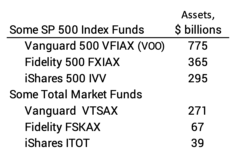
SP Global publishes indices of stock performance. They license use of the indices largely to mutual funds. Their best known and most widely used indices are the Dow Jones Index and the S&P 500 Index. Fidelity builds its US Total Stock Market fund (FSKAX) to track the S&P Total Market Index. ITOT is an ETF from iShares built to track this same index.


Twice a year S&P Global publishes a report called SPIVA®: S&P Index Vs. Active funds. They have now tracked relative performance of Index vs. Active for more than 20 years. This video is excellent on the process they follow to construct the reports. This video highlights the findings in the “Shooting …” report.


== Index funds now about 30% of the market ==


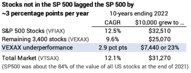
About 25% to 35% of the value of all stocks are held by Index funds. 17% of the value of the stocks in the S&P 500 are held by Index funds tracking that Index. The S&P 500 stocks were 85% of the total value of all stocks at the end of 2021. That means that ~15% of the total value of all stocks are held by S&P 500 Index funds: 17% times 85%. Other index funds hold those stocks and other stocks. For example, I hold all those 500 stocks in my US Total Stock Market Index fund; total market index funds are much smaller than S&P 500 Index funds. S&P Global estimates that all other index funds own another 10% to 20% of the value of all US shares.


== Fewer than 1 in 16 of Active funds outperform ==


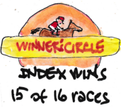
S&P Global categorizes a fund by its style – e.g., US Large Cap Growth – and compares the fund’s performance to its benchmark index over time. Active funds rarely outperform their benchmark in a year. The percentage that fail to outperform is worse with more years. Over a 20-year period about 6% Active funds outperform their benchmark index. This is true for Large Cap fund, Mid Cap funds, and Small Cap funds. Some argue the Mid Cap and Small Cap are less efficient and Active should shine. This has not been the case. If 6% outperform, that’s the same as 1 in 16 chance. The converse is the Index will beat the peer Active fund 15 of 16 times.


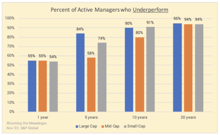
Results would be worse for an individual investor who almost certainly will hold more than one Active fund. One Active fund has a 1 in 16 chance of beating its peer index funds. A second Active fund has a 1 in 16 chance of beating its peer index fund. When you hold, say, five Active funds, you almost have no chance of the combination outperforming.


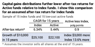
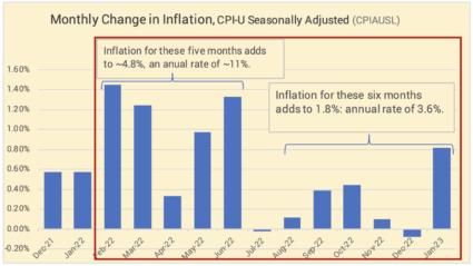
S&P Global is not comparing Active funds to Index funds, but I assume one can ignore the small expense ratio of Index funds relative to their peer benchmark. That small cost and possible tracking errors are more than offset by the cost in after-tax return from far greater capital gains distributions by Active funds that I described last week.


== They don’t manage volatility ==


Active managers do not manage portfolio volatility. They underperform roughly 95% of the time in down markets and 95% of the time in up markets.


== Almost no persistence ==


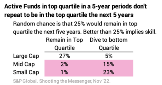
Judging skill based on history is a lousy yardstick. You’d think that a significant portion of funds that were in top 1 in 4 (top quartile) over a five-year period were more skilled. If they were skilled, a high percentage would remain in the top quartile the next five years. Random or no skill would be that 25% would repeat the next five years.


Just 27% of large cap funds stayed in the top quartile five years later, implying a tiny bit of skill. The case of mid and small cap funds, the case for no skill is pretty clear. Very few in the top quartile for five years remain in the top quartile the next five years. The worst: just 1% of small cap funds at the top for a five-year period repeated the next five years, and almost one-fourth dove to the bottom quartile. How dismal!


== Why does indexing work? ==


The report mentions a number of reasons. I focus on three here.


1. It’s a zero-sum game. Any outperformance has to come at the expense of those who underperform. The return for the aggregate of all investors before consideration of costs is the same. Index funds, before costs, clearly earn market returns – these funds own stocks in proportion to match an index; they may have small tracking errors, but these tend to be really small. The aggregate of all other investors also must earn market returns before consideration of their costs. That’s the simple math.


2. The targets for underperformance have shrunk and continue to shrink. In the 1970s, there were two targets for underperformance: individual, amateur investors and poor performing professional managers.


• Individual investors no longer can provide enough underperformance. In the late 1970s and 1980s Active fund managers made the case that they would accrue the underperformance of individual investors. Many studies showed individual investors decided what and when to buy or sell emotionally and underperformed the market. I remember a market indicator that said if individual investors were buying, it was a good time to sell, and vice versa.


I don’t find good data, but 50 years ago I’d guess that more than 50% of the market value of stocks was held by individual investors. That’s a hefty target of potential underperformance.


The landscape is completely different now. Individual investors who pick their own stocks have largely gone by the wayside as measured by the total value of stocks they hold. I estimate that only 5% of the value of stocks are held by individuals making their own investment decisions. (Their trading volume is greater than that.) Professionals dominate and hold, in effect, 95% of the value of US stocks. That 5% isn’t a big enough source of underperformance for the 95% professionals to argue that they can outperform.


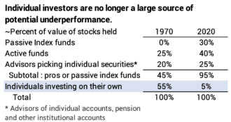
• A better and better set of professional investors makes it harder and harder for an individual professional investor to beat other professional investors. Investors in Active funds didn’t have comparative benchmarks 50 years ago. Today, investors can see how an Active fund or an advisor performs relative to peer peer indices or index funds. The pros who don’t match up find that investors flee and move capital out of their fund to invest elsewhere. They become smaller players or disappear. The remaining set of hard-working, smart professionals are the more successful ones, and they are battling other successful, hard-working and smart professionals.


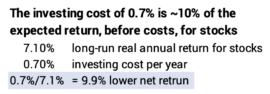
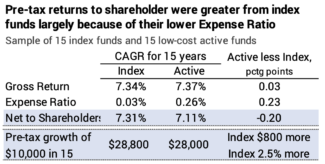
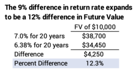
3. Active funds and advisors can’t overcome their added costs. This is the most powerful argument. Before costs the aggregate returns for Index funds and Active funds and advisors will be the same. The average expense ratio for an Active fund in 2021 was 0.68% and was 0.06% for an Index fund. (Advisor fees would be an added cost.) The aggregate of Active funds must underperform Index funds – return less to their sharehoders – by the difference in their costs, 0.62 percentage points in the year.


Assuming real stock returns of about 7.1% per year, the added cost is consuming about 9% of the growth rate (0.62%/7.1%). In 20 years, that return difference results in a greater dollar difference in the value to an investor after about 15 years. If one pays an advisor in addition to these fund expenses, lowering the net return rate, the effect would be worse.


Conclusion: S&P Global regularly issues SPIVA® reports that compare the performance of Active funds vs. their benchmark index. They now have data for 20 years. Over 20 years, you win in ~15 of 16 times with Index funds: about 94% of Active funds underperform their benchmark index. Active funds underperform about 95% of the time in up markets and in down markets. Past results are a poor guide to future results: for small cap funds, the worst example, only 1% of funds that were in the top 1 in 4 (top quartile) of funds over a five-year period repeated the next five years, and almost 25% dove to the worst 1 in 4 (bottom quartile) the next five years.


Active funds fare poorly against their benchmark index for three reasons:


1) It’s a zero-sum game; outperformance only comes from another’s underperformance.


 2) The sources of gross underperformance have dwindled. Fifty years ago, the argument was that fund managers would accrue the underperformance of individual investors who bought and sold individual securities. The landscape has changed; buy-sell decisions are dominated by professional investors, and individual investors likely hold less than 5% of the total value of stocks.


3) The cost of an active fund in 2012 was 0.68% of assets invested as compared to 0.06% for the average index fund. Active funds in aggregate have to return 0.62 percentage points less return to their investors than Index funds. That’s about 9% of the future growth rate, assuming the expected real return rate for stocks is 7.1%: 0.62/7 = 9%. That difference in return rate expands to a bigger difference in the value of an investment for holding periods greater than 15 years.

What are the costs of holding Active funds?

I liked this article, “Index Funds’ True Advantages.” The author took a sample of 15 Index Funds and 15 low-cost Active funds and compared them over 15 years. While this is a very small sample – much smaller than the universe of funds examined here – the comparison reinforced the two penalties from holding Active funds rather than Index funds. 1) The returns from Index funds are greater than Active funds by the difference in their costs: their expense ratio. 2) Active funds return less than Index funds on an after-tax basis because of early taxes paid on capital gains distributions. In the example, Investors lost about 1/2% of annual after-tax return from the two factors.


== Index funds return more because of their lower cost ==


As I mention in Chapter 6 Nest Egg Care, in a simple world of just Index funds and Active funds, the fundamental math says that, in aggregate, Index funds and Active funds earn the same market returns before costs That’s a zero-sum game.


One has to subtract investing costs – at least a fund’s expense ratio and advisor fees, if any – from market returns to get the net to an investor. The simple story is that cost for Index funds is close to 0%, but the average for active funds is about 0.7% per year; the typical Active fund will return 0.7% less to its shareholders per year. At expected returns for stocks, these investors earn ~10% less return per year than Index fund investors.


This is essentially what happened in the sample of 15 Index funds and 15 Active funds. The Active funds in the sample had VERY LOW expense ratio, about 1/3rd that of the average Active fund. Still, they could not overcome their added cost. Before expenses, the sample of Active fund returned slightly more than the index funds – 0.03% per year; that meant this sample of 15 beat other Active funds by a whisker. But expenses were 0.23% more per year. Index funds returned 0.20% more per year. On a pre-tax basis – if the funds were held in a retirement account – shareholders of Index funds would have about 3% more after 15 years.


== Capital gains distributions lower after-tax returns  ==


A mutual fund passes its taxable gains from the sales of securities onto its shareholders as a Capital Gains Distribution. If the investor holds the fund in a taxable account, he pays the tax, not the fund. This discussion does not apply to a fund in a tax deferred account; there is no adverse effect of capital gains distributions.


An Index fund basically buys and holds and RARELY has a gains distribution. An Active fund trades shares to reshape its portfolio in its attempt to outperform other Active funds. An Active fund might completely change or turnover 20% of its holdings in a year. Some Active funds issue Capital Gains Distributions annually. Fidelity Contrafund, the largest Active fund, has distributed nearly 35% of its Net Asset Value as Capital Gains Distributions over the last four years.


The fund’s shareholders receive no added cash, and the total value of their holding remains the same after the distribution. They get more shares, but the Net Asset Value per share declines. The shareholder’s cost basis increases by the amount of the distribution. When the shareholder finally sells to get cash for spending, the capital gain and tax are less. But the shareholder’s after-tax return is less than if they never had a capital gains distribution. They have lost some after-tax growth by paying taxes earlier than they otherwise would.


In this post, I calculated the amount lost in annual after-tax return is roughly 0.2% in annual return relative to an index fund. This is a good rule of thumb. The percentage varies by perhaps less than 0.1 percentage point depending on the amount and timing of distributions and the number of years you hold the fund before you sell it for your spending. (This penalty is roughly double for someone who holds on to an active fund in a taxable account to death and therefore would never incur a final capital gains tax.)


The 15/15 sample basically confirmed this rule of thumb. It found the total after-tax penalty from Active funds was 0.46% per year: that’s roughly 0.20% from lower pre-tax return from their greater costs and 0.26% from the effect of paying taxes too early on capital gains distributions.


== Maybe 15% more ==


If the average Active fund is 0.7% greater in cost and has 0.2% penalty from Capital Gains Distributions, the average Active fund in a taxable accout is earning 0.9 percentage point lower after-tax return. That difference accumulates to about 14% more from index funds in 15 years, and the difference is greater with more years.


Conclusion: Active funds have two costs to their shareholders. In aggregate the funds will return less to investors by their expense ratio, which averaged 0.7% in 2021. They also pass on capital gains distributions from their sales of securities onto shareholders; the gains are taxable without increasing the investor’s value; paying taxes earlier lowers the after-tax return by about 0.2% per year.


A recent article in Morningstar supports these two facts using the results of a small sample of 15 index funds and 15 active funds for 15 years. Active funds had 0.23% greater expense ratio and underperformed Index funds by 0.20% per year on a pre-tax basis. On an after-tax basis, which includes the effect of capital gains distributions, Active funds underperformed by 0.46% per year.


Index funds. Not Active funds. You’ll have more pre-tax in the future. You’ll have even more in a taxable account since you avoid the effect of lower return from paying taxes early from capital gains distributions. Sell your active funds in your taxable account for your spending before your index funds.

Is my choice of 30% international stocks a correct one?

I never owned international stocks before I decided on my retirement portfolio in December 2014. I chose to hold 70% US stocks and 30% international stocks for Patti and me. (Our mix is 85% stocks and 15% bonds; see Chapters 8 and 11, Nest Egg Care [NEC]). Returns for International stocks have lagged since then – by nearly six percentage points per year. They’ve lagged US stocks for much longer than that. Do I have too much allocated to International? Should I hold any international stocks? I conclude I’m sticking with my 30% allocation.


== Return rate: less than half US since 2015 ==


Our US Total Stock Market fund is FSKAX and our International Total Stock Market fund (VXUS; this is the EFT of VTIAX). Since the start of 2015, the annual, compound return rate for FSKAX has been for 9.6%. The rate for VXUS has been 3.8%. VXUS has lagged by nearly six percentage points per year.


$10,000 invested FSKAX has more than doubled; VXUS increase by 35%. If we did not invest in VXUS, we’d have +50% more than the portion nvested in VXUS.


It’s a bit worse than the comparison above. In six of eight years, FSKAX has returned more than VXUS. When I rebalance back to 70%-30%, I’ve sold FSKAX buy more VXUS in six years and done the opposite in two. Over the eight years, I’ve definitely sold more FSKAX than VXUS to rebalance. That means the difference in my cumulative returns is worse than portrayed.


== More than just the past eight ==


The data I have for MSCI-EAFE (the index for developed countries in Europe, Asia, and Far East) shows that International kept pace with US stocks 1970 to 1993 and lagged since then. Over +50 years, International has lagged in real – inlfation-adjusted – return rate by 2.5 percentage points per year. Jeremy Siegel in Stocks for the Long Run, Sixth Edition has a table (4-1) that shows EAFE lagged US by 1.5 percentage points per year 1970 through 2021; Burton Malkiel in Random Walk Down Wall Street (page 203) shows EAFE returns were better than US returns 1970-2013. I can’t explain the difference: I think my data for annual returns for International and US are accurate.


== I could make this same argument ==


It looks like 30% International was not a great choice. I could make this same argument for a number of choices. Why didn’t I just buy an S&P 500 index fund? Over the past ten years, the remaining ~3,500 stocks out of the total of about 4,000 US stocks that my Total Stock Market fund holds lagged by three percentage points per year.


Why did I include US value stocks? I could have picked a fund that only focused on growth stocks. Over the past ten years, US Value stocks have lagged Growth stocks by nearly four percentage points per year.


== We can’t predict ==


The simple answer is that we have no logical basis as to what kind of stocks will underperform or outperform in the future. We can’t make judgments based on history. Last week I checked out the sixth edition of Stocks for the Long Run by Jeremy Siegle. In the fifth edition, the one I had when I wrote Nest Egg Care, Siegle made the case that one should overweight a portfolio with small cap stocks and value stocks. That was based mining the historical data; there was nothing about the fundamentals of small cap stocks or value stocks that would suggest they would outperform, and they haven’t for the past decade. It’s been a lot longer than that for small small cap stocks. I conclude the past is a poor predictor of the future, and it’s better not to guess.


== Smoothing effect ==


I would like to be able to show that a mix of US and International stocks smoothed the most harmful sequences of returns for stocks for a retiree. Ideally, we’d see that a mix of US and International stocks is a safer portfolio than just US stocks: we would calculate to more years to depletion for a given spending rate.


The two most harmful sequences of return for US stock returns were the sequences that started in 1969 and in 2000. The 1969 sequence starts with the steepest six-year decline for stocks in history and includes the second worst two-year decline in 1973-74. The 2000 sequence starts with the second steepest three-year decline in history and includes the second steepest one-year decline in 2008.


I can’t test FIRECalc – actually my spreadsheet that duplicates FIRECalc’s result – with a mix of US and International stocks. I don’t have enough data. The index for developed international stocks (MSCI-EAFE) started in 1970. I really want the data starting in 1969, preferably earlier. I’d like to include emerging company stocks, since they are (currently) ~30% of the value of all international stocks, but that index started in 2001, and I can’t find the history of returns for those early years.


My rough attempt, using the pieces of data that I have, does not clearly show an advantage for holding international stocks for those two return sequences. International stocks weren’t headed up when US stocks cratered. They didn’t decline less when when US stocks cratered. This does not mean they won’t be valuable protection for our portfolio in the future.


== Other reasons ==


International stocks are too much of the world’s stocks to ignore. At the end of 2021 International stocks were 40% of the value of world stocks.


Some argue that you get exposure to International by solely holding US stocks. Siegle points out that US companies derived 41% of their revenues from international sales in 2021, and this percentage has been increasing. But the US imports more than it exports and we buy more than 1/3 of goods from international companies.


Fidelity  recommends 30% International and Vanguard recommends 40%. I think anything above 20% is fine. I don’t want to vary much from thier mix of the total capitalization of the world’s stocks. I’m sticking with my 30% allocation of International stocks.


Conclusion: I decided on 30% international stocks and 70% US stocks for our (Patti and me) investment portfolio when we started our retirement plan in late 2014. International stocks have underperformed US stocks over the following eight years. And for more years than that. I can’t even make the case that they were helpful in the most harmful sequences of return that we use to derive our Safe Spending Rate (SSR%. See Chapter 2, NEC.) That poor past history does not affect my thinking. There is no logic that says they should permanently underperform in the future. International stocks are about 40% of the capitalization value of all the stocks in the world. That’s too big to ignore. I’m sticking with our 30% mix of international stocks.

Oops. Is 2% inflation in sight?

Inflation data for January came out last week and a final piece came this morning. Inflation upticked in January. The picture looks different from last month: I thought we were on track to 2% annual inflation. The January result throws that view out the window: we are tracking closer to 5% inflation. This post displays January inflation and the trend.


I want to track the month-by-month trends in inflation. Increasing and high inflation is not good for bonds or stocks. Decreasing and low inflation is good for bonds and stocks. Ideally we get to the Fed’s target of 2% inflation fairly quickly.


I show several graphs that help me see the trends in inflation more easily. I show two graphs for Consumer Price Inflation (CPI) and a graph for Personal Consumption Expenditures (PCE); this latter measure is the favored by the Federal Reserve. PCE tracks inflation by the changes in consumer purchasing patterns (e.g., perhaps more beans and less beef) and not for a fixed basket of goods and services. Both measures are tracking to annual inflation in the range of 5%.


== Most widely reported ==


The most widely-reported measure of inflation is Seasonally-adjusted inflationThis measure of inflation increased by 0.8% in January. The graph shows that the January result messes up the story that we were on track to an annual 2% rate. The 0.80% increase in January is four times the average of the prior six months. The greatest component of increase was energy, +2% for the month. The rate over the last six months adds to 1.8%; that translates to an annual rate of 3.6%; the annual rate for the last seven months is lower.


== Key measures that exclude Energy and Food ==


Core inflation excludes volatile energy and food components. Over the past months, it never increased as much as Seasonally adjust inflation, and it has not fallen as much in recent months. The increase in January was +0.40% – half the increase of Seasonally-adjust inflation, above. Removing the energy component had a big effect. Inflation for the last six months has been at an annual rate of 5.3%. The rate for the last four months has been lower, but the pattern, again, does not show a trend that points to an annual 2% rate.


The Bureau of Economic analysis issued the January index for Personal Consumption Expenditures less food and energy this morning. The Federal Reserve Board favors this measure of inflation . The incease in January was 0.57%. Only June 2022 was higher over many past years. The last six months add  to an annual inflation rate of 5.0%.


== History of 12-month inflation ==


Full year inflation measured by the CPI-U shows that inflation for the last 12 months has been 6.41%. This is a slight decline from last month. The 12-month peak was 9.1% in June.


Conclusion: The Core rate of inflation – that excludes the volatile components of food and energy – was 0.40% in January; the last six months average to 5.3% annual rate. Another favored measure of inflation is Personal Consumpution Expenditures less food and energy. That measure of inflation increased 0.57% in January; only June 2022 was higher; the last six months average to an annual rate of 5.0%. Both are well above the Federal Reserve’s target of 2% inflation.

How bad were bond returns in the last two years?

I briefly mentioned in this post that the -25% real return for bonds for 2022 was the worst in history and the past two years have also been the worst in since 1926. I provide more detail and perspective in this post as to how badly bonds have performed in recent years: we can add that the three-year return ending 2022 was the worst since 1926; with the exception of 2021 and 2022, bonds have been good insurance when stocks have declined: bonds have almost always outperformed stocks when they declined. 2022 was the big exception.


== Absolute Returns ==


The periods ending in 2022 were the worst one-year, two-year, and three-year return for bonds since 1926. I’m use the data that generated the graph of real returns for stocks and bonds since 1926 that I included in the January 27 post.


== Relative returns: one year ==


We hold bonds as insurance. We use our insurance – sell it only or disproportionately – for our spending when stocks decline. When stocks decline, bonds normally outperform stocks. When we sell bonds, we deplete less of our portfolio. We give stocks more time to recover.


Bonds have really shined when stocks are at their worst. But not 2022. I show the worst 12 years for stocks and bond returns. On average, bonds have outperformed by 24 percentage points, but bonds were worse by 2 percentage points in 2022. That’s 26 percentage points off the historical average.


== Relative returns: two years ==


Stocks have declined in 24 of the 96 two-year periods since 1926. Bonds have returned more than stocks in 22 of those periods. Bonds were better than stocks by 43 percentage points in the worst ten two-year period for stocks. The two-year return for bonds for the period ending 2022 is far off the expected pattern.


== So? ==


Hey, it’s over and done. I’m still viewing bonds as insurance. I want to sell them, not stocks, when stocks have cratered: I want to buy time for stocks to recover, and I think stocks will do much better than bonds in the future. I’m doing exactly that for our spending in 2023: selling solely bonds.


I started our plan with what some would consider as a high mix of stocks: 85% vs. 15% for bonds. I’m happy that I did since bonds have not been had the insurance value than most anyone would have predicted.


Conclusion: This was a very poor year for bonds. This post gave some detail as to how poor. The year ending 2022 was the worst year for bonds since 1926; the worst two-year period; and the worst three-year period. Before 2022, bonds have always been better in return in the worst years of stock returns. Before 2022, bonds have averaged 22 percentage points than stocks for all the two-year periods when stocks returns were below 0%, but bonds were 25 percentage points worse in 2022.

How was my experience with TurboTax?

Last week I decided to test run TurboTax to file my 2022 tax returns. I was lured by Fidelity’s offer of FREE federal and state tax return. I completed all the entries into TurboTax this week, and this post recounts my experience: it took me a lot longer than I thought it would to enter the information as a first-time user; I had two glitches that TurboTax solved very promptly when I finally asked for help. I know the results from TurboTax are accurate. I am very comfortable in filing my taxes using my FREE version of TurboTax. I’m a but surprised, but I feel a sense of accomplishment in learning how to use TurboTax. I’m looking forward to spending the $700 that we’ll save on something that Patti and I will ENJOY.


== My spreadsheets calculate our taxes ==


I would not have tried TurboTax without my independent calculation of total taxes due on our federal and state returns. The spreadsheet from last week’s post gave the answer for our federal return, and it was straightforward to calculate Pennsylvania taxable income from the data from my Federal return.


== I went for totally FREE ==


I took up Fidelity’s offer of FREE use of TurboTax. When I start on TurboTax and roll through the entry screens, TurboTax periodically displays options that cost more. I decided to stick with FREE. I used the on-line version and didn’t even pay the $5 to download software to my computer. If I have to pay extra to figure out how to correctly enter the data in to TurboTax, I’ll just pay my tax preparer here, even if that’s a lot more than paying the expert through TurboTax.


I think show correct prices of added services


I shouldn’t need help. I will always include all the possible sources of income that are reported to the IRS; I can’t under-report income. Patti and I will RARELY incur expenses that exceed the standard deduction: 2022 is the rare occasion. It should be easy for me to enter all the data, especially if I enter the data when I get a tax reporting form and don’t wait to enter the data from all of them at one time as I just did.


== The flow with TurboTax ==


I had all my tax reporting forms by last Friday. This is the earliest I’ve had them in years. The flow of data entry is similar to the way I entered information on my spreadsheet: all items of income; all items of deductible expenses as the test of Schedule A vs. the standard deduction.


The input screens in TurboTax can be a bit tedious: if you want to check how you entered information for one 1099, for example, you can’t jump to that form. You have to roll through a number of screens and perhaps answer questions again that you’ve already answered, but I don’t see anyway around that bit of tedium.


== Downloads and reading of scans ==


TurboTax connects to Fidelity – and other brokers – and downloads the detail in their tax reporting forms. Fidelity provides 1099 DIV, INT, B and R forms. TurboTax connected and downloaded my mortgage interest form 1098. In some cases,  you can link TurboTax to a document you have scanned, and it tries to import the information. I did that for several forms; that wasn’t always accurate, and I had to type in the correct information on one form.


I had to type in the information for about forms: our SSA-1099s; information for a 1099-R from a defined benefit plan; a 1098 mortgage interest statement for my HELOC. I had to enter the detail from two K-1 forms, and I had to go back several times and read the supporting schedules that came with them to correctly answer a few questions; that took a while to make sure I had all those entries correct.


I had assembled all the forms and expenses that I had in my Quicken, so I knew total that I had entered the correct total for gross expenses for Schedule A. TurboTax asks for an arrangement of medical expenses different from the way I keep them. I’m sure that format is just for recordkeeping and isn’t a requirement for the IRS, but I resorted our medical expenses to enter them into TurboTax’s format.


== Results equals Spreadsheet ==


The final result is that the TurboTax’s calculation of total Federal tax was $20 less than the amount I calculated with my spreadsheet; I’m not chasing down the detail of the difference. It was in total agreement with my calculation of PA total tax.


== Two issues with my State return ==


I had two data entry problems with our PA return and spent A LOT of time trying to resolve them – hours. That’s mainly because I tried to figure them out without asking for help. I had an overpayment from my 2021 return that I wanted to apply to this return, and I just could not find the data entry screen. I must have cycled through the input screens five times trying to find out where I entered the information on credits from prior tax returns.


We contributed to several 529 plans, and PA lets you deduct the amount contributed from other taxable income: contribute $5,000 to a 529 Plan, and you get a $5,000 deduction from taxable income; at PA’s ~3% tax rate, that’s $150 less PA tax. I could not get TurboTax to give credit for the full gifts.


I posed questions to the “TurboTax community” to get an answer. I did not get an response. I was FRUSTRATED. (I did get the correct response after my session with Franciso.)


== Help arrived FAST ==


I finally decided to hit the help button, not the one that triggered $124 for an expert. The screen said someone would call in five minutes, but Francisco called in one minute. I gave him permission to see my screen. A video of him appeared in a little window. He could point to items on the screen that I should select. He led me through the screens. We found the one with a box at the bottom, “See all tax breaks”; that did it for the overpayment credit I needed to enter. We still had a hard time resolving the glitch on contributions to 529 for the proper PA deduction, but we finally figured it out with him helping for MORE THAN AN HOUR. WOW. I had to change one detail on the page where I entered the contributions.


== I am pleased. A sense of accomplishment. ==


SUCCESS! I am pleased with myself. I am happy that I understand TurboTax. I am impressed with TurboTax’s service. Francisco spent an hour with me. I was also pleased that I also got an email within two hours from a TurboTax tax expert offering to help me more. All for FREE.


I will save $700 per year. Will I enjoy the $700? YES! I will think of really nice place where we will stay for our trip to England in August. Alternatively, I can donate $700 to Doctors Without Borders. Either choice will make me happier than spending $700 on tax preparation.


== Next year should be very easy ==


Next year I can start January 1 on our 2023 returns. I’ll start on a TurboTax return, hopefully FREE again. I get our SSA-1099s the first week in January, and I can enter the data into TurboTax. I can enter all the forms as I get them and the data from my expense summaries as I complete them. I’ll likely be spending no more than 15 minutes at a time with TurboTax. The total process will be painless. I’ve sketched out all my tax reporting forms and data gathering tasks for next year here. A schedule like this may help you.


Conclusion: I decided to try TurboTax for my tax return this year. Fidelity’s offer of FREE federal and state tax return with TurboTax was too good to pass up. I paid $700 to my local tax preparer last year. I completed my tax return in TurboTax this week. Date entry took longer than I thought it would. I was  frustrated with two items, but TurboTax help was excellent: the person helping me spent an hour figuring out how to answer my questions! I was surprised at the prompt and thorough help, especially since I was a FREE customer ­– or was paid for by Fidelity. I know my federal and state tax returns are accurate with TurboTax. If I get FREE in the future, I’ll save the $700 every year in the future. I’m happy.

Should I use TurboTax for my tax return this year?

I’ve had a local tax preparation firm prepare my tax return for many years. As I think about it, I pay them A LOT relative to our investment costs. I’m going to complete my return in TurboTax this year. I’ll see how it goes. I may use my tax preparer this year to compare, but maybe I’ll be confident in the TurboTax return, meaning I won’t engage them this year.


== I think this is new this year ==


I like this offer on my login page for Fidelity. I like FREE. A lot.


== I pay A LOT ==


Last year I paid $700 to my tax prefparer. There is comfort knowing that it is done correctly, but $700 is significant relative to our total investing cost. Our total investing cost is less than 0.04% of the amount invested or less than $400 per $1 million invested.


We only own one Fidelity fund, FSKAX, and its expense ratio is 0.015%. That means I pay Fidelity $150 per $1 million invested in FSKAX. And THAT’S IT! My friend Pete only owns Fidelity funds with 0% expense ratio, so he pays Fidelity NOTHING. $700 to prepare my tax return is out of whack. I’m paying my tax preparer the same amount that I would pay Fidelity to manage more than $4 million of FSKAX!


== I’m more confident in DYI ==


I understand more about how some things are calculated on my return. I get 100 pages of detail with my copy of the tax return from my tax preparer. That’s fooled me into thinking it is more complex than it really is. For example, I now understand QBID. It’s a simple calculation of 20% of the sum of items considered business income. That results a reduction in taxable income that lowers the effective tax rate on this business income.


This week I refined my spreadsheet that estimates how much tax I will pay. You can download my spreadsheet here. Here’s a sheet with some added explanations. Download my sheet; add or subtract rows appropriate to you; input the data from your tax reporting documents; and use the right tax calculation in cell E23. It should be VERY close to your tax final tax return.


This is screenshot of spreadsheet that should calculate closely to your 2022 taxes. You’ll need to change cell E23, highlighted in pink in the screenshot, for your correct filing status and marginal tax bracket.


When I look at my spreadsheet, I count that I have to get the data from 13 tax reporting forms to give to my accountant. Five forms come from Fidelity. If I used TurboTax, the data from Fidelity downloads to my tax return. I only need to gather eight tax reporting forms. I’d guess you have fewer than eight added forms.


== This task does not change ==


I have to add the items of expense for Schedule A to see if we exceed the Standard Deduction. Because we have high property taxes and a mortgage, Patti and I get close. Because of higher Medical co-pays in 2022 – I had three (!) surgeries – we’ll actually have some Medical Expenses that are more than the threshold of 7.5% of AGI and we exceed the Standard Deduction this year. Patti and I need to get in the habit of doing this task every year. When it is just one of us, itemized expenses will always exceed the Standard Deduction.


== I think TurboTax does it all ==


As I think about it, I think TurboTax’s software has to do the same calculations as the software my tax preparer uses. I remembered a number of things that I’ve been confused about in the past, and when I google “How does TurboTax handle ….” I find an answer that says it handles it and describes how to correctly enter the number into a TurboTax data entry screen.


I have nothing to lose but time to generate a return using TurboTax . (I think I pay $125 if I need assistance on my return, but I’m thinking I won’t need this.) I can see if the return matches my spreadsheet result. If I’m really confident in it, I’ll cut my current tax preparer loose. Or I’ll have my tax preparer complete the return this year and cut them loose for the 2023 return.


Conclusion. I pay more to my tax preparer than I pay Fidelity to manage all my investments, provide 24X7 phone service, provide a local office to visit with a specific advisor who always answers any questions I may have, provide all my tax reporting forms, and provide TurboTax for FREE. I think I’m a self-reliant investor, and the amount I pay my tax preparer seems out of whack. I’m going to start on my FREE TurboTax this next week. I’m thinking the data entry will be straightforward. I may stick with my tax preparer one more year to see if the result with TurboTax matches his return. I’m hoping I can file with TurboTax and save $700 per year.

What was the inflation change in Personal Consumption Expenditures?

Today we got the second set of measures of inflation for December: the data of Personal Consumption Expenditures – the measure favored by the Federal Reserve. I show two graphs of the trends. One shows the last six months have been at an annual rate of inflation near 2% and the other shows the last six months have been at about 3.5% annual rate. These measures are very close to the changes in Consumer Price Indices that are issued earlier in the month.


The first graph is total Personal Consumption Expenditures, seasonally adjusted. Inflation for the last six months has been 1%. This is almost identical to the CPI seasonally adjusted that I showed in this post.


The second graph is total Personal Consumption Expenditures less the volatile food and energy components. Inflation for the last six month has been 1.8%.  This is a bit lower than Core Inflation that I showed in the same post.


Conclusion. Early in the month we get measures of inflation for the Consumer Price Index (CPI). Later in the month we get measures of inflation using Personal Consumption Expenditures (PCE). The Federal Reserve favors the latter measures. The data issued today for December show that inflation is running at 2% to 3% annual rate of inflation. This is far better than our peak of 9% inflation (CPI) for the 12-months ending June 2022.