All posts by Tom Canfield

How much lower will your taxes be in 2018?

I visited my accountant, Bob, this week to finalize my 2017 taxes. Yep, I was little late completing them, but he finalized the returns and filed them this week. When we sat down, he gave me some information for my tax planning for 2018. I’m clearly not a tax expert, and you should rely on your pro. But I’m passing on what I learned in this post.


I conclude we can expect roughly 15% lower Federal taxes in 2018 for the same Taxable Income as 2017. Taxable income is basically line 43 of your 1040. That’s your Adjusted Gross Income (line 38) less Itemized Deductions (line 40).


[Note: Your Taxable Income may not be calculated the exact same way in 2018 as in 2017. The change I’ve heard about most is the limit on Itemized Deductions.


Deductions for state and local income and property taxes are limited in 2018 to a total of $10,000. That has little effect on Patti and me, since state (PA) and local (Pittsburgh) taxes on retirees are low. Neither tax Social Security or retirement income: they taxed it when we earned it; they gave us no deduction for contributing to our retirement accounts. Also, we can avoid Pennsylvania taxes on any other income if we choose to. Therefore, our calculation of taxable income in 2018 will be very similar to the way we calculated it in 2017.]


I show the detail of the tax bracket changes here. I summarize the effect on Taxable Income in the table below. You can see that this works out to be about a 15% or more cut in Federal taxes for a wide range of incomes. That translates to 3% or so increase of Taxable Income that’s in our pockets – more fun money for us.


I display incomes up to perhaps ridiculously high amounts, partly to see how the percentage tax reduction affects higher incomes. [But older retirees could have high incomes, because their calculation of their Safe Spending Amount will be much higher: their Safe Spending Rate (SSR%) is much greater, and with recent market returns, all of us have a bigger investment portfolio – even after high withdrawals for spending.]


I’m also clearer on the total percentage tax I will pay. I used too low of withholding rate in 2017 for our estimated quarterly payments and for withholding when I took my withdrawal from my retirement accounts. I’ll adjust to 20% to make sure I’m covered.


Conclusions. My rough picture of the impact of new tax rates means we’ll all see about 15% or so lower Federal taxes. The increase in our take home pay is a meaningful amount. We can all have more fun. Or give more to those we care about.


We all should use 20% (or close to 20%) for quarterly estimated taxes on Social Security and other income and withholding on withdrawals from our retirement accounts.

How many Fidelity actively managed funds have outperformed their peer index fund?

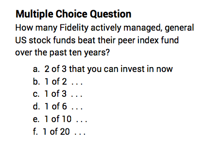
I count 46 actively managed, general stock funds at Fidelity, and I conclude that you can buy two that have outperformed their peer index fund over the last decade. Four of the 46 are closed to new investors (four of the best performing funds). So just two of 42 available to new investors outperformed. (That’s answer f.) That sorta means that when you pick and buy an actively managed fund from this batch, it’s about 95% probable – based on this history – that you will perform worse or no better than a peer index fund. Ugh.


The purpose of this post again is to say (similar to here), that since we are retired, we should NOT be betting on actively managed funds. That’s a game with the odds stacked very much against us. Hard core Nest Eggers stick with index funds and hold only two stock index funds. (See Chapter 11, Nest Egg Care.)


Don’t get me wrong. I really like Fidelity. All my Nest Egg is there. The web site and customer service is terrific. My single largest holding in my portfolio is Fidelity’s US Total Stock Market Index Fund, FSTVX (the lower cost version of FSTMX). Over this past year or so, Fidelity has slashed the Expense Ratio on FSTVX and other index funds to be as low or lower than the comparable fund at Vanguard. That’s darn low. (Full disclosure: I also hold some FTIPX as described here.)


But Fidelity made its reputation on actively managed funds, ones with managers who try to pick the winners from the losers and therefore outperform. The most famous Fidelity fund, the Magellan® fund (FMAGX), more than doubled the returns of index funds for many years and in 1990 was the best performing mutual fund in the world. Peter Lynch ran the fund, and he retired in 1990, and performance since then has been worse than mediocre. Contrafund® (FCNTX) was a rocket ship in the 1980s and 1990s in particular. Low-Priced Stock (FLPSX) was another.


But as these funds outperformed, money poured in from new investors and transformed the size of these funds and the character of what they can invest in. Contrafund now has to invest in very large companies to deploy its +$120 billion under management. It owns more than $8 billion of Facebook. Only seven of those 46 funds have more than $8 billion of total assets to invest.


The question: How do these historic funds and all Fidelity actively managed funds perform relative to their peers over the more recent past? Answer: It’s not good. It makes far more sense to me to own FSTVX and be done with it .


Here’s the data. For many years, I’ve subscribed to a monthly newsletter that gives investors information on Fidelity and its funds. I really liked it when I believed in the power of actively managed funds. Now that I’ve changed to a hard core Nest Egger (I only invest in index funds.), I still subscribe. But I view all the detail of fund performance differently now.


Each month the newsletter displays a performance table for every Fidelity fund: it shows the return in the most recent month, year-to-date, the last three months, and over the past one, three, five and ten years. It’s a lot of information in one big table. I count more than 225 actively managed funds!


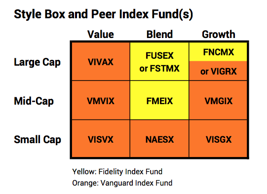
I show the 10-year results for 46 actively managed, general US stock funds in a table you can download. Most all of us have an investment horizon far longer than 10 years, and that’s what I’m interested in: which funds have demonstrated that they perform better than their peer index fund over the long haul. I certainly am not motivated to read the tea leaves in one or three-year performance trends, for example.


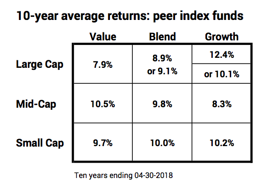
The 46 are grouped by style, and the table includes the returns for the peer index fund for each cell. Fidelity has a peer index fund(s) with a 10-year record for three of the cells in the style box, highlighted in yellow. I use the Vanguard index fund, highlighted in orange, in the other cells.

.


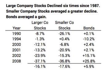
Ten-year returns for the benchmark index funds vary in the cells. Over time, those that are above and below average will change. For example, many would suggest that history tells us that Value is the place to be to do better than average, but Large Cap Value was the poorest performing over the past decade. Just because that cell was low does not tell us anything about how it will rank in the next decade. It’s anyone’s guess. (Large Cap Stocks are about 80% of the total market value of the market; the mid-cap and small cap cells represent much smaller slices of the total; the cells won’t simply average to the total market return, which is the 9.1% for FSTVX.)


Here’s the performance story: Let’s organize this by Large Cap, Mid-Cap, and Small Cap. You can download a more detailed summary table here. Print it along with the other sheet you downloaded. Set them side by side and you’ll have a shortcut understanding of the charts and text below.


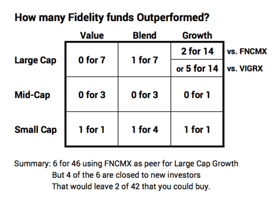
LARGE CAP: The top performing fund in the Large Cap cells has been closed to new investors for over five years. In terms of the remaining funds that you can invest in now, its just two of 27 that beat the peer index funds Fidelity identifies. Using a Vanguard index fund as the peer for one cell rather than the one Fidelity uses results in five of 27 that outperformed.


• Large Cap Growth. Fourteen Fidelity actively managed funds are in this cell of the style box – double (or more) that of any other cell. Fidelity’s peer index fund with 10 years of performance is its Nasdaq Composite Index Fund, FNCMX. With FNCMX as the peer, this cell at 12.4% is clearly the best cell over the last ten years. Two funds of 14 outperformed FNCMX: FDGRX and FOCPX. These two have a greater weight of technology stocks than any of the other actively managed funds; they are also the two most volatile funds out of all 46. FDGRX has been closed to new investors for over five years. The summary is that two of 14 performed better, but you can only invest in one as a new investor. You could consider that as one in 13. Not a terrific batting average.


One could argue that the Vanguard Growth Index (VIGRX) is a better yardstick for this cell. VIGRX is closer to the market weighted average of 30% for technology stocks vs. 49% weight in FNCMX. Using VIGRX as the peer, we find that five funds outperformed, and four of them are open to new investors. That’s 4 of 13 that you can invest in now; not good, but not nearly as bad.


• Large Cap Blend. Fidelity has one of seven funds that outperformed, FLCSX, and it’s open to new investors. (But it has trailed its peer index funds over the past one, three and five years; not shown.)


• Large Cap Value. None of the seven Fidelity funds outperformed. Zero for seven.


MID-CAP. Fidelity had no actively managed Mid-Cap funds that outperformed Growth, Blend, or Value peer index funds. That adds to zero for seven.


SMALL CAP: Small Cap Growth, Blend, and Value. Fidelity has a fund that outperformed in each cell, but each is closed to new investors. Two of those three have been closed to new investors for more than five years. So, you could call it three of six or perhaps zero for the three you could actually invest in.


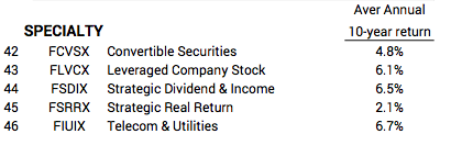
“SPECIALTY” funds did not perform close to the level of any of the index funds used in the style box. Zero for five.


[Why are the highest performing funds (with a few exceptions) closed to new investors? Answer: they’re closed to best preserve their high ranking; without those high rankings the story that some actively managed funds outperform unravels. (One can always compare a fund to the wrong peer index fund, and some do that; but that’s not playing fair.)


My thinking is that Fidelity wants those funds to shine in a ranking similar to that on the sheet you downloaded (those highlighted in green on the table). Fidelity choses to restrict the inflow of funds (at the cost of lower management fees they collect) to avoid changing the nature of the companies the fund must invest in and therefore depressing future fund returns. Even so, one of these four funds obviously had its years of dramatic outperformance more than five years ago: it’s well below its peer index funds for the one, three, and five year periods. Unless it gets on a far better trajectory, that year or years of great performance will roll beyond ten years in the past, and it will look very ordinary.]


Conclusion. I’ve been a fan of Fidelity for many years. All my nest egg is there. It has had three actively managed mutual funds that were rocket ships in the past, dramatically outperforming their peer index fund. But those past rocket ships and the others that one can really invest in now (excluding the funds closed to new investors) just look like normal actively managed funds – there’s nothing really to indicate that they will outperform and lots to indicate that the overwhelming number of them – perhaps 95% of them – will underperform. I’m sticking with the simple US Total Stock Market fund, like FSTVX.


Fidelity and Vanguard are registered trademarks of their owners.

Now that you’re retired, is Investing Cost your top monthly expense?

Oh, I hope not. If you are a Nest Egger, the answer clearly is NO. If you are not a Next Egger, you may find that that your Investing Cost is your top monthly expense. It is for a couple of friends of mine.


This drives me batty: too few people calculate their Investing Cost. Too few people realize that they control and must decide on their Investing Cost as part of their financial retirement plan. It’s the second most important decision they will make. The purpose of this post is to urge you to calculate your Investing Cost. See how it ranks in terms of your routine monthly spending. And then decide to cut it. To the bone. You’ll find a description on how to calculate your Investing Cost in Appendix F of Nest Egg Care. And you’ll find a spreadsheet that helps under the RESOURCES Tab on this web site. (Here it is directly.)


Here are two examples:


• My friend Mary spent all of February with her daughter and family in Seattle. Nice. Enjoy Now and spend more time with your family. When she got back, she mentioned at the weekly coffee klatch (We call ourselves the Council of Elders.) that she spent $1,000 to keep her dog in the kennel for the month. I said, “Yep, that’s what it’s going to cost. You put her in the #1 kennel in the whole area. You know she was well cared for and really had a good time.”


At the gathering of elders a week or two later, she mentioned again that she spent $1,000 to put her dog in a kennel for a month. She’d forgotten that she told us this before. This obviously was bugging her. I warned her that I was going to make a snide remark: “During that month, you paid $2,000 to your investment advisor and fund managers for your investment portfolio. And now it’s a month or so that you’ve been back, and you spent another $2,000. You spend that $2,000 each month. That’s more than your mortgage payment. That’s more than your property taxes. That’s more than all your utilities. It’s more than all of that combined. What gives with that?”


• Patti and I had coffee with our friends John and Jill a couple of weeks ago. Jill mentioned that she was not happy that her iPhone did not store all the photos she has – probably more than ten years worth. Patti said, “It’s $1 per month to get more storage in iCloud than you will ever need.” Jill said, ”I don’t want to pay that. It’s not nearly as convenient for me, but I can store my photos elsewhere and save the $1 per month.”


I said nothing, but over the next week or so that $1 per month rattled in my head. I thought about it every day. I’d guess that John and Jill spend $1,000 per month in Investing Cost to their financial advisor + fund managers for their Nest Egg. It has to be their top routine monthly expense. And that $1,000 is mostly just a dead expense: it’s very improbable that better than average performance by fund managers can cut the net effect of those costs. (That would also be easy to check.) How in the world can $1 per month (that gives some convenience and therefore is of value) be of concern when $1,000 per month (at near-zero value) isn’t of concern?


On the same basis, I’d estimate that Patti and I spend $60 per month.(That $60 per month is at the very bottom of our routine expenses.) We spend about 1/15th and $940 less per month than John and Jill. That means we spend $10,000 less per year in Investing Cost. That’s A LOT more Enjoyment for us Now. That’s A LOT more that we can give now to heirs. If we (or our heirs) just leave it for the future, that $10,000 per year will most likely compound to $100,000 in today’s purchasing power in about eight years. More over more years.


Why don’t folks know their Investing Costs? Well, first, the financial industry doesn’t make it easy to calculate your total costs, and, second, they are obscured in the way you pay them. Those financial guys are really smart in this regard.


It’s not easy to understand your costs. A big part of the total you are spending is the Expense Ratio (basically administrative, marketing and fund manager fees) of each mutual fund or ETF that you own. You’ll never see these stated on your monthly or annual statements. They’re a cost that’s subtracted from the gross return earned by a mutual fund,* so you don’t see them directly. You have to go to an independent source like Morningstar to find the Expense Ratio of each mutual fund or ETF that you own, do a little multiplication to get your dollar cost for each, and then add them up. (See spreadsheet.)


The other expense you may incur, that of a financial advisor, is obscured among the list of transactions of dividends, interest, and gains distributions received in a monthly statement. That’s the detail that almost no one ever looks at. Almost all folks I talk to who employ a financial advisor cannot tell me what they spend.


The method of collecting fees from you obscures them. The financial guys know it’s far better to subtract expenses and fees from your Nest Egg so that you really don’t explicitly see them. The last thing they would want to do is to actually send a bill for those costs. They know: do not do business like the kennel (or any other routine service you receive). NEVER send a bill.


Mary picked up her dog. She was handed a bill for $1,000. She presented her credit card and authorized the $1,000 payment. Later she saw the $1,000 on her monthly statement, and then she thought about it one more time as she wrote the check to pay her total credit card bill. Jill would have seen that $1/month on her credit card statement perhaps for as long as she owned her iPhone. But neither clearly sees one dime of expense or writes a check for the over $1,000/month they pay in Investing Cost: out of sight; out of mind.


Don’t be like most folks. Do not ignore Investing Cost. Calculate it. Figure out how it ranks among your routine monthly expenditures. Also do the experiment on the performance of your stocks and bonds that I think will convince you that you gain nothing from high Investing Cost.


Conclusion. You decide on the Investing Cost you will incur when you are retired. That’s the second most important decision for your financial retirement plan. Most folks overlook this cost, and it may be their largest routine monthly expenditure. Nest Eggers keep this cost to a small fraction of one percentage point. We simply keep 98% of what the market gives all investors. Investing Cost is far down our list of our routine expenses. Calculate your Investing Cost now. Lower it to get close to the cost of hardcore Nest Eggers.


* More precisely these are expenses deducted from a fund’s average net assets, but it’s fair to think of them as a reduction in the returns a fund could give you.


Apple, iPhone, and iCloud are registered trademarks of Apple, Inc.

How do your returns compare to those of bland index funds?

I’m a bit surprised that so few folks I know compare the performance of their investments to a very simple portfolio of index funds – what the market basically gives all investors. We Nest Eggers own just a few index funds, and we know we simply and consistently keep 98% of the aggregate return from the market. We invest in funds or ETFs like the ones I recommend in Nest Egg Care (Chapter 11 and Endnotes, Part 4) or from here or here. We have a winning strategy.


I find that many folks just don’t pull the trigger and switch to index funds. Inertia and inaction rule. To drive home the point on the advantage of index funds, take the time to compare your performance to the returns that the market gives all investors. One finds the returns for the S&P 500®, a common benchmark, but not returns for the Total Stock Market (US or International) or for the Total Bond Market. You have to work a bit to find those.


This post discusses two ways to compare:


1. Compare your return for 2017 with the return earned by Nest Eggers; we invest solely in total market index funds and basically earned what the market gave all investors. You can do this most simply by using an IRA account(s) where you did not add or withdraw in the year. That means you can clearly understand your return rate for 2017. It’s simply the percentage change in value during the year. (Fidelity®, my brokerage house, also reports 12-month returns for each account – correctly accounting for the effect of additions or withdrawals. It’s a more accurate comparison, though, to use accounts that had no additions or withdrawals.)


You should know or you can find your mix of stocks and bonds on January 1, 2017. You use that mix to find your personal benchmark: what you would have earned had you held index funds. You can see I reported total market returns of +23.0% for stocks and +3.6% for bonds here. You’d do the math to get your benchmark: for example, if your choice of mix was 75% stocks and 25% bonds, your personal benchmark for the year was +19.1%. You’d then compare: is this what you earned with your actively managed funds/stock and bond picks?


 2. Start anew and run an experiment for a year directly in your own account(s). I like this choice. I think the results will be more convincing to you. That’s what my friend George did. His one-year experiment just ended March 31.


Last March George transferred a portion of his IRA funds to an account with an investment advisor. The advisor chose a mix of stock and bonds and weights for US and International for each. The advisor selected actively managed funds attempting to beat the market and was fully invested April 1.


George similarly transferred IRA funds to a new account at Schwab®. George invested in four index funds/ETFs to match the advisor’s mix and weights. (This restructuring to new holdings was simple for both the advisor and for George, since there are no tax consequences for sales in an IRA account.)


George’s four index funds/ETFs in turn own 17,000 securities. That’s a lot of diversification. He probably owns a greater number of securities than held by the greater number of actively managed funds picked by his financial advisor.


George did not add or withdraw from either account during the year. That made it simple to track account values quarterly and calculate the cumulative returns from the April 1 start.


You can see in this table that George (index funds) killed it! George beat the advisor by 4.5 percentage points. George earned 15.4% for the 12 months; the advisor earned 10.9%. That 15.4% is more than 40% better than the 10.9%. You can also see that George outperformed every quarter. (You can use  this spreadsheet for your experiment.)


How important is that 4.5% underperformance? The advisor’s account underperformed by $4,500 for every $100,000 George had with him. If George started with $300,000 there, that would be $13,500 underperformance. And there is no logic that suggests he can recoup that. That’s very painful in my mind. I think of that as a two or maybe three-week trip to Europe for George and his wife. UGH.


Why did this happen? The difference in returns has to be a combination of three factors:


1. The active fund managers did not match the market before any consideration of their greater fund management fees. (As I describe in Nest Egg Care, before costs it’s a zero sum game for active funds managers. They’re just fighting among themselves: in aggregate all actively managed funds must match the market as a whole. For this 12-month period, the advisor’s active fund managers came up on the short end of the game of which active fund managers would pick winning stocks and which ones would have losers.)


2. The fund management fees for actively managed funds are greater than for index funds; one percentage point more than index funds would not be unusual.


3. The fee for the advisor is a reduction of what George gets to keep. I’m guessing that George incurred more than a one-percentage point fee for his advisor for the year.


Conclusion. You’re retired. Don’t try to beat the market. Just accept that you should predictably earn 98% of what the market gives all investors. It’s a winning strategy, and it’s a core ethic of Nest Eggers.


If you have not made the switch to index funds, you may want to see the evidence more clearly. Compare the result from your choice of actively managed funds or stocks to that of simple, bland index funds, similar to those owned by Nest Eggers. You may not see as dramatic a difference in 12 months that George saw, but my guess is that you will see a difference. While many actively managed funds do beat index funds in a year, most do not, and in aggregate they average more than one percentage point less. My guess is that your mix of actively managed funds will succumb to the rule of large numbers: you will converge on the expected results that actively managed funds will underperform index funds.

Why Does Life Speed Up As You Get Older?

Of course time does not speed up as we get older, but the illusion in our brain is that it indeed speeds up. Years can fly by. Once we are past 40 or 50, a year seems to last a fraction it did when we were 15 or 20. Why? And can we change that illusion?


I checked out this this book in our library, Why Life Speeds Up As You Get Older: How Memory Shapes Our Past. Chapter 14 discussed the question. The answer: it’s an illusion in our brain that’s determined by the frequency and intensity of memorable events.


A French psychologist, Jean-Marie Guyau, in 1885 gave us some of the first insights as to the illusion of why time seems to speed up. The events of our youth were new and therefore intense and frequent. Each of year between the age of 15 and 25 was packed with memorable first-time events. We’ve revisited these events enough for them to become memory markers. A period of time that has more memory markers will expand when seen in retrospect and seems to have lasted longer than an equally long period with few memory markers. Old age, by contrast, is relatively unchanging; the weeks resemble one another; the months resemble one another; the monotony of life drags on. In our imagination, time is abridged. “What did I do with this year? How is it possible for the 365 days to have passed and seem no more than a couple of months?”


Here is Guyau’s recommendation: “If you want to lengthen the perspective of time, then fill it, if you have the chance, with a thousand new things. Abandon routine. Go on an exciting journey; rejuvenate yourself by breathing new life into the world around you. When you look back you will notice that the incidents along the way and the distance you have travelled have heaped up in your imagination; all these fragments of the visible world will form up in a long row, and that, as people say so fittingly, present you with a long stretch of time.”


A second observation is that desire or anticipation of an event makes the time to the event feel disproportionately long and time seems to lag. The conclusion: plan new events far into the future; as you anticipate them, time will seem to pass more slowly.


I’ve asked a number of retirees, “What’s the exciting trip or event you have planned for 2018?” I was really encouraged by the list of upcoming travel for the +70 year olds that I meet for coffee a couple of times a week. This list below is the travel plans for a total of roughly ten travelers (couples and singles). All of us shop at Costco, Aldi’s, and Trader Joe’s meaning that none of us are swimming in money, but all these folks have prioritized travel as a way to abandon the routine and to make 2018 a memorable year. All are living their retirement to the hilt. I like that attitude.


This is the chronological order starting January 1, 2018 for about ten travelers. I list the travel outside of the US. I’d include quite a few more visits to family and friends in the US, including a month long VRBO to visit family in Seattle.


2018

Back to back tours that included Vietnam, Cambodia, and Thailand

Costa Rica

Hiking tour on the Isle of Wight, England

Hiking in the Lake District, England

Canada tour: train from Montreal to Vancouver.

Tour: boat travel in Portugal

Tour Japan with son and his family

Photography tour to Norway

Africa: Uganda and gorillas; Egypt and the Nile


Early 2019

Canada to see the Northern Lights

Two of the guys: fly fishing in Argentina


And also for Patti and me: our new, adopted dog, Dudley (shown with his first Nylabone®), is creating lots of first time memory markers! I’d forgotten the struggle to settle in with an adopted dog that’s had no prior regulation of behavior.


Conclusion: I wrote Nest Egg Care to help you maximize to joys of retirement. Live your retirement to the hilt. Spend (and gift) all your Safe Spending Amount every year. Many folks I know are living 2018 to the hilt, abandoning the routine with travel planned to family and to new places. They’re creating wonderful, varied memory markers. Do the same. That’s the way to Enjoy More.

Is Equal Weighting a means to easily beat the market?

Well, this article says it’s a slam-dunk. Investment Strategies To Improve on Passive US Indexing states Equal Weighting is the way to go for retirees. The purpose of this post is to discuss the article and give you evidence from performance of several Equal Weight ETFs you could choose. Here’s my conclusion: I don’t see the evidence says that Equal Weight, a method to overweight smaller company stocks, pays off. That’s similar to what I stated here.


(I do agree with the article about ”Going International” [see Chapter 11, Nest Egg Care]. I’ll discuss the other Strategy mentioned in the article, Value and Momentum Weighting in another post, but I think my conclusion on that will be the same as for Equal Weight: you can Tilt ‘til You Wilt, as I state in Nest Egg Care, but I don’t see that its really worth the added cost, effort and, perhaps, the added complexity to your portfolio.)


What is Equal Weighting vs. Market Capitalization Value Weighting?  You hold the same percentage of each stock with Equal Weight. Weight by Capitalization Value holds stocks in proportion to their total market capitalization value (total number of shares times price) relative to the total value of all stocks in the portfolio. I’ll assume you understand the difference in the two methods from the image at the top of this post. You can read a longer description at the bottom of this post.*


The article cites a 2012 academic study that states that over four decades Equal Weighting a portfolio improves returns by “1% to 2%” (that’s really meant to say one to two percentage points per year) over the conventional weighting by Capitalization Value. The author of the article recommends a low cost ETF, iShares MSCI USA Equal Weighted ETF (ticker: EUSA) with an expense ratio of .15% versus .04% for a typical Capitalization Weighted EFT. So, for about .1% in added cost, you get one to two percentage points greater annual return. It’s an obvious choice. If it really works.


So, I read the 37 page study. Wow, was that a lot of detail. If you read it, you’ll come across terms like these: nonparametric monotonicity relation test; kurtosis; power utility investor; log-utility investor; negative skewness; reversal factor; idiosyncratic volatility; systematic return, certainty equivalent return; Sortino Ratio; Treynor Ratio.


Results are based on the average results of many 1000s of portfolios each comprised of a sample of stocks (e.g., 100) from the S&P 500® (largest 500 companies in market capitalization value) and similar samples from other indices (e.g., Small Cap S&P 600 index). The process rebalanced each Equal Weighted portfolio monthly. Monthly rebalancing was essential; advantages of Equal Weight dissipated with less frequent rebalancing. If the rebalancing was once per year, for example, Equal Weighting resulted in NO improved performance. But following the monthly rebalancing process in the article, Equal Weight outperformed Capitalization Value weight by 2.4 percentage points per year and outperformed in 2/3 of years.


That’s a Big Deal, as you can see below. I’ve show this as 2.3 percentage points better after assuming a .1% greater expense ratio (basically management fee). That’s beating the market by about 35% per year (2.3 points better/6.4 percentage points for the long run real return rate). You’d accumulate about 25% more in a decade and 50% more in 20 years. Oh, man, you can see that it’s a lot of moola. We Nest Eggers gotta invest this way if this is true.


How has this worked in practice? That increase in performance is so significant, I’d think we should easily see the benefit over a fairly short history. We can simply compare the results of low cost ETFs that emply Equal Weight to see how it has worked. You can see here the results I assemble from compounded returns over the last decade. My conclusion: Not Great.


I was expecting to see better results almost every year and at least a point or two better every year. But over one, three and five years, Equal Weight does not match Capitalization Value Weight: Equal Weight trails by perhaps one percentage point per year for results over the past five years. (Note that RSP did outperform in 2009 and 2010, so over 10 years, it is better by about one percentage point.)


What’s going on here? Why isn’t Equal Weight consistently delivering better returns that approach 2.4 percentage points per year? I dunno. It seems we find a result in this study and then search like hell to find a reason why it is true. The authors did not start with a logical hypothesis as to why Equal Weight should be true and then work to see if the evidence supports that hypothesis. That’s how I view the scientific approach, the correct way to get to a solid conclusion.


I don’t see a logical reason to think that smaller capitalization stocks will outperform and by that much. I don’t see a logical reason why monthly variability of returns combined with frequent rebalancing would lead an equal weight portfolio to outperform and by that much. (The logical extension from the conclusions from the study would be to rebalance an Equal Weight portfolio weekly or even daily for even greater advantage.)


But it’s a good story, and we all like stories that tell us we can beat the market. That’s the powerful lure. The story may appeal to you. It does not for me. It looks to me that Equal Weight results in lower performance and more unpredictable returns than what the market gives all investors in aggregate –  measured by total increase in the market capitalization value of all stocks. We Nest Eggers hate doing something that results in greater uncertainty and less predictability. We just want to consistently keep 98% of what the market in aggregate gives all investors.


Conclusion: Some recommend retirees invest in an ETF or fund that employs Equal Weighting as a way to significantly boost returns. It’s a way to overweight smaller company stocks. A detailed academic study supports this strategy. The results from low cost ETFs that implement Equal Weight do not: returns from Equal Weight for the last five years lag conventional, low cost index funds that use Capitalization Weight by perhaps one percentage point per year. I conclude that it’s best to just stick with the predicable result of keeping what 98% of the market gives all investors (Capitalization Weighted).


*Equal Weighting means you own a fund or ETF that holds an equal percentage of each company in its portfolio. If you owned a fund that equal weighted the all the holdings of the S&P 500, your value for each holding would be 1/500th of the total. You’d own 1/500th of Apple (.2%), 1/500th of Microsoft (.2%), all the way down to Range Resources (.2%).


The S&P 500® index is by Capitalization Value. A daily (monthly, yearly) change in the value of the S&P 500 is the change in the total market capitalization value of all 500 stocks (including the effect of dividends). That means the percentage change in the value of Apple (about 3.9% of the total value of all 500 stocks) is weighted more than 500 times than the percentage change in value of Range Resources, which has a market capitalization value that is .013% of the total of all 500.


Therefore, Equal Weighting is another way of overweighting smaller company stocks. Relative to Capitalization Value weighting, Equal weighting would slash our holding of Apple by a factor of about 20 and boost our holding of Range Resources by a factor of 15.


You have more money now than you did three years ago. What’s that mean?

I’ve asked that question to a number of retired folks. I was a bit surprised with the answers. Most retirees had not given a thought as to what that means other than the obvious: the market has been good to them. Maybe too good in their view: “What goes up comes down.” That’s a lot of cumulative up in the last three years – US stocks are up +33%! (And up more than 115% over six.) How would you answer that question? If you have a financial advisor, what is he or she telling you? Nothing, I bet.


All retirees should give a very similar answer to that question. My friend Karl instantly gave me what I think is close to the right answer, “I’ve not been spending enough.” (Karl told me that he and his wife years ago decided on the amount that should go to his three children and they gifted [directly or perhaps in a Trust] to them. So, what Karl has now is for his spending and for his favorite charities.)


I would answer that question slightly differently, because I know Patti and I have been spending enough. We know our annual Safe Spending Amount (SSA): we follow the CORE. We’ve paid ourselves our annual SSA. We know spending more than that amount borders on unsafe. And spending less than that amount makes little sense to us. We’ve spent it (or gifted it) ALL each year. Nothing was left at the end of a year to throw back into the pot. Therefore, we didn’t spend (and gift) too little.


The correct answer for us is, “We’re paying ourselves such that we shouldn’t really be accumulating more, but we do have more. That means we definitely have more than needed for our current spending. We should spend (and/or gift) more in the future. Let’s start on that right now.”


That conclusion comes from two facts, also stated here:


1) As we age, we need less portfolio value to support a given level of spending: our money doesn’t need to last as many years. When I am 80, Patti and I will need 35% less portfolio value for the same real spending level than when I was 70.


2. When our portfolio value increases to more than it was in the past (after adjusting for inflation), it’s obvious that we have accumulated More-Than-Enough for our current spending. Our withdrawal rate at the end of 2016 was less than 5% for our 2017 spending. But with the high stock returns in 2017 (+20%) we obviously had more at the end of 2017 than before that withdrawal.


Combining effect # 1 and #2, Patti and I calculated, base on our one-year returns on November 30, that we had accumulated a fairly large mountain of More-Than-Enough. You also accumulated More-Than-Enough, but unless you did the calculation you don’t know how much More-Than-Enough.


We’re now paying ourselves about 15% more in 2018 than we did in 2017. What are the potential actions running through our minds now?


Spending:


What’s going to be more fun for us? What added or better trips (better travel, better lodging, longer stay) might we want to take? We have a safari to Africa on our punchlist. Should we do that in 2018 or 2019? Might we take a trip somewhere south soon where it’s warmer than Pittsburgh?


Giving:


How much should we give to our heirs/family now and in what form? We like gifts to 529 plans for a number of reasons. We like gifts to their IRAs – we’d like all family members to have an IRA that they contribute to, and maybe our gift can be an incentive for them to contribute more. Both these gifts will improve their lives down the road. Maybe Big Time.


Do we have siblings or others who could live a much happier life or have a life experience that they’ve been wanting to do? Might we help pay for a dream vacation? Needed home improvements?


We have a favorite four charities. Should we step up our giving to a higher level?


Conclusion. Retirees’ portfolio value, adjusted of inflation, has increased over at least the last three years if they are spending and investing at anything close to the plan they’d develop in Nest Egg Care. That means they have More-Than-Enough for their current level of spending. They can spend at a much greater level and/or they can give much more now and appreciate now the impact of their giving.


Should you overweight to own more small company stocks?

No, you should not overweight your portfolio with Smaller Company Stocks. Just maintain a proper, healthy weight. In Nest Egg Care, I recommend that you own smaller company stocks in proportion to their contribution to the total stock market. That means I like a capitalization-weighted Total Market Stock Fund, one that holds virtually all stocks (e.g., all 3,700 US stocks). That’s going to be about 80% Larger Company Stocks and 20% Smaller Company Stocks. I think holding all stocks simply ensures that you have the broadest representation of all the companies that make up our economy.


A popular and often recommended overweight is to hold more Smaller Company Stocks than their value as a proportion of the total value of all stocks (to hold more than the 20%). One portfolio specifically for retirees that I saw recently recommends about double overweight of Smaller Company Stocks.* Ouch. That really doesn’t make sense to me. This post discusses the reasons why I don’t think you should overweight Smaller Company Stocks.


1. Over the period 1926 to the present, smaller company stocks have outperformed larger company stocks. But this is not true for the last 30 or so years.


I get return data on stocks from 1926 in a book my local library keeps on reserve**: 1) annual returns for the largest 500 companies (S&P 500) – that’s about 80% of the total market capitalization value for all US stocks*** – and 2) annual returns for Smaller Company Stocks – the smallest 20% of the market. (Obviously, the two together represent the Total Market.)


Since 1926 S&P 500 stocks have returned about 7.1% real return per year. Smaller companies have returned about 9.6%. The rate difference compounds to a BIG dollar difference over 92 years. But that difference in return rates is basically accounted for by an explosive period of returns for Smaller Company Stocks from 1975 to 1984. (This is after the steep declines for both Large and Small in 1973 and 1974).


Starting in 1975 Smaller Company Stocks returned an average of 26% real return per year for nine years, compounding to 7.8 times their value at the start of 1975. That’s a steep rise: at an average rate of 7%, it would normally take stocks about 30 years to compound 7.8 times. (Over that period starting in 1975, S&P 500 stocks compounded at 7.5% per year over nine years – not far off their long run average – to 1.9 times.)


Jeremy Siegel in Stocks for the Long Run (Chapter 12) points out that excluding that period starting in 1975, Larger Company Stocks and Smaller Company Stocks returned about the same since 1926.


Over the past 30 years, there is no difference in returns between Larger and Smaller Company Stocks. You can see the cumulative change for each over the last 30 years in this graph: both have averaged 7.4% real return Not a bit of difference.


2. Smaller company stocks have greater BAD VARIABILITY than larger company stocks. When we’re retired our big concern is, “Don’t run out of money!” We don’t like BAD VARIABILITY. It’s really BAD VARIABLITY from stocks that is going to get us.


• I repeat data from a table in this post. In all cases shown here, BAD VARIABILITY of Smaller Company Stocks is worse than for Larger Company Stocks.


• Real returns for Large Company Stocks have been below 0% in 27 out of the 92 years since 1926. Smaller company stocks were better in 14 of these years, but were worse in 13. Compare: bonds (clearly a different asset class) were better in 25 years and worse in just two.


• In the last 30 years Larger Company stocks declined six times. The table shows the returns from Smaller Company Stocks and from bonds in those years. On average Smaller Company Stocks declined more. We Nest Eggers like bonds for their insurance value: their returns averaged 22 percentage points better than Larger Company stocks (+5.9 compared to -16.1%).


Conclusion. You can find recommendations to overweight your portfolio to hold more Smaller Company Stocks, even from some recommended portfolios for retirees. Those arguments hinge on greater returns for smaller company stocks in periods more than 30 years ago and particularly a nine year period from 1975 to 1984. Since then, returns for Large and Smaller Company stocks  have basically been the same.


* See article here. You have to  look at the details of the mix of stocks and bonds displayed on the bar graph. The stock portion is 64% Large Company Stocks and the 36% Smaller Company Stocks. This is roughly double overweight of Smaller Company Stocks.


Also, this recommended portfolio 55% stocks and 45% bonds. When you follow the steps in Nest Egg Care, you would NOT conclude that you want 55% stocks and 45% bonds as your retirement portfolio.


** Stocks, Bonds, Bills, and Inflation (SBBI) Yearbook. Ibbotson and Grabowski. I site two other sources for return data in this post, but those two don’t display both Large Company and Smaller Company stock returns.


*** 78.6% as of 2012. Stocks for the Long Run, Chapter 7. Jeremy Siegel. The percent of the total will change with the difference in returns of Larger Company vs. Smaller company stocks. Over the last five years (since 2012) Larger Company Stocks have averaged 8.6% per year, and Smaller Company Stocks have averaged 7.2% per year.

We Nest Eggers keep 98% of what the market gives all investors.

It’s a key part of the Nest Egger WayNest Eggers invest to be at least in the top seven percent of all investors. We invest to simply and efficiently keep 98% of what the market in aggregate gives all investors. We don’t try to earn more than what the market gives (gross returns). We accept we will earn less: just a tad less. Yet we will be in the top ranks of all investors over time. This post answers the question, “Why will keeping a tad less than market returns place us in the top ranks of investors?”


What do we Nest Eggers do? We simply and efficiently keep our investing cost (the net cost we incur relative to market returns) predictably to no greater than 0.10% of our portfolio. That’s likely a different view of how to invest than most of us had when we were in our Save and Invest phase, but we now know Spend and Invest is different. The hard core among us now love predictability and ONLY invest in broad-based, index funds: we purge our actively managed funds. We also don’t pay high advisor fees: the funds we own and our annual process steps to maintain the health of our portfolio are so simple that we don’t have to incur those costs.


This tactic of keeping investing costs rock-bottom low is less than flashy, but it works. We’re being really simple and yet, in aggregate, we’re consistently beating 1,000s of professional fund managers. They’re paid a ton (through the expense ratio that investors pay) to pick winners, avoid losers, buy at the right time, and sell at the right time; you’d think it would be easy to beat the market and more than overcome the costs that investors are paying them to do so. Yet, each year Nest Eggers beat 60% of the pros; we’re in about the top 40% of all funds that investors own. A minority of the pros in any year will do better than we do (all at the expense of those pros that do worse): most of those that do better will be just a little bit better, but some will be much better; those few get boasting rights as how smart they were that year.


But we just repeat our performance of being in the top 40% year after year. As the years pass, our rank just keeps rising. The pros are just too erratic in their performance. Most all of the ones with boasting rights in one year fall deadly silent in other years. Over time, we leave all but a handful in the dust. When we look back at our results over the years we then own the boasting rights.


Here’s the killer evidence. I cite three studies in Nest Egg Care, but this is a fourth study. It’s a thorough 30-page report. Here’s my short summary.


• Over a one-year period, 60% of funds headed by an active mutual fund manager failed to outperform what the market gave all investors. (This report is using market returns as the benchmark for comparison. Our investing cost is so low that I assume this comparison applies to the net we keep.) This means we Nest Eggers outperform 60% of the time. (You can see in the study that in some prior one-year periods Nest Eggers outperformed 80%.)


• Over a five-year period, 85% of active fund managers failed to outperform. They are inconsistent. The ones that did well in a year or two don’t repeat. We Nest Eggers outperform 85% of the time. (We’re in the top 15%. I find it pretty amazing that we outperform that many in that short period of time.)


• Over a 15-year period, about 93% of active fund managers failed to outperform. We Nest Eggers outperform 93% of the time. We’re in the top 7%.


We’re actually better than this. This is comparing results of funds not investors. Investors who hold more than one actively managed fund (And they all own many more than just two or three.) won’t hit that 93% mark. They’ll be lower since not all the funds they own will be in the top 7%; the average of the funds they own will be less. And these data exclude the effect of added investment advisor fees that many retirees pay. That would make Nest Eggers’ rank even better.


=============================


It’s not easy for our brains to absorb and accept this evidence. It’s just not how we think about ourselves: we work hard; we are smart; we are above average. That’s why we have a nest egg to worry about. Investing to accept a shade less than what the market gives all investors (gross market returns) just doesn’t seem to fit who we are. Our brains and our ego tell us we can do better than that. (And, boy, does the financial industry live off this mental misfit with the facts.)


My friend, Dave, is an example, of someone who has not changed from the way he has invested for years. Dave invests in actively managed funds as he has his whole life; he also pays an advisor to look for openings and ways to beat the market. (I think Dave actually has some disdain for index funds.) The cold, hard evidence says that this approach is not the winning game tactic for his stage of life. I’ve not had success in convincing him to change what I now consider to be a very bad habit.


Why will Dave underperform? Dave and others like him are going to spend unnecessarily and on average only keep about 85% of the returns the market will give. Why? Because the greater fees of actively managed funds lower what the typical investor keeps by about one percentage point (See Chapter 6, Nest Egg Care for detail.) Since Dave employs an advisor at about another one percentage point, he most likely will keep only about 70% of what the market will give all investors over time. Those differences could add up to roughly $500,000 over the years. (See Chapter 6.) That’s a heck of a lot less for Dave to ENJOY or to have for his heirs.


Worse (and something few ever discuss), Dave’s changed the shape of his hockey stick – the curve of the year-by-year probability of depleting a portfolio. He’s shortened the shaft of a stick that he thinks is safe: it’s fewer years than he thinks to the first chance of depleting. The blade angle (the rising probability of depleting thereafter) starts its rise earlier. That earlier rise translates to a probability of depleting that’s maybe six times in out years than it would be if his investing costs were like mine. (See Chapter 6 again.)


Conclusion: We Nest Eggers are hard working, smart, and above average. We’re logical, efficient and effective. We are able to accept the evidence that tells us to invest to predictably keep 98% of what the market (stock and bond returns) gives all investors: this decision is central as to who we are. When we keep 98%, we will be in the very top ranks of investors over time.


I shudder at the institutional default of 60% stocks and 40% bonds.

A prior post discussed the insurance value of bonds. When stocks tank, bond returns are always better and almost always MUCH BETTER – as much as 63 percentage points better in a year. Since we retirees are selling securities each year for our spending, we want the insurance value of bonds when stocks tank: we sell (mostly or solely) bonds when stocks tank. But how much of this kind of insurance do we want to buy?


You make your decision on your complete insurance package – and bonds are just one part – in Part 2, Nest Egg Care. After reading that I think you’ll agree: an insurance package that includes 40% bonds simply means you are over-insured.


I stated in the last post that stocks had to be the dominant portion of our portfolio. Stocks are the fuel that will provide More-For-Us (and our heirs) when we don’t ride a HORRIBLE sequence of returns, and the probability of a truly HORRIBLE sequence is low. Bonds don’t nearly have the same fuel value. This post elaborates on the much greater fuel value of stocks versus bonds.


My conclusion: I shudder every time I think of someone in their 30s or 40s saving for retirement 30 to 40 years down the road and accepting a mix of 60% stocks and 40% bonds – often called the institutional default. My friend Larry went to a financial advisor decades ago, and that’s how he’s been invested. It looks okay to him, since his portfolio obviously has grown. But his total would be MUCH MORE had he had a greater mix of stocks.


My conclusion: I also shudder at recommendations to retirees for 60% stocks; one I read recently is for 55% stocks.*** After you’ve finished Parts 1, 2 and 3 in Nest Egg Care, that low mix of stocks should not make ANY sense to you. The plan you develop will be  safer with a greater mix of stocks and provide MUCH More-For-You (and your heirs) when you ride other than a HORRIBLE sequence of returns.


Stocks are are much better fuel than bonds. Stocks compound to much greater value that bonds. In Nest Egg Care, I state that stocks average roughly 6.4% real return per year while bonds average 2.6%. That was from data through 2012.* When I get source data** and update through 2017, I get slightly different rates: greater for stocks; less for bonds. But the conclusion is the same: the long-term, average annual return rate for stocks is about 2.5 to 3 times that for bonds.


That difference in return rates compounds to a big dollar difference over time.  You see the dramatic effect of compounding of returns for stocks and bonds in this graph below. It uses a linear scale for the Y-axis. (Full display that you can print here.) Stocks look like they are shooting for the stars. Bonds look like they fell asleep. Yes, the numbers are correct: stocks have compounded 544 times since 1926 and bonds 16. Stocks have compounded about 33 times more than bonds.


You can see the trends for stocks and bonds more clearly on a semi-log plot. With this plot, each increment on the Y-axis is the same percentage change. The green trend line (stocks) is 7.1% annual rate of increase since 1926, and the orange trend line (bonds) is 2.3% increase.


1. As stated in the last post, stocks have had three periods of essentially zero percent cumulative growth: I can draw horizontal lines connecting points along the red line for the 13-year period starting in 1930; the 17-year period starting in 1966; and the 12-year period starting in 2000.


2. For stocks, periods of high return rates have been from starting points on the red line that are below the green trend line. For example, a line from any point from about 1974 to 1985 to the present will be steeper than the green 7.1% trend line. That means the return rate is greater than 7.1% for those lines. (That’s what made my returns from my IRA investments in 1981 and 1982 so terrific.)


3. Bonds had a 44-year period of essentially zero cumulative growth: from 1941 to 1985. (I can draw a horizontal line connecting those years on the blue line.) Wow! 44 years! Inflation in 1940 was about 0% per year and it peaked at about 12% in the early 1980s. Bond prices change in the opposite direction of interest rates: as rates increased in line with inflation and expectations, bond prices fell and the total return from bonds fell.


4. Bonds have declined more than stocks for some time periods. I bet that’s a surprise. You can see that bonds have departed more widely from its trend line than stocks have departed from its trend line.


• Bonds declined by about 50% over the 17-year period from 1965 to 1982. (This was a period of inflation change from about less than +2% to over +10% with even greater change in interest rates.) The worst cumulative return for stocks over 17 years is 0%.


• Bonds declined -41% over the 5-year period from 1977 to 1982. The steepest five-year decline for stocks is -39%.


5. For bonds, periods of high return rates have been from starting  points on the blue line that are below the orange trend line. You can see a steep improvement in bonds from the depths of 1982: bonds increased by 125% over the next five years. This is a period where inflation and interest rates fell (Inflation from about +12% in the early 1980s to about 4% by the late 1980s.); therefore, bond prices increased dramatically. That’s a steeper increase than all but one five-year period for stocks. But since that spurt for bonds 30 years ago, stocks have accumulated to twice that of bonds.


It’s impossible to envision now that bonds will have periods of steep increases in return. In the 1980s one could have concluded that bonds were fuel for growth for More-For-Us: we could have anticipated that inflation and rates would crater and therefore bond prices would explode. But you can’t conclude that now. They’re basically on their trend line and have been for some time. Inflation and interest rates just can’t fall enough from current levels for prices and total return for bonds to increase that much.


Conclusion: Bonds are very good insurance for years when stocks tank. We want to hold them for that insurance value, and we want to make sure we have the right amount of insurance. But bonds aren’t good fuel value for the growth of our portfolio. Over the very long term, bonds have been about 1/3 the fuel value of stocks and compounding of returns makes it a poorer fuel than that. The exception has been the period from the depths of bond returns in the early 1980s. We want the potential for More-For-Us (and our heirs) in the future. For that, stocks must be the dominant portion of our retirement portfolio.


* I used the data from Chapter 5 Stocks for the Long Run, Jeremy Siegel. Fifth edition.

** Stocks, Bonds, Bills, and Inflation (SBBI) Yearbook. Ibbotson and Grabowski. This contains real return rates for stocks and bonds from 1926. I used in this post the return rates for Larger Company Stocks and Long Term US Government (higher grade) Bonds; this choice is consistent with other publically available sites that show bond returns from 1926.

*** This article recommends a mix of 55% stocks and 45% bonds for retirees.