All posts by Tom Canfield

The luck of the draw: building our nest egg and now spending it.

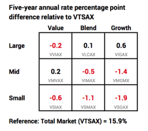
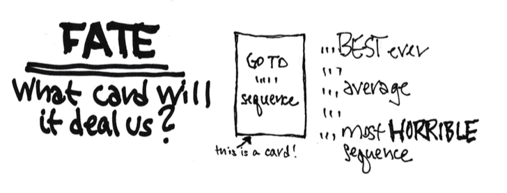
The purpose of this post is to describe how fate – the sequence of market returns we have faced and will face – affects our nest egg and spending in retirement.


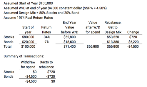
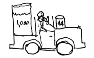
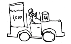
The luck of the draw – random chance – had a big effect on the size of our nest egg at the start of our plan. We all start our financial retirement plan with a snapshot of our nest egg – our financial balance sheet. That’s the fuel in our main tank right at the start of our retirement. At the end of each year we take out an amount and put it in our smaller feeder tank to our engine for our journey for the next 12 months. (Patti and I started taking out 4.4% at the start of our journey – 44 gallons per starting 1,000 gallons.)


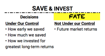
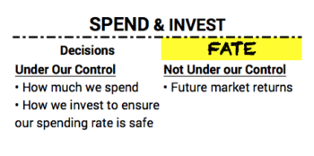
We retirees have spent decades to build fuel for that main tank. What led to its size clearly depended on two basic decisions under our control: 1) how we saved – how early we saved and therefore how many years we had compounding of returns working in our favor – and how much we saved; and 2) how we invested. The uncertainty not under our control – the card that fate would deal us – was the sequence of market returns we would ride along.


The best we could do was to make the right decisions to position ourselves to succeed for whatever returns fate might deal us. One thing we knew, or should have known, was that stocks would outperform anything else over the many, many years we had before we would spend any of our savings.


Fate dealt a terrific card in terms of stock returns for folks now age 65 or older – those of us who could have saved when we were in our late 20s or early 30s. That means we started saving and investing in the 1980s: that’s when 401k plans and IRAs really got their start, giving us all an incentive to save for retirement.


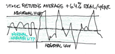
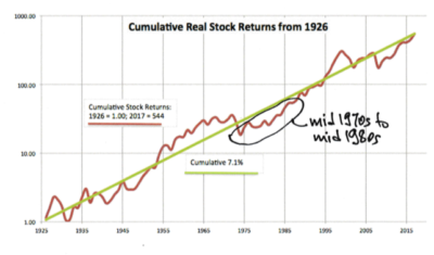
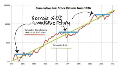
The returns for the years from the mid 1970s through the 1980s to today have been above the long run average real return for stocks. You get a clear picture of the return pattern over time on this semi-log plot of cumulative stock returns since 1926. (You can see and print a full display here. Oh, yes, that is a 544-fold increase since 1926; purchasing power from stocks doubles roughly every ten years; that’s about 9 doublings since 1926.) That red return line in the mid 1970s to mid 1980s is below the green long-term trend line; that means a line drawn from any of those years to the present is steeper than the green line – a slope greater than 7.1%*. We’ve all experienced above average return rates for our savings invested in stocks in those years. (This asssumes we very nearly nearly kept what the market has given to all investors; this was easy to do if we invested for low, low investing cost.) Those of us who were serious savers starting then are probably the richest set of retirees in history. (You can read the results from the $2,000 I invested in my IRA in 1981 and 1982.)


The luck of the draw – random chance – has a big effect as to how we retirees will fare in the future. How we will fare in the future has the same elements. We make key decisions on what we can control: 1) how much we spend and 2) how we invest to ensure our spending rate is safe. The uncertainty not under our control – the card that fate will deal us – is again the sequence of market returns we will ride along.


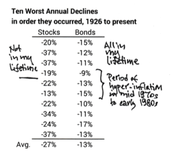
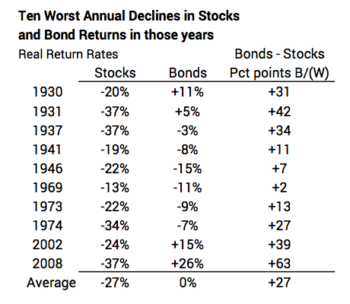
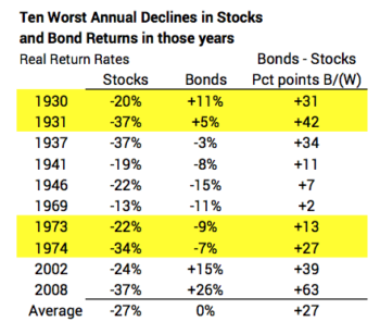
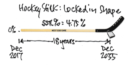
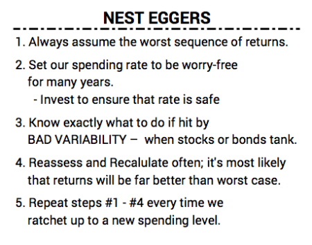
We Nest Eggers have made the right decisions to put ourselves in the best position to succeed for whatever returns fate might deal us. We did that when we completed our worksheet of key decisions Nest Egg Care. The key planning trick we employed was to always assume we are going to ride along one of the sequences of return that resulted in essentially 0% cumulative return from stocks over many years. That assumption always drives our Safe Spending Rate (SSR%) to a low level. On this graph below I’ve highlighted the three long periods of zero percent cumulative returns from stocks. The shortest is 13 years.


• 1930 to 1943 (13 years)

• 1966 to 1983 (17 years)

• 2000 to 2013 (13 years)


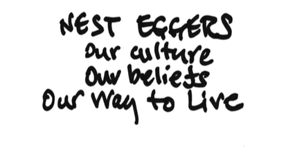
In a previous post, I described how we Nest Eggers think about and live our retirement. Here’s a summary of part of what we do.


Conclusion. Fate will deal us a sequence of future financial returns that can range from the best in history to the worst. The best we can do as retirees is to make decisions that put us in the best position to succeed for whatever returns fate might deal. You have made the right decisions when you’ve completed your planning worksheet in Nest Egg Care.


* I state the real return for stocks as 6.4% in Nest Egg Care. That was data through 2012 as stated in Stocks for the Long Run by Jeremy Siegel. The compound return rate will slightly vary year by year when one calculates that rate from 1926 to a specific end point.

“Why do I own bonds? The rate looks so low.”

My friend Betty asked that question and it’s a good one. The basic answer is that we own bonds as insurance to protect us from the DEVASTATION that BAD VARIABILITY of stocks returns would have on our portfolio. The returns from bonds are always greater (and almost always MUCH GREATER) than stocks when stocks tank. That’s when our insurance pays off: we sell mostly (or solely) bonds for our spending when stocks have tanked.


The purpose of this post is to describe the insurance value of holding bonds. You make your decision on how much insurance to buy (e.g., your mix of stocks and bonds) in Chapters 7 and 8 in Nest Egg Care.


We should always have stocks as the dominant portion of our portfolio. Stocks are the fuel for More-For-Us and our heirs when we ride other than a horrible sequence of returns. Bonds don’t have nearly the same power for More-For-Us. The average real return rate for stocks (about 6.4% per year) is 2.5 times that of bonds (2.6%).* That 3.8 percentage point difference accumulates to a BIG difference over time.


If we knew that the future sequence of returns we would ride would be average or even somewhat below average, it would be simple: never hold bonds. We see from history that we don’t need bonds at all for most of the sequences of returns we may face. For example, stocks have cumulatively increased by +15% in 75% of the three-year sequences of return (i.e., 1926 – 1928, 1927 – 1929, and so forth); that basically means most all of us** would Recalculate and find our Safe Spending Amount (SSA) would increase in all these cases; bonds would only depress those cumulative returns and lower the increase in our SSA (or the balance for our heirs if we chose not to increase spending).


But we don’t know the sequence of returns we will ride along. It’s a portion of the remaining 25% of sequences that are the concern – when stocks cumulatively decline in the first three years and then continue to decline. This is why we accept that 3.8 point average difference in returns by holding bonds. (See Chapter 8 Nest Egg Care.)


The BAD VARIABILITY of stocks is much worse than BAD VARIABILTY for bonds. The last post shows that when stocks tank, they really tank. Bonds also vary in return, but not as much as stocks. The statistical measure of variability (standard deviation) calculates that stocks are three times more variable than bonds for a one-year holding period. (A holding period is the length of time we hold on to a security before we sell it for spending.)


Here’s the table of the ten worst stock returns since 1926 in the order they occurred from the prior post, and I’ve added the 10 worst bond returns since 1926 in the order they occurred. (These are not for the same years.) You can see the 10 worst years for stocks averaged -27% while the ten worst for bonds averaged -13%.***


When stocks tank, bond returns have always been better – MUCH better on average. I lined up bond returns in the 10 worst years when stocks tanked. The table below shows that when stocks tanked, bonds outperformed on average by 27 percentage points. This is table shows why bonds are considered as a different asset class than stocks; when stocks zig, bonds can zag; or when stocks zig, bonds don’t zig as much.


We’re now seeing the insurance value of bonds. On average bonds cost us about 3.8 percentage points per year (the 6.4% less the 2.6%), but bonds pay us back seven times that on average that when we really need them. (Bonds paid off Big Time in 2002 and 2008, years when some of us may have been retired.)


The math that requires us to rebalance our portfolio at the end of every year results in our selling mostly (or solely) bonds for our upcoming spending when stocks tank. You can follow this math in this example below. (You can see full size and print here.) This example shows that in 1974 (fourth worst year for stock returns) we would sell $4,500 for our upcoming spending from bonds and still have a transaction to sell $720 more bonds and buy $720 of (depressed) stocks to complete the rebalance task. We’re completely skipping selling stocks and giving them a chance to rebound. (Stocks did rebound in 1975: returns were +28% for stocks and +2% for bonds.)


In our previous post, we found two back-to-back years of stock returns that appeared in many of the worst sequences of return: 1930 & 1931 and 1973 & 1974. I’ve highlighted those years. Bonds really helped in 1930 & 1931 but not nearly as much in 1973 & 1974.


We’re now starting to get a sense of the benefit of also holding a Reserve. I recommend a one-year off-the-top Reserve; we can use the Reserve for spending, and we avoid selling stocks or bonds in years that both have tanked. 1946, 1969 and 1974 would have been good examples when both stocks and bonds were in their worst 10% of annual returns. I’ll show the exact benefit of that action in future posts.


Conclusion. In years like 2017, we can conclude that bonds don’t do much for us and that they are costly in terms of lower total return. But we want bonds as insurance when stock returns tank. Bond returns are always better – most always MUCH BETTER – than stock returns when they tank. We get the benefit of holding bonds when we withdraw and rebalance for spending; we’re selling bonds, not stocks. We dodge locking in big losses. We’re giving stocks a chance to rebound to make our portfolio healthy.


* I take these returns from Stocks for the Long Run by Jeremy Siegel, Fifth edition. That was data though 2012. I get a greater real return rate for stocks and a lower real return rate for bonds when I extend the data through 2017. The differences would not change our thinking or decisions on the insurance value of bonds, so 6.4% for stocks and 2.6% for stocks is a good enough assumption.

** Not older retirees with Safe Spending Rates (SSR%) well in excess of 5%.

*** Data source for returns in this post: Stocks, Bonds, Bills and Inflation (SBBI) Yearbook, Ibbotson and Grabowski. The Yearbook has real annual returns for three types of bonds. I selected the returns from long term US Government Bonds for this post.

What do really bad sequences of stock returns actually look like?

When were retired we’re in the Spend and Invest phase. We’re withdrawing from our portfolio each year for our spending. We’re stressing its health each year. Most times it remains healthy or even grows to be super-healthy over our retirement. We Nest Eggers are most concerned about HORRIBLE sequences of return that can deliver a blow so harmful that we can’t keep our portfolio healthy. It ultimately can deplete. The purpose of this post is to numerically understand the sequences of return that could deplete our portfolio.


The key Retirement Withdrawal Calculator I rely on in Nest Egg Care, FIRECalc, builds its test sequences based on annual returns in the order that they occurred in the past. FIRECalc graphs how a portfolio would fare for all sequences of return it builds for a given set of inputs. In Nest Egg Care, I display the FIRECalc output graph for the start of the retirement plan for Patti and me in December 2014 (Chapter 2). A nasty blue line was the first sequence to deplete. I want to understand the returns that made that blue line so bad.


I focus here on stock returns, the big reason for BAD VARIABILTY (and also the big reason we will have More-For-Us and our heirs when we ride other than a horrible sequence of returns). Other things we do (e.g., add bonds) dampen the effect of BAD VARIABILY of stock returns (at the cost of less More-For-Us when we ride other than a horrible sequence of returns).


Here’s what I did to get to the information on the sheet you can see and print and the tables below.


Get return data. It’s easier to understand when we look at real, inflation-adjusted returns. My local library has a reference book* that has the real returns for stocks and bonds from 1926; the authors inflation adjusted the nominal returns. I could have also used the return data from here, and inflation-adjusted these with data from here. You can download data from another source, but that one requires more calculations to get to return rates; I didn’t do those calculations. The real annual returns rates from the first two sources differ by an inconsequential amount in some years; the third has to be similar.


Find and display those return patterns that are the worst. Once I have annual returns listed from 1926 to the present, I can calculate the cumulative return for any number of years I pick. I then can narrow in on the worst ones.


The tables below summarize the worst sequences of BAD stock returns from the table above. S&P 500 stocks are ~80% of US stock market total value; smaller company stocks are those that make up the bottom 20% of total market value.


1. BAD VARIABILITY immediately consumes big chunks of a portfolio. Eeek. Look at those percentage declines in the table below; and the decline in our portfolio would be worse when we account for withdrawals each year for our spending. These are the return patterns that drive our Safe Spending Rate (SSR%) to a low level. (Our SSR% determines the Safe Spending Amount we withdraw for our spending.) These are the return patterns that drive us to buy insurance, in effect, so we are not selling stocks for our spending in years of horrible stock returns. (See Chapters 7 and 8 in Nest Egg Care.)


2. Smaller company stocks have worse BAD VARIABILITY than S&P 500 stocks. You can see that on the table below. Some of those declines are SHOCKING. It’s true that smaller company stocks have wildly better GOOD VARIABILITY, but this picture of them does not lead me to want to overweight them in a portfolio. I recently read an article that recommends retirees greatly overweight them.** I would not agree with that.


3. We’re going to know within three to five years into our retirement period if we’re on a really bad sequence of return, meaning our Safe Spending Amount will increase each year for inflation (same constant spending power that we started with), but we’ll never Recalculate and find we can increase it by more than inflation.


We hope that we don’t start on one of these horrible returns at the start of our retirement period, but fate may mean we begin a ride on one sometime during our complete retirement period. After three years, Patti and I are at a new spending level that is 20% greater than when we started. If a bad sequence starts now, it wouldn’t have the same effect as if it had started three years ago.


4. Two two-year sequences of return are buried in many other bad sequences of return. That’s more clear when you look at the detail on the sheet.


These horrible back-to-back returns – about 50% declines – have happened twice since 1871 or twice over the past 146 years. Most Retirement Withdrawal Calculators assemble their sequences of returns assuming the return for one year is independent of last year’s return. If we used that approach (applying the math of Standard Deviation to each return) we’d conclude that hitting -20% or worse and -35% or worse two years in a row is about a 1-in-1400-year event – far off the actual 1-in-about 75 that has occurred. From this fact, I gain confidence that we’re on the right track to use annual returns in the order that they’ve occurred (FIRECalc’s approach) for our planning.


5. The longer sequences of poor returns are of most concern, since we are also withdrawing for our spending in each year. The worst six-year sequences are those that started in 1969, 1973, 1937, and 1929. The 1969 sequence as the worst surprised me; I would have thought the worst would have been during the Great Depression of the 1930s.


I display the 1969 start below. I’m pretty sure that has to be the blue line I saw on my FIRECalc graph. We’ll check that in another post. As I look at this sequence and the other three, I see they all have back-to-back years of large negative returns, and we’ve only had that once in the last 42 years now (actually three years of negative returns in 2000, 2001, and 2002, but that sequence didn’t make it in the four worst six-year sequences in history).  Maybe I’m lulled, but returns like these seem so improbable that I have a sense of optimism. Our SSR% is based on the assumption that we will ride a sequences like this starting NOW, but I’m very comfortable thinking that Patti and I won’t hit something this bad. We’ll enjoy more real increases in our Safe Spending Amount.


In a future post, I’ll walk through a spreadsheet of the year-by-year calculations of portfolio value for at least the return pattern starting in 1969. (FIRECalc and all other calculators are basically using a spreadsheet to develop data for each of the year-end portfolio values displayed.) We’ll better understand how a portfolio can deplete to a level that makes it impossible to get healthy again – the tipping point – and what we can do to push that point farther into the future.


* Stocks, Bonds, Bills, and Inflation (SBBI) Yearbook. Ibbotson and Grabowski.


** See article here. The recommended stock portfolio has 36% smaller company stocks, roughly a double overweight. (Note: when you follow the steps in Nest Egg Care, you also would not get to the conclusion that you want 55% stocks and 45% bonds as your portfolio in Retirement as stated in the article. See Nest Egg Care, Chapter 8. I’ll post more on this discrepancy later.)


Vanguard improves their Retirement Withdrawal Calculator. A lot.

Vanguard recently improved its display(s) of results of their Retirement nest egg calculator – their Retirement Withdrawal Calculator (RWC). I describe RWCs in Nest Egg Care (Chapter 2 and Appendix C), but here is a separate description. I rely on two key RWCs in Nest Egg Care, and this one is one of the two. These improvements are excellent.


The purpose of this post is to explain the changes. The most significant improvement is that we now have two output graphs rather than one. I’ll post later about what we learn from each and why we want to use both graphs together to fully understand what they can tell us.


Here are four improvements:


Improvement #1: the graphics are cleaner and clearer. I like the use of the sliders for both inputs and mix of stocks, bonds, and cash. If I’m remembering correctly, you previously had to type in the mix of stocks, bonds, and cash. I like the blue color scheme and the shading of results on the graph, “Projected savings balance”.


Improvement #2: the results are based on 100,000 new sequences of returns every time you hit the Run Simulation or Re-run Simulation button. It was 5,000 sequences, but that was actually not big enough sample size. Vanguard’s method to build sequences that we can test to see how a portfolio fares runs in total a billion-billion-billion (or so) possible sequences. That’s why they take a sample. Before, you could repeatedly hit Rerun Simulation for a set of inputs and get a slightly different numerical result and slightly different looking graph. This was confusing and distracting.


Not now. Or, not as frequently now. With 100,000 I don’t think you will see changes in the numerical results if you repeatedly hit Rerun Simulation for the same set of inputs. When I pound on that Rerun box now, I only notice a tiny, tiny change in the graphs. Any tiny numerical or graphical changes you might see are of no importance for decisions for our financial retirement plan.


Improvement #3: we get a new display, “How long will your savings last?” This is the new, standard graph that the user first sees. BIG IMPROVEMENT. It’s the graph of the year-by-year probability that a portfolio will survive in any future year for a given set of inputs. The approach in Nest Egg Care is to plot the year-by-year probability that a portfolio will deplete. That’s our hockey stick. Our hockey stick is 100% minus the probability that savings will survive that Vanguard shows. In essence, the Vanguard graph is an upside down hockey stick! That’s impossible to see at the scales that Vanguard uses for this graph, but it’s true.


Here’s my sketch of the Vanguard display. (I don’t have permission to paste in the actual graph you’d find here with the inputs 4.5% spending rate [$45,000 spending with $1 million start] and 75% stocks and 25% bonds.)


And here’s my plot of the probability of depleting one can get by adjusting the How Many Years . . . input setting for that graph. This graph is a better scale for our understanding. (We’d never consider 50 years as helpful for a 4.5% spending rate or display the probability scale from 0% to 100%.)  This, then, is a graph of the Vanguard brand of a $45,000 hockey stick. Because of the different process to build test sequences of returns, Vanguard’s brand of hockey sticks don’t have the same characteristic shape as FIRECalc’s brand of hockey sticks. But both get us to the same decisions for our financial retirement plan. (See Chapter 2 and Appendix C.)


We get an added BIG BENEFIT from this new graph, because we can couple its results with the next graph, “Projected savings balance.” We can use these two charts to quickly verify an important finding in Chapter 8 in Nest Egg Care: identically shaped hockey sticks, each with slightly different spending rates and mixes of stocks and bonds, can result in VERY DIFFERENT expected future portfolio values over time. Here’s an illustration of two identically shaped sticks; I used FIRECalc’s data for these: a $45,000 hockey stick and a $43,000 hockey stick. I’ll go over how you confirm this finding using the two Vanguard displays in another post.


Improvement #4: the graph “Projected savings balance” now shows shaded bands of percentages of future portfolio values (e.g., 50% of results fall within a band; etc.; click on a color [grey] and the meaning of the band becomes more visible). I use the same inputs as for the prior graph for my sketch below. With a little work you can understand, “What is expected value of my portfolio if I rode an expected (average) sequence of returns?” I eyeball it on this graph (the midpoint of the grey band) at $3 million from a start of $1 million. You couldn’t get close to understanding that with the prior display; the graph was just just one green blob. We need to dig a little to really understand what this graph tells us; I’ll have a future post.


Conclusion: Vanguard has improved its displays from its Retirement nest egg calculator. We’re going to be able to more clearly see that the Vanguard and FIRECalc RWCs give similar results for our decision making for our financial retirement plan. These new displays are going to be most important in confirming findings in Chapter 8, Nest Egg Care.

Are you getting nervous about stock returns?

The point of this post: it’s waaaay to early in the year to be concerned about the rapid decline in stocks.


I liked reading Thinking, Fast and Slow by Daniel Kahneman. Kahneman is a psychologist who won the Noble price in economics. He’s the only non-economist to win the prize. His contribution is behavior finance. His book describes how we make decisions and how we often make irrational financial decisions by not thinking it through.


One example from the book describes how we feel and how we should think about an event if we spend time to do a few calculations. The example I remember is two investors:


• One starts with $1,000. The stock market varies about plus or minus 1% over a period and at the end of the period, the ending value is $1,000.


• The other starts with $1,000. The stock market races to +5% but then decreases to an ending value of $1,000.


Which one feels just fine, and which does not? The former is fine, and the latter is unhappy. The reality: no difference.


Yep, the market raced in January to its best month in 30 years. And now it’s quickly given more than that back. How should I view that?


1. My next withdrawal for spending – my next sale of securities for spending – is early December. That’s ten months from now. Stocks declined by about -6% in January 2016. They wound up at +11% for the year. A lot can change between now and early December.


2. Since I Recalculate based on results at the end of November, that’s the start I should be using for Year-To-Date results. The change does not register on my worry-meter.


3. My Fidelity statement tells me my 12-month return rate ending January 31 was +26% for stocks and +3% for bonds. You hit those marks, too, following the recommendations in Nest Egg Care. That stock return is well above average. Real returns will gravitate toward  6.4% over time. We should expect some down years.


Perspective: we should not be worried about normal variability of stock returns. In my mind normal variability is the band of returns that hold 80% of all returns. 10% of all returns are above the band and are abnormally high. We’re concerned about the 10% that are abnormally low. That’s the time for concern or even worry. Below the band is about -17% real return for the whole year. We’re a long way from that.

Why am I pouring my FUN MONEY into a non-productive asset?

What’s it all about now that we are retired? Enjoying More, NOW and helping others to Enjoy More, NOW. Why would we spend money on something that subtracts from what we could ENJOY?


Every year at this time I ask the question when two bills roll in, “Why don’t I use my home equity line of credit to pay our property taxes and home owners insurance and therefore provide more for us to ENJOY?” My point of this post: you should also ask yourself this question. Here’s what’s running through my head.


We retirees have financial assets and non-financial assets. Our financial assets are in our main fuel tank for our journey. We take out an annual amount – our Safe Spending Amount (SSA) – for our feeder tank for the upcoming year. Patti and I started our journey at 4.40% as our Safe Spending Rate (SSR%) for our spending for 2015. It’s now 4.75% for 2018. When we recalculated this past December, we also had more in our main tank than we did at the start. The multiplication worked out to a healthy increase in our SSA. Still, 4.75% is not a big flow rate. We need to put our SSA to maximum use.


Nest Eggers don’t count non-financial assets as part of our main fuel tank. Our non-financial assets are an important DEEP reserve apart from the formal financial reserve I recommend in Nest Egg Care. For Patti and me, our home is our large non-financial asset, and we love it. But its non-financial value isn’t on the same scale as our financial assets, which we clearly use (spend) to ENJOY.


Our non-financial assets basically just sit there. They’re likely to maintain their value with inflation (house yes; other no). Yes, our home in particular feels like a thick security blanket. But over the next 15 or more years we hope to be here, it’s +95% probable that our financial assets will grow faster than inflation. (At average return rates money invested in stocks will more than double in purchasing power.) Relatively speaking, our non-financial assets are a loser.


Every year at about this time I get my property taxes and homeowners insurance bills, and I stare at them. I ask, “Why am I using my FUN money to pay these NOT-FUN bills?” They’re adding no real value to our home. I’m not repairing something that should be repaired. I’m not  improving the quality of living in it.


This NON-FUN expenditure can be a real drain on FUN money. I mention my friend Alice in Nest Egg Care. Let’s assume her nest egg (after the formal off-the-top reserve) was $900,000 at the end of 2017 and her SSR% is 5.3% for 2018. She will pay herself about $48,000 as her SSA in 2018.


What’s that mean? She has Social Security (maybe $30,000 net for the year) and the $48,000. Total $78,000. Let’s assume income taxes (definitely a NOT FUN expenditure) are $12,000. Net to ENJOY = $66,000.


Now let’s assume she has to spend $8,000 for NOT FUN on property taxes (high here in Pittsburgh) and on homeowners insurance. That $8,000 is more than 12% of her net to ENJOY.


I’d think really hard about this option: pay the $8,000 out of her home equity line of credit at interest only. That would be about $25/month. (Yes, no longer tax deductible.) She’d never miss that. But how much enjoyment could $8,000 buy in 2018? Here are some options:


Alice could think, “I’d really like to rent a beach house this summer to spend a week with my son, his, wife and my two grandchildren. The whole vacation will cost $8,000, but I’ll defer. I’ll pay that $8,000 instead for for property taxes and insurance.” She could think that way every year in the future. That does not make sense to me. Enjoy NOW. Rent the beach house. Spend that special time with your family. Pay the $25/month.


Knock on wood: we all will find we aren’t riding a WORST case of future financial returns. Recalculation will show (as it did for Patti and me in 2016 and 2017) that Alice has More-Than-Enough (again) for her current spending. She can chose to repay the $8,000 or increase her SSA: the $25/month will disappear or really be trivial. That week at the beach house: priceless.


Conclusion: We Nest Eggers work hard to Enjoy More NOW for the  the time left in our journey. The annual amount we spend to Enjoy comes from our financial assets and Social Security. (Some of us may have other income.) Most all of us have significant non-financial assets. Our home is a large one that consumes cash (property taxes and home owners insurance) that doesn’t really add to its value. Is the better alternative to pay those taxes/insurance by using your home equity line of credit? That would mean more joy from your Safe Spending Amount. It’s your decision: I’d lean to Enjoy More NOW.

What’s my market outlook for stocks for 2018 and beyond?

What the heck are those? Those are the nine worst annual (calendar year) real (inflation-adjusted) returns for stocks since 1926 – over the past 92 years. HORRIBLE! UGLY! SCARY! The message of this post: Nest Eggers ALWAYS plan for the worst and adjust if it turns out not to be the worst.


None of those returns would be my answer for the Outlook for 2018 or the next few years. The true outlook for stocks, as I read all the pundits, is NOT for a disaster year like one of those. Economic growth is forecast to be positive in 2018; retail sales are on a steady upward trend; unemployment is low and forecasted to be lower; consumer confidence is high; real wages for workers have increased; inflation is low and its not forecasted to increase by much; tax rates for corporations will be lower in 2018. “The U.S. economy is in solid shape at the end of 2017 and should continue to improve well into 2018.” (Read here.) Heck, stock returns are up +6% so far.


Am I going to base how much we spend or how we invest on what those pundits say or on the good bump so far this year? HELL NO. I’m the ULTIMATE PESSIMIST when it comes to our financial retirement plan: I have the pedal pressed to the metal in my pessimistic-mobile at the start of every year. And right now, too.


We Nest Eggers live by this mantra: ALWAYS PLAN FOR THE WORST and adjust if it turns out not to be the worst. That’s the Nest Egger way!


Just to review, ALWAYS PLAN FOR THE WORST drives our Safe Spending Rate (and therefore our Safe Spending Amount) to a low level. Here’s the picture of our plan at the start of 2018 that I described in a previous post. It looks like a hockey stick with the inflection point LOCKED into place: 4.75% Safe Spending Rate (SSR%); 18 years of zero probability of depleting our portfolio through 2035 (the shaft of the stick). That’s to Patti’s age 88 and my age 91, beyond the life expectancy of each. (Obviously we’ve made the key  decisions on How To Invest to know that we’ve LOCKED IN the shape of our stick.)

You’re an ULTIMATE PESSIMIST, too, when you pick the Safe Spending Rate (SSR%) linked to the number of years you pick. Every stick assumes we will hit one of those HORRIBLE, UGLY, SCARY returns starting on January 1, 2018 – and maybe another one in 2019. (That combination for two of those ugly nine years has happened! Three times!) We know our plan can absorb HORRIBLE blows like those and NOT DEPLETE our portfolio for the number of years we picked. (I’ll post more on how bad bad stock returns can be in an upcoming post.)


Let’s admit it, though, Patti and I would certainly be SHAKEN if we’re hit in 2018 with a return like one of those worst nine. I discuss how we cope with disturbing, frightening bad variability of stock returns, in Chapter 7 in Nest Egg Care, but I’ll also add posts on this topic.


Conclusion. Nest Eggers always plan assume we are riding on one of the most HORRIBLE sequences of future financial returns in history. These HORRIBLE sequences are really UGLY and SCARY. And, fortunately, fairly rare. That planning assumption drives our Safe Spending Rate (SSR%) to a low, safe level. For 2018, Patti and I picked 18 years for zero probability of depleting our portfolio: that’s our 4.75% spending rate for 2018.


Data source: Return data is from Ibbotson, Stocks, Bonds, Bills, and Inflation (SBBI) Yearbook. I calculated Total Stock Market returns as 80% S&P 500 and 20% Small Cap Stock. (Ibbotson has its Small Cap Stocks as the lowest 20% quintile in market capitalization.)

What does it mean to be on the Nest Egg Team?

We Nest Eggers think differently about retirement and live differently in retirement than most. We Nest Eggers focus on Enjoying More, NOW and helping others Enjoy More, NOW.


What do we do?


• At the start of every year, we pay ourselves our annual Safe Spending Amount (SSA). We deliberately spend or gift it all every year.


• Initially we focus on ourselves. We know we have fewer years (together, if you are planning for two) than we would like. “What’s the Next Fun Thing To Do?” (Patti and I plan our fun trips.)


• Later our focus is on giving to others. We know our money can have a positive impact. Typically we ask, “Who should benefit from our increased giving this year? And how much?” Because one thing is certain: we’ll enjoy our retirement more when we gift to our loved ones and/or fund our favorite causes while we’re still around to appreciate the positive impact we’ve made.


How do we know we are safe? We use a Safe Spending Rate (SSR%) to get to our annual Safe Spending Amount (SSA). Our SSR% is always based on the assumption that we will ride the WORST sequence of future market returns in history. Our decision on spending rate and a few others as to how to invest are key. We know we have LOCKED IN the number of years we want with zero chance of depleting our portfolio – typically to when we are in our late 80s or perhaps 90s. (It’s the shaft of the hockey stick.) The probability of outspending and outliving our portfolio for any year thereafter is extremely low. Besides, we know what to do to dampen any worries if they arise.

• We frequently reexamine to see if we can use a greater SSR% and increase our SSA. A greater SSR% makes sense as we age since we will need our money to last fewer years, and we most likely will find we haven’t been riding the WORST sequence of returns. Our SSA most likely will increase over time – maybe to twice its initial amount.


• We keep investing costs very low. We keep 98% of what the market (stocks and bonds) gives all investors. (The average investor incurs high costs and keeps just 85% of what the market gives.) Over time we will be in the topmost 7% of all investors.


(I like this short reminder of Nest Eggers’ culture, beliefs, and way to live. Here’s a pdf that you can print. I keep this sheet near my 3×5 card of my financial plan.)


What segments of the US market outperformed in 2017?

I like looking at the Vanguard Style Box (I call it a Nine Box.) at the end of the year to get a snapshot of what outperformed and what underperformed the US stock market as a whole. Vanguard displays this matrix of its index (and other) funds that focus on segments of the total US market. The columns are Value, Blend, and Growth stocks and rows are Large Capitalization (Cap), Mid Cap, and Small Cap stocks.


I display the 2017 returns for the segments. I’m using the returns for Vanguard’s index fund* for each of the boxes in the matrix.

For reference, I display the Vanguard fund VTSAX as the measure for the change in the Total Stock Market. VTSAX is the capitalization value-weighted fund of essentially all US stocks – 3600 of them. The change in VTSAX is the change in the total market value of all US stocks. VTSAX increased by just under 21.2% last year, and therefore the total market capitalization value of the US stock market increased by 21.2% (Adding back the .04% expense ratio for VTSAX does not change the return rounded to nearest .1%.) Saying it a bit differently, the US stock market gave all investors, in aggregate, 21.2% more in 2017 than they had at the end of 2016.


If you count the boxes, four were better than VSTAX and five were not. I display the percentage point difference from VTSAX in each box below. (Each box does not have the same percentage of the total market, so the numbers in the boxes won’t net to zero.) All in the growth column were better. All in the value column were worse. The best performer was Large Cap Growth (about 6.6 percentage points better than VTSAX) and the worst was Small Cap Value  (about -9.4 percentage points lower than VTSAX). The difference between Large Cap Growth and Small Cap Value was 16 percentage points.

Common wisdom is that you can tilt your portfolio to outperform the average. The thinking is that Value will outperform Growth given enough years, and Small Cap will outperform Large or Mid Cap. Tilting these ways did not pay off for 2017 (above) and has not for the last five years (below).

For reference:

Total International Stocks (VTIAX) = 27.55%

Total world market stock index, MSCI All Cap World Index = 24.62%


* I display the “Admiral class” funds. These would be funds held at Vanguard that meet a greater investment minimum ($10,000). No greater than .07% expense ratio. VTSAX has a slightly lower expense ratio: .04%.

What did Nest Eggers score in calendar 2017?

Fellow Nest Egg Team members: you should be happy with our team’s scoring for last calendar year ending December 31. Our team had a very good year. If you followed the recommendations in Nest Egg Care, you came out with handsome results. As in all prior years, our scoring is solidly above the average of others (funds and investors). (You’ll see added support for this assertion in an upcoming post.) Here are our team’s scoring results.*


Your combined return for stocks plus bonds might differ from mine based on your decision on mix of stocks and bonds. You are still above average for all those who chose a similar mix.


As mentioned in previous posts (here and here), your return rate for your 12-month period (for the date you pick for your Recalculation) exceeded the Safe Spending Rate you used last year. That obviously means you have more now than you did then, and you can (or have already decided to) ratchet up to a new Safe Spending Amount for 2018. (You could have decided to lop off some of the More-Than-Enough as gifts now, like Alice did).


Just for reference, I could also display the result for prior calendar years, and that would look like this since 2015.


Conclusion. 2017 was a good year – well above expected the return rate for stocks (6.4% real) and for bonds (2.6% real). Our team was above average for all others (funds and investors), just as it is in all years. Our combined return rate for stocks and bonds meant all of us had more money when we recalculated for our Safe Spending Amount (SSA) for 2018. We all could ratchet up to a greater spending amount (or gift more now). In essence, all of us are starting on a new financial retirement plan (hockey stick) for 2018.


* Your results may differ by a small amount depending on your choice of fund and your weights between US and International. Your returns on your Recalculation date (e.g,  October 31 or November 30) would  differ.


Note: On Jan. 15, I updated the numbers in the displays to correct for small errors I recorded for return rates. The biggest change lowered 2017 Bond returns by .16%. Cumulative three-year returns were slightly greater for both stocks and bonds.