Vanguard improves their Retirement Withdrawal Calculator. A lot.
Posted on February 16, 2018
Vanguard recently improved its display(s) of results of their Retirement nest egg calculator – their Retirement Withdrawal Calculator (RWC). I describe RWCs in Nest Egg Care (Chapter 2 and Appendix C), but here is a separate description. I rely on two key RWCs in Nest Egg Care, and this one is one of the two. These improvements are excellent.
The purpose of this post is to explain the changes. The most significant improvement is that we now have two output graphs rather than one. I’ll post later about what we learn from each and why we want to use both graphs together to fully understand what they can tell us.
Here are four improvements:
Improvement #1: the graphics are cleaner and clearer. I like the use of the sliders for both inputs and mix of stocks, bonds, and cash. If I’m remembering correctly, you previously had to type in the mix of stocks, bonds, and cash. I like the blue color scheme and the shading of results on the graph, “Projected savings balance”.
Improvement #2: the results are based on 100,000 new sequences of returns every time you hit the Run Simulation or Re-run Simulation button. It was 5,000 sequences, but that was actually not big enough sample size. Vanguard’s method to build sequences that we can test to see how a portfolio fares runs in total a billion-billion-billion (or so) possible sequences. That’s why they take a sample. Before, you could repeatedly hit Rerun Simulation for a set of inputs and get a slightly different numerical result and slightly different looking graph. This was confusing and distracting.
Not now. Or, not as frequently now. With 100,000 I don’t think you will see changes in the numerical results if you repeatedly hit Rerun Simulation for the same set of inputs. When I pound on that Rerun box now, I only notice a tiny, tiny change in the graphs. Any tiny numerical or graphical changes you might see are of no importance for decisions for our financial retirement plan.
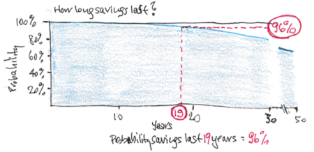
Improvement #3: we get a new display, “How long will your savings last?” This is the new, standard graph that the user first sees. BIG IMPROVEMENT. It’s the graph of the year-by-year probability that a portfolio will survive in any future year for a given set of inputs. The approach in Nest Egg Care is to plot the year-by-year probability that a portfolio will deplete. That’s our hockey stick. Our hockey stick is 100% minus the probability that savings will survive that Vanguard shows. In essence, the Vanguard graph is an upside down hockey stick! That’s impossible to see at the scales that Vanguard uses for this graph, but it’s true.
Here’s my sketch of the Vanguard display. (I don’t have permission to paste in the actual graph you’d find here with the inputs 4.5% spending rate [$45,000 spending with $1 million start] and 75% stocks and 25% bonds.)

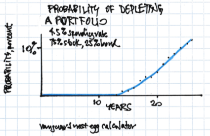
And here’s my plot of the probability of depleting one can get by adjusting the How Many Years . . . input setting for that graph. This graph is a better scale for our understanding. (We’d never consider 50 years as helpful for a 4.5% spending rate or display the probability scale from 0% to 100%.) This, then, is a graph of the Vanguard brand of a $45,000 hockey stick. Because of the different process to build test sequences of returns, Vanguard’s brand of hockey sticks don’t have the same characteristic shape as FIRECalc’s brand of hockey sticks. But both get us to the same decisions for our financial retirement plan. (See Chapter 2 and Appendix C.)
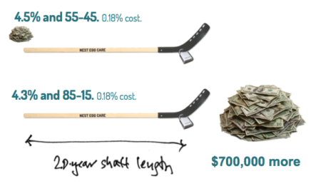
We get an added BIG BENEFIT from this new graph, because we can couple its results with the next graph, “Projected savings balance.” We can use these two charts to quickly verify an important finding in Chapter 8 in Nest Egg Care: identically shaped hockey sticks, each with slightly different spending rates and mixes of stocks and bonds, can result in VERY DIFFERENT expected future portfolio values over time. Here’s an illustration of two identically shaped sticks; I used FIRECalc’s data for these: a $45,000 hockey stick and a $43,000 hockey stick. I’ll go over how you confirm this finding using the two Vanguard displays in another post.
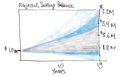
Improvement #4: the graph “Projected savings balance” now shows shaded bands of percentages of future portfolio values (e.g., 50% of results fall within a band; etc.; click on a color [grey] and the meaning of the band becomes more visible). I use the same inputs as for the prior graph for my sketch below. With a little work you can understand, “What is expected value of my portfolio if I rode an expected (average) sequence of returns?” I eyeball it on this graph (the midpoint of the grey band) at $3 million from a start of $1 million. You couldn’t get close to understanding that with the prior display; the graph was just just one green blob. We need to dig a little to really understand what this graph tells us; I’ll have a future post.
Conclusion: Vanguard has improved its displays from its Retirement nest egg calculator. We’re going to be able to more clearly see that the Vanguard and FIRECalc RWCs give similar results for our decision making for our financial retirement plan. These new displays are going to be most important in confirming findings in Chapter 8, Nest Egg Care.