All posts by Tom Canfield

Why am I pouring my FUN MONEY into a non-productive asset?

What’s it all about now that we are retired? Enjoying More, NOW and helping others to Enjoy More, NOW. Why would we spend money on something that subtracts from what we could ENJOY?


Every year at this time I ask the question when two bills roll in, “Why don’t I use my home equity line of credit to pay our property taxes and home owners insurance and therefore provide more for us to ENJOY?” My point of this post: you should also ask yourself this question. Here’s what’s running through my head.


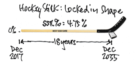
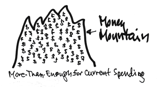
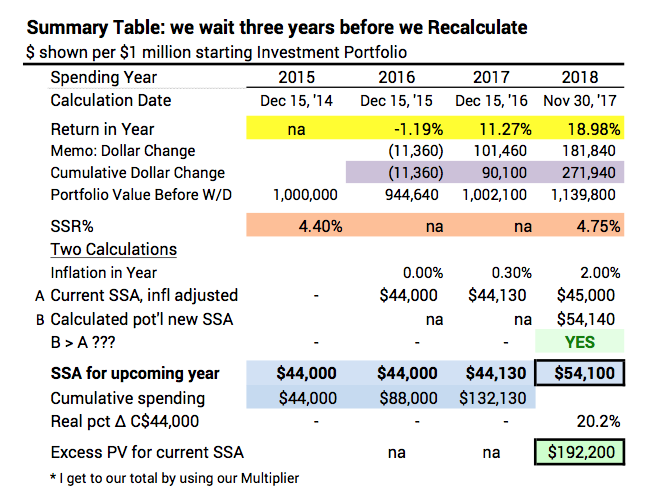
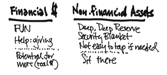
We retirees have financial assets and non-financial assets. Our financial assets are in our main fuel tank for our journey. We take out an annual amount – our Safe Spending Amount (SSA) – for our feeder tank for the upcoming year. Patti and I started our journey at 4.40% as our Safe Spending Rate (SSR%) for our spending for 2015. It’s now 4.75% for 2018. When we recalculated this past December, we also had more in our main tank than we did at the start. The multiplication worked out to a healthy increase in our SSA. Still, 4.75% is not a big flow rate. We need to put our SSA to maximum use.


Nest Eggers don’t count non-financial assets as part of our main fuel tank. Our non-financial assets are an important DEEP reserve apart from the formal financial reserve I recommend in Nest Egg Care. For Patti and me, our home is our large non-financial asset, and we love it. But its non-financial value isn’t on the same scale as our financial assets, which we clearly use (spend) to ENJOY.


Our non-financial assets basically just sit there. They’re likely to maintain their value with inflation (house yes; other no). Yes, our home in particular feels like a thick security blanket. But over the next 15 or more years we hope to be here, it’s +95% probable that our financial assets will grow faster than inflation. (At average return rates money invested in stocks will more than double in purchasing power.) Relatively speaking, our non-financial assets are a loser.


Every year at about this time I get my property taxes and homeowners insurance bills, and I stare at them. I ask, “Why am I using my FUN money to pay these NOT-FUN bills?” They’re adding no real value to our home. I’m not repairing something that should be repaired. I’m not  improving the quality of living in it.


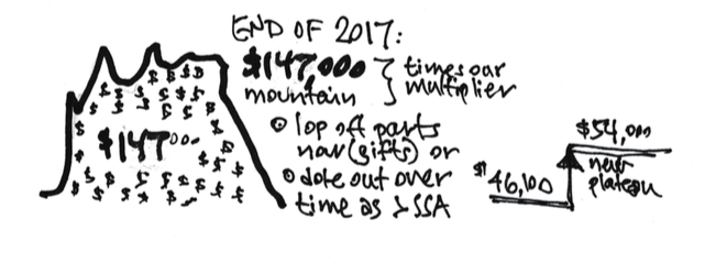
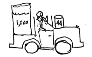
This NON-FUN expenditure can be a real drain on FUN money. I mention my friend Alice in Nest Egg Care. Let’s assume her nest egg (after the formal off-the-top reserve) was $900,000 at the end of 2017 and her SSR% is 5.3% for 2018. She will pay herself about $48,000 as her SSA in 2018.


What’s that mean? She has Social Security (maybe $30,000 net for the year) and the $48,000. Total $78,000. Let’s assume income taxes (definitely a NOT FUN expenditure) are $12,000. Net to ENJOY = $66,000.


Now let’s assume she has to spend $8,000 for NOT FUN on property taxes (high here in Pittsburgh) and on homeowners insurance. That $8,000 is more than 12% of her net to ENJOY.


I’d think really hard about this option: pay the $8,000 out of her home equity line of credit at interest only. That would be about $25/month. (Yes, no longer tax deductible.) She’d never miss that. But how much enjoyment could $8,000 buy in 2018? Here are some options:


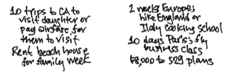
Alice could think, “I’d really like to rent a beach house this summer to spend a week with my son, his, wife and my two grandchildren. The whole vacation will cost $8,000, but I’ll defer. I’ll pay that $8,000 instead for for property taxes and insurance.” She could think that way every year in the future. That does not make sense to me. Enjoy NOW. Rent the beach house. Spend that special time with your family. Pay the $25/month.


Knock on wood: we all will find we aren’t riding a WORST case of future financial returns. Recalculation will show (as it did for Patti and me in 2016 and 2017) that Alice has More-Than-Enough (again) for her current spending. She can chose to repay the $8,000 or increase her SSA: the $25/month will disappear or really be trivial. That week at the beach house: priceless.


Conclusion: We Nest Eggers work hard to Enjoy More NOW for the  the time left in our journey. The annual amount we spend to Enjoy comes from our financial assets and Social Security. (Some of us may have other income.) Most all of us have significant non-financial assets. Our home is a large one that consumes cash (property taxes and home owners insurance) that doesn’t really add to its value. Is the better alternative to pay those taxes/insurance by using your home equity line of credit? That would mean more joy from your Safe Spending Amount. It’s your decision: I’d lean to Enjoy More NOW.

What’s my market outlook for stocks for 2018 and beyond?

What the heck are those? Those are the nine worst annual (calendar year) real (inflation-adjusted) returns for stocks since 1926 – over the past 92 years. HORRIBLE! UGLY! SCARY! The message of this post: Nest Eggers ALWAYS plan for the worst and adjust if it turns out not to be the worst.


None of those returns would be my answer for the Outlook for 2018 or the next few years. The true outlook for stocks, as I read all the pundits, is NOT for a disaster year like one of those. Economic growth is forecast to be positive in 2018; retail sales are on a steady upward trend; unemployment is low and forecasted to be lower; consumer confidence is high; real wages for workers have increased; inflation is low and its not forecasted to increase by much; tax rates for corporations will be lower in 2018. “The U.S. economy is in solid shape at the end of 2017 and should continue to improve well into 2018.” (Read here.) Heck, stock returns are up +6% so far.


Am I going to base how much we spend or how we invest on what those pundits say or on the good bump so far this year? HELL NO. I’m the ULTIMATE PESSIMIST when it comes to our financial retirement plan: I have the pedal pressed to the metal in my pessimistic-mobile at the start of every year. And right now, too.


We Nest Eggers live by this mantra: ALWAYS PLAN FOR THE WORST and adjust if it turns out not to be the worst. That’s the Nest Egger way!


Just to review, ALWAYS PLAN FOR THE WORST drives our Safe Spending Rate (and therefore our Safe Spending Amount) to a low level. Here’s the picture of our plan at the start of 2018 that I described in a previous post. It looks like a hockey stick with the inflection point LOCKED into place: 4.75% Safe Spending Rate (SSR%); 18 years of zero probability of depleting our portfolio through 2035 (the shaft of the stick). That’s to Patti’s age 88 and my age 91, beyond the life expectancy of each. (Obviously we’ve made the key  decisions on How To Invest to know that we’ve LOCKED IN the shape of our stick.)

You’re an ULTIMATE PESSIMIST, too, when you pick the Safe Spending Rate (SSR%) linked to the number of years you pick. Every stick assumes we will hit one of those HORRIBLE, UGLY, SCARY returns starting on January 1, 2018 – and maybe another one in 2019. (That combination for two of those ugly nine years has happened! Three times!) We know our plan can absorb HORRIBLE blows like those and NOT DEPLETE our portfolio for the number of years we picked. (I’ll post more on how bad bad stock returns can be in an upcoming post.)


Let’s admit it, though, Patti and I would certainly be SHAKEN if we’re hit in 2018 with a return like one of those worst nine. I discuss how we cope with disturbing, frightening bad variability of stock returns, in Chapter 7 in Nest Egg Care, but I’ll also add posts on this topic.


Conclusion. Nest Eggers always plan assume we are riding on one of the most HORRIBLE sequences of future financial returns in history. These HORRIBLE sequences are really UGLY and SCARY. And, fortunately, fairly rare. That planning assumption drives our Safe Spending Rate (SSR%) to a low, safe level. For 2018, Patti and I picked 18 years for zero probability of depleting our portfolio: that’s our 4.75% spending rate for 2018.


Data source: Return data is from Ibbotson, Stocks, Bonds, Bills, and Inflation (SBBI) Yearbook. I calculated Total Stock Market returns as 80% S&P 500 and 20% Small Cap Stock. (Ibbotson has its Small Cap Stocks as the lowest 20% quintile in market capitalization.)

What does it mean to be on the Nest Egg Team?

We Nest Eggers think differently about retirement and live differently in retirement than most. We Nest Eggers focus on Enjoying More, NOW and helping others Enjoy More, NOW.


What do we do?


• At the start of every year, we pay ourselves our annual Safe Spending Amount (SSA). We deliberately spend or gift it all every year.


• Initially we focus on ourselves. We know we have fewer years (together, if you are planning for two) than we would like. “What’s the Next Fun Thing To Do?” (Patti and I plan our fun trips.)


• Later our focus is on giving to others. We know our money can have a positive impact. Typically we ask, “Who should benefit from our increased giving this year? And how much?” Because one thing is certain: we’ll enjoy our retirement more when we gift to our loved ones and/or fund our favorite causes while we’re still around to appreciate the positive impact we’ve made.


How do we know we are safe? We use a Safe Spending Rate (SSR%) to get to our annual Safe Spending Amount (SSA). Our SSR% is always based on the assumption that we will ride the WORST sequence of future market returns in history. Our decision on spending rate and a few others as to how to invest are key. We know we have LOCKED IN the number of years we want with zero chance of depleting our portfolio – typically to when we are in our late 80s or perhaps 90s. (It’s the shaft of the hockey stick.) The probability of outspending and outliving our portfolio for any year thereafter is extremely low. Besides, we know what to do to dampen any worries if they arise.

• We frequently reexamine to see if we can use a greater SSR% and increase our SSA. A greater SSR% makes sense as we age since we will need our money to last fewer years, and we most likely will find we haven’t been riding the WORST sequence of returns. Our SSA most likely will increase over time – maybe to twice its initial amount.


• We keep investing costs very low. We keep 98% of what the market (stocks and bonds) gives all investors. (The average investor incurs high costs and keeps just 85% of what the market gives.) Over time we will be in the topmost 7% of all investors.


(I like this short reminder of Nest Eggers’ culture, beliefs, and way to live. Here’s a pdf that you can print. I keep this sheet near my 3×5 card of my financial plan.)


What segments of the US market outperformed in 2017?

I like looking at the Vanguard Style Box (I call it a Nine Box.) at the end of the year to get a snapshot of what outperformed and what underperformed the US stock market as a whole. Vanguard displays this matrix of its index (and other) funds that focus on segments of the total US market. The columns are Value, Blend, and Growth stocks and rows are Large Capitalization (Cap), Mid Cap, and Small Cap stocks.


I display the 2017 returns for the segments. I’m using the returns for Vanguard’s index fund* for each of the boxes in the matrix.

For reference, I display the Vanguard fund VTSAX as the measure for the change in the Total Stock Market. VTSAX is the capitalization value-weighted fund of essentially all US stocks – 3600 of them. The change in VTSAX is the change in the total market value of all US stocks. VTSAX increased by just under 21.2% last year, and therefore the total market capitalization value of the US stock market increased by 21.2% (Adding back the .04% expense ratio for VTSAX does not change the return rounded to nearest .1%.) Saying it a bit differently, the US stock market gave all investors, in aggregate, 21.2% more in 2017 than they had at the end of 2016.


If you count the boxes, four were better than VSTAX and five were not. I display the percentage point difference from VTSAX in each box below. (Each box does not have the same percentage of the total market, so the numbers in the boxes won’t net to zero.) All in the growth column were better. All in the value column were worse. The best performer was Large Cap Growth (about 6.6 percentage points better than VTSAX) and the worst was Small Cap Value  (about -9.4 percentage points lower than VTSAX). The difference between Large Cap Growth and Small Cap Value was 16 percentage points.

Common wisdom is that you can tilt your portfolio to outperform the average. The thinking is that Value will outperform Growth given enough years, and Small Cap will outperform Large or Mid Cap. Tilting these ways did not pay off for 2017 (above) and has not for the last five years (below).

For reference:

Total International Stocks (VTIAX) = 27.55%

Total world market stock index, MSCI All Cap World Index = 24.62%


* I display the “Admiral class” funds. These would be funds held at Vanguard that meet a greater investment minimum ($10,000). No greater than .07% expense ratio. VTSAX has a slightly lower expense ratio: .04%.

What did Nest Eggers score in calendar 2017?

Fellow Nest Egg Team members: you should be happy with our team’s scoring for last calendar year ending December 31. Our team had a very good year. If you followed the recommendations in Nest Egg Care, you came out with handsome results. As in all prior years, our scoring is solidly above the average of others (funds and investors). (You’ll see added support for this assertion in an upcoming post.) Here are our team’s scoring results.*


Your combined return for stocks plus bonds might differ from mine based on your decision on mix of stocks and bonds. You are still above average for all those who chose a similar mix.


As mentioned in previous posts (here and here), your return rate for your 12-month period (for the date you pick for your Recalculation) exceeded the Safe Spending Rate you used last year. That obviously means you have more now than you did then, and you can (or have already decided to) ratchet up to a new Safe Spending Amount for 2018. (You could have decided to lop off some of the More-Than-Enough as gifts now, like Alice did).


Just for reference, I could also display the result for prior calendar years, and that would look like this since 2015.


Conclusion. 2017 was a good year – well above expected the return rate for stocks (6.4% real) and for bonds (2.6% real). Our team was above average for all others (funds and investors), just as it is in all years. Our combined return rate for stocks and bonds meant all of us had more money when we recalculated for our Safe Spending Amount (SSA) for 2018. We all could ratchet up to a greater spending amount (or gift more now). In essence, all of us are starting on a new financial retirement plan (hockey stick) for 2018.


* Your results may differ by a small amount depending on your choice of fund and your weights between US and International. Your returns on your Recalculation date (e.g,  October 31 or November 30) would  differ.


Note: On Jan. 15, I updated the numbers in the displays to correct for small errors I recorded for return rates. The biggest change lowered 2017 Bond returns by .16%. Cumulative three-year returns were slightly greater for both stocks and bonds.

A great gift from Tom to Tom and Patti

I opened my Gift Envelope this morning, the one I gave to Patti and me on January 2, 1982 – 36 years ago. I emptied its contents on the kitchen island counter: $102,800!*


I followed the same investment plan as for the envelope I opened last year: $2,000 put into my IRA and invested in US stocks for 36 years. Stocks are only thing that makes sense for a 36-year holding period; bonds have never outperformed stocks for that length of time. Our return is from investing in a bland, boring US stock index fund for all those years. Because of the fund’s low expense ratio, our return is just a bit less than the gross return from the market.


Now, $2,000 invested then is not the same as $2,000 now. When I do the calculation to adjust for inflation, it was more like $5,200 in today’s purchasing power. So, that means in real purchasing power, I invested $5,200 then and found it compounded to $102,800 over these past 36 years. Nearly 20X.

That’s better than the 14.5X from the envelope I opened last January 2. Both are much better than one would expect from the long run average return rates (maybe 9.5X**). Why is the one I just opened so much more than the one I opened last year? For the sequence ending now, I dropped a bad year (1981: stocks were down about 5%) and added a good year (2017: stocks were up over 20%).


I know the contents of 36-year envelopes I plan to open every January 2 will vary depending on the actual sequence of returns. The returns in the 1980s and 1990s will be hard to match moving forward; my guess is that this one just opened may be the highwater mark in terms of the multiples earned: 1982 was a +20% year, and my next sequence will not include that year. But for now, we’ll ENJOY that $102,800. We’ll spend or give away all of it by the end of this year (or the portion of it within our calculated Safe Spending Amount). Oh, boy. We have work to do to figure that out.


Conclusion. We retirees have ridden a very favorable sequence of returns starting in the early 1980s through the 1990s, compounding savings then by many multiples with a simple investment plan. The 36-year envelope we just opened increased nearly 20X in purchasing power, well above what one would expect.


We don’t know the future sequence of returns. But the chances are that a similar, relatively small gift – not to ourselves but to those we love – will compound to many multiples of purchasing power. You can dramatically improve lives of those you love.


* Source. Morningstar. VFINX’s “Growth of 10K” graph. Change the start date to 01/02/1982 and the end date to 01/01/2018. You will see $10,000 grew to $514,000 or 51.4X. $2,000 * 51.4 = $102,800


** I plant in my head 6.4% real return per year as the average for stocks over the past 90 or so years. 6.4% translates to doubling in purchasing power about every 11.25 years, and 36 years would be about 3.2 doublings or a multiple of about 9.5X.

Tell me again: why do Patti and Tom have this mountain of cash that is More-Than-Enough for current spending?

In our Recalculation the first week of December, Patti and I found that we had far more than enough to support our current spending. A small mountain of cash: +$147,000 per $1 Million starting Investment Portfolio (December 2014). And a calculation of a new Safe Spending Amount (SSA) of $54,000. (I have to use the multiplier I set in December 2014 to get to the grand totals.)

You also have a similar mountain of cash if you are just reasonably close to the correct decisions of How Much to Spend and How To Invest. But I’m guessing you don’t exactly understand this. You can only quantify the size of your mountain when you know how to Recalculate. (See Nest Egg Care, Chapter 9.)


Let’s just review. How did Patti and I get our mountain of cash again? Why is it we can increase our Safe Spending Amount by so much? It may be easier to look at this over a three-year time period rather tracking changes year-by-year.


Let’s assume that Patti and I waited three years for our first Recalculation: start in December 2014 and now Recalculate in December 2017. In December 2014 we started with a Safe Spending Rate (SSR%) of 4.40% and applied that to $1 million Investment Portfolio. That gave us $44,000 per $1 million as our Safe Spending Amount (SSA) for 2015, and I’d use our multiplier calculated then to get to the total. That $44,000 is a constant dollar spending amount that does not change (only adjusts for inflation) independent of our portfolio value.


I’ve abbreviated the complete Recalculation sheet for the three years assuming we made no real changes to spending in 2016 and 2017. We only inflation adjusted the initial $44,000. That’s the three-year series of $44,000, $44,130, and $45,000. (That’s the row beginning “A  Current SSA …”)


The sheet shows we now have $192,200 (outlined green cell) More-Than-Enough for our constant dollar spending amount adjusted for inflation – $45,000. We could lop off that $192,000 for gifts, for example, or we could dole that out over time as an increase to our new constant dollar Safe Spending Amount of $54,100 (outlined blue cell). Or, some combination of the two.


Why is this increase so big? What happened? Two factors are at play here.


• The first obvious factor is the series of returns we rode was clearly not a track of most HORRIBLE ever. Over the three years (for spending years of 2015, 2016, and 2017) we withdrew a total of +$132,000 (row highlighted in blue), but our total return over the period was ~$272,000 (row highlighted in purple). We obviously have more that we started with, about $140,000 or about 14% more (See row below the purple).


(Stock returns in particular were above their long run average rates for the three years. Stock returns averaged about 11% per year relative to their long-run real return rate of about 6.4% per year.)


• The less obvious second factor is that we are older; we are three years (approximately) closer to the end of our journey. We, therefore, logically don’t need to plan to have our money last as long as we did before. In terms of the hockey stick, we don’t need one with as long of a shaft length – as many years of zero probability of depleting. We can take the current stick we’ve been using and saw off a little bit. A shorter stick has a greater SSR%. (Recalculation steps in Chapter 9 in Nest Egg Care tell you if it’s Okay to saw off a bit or not.)

For Patti and me at the end of 2017, our shorter, applicable stick (SSR%) – based on Patti’s age and life expectancy for the probable shorter journey – is 4.75% (That’s from the Data Table in Appendix D in Nest Egg Care.), not 4.40% that we started with in December 2014.


That .35% seems like a small change, but it’s is an 8% increase in our SSR% over the three years (.35%/4.40%). This 8% increase has two effects.


• We use the inverse of our SSR% is to find the amount we need for a given level of spending: at SSR% of 4.40% we needed 22.7 times a given spending level; at SSR% of 4.75% we need 21.1 times. For Patti and me at the end of 2017, I multiplied 1/4.75% times $45,000 – this is 2017 spending adjusted for inflation. That calculates to $947,600 needed for the $45,000, but we have $1,139,800. We have $192,200 More-Than-Enough.*


• Or we apply the 8% boost in our SSA to our portfolio value right before our withdrawal for next year. I multiply the 4.75% SSR% and the $1.14 million portfolio value to get to a new SSA of $54,100. That’s 23% greater than our initial $44,000 (some of which is inflation). We’d get to that same percentage increase by just dealing with the percentage changes: 8% greater SSR% applied to the 14% greater portfolio value. Using inflation adjusted results, 40% of our increase is due to an increasing SSR% and 60% of our increase is due to favorable returns.


Conclusion. Each of two factors work to calculate that you have More-Than-Enough for your current spending. And when you have More-Than-Enough for your current spending, you know you can increase your Safe Spending Amount (SSA).


The first obvious factor is favorable returns – returns that exceed withdrawals rates are obviously favorable. The second less obvious factor is the potential to use the greater SSR% applicable to our age (and its decreasing inverse).


* You may notice that the $192,000 calculated here is much greater than the $147,500 that I calculated for Patti and me when we recalculated annually. That’s because we paid ourselves more in 2017 from the Recalculation. That greater amount in “A  Current SSA, infl adjusted” was $47,000, not $45,000. The use of the 21.1 (inverse of the 4.75% SSR%) to that $47,000 worked out less More-Than-Enough.

What’s our Financial Retirement Plan for 2018 look like?

Yep. It’s a hockey stick with that inflection point locked in right where I want it to be – 2035. That’s zero probability of depleting our portfolio for 18 years. The Safe Spending Rate (SSR%) of 4.75% and other original design decisions determined the shape of this stick.


Financial risk is generally defined by the variability or unpredictability of results, and there is no unpredictability in the shape of this stick. The stick assumes we hit the MOST HORRIBLE sequence of financial returns history: BIG negative returns very soon. Maybe even worse than -35% real return for stocks in 2018. (Oh, let’s hope that doesn’t happen, buy it has happened three times since 1926.) So, there is no downside market uncertainty or risk in the stick. It can’t be worse. Only better. Therefore, I control all design decisions that determine the length of the shaft – the number of years of zero probability of depleting our portfolio – and the resulting blade angle.


Is this stick “Aggressive” or “Conservative?” (That’s how financial professionals like to characterize a financial retirement plan.) Is it “High” or “Low” in Risk Tolerance? It has ZERO TOLERANCE FOR RISK. There’s NO UNPREDICTABILITY to that inflection point. It’s LOCKED IN PLACE as determined by my design decisions: spending rate and the key ones as to how to invest.


I guess you could quibble with my choice for 18 years from now for the shaft length (to Patti’s age 88 and my age 91). We have some “life span risk”, but that’s different than unpredictable results from other factors out of our control.


Patti and I see our 18-year choice as worry free. Here are two reasons:


• Of our parents, only Patti’s mother lived longer than 88 (to 89); all others died before 84. It’s just 19% probable that I’ll live to 91, for example.


• Patti and I and you – as fellow readers of Nest Egg Care – know that 2035 is not frozen in concrete: we know what to do to push to later years if we need to or want to. Our Safe Spending Amount with our current stick is 20% more than we started with. Going back now to our original spending of $44,000 in constant dollars, we’d be using a  spending rate that would push out the inflection point to 2040, for example – to my age 95 with just 7% probability of being alive then. Since it’s almost certain that we’ll be better off in the future than now (even after this 20% increase), we’re certainly not going to lower our current Safe Spending Amount now.


I can only mess up this stick by doing stupid stuff that inadvertently shortens the shaft to fewer years. Here’s stupid stuff WE WON’T DO.


1. Patti and I won’t spend more than the stick says we should. This stick is a Safe Spending Rate (SSR%) of 4.75% that leads us to our Safe Spending Amount. (We likely will find that both our SSR% and SSA will increase in time.) We rigidly control spending by paying ourselves our annual SSA in monthly paychecks and no more. We know to never spend one dime more in a year. (And we have no need to spend one dime less!)


2. I will make no changes to our portfolio to give us a less than the certain result of 99.93% of what the market as a whole will give all investors. I’m not trying to beat the market to get more than 100% of what the market gives. I’m not adding costs to fiddle with our portfolio. EVER.


3. I won’t fail to rebalance our mix of stocks and bonds right after our withdrawal for the upcoming year. (That’s early December for us.) Rebalancing takes less me less than 15 minutes, so it’s inexcusable if I forget to do that.


Conclusion: Our financial retirement plan (your plan) can be viewed as a hockey stick. If you follow the decision steps in Nest Egg Care, you wind up with ZERO RISK TOLERANCE in your plan for the number of years you pick for zero probability of depleting a portfolio (and your probability of outspending and outliving your portfolio in the years thereafter is extremely low.) You LOCK IN the shape of your stick with your design decisions. The only risk in the shape of your stick is if you do stupid stuff and inadvertently shorten the stick. DON”T DO STUPID STUFF!

Whooowee. I made two changes to our plan this year.

I reviewed our extensive Retirement Financial Plan (Written out, it fits on a 3 by 5 card.) and made the following changes:


1. On my 3 by 5 card, I erased the $46,100 that I had written in pencil last year for our Safe Spending Amount and wrote in $54,000.  (I get to our total by using our multiplier.)


2. On my 3 by 5 card, I added a mutual fund to our extensive list (NOT!) of funds and ETFs that we own. I did this to simplify my task of rebalancing our portfolio. It was simple to do that before, and now it’s even simpler.


Our investment accounts are at Fidelity, and I added FTIPX (Fidelity Total International Stock, a mutual fund). That means I now own two Total International Stocks securities: VXUS (an Exchange Traded Fund basically identical to the Vanguard mutual fund VTIAX) and now FTIPX. (FTIPX did not exist when I started our plan in December 2014; it’s essentially identical to VXUS/VTIAX in holdings and cost. [It’s actually a shade lower in cost.])


Adding FTIPX allows me to easily “exchange dollars” between two Fidelity mutual funds to rebalance US Total Stocks and International Total Stock holdings. I can now do this task with one transaction. With only VXUS, it was two transactions: for example, I would have had to “sell dollars” in FSTVX (the dollar amount I wanted to buy of VXUS to be in perfect balance) and then wait to the next day to calculate the number of shares I should buy of  VXUS and place the order.


Conclusion: Fidelity or Vanguard both have stock index mutual funds that are essentially identical in composition and cost (rock bottom low) for US Total Stocks and for International Total Stocks. If your accounts are at either one, it’s easiest to rebalance between mutual funds in the same family (within Fidelity or Vanguard) by “exchanging dollars” between the two mutual funds.


It’s December 15. My day spent bottling the wine I’ll drink next year.

This is my imagined task every December 15. I even mark this day as Bottling Day on my calendar. Why do I do this? To imagine my portfolio differently.


We all need to form our view of risk tolerance. The real shape of my and your risk tolerance curve looks like a hockey stick. You lock in your stick – the number of years you want of zero probability of depleting your portfolio – with your spending rate and other decisions. It’s already assumed HORRIBLE sequences of bad variability in returns (early, big negative returns); we logically don’t need to pay attention to bad variability of returns.


But sticking with the stick – trusting the stick – is hard to do. We’ve all spent decades thinking that risk is the ups and downs of market returns. The financial pros only talk about risk tolerance this way. (That’s not correct! But it helps them if you fear these ups and downs.) While I want to think only in terms of our hockey stick, I also look at our portfolio in a way that helps me be more accepting of bad variability when it will inevitably strike.


I don’t view our portfolio as one big lump – one pile of money – that moves up and down with market variability. I view it in parts that move up and down differently. Each part has a different holding period. (Holding period is the length of time one holds on to an investment before selling it for spending.) The mix of stocks and bonds varies with holding period.


I don’t want much variability in the parts with short holding periods. I’ll be selling securities relatively soon for our spending; I want more bonds. I’m accepting of more variability in the parts with longer holding periods; I’m good with more stocks. Since I have many years to wait before I will sell, I have plenty of time to recover from bad variability. (I have this same view for a Trust where I am Trustee; you can read about that here.)


I envision that that our portfolio is in ten wine barrels, aging over the years in a precise way, and in a large vat. (It’s far too hard for me to actually display our portfolio this way on my login screen for our investment accounts, but I’d really like to. I just have to do the calculations this time of year as if it were in the wine barrels and the vat.)


Each of the ten barrels holds about one year of spending. The barrels are in a precise mix of stocks and bonds. I consulted with a world-class vintner who told me that the number of years (10) was the right amount of aging and that the mixes in the barrels are ideal. He told me to think that each drop of wine I drink has followed his precise aging and mix schedule. (Just that thought seems to make it taste better!)


The ten wine barrels are in my garage in sequence; I have bottling equipment in the garage, too. The large vat is out back down a short trail from the garage.

• The first three barrels are the Finishing Barrels, and they’re invested in 80% bonds and 20% stocks. That means their volume isn’t going to change much year to year. That barrel closest to the bottling line sat with that mix for three years.


• The next seven barrels are the Aging Barrels, and they’re invested in 60% stocks and 40% bonds. Barrel #4 has aged for seven years now.

• The Large Vat out back is 100% stocks. It will have the most variation in volume. I won’t touch the first drop of that for a decade. I have 10 years to recover from bad variability in the vat.


I woke up early today. Brrr. It was cold and icy, 17 degrees. I went out to the garage to bottle the wine that I’ll consume in the upcoming year (2018).


I opened the Finishing Barrel closest to the bottling line. (I’d written “1” in chalk on it last year.) and that’s what I bottled. Later today I’ll take the bottles to the house and put them in a wine cooler in the basement. I’ll consume and give away all those bottles during 2018.


After I emptied and bottled the first barrel in line, I had some work to prepare for next year. I rolled empty barrel #1 to the end of the line. I rolled the full barrels forward to make space for it in position #10. I wiped out my prior chalk marks and renumbered the barrels from #1 to #10.


I adjusted the mix in my new #3 from 60% stock and 40% bonds to 80% bonds and 20% stocks. And I got wine from the Large Vat to fill #10: I adjusted that to 60% stocks and 40% bonds. (Getting that wine from the Large Vat to the garage is the most physically taxing work. Also, the trail can be icy, like it is this year. I think I may hire someone to help me with that next year.)


Okay. Now I’m ready for next year, and I’m ready to show you how those two groups of barrels and vat performed over the past three years.

You can see the range or variability of returns is smallest for the Finishing Barrels (roughly 7.7 percentage point spread) and greatest for the Large Vat (roughly 23.5 percentage point spread). That’s what I’d expect.


I’ve had three years of positive returns in the Finishing Barrels; that’s probably a bit unusual. In the first year I had small negative returns in the Aging Barrels and the Large Vat. But those return rates don’t approach what I think of as bad variability.


The cumulative returns are positive for all three. The greatest cumulative return is in the Large Vat. That’s also what I would expect.


Conclusion. None of us should view our portfolio as one big lump that rises and falls with market returns. That tends to make us too sensitive, too emotional when we are hit with bad variability in returns. It’s really our hockey stick that defines our risk tolerance, and it already has assumed the most HORRIBLE sequence of market returns.


It helps to view our portfolio in parts related to different holding periods. Each part should have an appropriate mix of stocks and bonds. This example is three parts starting with 80% bond and 20% stock and ending with 100% stocks. Each part will have its own degree of variability.


It’s too difficult for me to actually arrange my portfolio into parts with different mixes of stocks and bonds for our investment accounts, but I can calculate at least once a year to see the results as if it were organized this way. Looking at that longest holding period (10 years away before I spend any) helps distance my potential emotional panic when I’ll be hit (We’ll all be hit.) with bad variability of stock returns: I’ll know I have a decade to recover.