DO NOT consider using a lower Safe Spending Rate that I provide in Nest Egg Care!
Posted on December 31, 2021
Last week I summarized a report by Morningstar, The State of Retirement Income – Safe Withdrawal Rate. It suggests that Safe Withdrawal Rates should be cut by 25%. Retirees need 1/3rd more than they thought they’d need for a happy retirement. My friend Jay emailed me, “We’re all f*&ked.” NO. NO. NO. NO. NO. Do NOT buy into Morningstar’s predictions of a FAR WORSE future that would say the Safe Spending Rates (SSR%s) that I provide in Nest Egg Care (NEC) are far too high. (See Chapter 2 and Appendix D). DO NOT entertain the thought that you should lower the amount you withdraw for your spending! DO NOT think you need lots more money for a happy retirement! The purpose of this post is to give my views of why I think Morningstar report has missed the boat and is incorrectly striking FEAR into hearts of many retirees.
== Morningstar’s DARK, DARK financial future ==
#1) Stock returns will average 2.4 percentage points lower per year in the forever future than in the past; bonds will average 2.3 percentage points lower in the forever future.
• My take: I don’t see any good justification for the forever reductions in stock and bond returns. I see no logic for the prediction for stocks at all; one may judge that that they are overvalued now, but Morningstar predicts a 30% lower average return forever. I can buy the argument that bond returns will be depressed – interest rates are rock bottom; they can only increase; bond prices move in the opposite direction; the total return for bonds (interest reinvested and price change) may be very low for years. But we’ve already had more than four decades of 0% cumulative return for bonds in the past. Why assume that the forever average will be ~0%?
#2) The variations from average returns will be the same as in the past. A stock return that was 18 percentage points below the ~7% average real return for stocks in the past will again be 18 percentage points below the predicted average 5.6% real return. The result will be 2.4 percentage points lower.
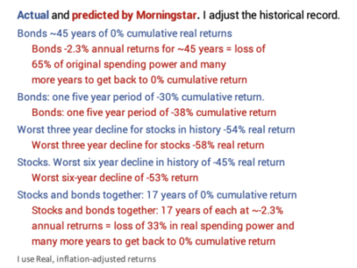
That means we could lower the complete history of annual stock and bond returns by those percentage point declines and have an accurate representation of the future Morningstar predicts. Returns have varied from their averages for long periods of time. I show how a few historical patterns of return would change from Morningstar’s predictions. Wow!
• My take: Morningstar provides NO logic as to why they think the statistical measure of variations in return will match the past. As a result, I think the adjustments to those historical patterns of return are just not credible. I’d generally think the variations in return would be lower given the lower average returns. If I’m correct, their calculation of the Safe Withdrawal Rate (SWR) would change – resulting in greater SWR than they recommend.
#3) Morningstar concludes we don’t have enough data to determine what exactly is THE Most Harmful Sequence of return to use to find what’s safe to withdraw for any period of time.
• My take. I disagree with their value judgment. The 1 worst out of 151 historical sequences of return is definitely good enough for our planning. Morningstar provides no clear logic as to why the worst out of 151 is not good enough to use as the Most Horrible Sequence in the calculations of Safe Withdrawal or Safe Spending Rate.
We have a very good record of stock and bonds returns since 1871; we have very fine-grain data from 1926 to the present. We have data on essentially all 151 sequences of return – some complete and some partial. For example, we have 132 complete 20-year sequences of return ranging from 1871-1891, 1872-1892 and so forth up to 2002-2022. But we can determine if any of the 19 partial sequences are candidate for Most Harmful. None of the past 19 years can be the start of a Most Harmful Sequence in history. And for ANY number of years! Returns have been too good; any declines – even the -37% decline in 2008 – were more than recouped in a few years; it took five years for stocks to get back to the start of 2008 +30%. Candidates for Most Horrible don’t do that for at least a decade.

The Most Harmful Sequence in history starts in 1969: that’s the real start date for the sequence with the deep -49% dive for stocks in 1973-74. This sequence is the Most Harmful Sequence for all periods greater than ten years and for a wide range of mixes of stocks vs. bonds. I’ve described this sequence here and here. Here is another display. When I look at all that I conclude, “That’s a REALLY A HARMFUL SEQUENCE. It has to be darn close to what anyone might expect EVER. Why should I spend time and effort to try to construct a sequence of returns that might be more harmful?”
#4) Morningstar concludes one needs to use a model to be able to find THE Most Harmful Sequence.
The model generates many sequences of return that might occur over the foreseeable future – perhaps, even, in the next 1,000 years. They input two numbers into the model: the average annual return for a period of years and a measure of annual deviations of return. The model then generates what it thinks is the complete range of future sequences from the almost impossibly horrible sequence (perhaps 1 in 10,000 chance) to top of the Everest sequence (10,000 out of 10,000). Morningstar picks a sequence or group of sequences at perhaps the 1st percentile (the 100thsequence of 10,000) and uses that as their choice of THE Most Harmful Sequence for the calculation of the Safe Withdrawal Rate for 30 years.
• My take. I place no credence in result of their model. Morningstar provides no description of what this return sequence looks like as compared to the 1969 sequence. Morningstar should say,
“Our model assembled 10,000 sequences, and we picked the sequence at the 1st percentile of sequences that we deem as THE Most Harmful Sequence of return.
We compare that sequence to the actual most harmful sequence since 1871: that sequence started in 1969. The sequence we pick is worse (or, ‘basically the same as’ or ‘better’) than the 1969 sequence.
We conclude that our sequence should be the one used to determine a Safe Withdrawal Rate for retirees. (or, ‘We conclude the 1969 sequence is a very good sequence to use as THE Most Harmful Sequence.’)
“Here is how we would describe the difference in the sequences: …, …, ….”
Conclusion: I DO NOT BUY the predictions of permanently lower stock and bond returns. They are not credible enough to change my conclusion that the ONE Most Harmful Sequence in history – the sequence that starts in 1969 – is valid for our financial planning. That sequence determines the Safe Spending Rates (SSR%s) that I show in Nest Egg Careand that you can verify with FIRECalc. NONE of us should lower the percentage we are withdrawing from our portfolio for our spending. NONE of us should conclude we don’t have enough money now to be able to enjoy our retirement.