How do you rank performance of your actively managed funds?
Posted on April 17, 2020
I’d guess that many retirees – and clearly many investors – have a lingering legacy of actively managed funds in their taxable account. The market has declined, and this a good time to consider selling an underperforming actively managed fund. You’d sell and invest the net proceeds in an index fund. Yes, when you sell, you’ll pay capital gains taxes now and have less to invest, but you’ll make that up: +90% of index funds will outperform over time. The key question is, “How long will it take for me to recoup – to have more in the future by selling my actively managed fund and switching to an index fund?” That’s primarily going to depend on your assumption of future performance of your actively managed fund. This post builds on last week’s post and describes how I would pick the funds that would rank at the top of the list to sell.
Next week I’ll run through the exact math for that decision. Spoiler alert: it takes very little time to recoup.
== Factors in your decision ==
Last week, I listed the factors for this decision. I knocked off #2c at the bottom of the list below. You pay a penalty of about .2 percentage points per year because of on-going taxes you pay on capital gains distributions from actively managed funds. We’ll see in this post that factors #2a and #2b potentially swamp that bad result. I focus on those two factors in this post. We’ll just keep the added .2 percentage point penalty from in the back of our minds for now.

== How I would rank funds to sell? ==
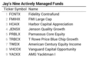
I’m going to use the example of nine actively managed funds my friend Jay owns in his taxable account. Jay’s held these for more than ten years. He spent A LOT of time and effort to pick high performing funds over a decade ago. I’ll guess that all of these were Morningstar five-star rated funds at the time he bought them. He tells me he bought more than 20! He got rid of those he didn’t like, and these remain. How would I look at these nine if I owned them?
== 1. Arrange by style and display Expense Ratio ==
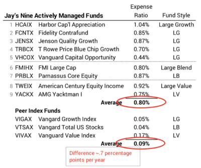
I reorder the funds by style and display their expense ratio. I get the style for the fund on the Morningstar (M*) Performance page for the fund. I get the Expense Ratio on the Quote page and also on the Price page. These funds fall into three of nine styles: Large Cap Growth, Large Cap Blend, and Large Cap Value. See this post for all nine styles and the peer index funds I use.
Why do I focus on expense ratio? I think you’ve got this. It’s a ZERO-SUM GAME for actively managed funds before costs: actively managed funds in aggregate MUST earn the same return as their peer index fund before its costs. The net return to investors from actively managed funds HAS TO BE LOWER by the difference in costs – annual expense ratio. That makes it LESS THAN A ZERO-SUM GAME FOR INVESTORS of actively managed funds. That’s basically why +90% of actively managed funds under-perform their peer index fund over time. (See here and here if you are foggy on these points.)
The expense ratio of these funds averages .8 percent. The expense ratio of the peer index funds average about .1 percent. That’s .7 percentage point difference in cost per year. I’d expect these funds to average .7 percentage point less in return. Nine is a very small sample of actively managed funds and three years is not that long of time: the result may be off one way or the other.
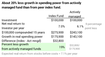
More importantly, I’d expect these funds in aggregate will under-perform in the future by .7 percentage points per year. If I add the .2 percentage point penalty for taxes on capital gains distributions I found last week, I’d conclude .9 percentage point less in annual return. That’s quite a hit: you’d expect – meaning you assume your actively managed funds perform on average – that you’d incur about 20% penalty in growth from your actively managed funds.
== 2. Compare performance relative to peer index fund ==
I compare a fund’s performance to its peer index fund. Morningstar displays how each fund’s performance compares to its peer benchmark index. Comparing to an actual fund you could own is fairer.
For this comparison I picked the annual return rate over three years. The Performance page for each fund on Morningstar shows average annual return data over a number of holding periods. I think three years a good time period. You could pick a different time period, though, since M* shows performance for a number of time periods. I gathered this data in early March; that’s good, since I don’t want to throw the effect of the steep decline since then into this comparison.
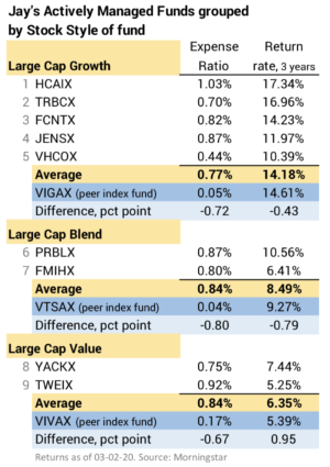
What do we find? Even though the sample size is small, the under-performance of actively managed funds generally follows the pattern I’d expect. The average performance of the five Large Cap Growth funds is close to the difference in expense ratio. The average performance of two Large Cap Blend funds is almost exactly the difference in expense ratio. The average two Large Cap Value funds performed better than their peer index fund.
You can see that Large Cap Growth was the winning style over the last three years. (That’s been true for longer than that). Its average annual return of the peer index fund was +14% while Large Value was +5%. The market as a whole represented by VTSAX was +9%. That’s good for Jay: I don’t know how much he has invested in each fund, but this would indicate he made a smart – or lucky – choice years ago to have more in Large Cap Growth.
== 3. Stock picking adds more variability ==
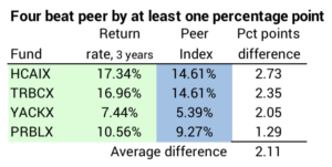
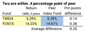
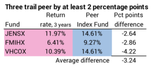
The fund manager’s stock picking ability or luck in choice of stocks magnifies or lessens the impact of a fund’s cost difference. Some managers will be good stock pickers or lucky and others won’t. I highlight in green the four funds that outperformed their peer index by more than one percentage point. Two funds in yellow were just a shade below their peer index fund. Three funds in pink under-performed by more than two percentage points.
The comparisons are easier to see when I regroup by level of performance in the tables below. Now we’re getting there. I want to focus on that third group of funds highlighted in pink. These look like the top candidates to sell: JENSX, FMIHX, VHCOX. None of those give me confidence that they’ll match their peer index fund in the future. I’ll focus on the exact math to use to decide if you should sell in the next post.
Conclusion: The market has declined. This is a good time to decide if you should sell an under-performing actively managed fund in your taxable account and replace it with a peer index fund. You need to rank order your funds. I get the data to do this from Morningstar. In this post I looked at nine funds my friend Jay owns. I found three that have badly under-performed. They are the prime candidates to sell. Next week I’ll provide the math steps to decide specifically what I’d do with these.