All posts by Tom Canfield
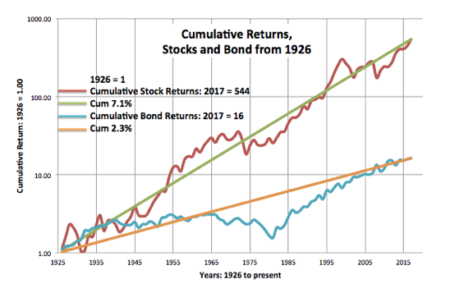
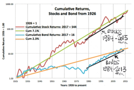
Stocks Real = 7.1%. Bonds Real = 2.3%
I’ve shown this graph in prior posts (download full view here), but the purpose of this post is to look at this graph in more detail and to better understand the implications for our financial retirement plan.
This is the plot of cumulative stock and bond returns. This is a semi-log graph. The x-axis is in years. The y-axis of cumulative returns (starting with January 1, 1926 = 1) is logarithmic; each unit of measure is the same percentage change: a change from 1 to 10 is the same unit of measure as the change from 10 to 100. Those straight trend lines (the 7.1% and the 2.3%) are of constant annual change
When I wrote Nest Egg Care, I used the average return rates displayed in Stocks for the Long Run by Jeremy Siegel, using data through 2012. Siegel displays the real return rate for stocks as 6.4% and 2.6% for bonds. My trend lines are slightly different: 7.1% is more for stocks and 2.3% is less for bonds. I may be using a slightly different data source than Siegel (See notes on pdf graph.) or drawing my trend lines differently. The differences in these rates don’t affect any decisions we make for our financial retirement plan.
What can we observe from the graph?
1. We see the obvious difference in long-term rates. The 7.1% rate for stocks is a steeper slope than the 2.3% rate for bonds. The stock rate is more than 3X that of bonds.
2. On this kind of graph, we don’t get a good picture of the effect of compound growth. I show that in the upper left on the graph: stocks compounded 544 times over the 91 years since 1926 and bonds 16 times. Stocks compounded 34 times more than bonds over this period. Wow.
3. We see that the actual lines for both stocks and bonds depart from their long-term trend line. When the actual line is going north from the trend line, the return rate is greater than the trend line. When the actual line is running west to east, the return rate is 0%; when the line is headed south, the return rate is negative.
========
For STOCKS, we see the following: three periods of rapid rise followed by periods of decline with many years to recover in cumulative return. The start of rapid declines are about 35 years apart (roughly 1930, 1965, 2000). My black lines show rapid climbs and then long plateaus.
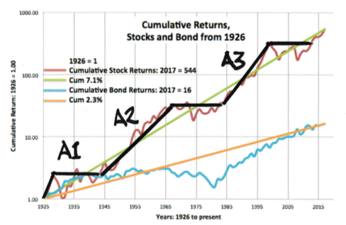
A1. The first is the rapid three-year increase from 1926 followed by a sharp decline: the start of the Great Depression. It took 15 years for cumulative stock returns to consistently surpass their 1928 level.
A2. The 23-year increase from increase from the early 1940s to the mid 1960s. The declines started in 1966. It took 17 years for cumulative returns to get back to their 1965 level.
A3. The 18-year increase starting in the 1980s through the 1990s with a decline starting in 2000. We see the deep dip in 2008. It was 14 years before cumulative returns got back to their 1999 level.
========
For BONDS we see a short, steep rise and then one big long period of zero percent cumulative returns. Then a steep recovery back to the long term trend line.
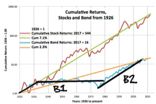
B1. From 1926, bonds followed the long term trend line for stocks, and then they wandered west to east with 0% cumulative return for 49 years from 1935 through 1984. 49 years. That is hard to believe.
B2. The sharp rise for bonds started in 1982 and rose fairly steadily through 2011. That line I drew would roughly parallel the line that I could draw for those years for stocks. That means bonds returns matched stocks over this period. (If you are picky on the start and end years, you can find periods where bonds outperformed stocks.)
Conclusion: I really like this graph of cumulative real return rates for stocks and bonds over time. Stock returns average 7.1% per year and bonds 2.3%, but we see a wide variation of both bond and stock returns over periods of time. Neither one steadily progresses along its average trend line. Our retirement period, in essence, will look somewhat similar to a segment of this plot of returns. The sequence of returns will vary for each segment we could construct. It’s essential to understand how our portfolio will fare considering the many possible sequences of returns we might face. That’s exactly what a Retirement Withdrawal Calculator does for us.

Think Real. Not Nominal. You’ll understand more clearly.
I always like to think of future financial returns in terms of inflation-adjusted dollars, generally called constant dollars. These are dollars stated in the same purchasing or spending power of some base year. Current dollars are the nominal count of the pieces of paper we call dollars. Because of inflation we need more current dollars to equate to the spending power of dollars from an earlier period. Stated differently, the spending power of our dollars shrinks over time due to inflation.
We understand more clearly when we just think real. The purpose of this post is to suggest you get in the habit of thinking real. Forget current dollars and nominal return rates.
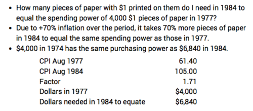
Here’s an example of the math of adjusting dollars in one time period to the same purchasing power in another time period. I find how many 1984 dollars match the spending power of $4,000 dollars spent in 1977. I got the inflation factors for this calculation from here. The spending power of $6,840 in 1984 equals $4,000 in 1977.
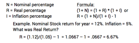
Here’s the math to find the real investment return rate. It’s just not the simple addition of real + inflation = nominal. Or, real = nominal – inflation.
Here are some advantages to thinking Real and not Nominal:
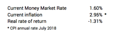
• We make better financial decisions when we think in terms of real rates of return. I read an article recently that suggested we retirees should invest more into money market funds since rates have improved. That’s true, but my immediate reaction was, “Real money market rates are below 0% and have been for a couple of years. Why would anyone shift more to that?” You can see below that real money market rates are about -1.3% now, and that’s less than a year ago. (Note: I’m willing to accept a less than 0% real return at times. In December I’ll put all of our 2019 spending into money market or similar. I want to isolate my brain from the vagaries of the market.)
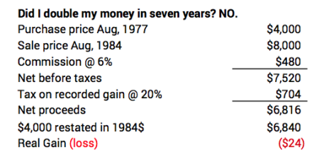
• We can get confused on how much we’ve really made (or lost) when we fail to state results in constant dollars. Patti and I purchased a lot for a second home many years ago. We paid $4,000 in 1977 as I recall. We eventually sold it for $8,000 in 1984. Did we come out ahead? No, not at all. We held it in a period of very high inflation: over 70% inflation in seven years. After the sales commission and taxes, we had an added 2,816 pieces of paper with $1 printed on them than we started with, but we lost real spending power!
• We more clearly understand what a Retirement Withdrawal Calculator (RWC) tells us when we use real returns and constant-dollar portfolio values. I like FIRECalc because all returns are real returns and all and portfolio values are in constant spending power. We understand the results of our plan so more easily.
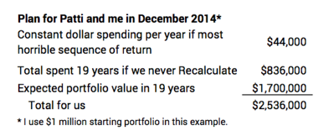
For the inputs that Patti and I chose for our plan in late 2014, FIRECalc shows the expected portfolio value in 19 years would be 70% more than our initial portfolio. Let’s assume in this example a starting portfolio balance of $1 million. The expected result of our plan would mean we could spend about $835,000 in today’s spending power over the years (19 * $44,000), and we’d still have 70% more in spending power than we started with. That adds up to more than $2.5 million for us. (Knowing that tells us we would not have to stick with that $44,000 spending amount for every year in the future.) Wow.
I like the Vanguard RWC, but I have no use for the numbers it displays for future portfolio values on its results graph. Those numbers include inflation, and because of the way Vanguard builds its sequence of returns, one can’t apply an inflation adjustment to understand what those numbers really mean. We don’t get close to understanding that our total spending power will be 2½ times the amount we start with if we ride a more average sequence of returns.
• We can do financial analysis more simply when we use constant dollars. In a week or so, I’ll post my analysis of whether you should take Social Security early (before age 70) or wait for the 8% boost you’d get by waiting one year. The conclusion is clear to me when I put all the numbers in constant dollars. But I read many articles that get the logic and math really confused, partly because they don’t use constant dollars and real return rates for the analysis.
Conclusion: We’ll all understand much more clearly when we think in terms of constant dollars (constant spending or purchasing power) and real return rates. Forget current dollars and nominal rates of return.

Nest Eggers: my Investing Cost dropped by 30%. Yours dropped or will soon.
My Investing Cost (my net cost reduction from market returns I assume in my financial retirement plan; and it’s really for Patti and me) has just dropped about 30%. Wowee. I thought it was as low as it could get, but I was wrong. We (Patti and I) save $20 per year relative to every $100,000 invested. We will now pay $50 per year (.05%) rather than $70 (.07%). Lower cost is always good, but lower than low is not earth shaking. It doesn’t change the key decisions for our retirement plan: when I run FIRECalc to see the effect, I see the time for zero chance of depleting our portfolio (e.g., the 19 years we set at the start of our plan) extends by just a few weeks.
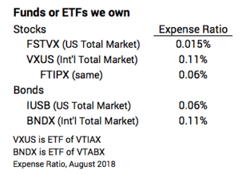
Why did our Investing Cost drop? Our investing cost dropped because the expense ratio of our largest single holding dropped by nearly 60%. Fidelity cut the cost for their US Total Market Index fund to .015% from .035%.
Fidelity also lowered the expense ratio of other index funds. I also own FTIPX, Total International Index. It did not exist when I started our plan in 2014. I purchased some this last December as explained here. Fidelity cut its cost to .06%. I’ll watch to see if that translates to slightly better return to investors than my original choice, VXUS.
Here are our holdings and their expense ratios. When I weight them by the percentage that we own of each, our personal Investing Cost adds up to less than .05%.
========
Why will our (and your) Investing Cost drop again? It’s a war out there. Three brokerage companies, Vanguard (funds and ETFs), Fidelity (funds) and Blackrock (ETFs) battle to see who can have lowest expense ratio for index funds. They’ve all steadily cut their expense ratio. I have to think that Vanguard at least will respond and lower their cost again. We might get to keep another $5 or $10 per year!
========
Fidelity just announced two new funds available to its customers that have 0% expense ratio! FZROX is for US Total Stock Market, and FZILX is for International Total Stock Market. Wow. You can read more here and here.
I read the Fidelity report on Index Methodology. Interesting. Fidelity has designed the indexes (baskets of stocks; process by which stocks are added or subtracted). Fidelity is doing this to avoid fees it would pay to companies who independently establish indexes, such as S&P Dow Jones, CRSP, Barclays, MSCI, and others. Brokerage houses typically pay fees to those companies to use their indexes as benchmarks and then do their best to have their index funds match. Fidelity’s construct may not be the same as the others. I’m not chasing after those 0% funds until I understand their performance for investors over time.
Conclusion: The expense ratio (our Investing Cost) of index funds keeps falling. It’s a war out there to see who can be lowest cost. The weighted Investing Cost of our portfolio has declined to less than .05%. That just means Patti and I get to keep more of what the market will give to all investors over time. I used to think we’d keep 98% of what the market will give. Now I think it’s 99%.

Once you’ve LOCKED IN SAFETY, Maximize the Pile of Money
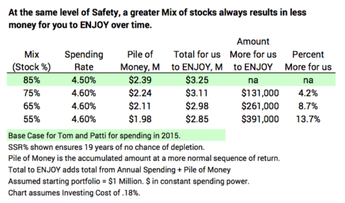
The last post shows that you LOCK IN SAFETY – the number of years you want with no chance of depleting a portfolio – with three key decisions: Spending Rate, Investing Cost, and Mix of stocks vs. bonds. Different decisions on those three can lead to the EXACT SAME LEVEL of safety. As reference, Patti and I adopted a safety level of at the end of 2014 that was no chance of depleting our portfolio for 19 years. (See Nest Egg Care (NEC), Chapters 2, 3, and 4.) (Refer here for a glossary of terms.)
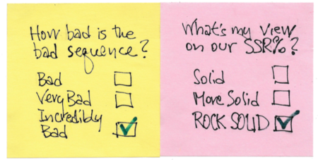
But different decisions will lead to different Piles of Money – the amount you’d accumulate in a future year if you rode a more normal or expected sequence of returns.* (You’ll see below that the Pile of Money for Patti and me is about $3,000 relative to a $1,000 initial portfolio.) The purpose of this post is to explain how I got the to Piles of Money displayed in last week’s post.
========
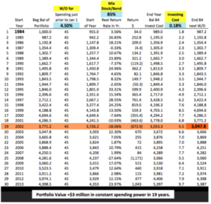
Two weeks ago I independently verified the SSR% I originally got from FIRECalc by buiding a spreadsheet using the most horrible sequence of stock and bond returns that I found. My spreadsheet confirmed FIRECalc’s results. It confirmed 19 years of no chance for depletion for Patti and me at the start of our plan.
My method here also uses one sample sequence for the same spreadsheet. The return sequence is different. I tried to pick the 30-year return sequence that was average. (In hindsight, perhaps I should have focused on a 20-year sequence.) That meant I looked for a sequence with the starting and ending points for stocks and for bonds that most closely paralleled their long-term trend line. That’s the 7% per year real return line for stocks and 2.3% line for bonds. I eyeballed and settled on 1984 as the start year. You can see my handiwork here. (It’s not so easy to find them both marching along their trend lines!)
I then entered the return sequences and the spreadsheet calculates year-by-year portfolio values. Again, for our plan inputs (those for Patti and me), the Pile of Money at the end of the 19th year is about three times the amount we started with. That’s stated in constant spending power. (Full size display here.)
That magnitude of increase (and the increase in just a few years) tells us we can Recalculate during retirement: (See Part 3, NEC.) My recalculations based on returns for 2015, 2016, and 2017 mean Patti and I can now safely spend about 20% more per year than for the first year of our plan: our 2015 spending was $44,000 per year per starting $1 million Investment Portfolio; our 2018 spending is $54,000.
========
FIRECalc gets to the value of the Pile of Money by averaging portfolio values in a future year for all the sequences it builds. For example, it averages the ending values for as many as 129 19-year sequences . That method is more thorough than mine. And FIRECalc’s average is a lot less than from my choice of the 1984 sequence. But my crude method and FIRECalc’s lead to the exact same conclusions and decisions for your plan.
Conclusion: Assuming you ride the most horrible sequence of return we can anticipate, a Retirement Withdrawal Calculator will find the Safe Spending Rate (SSR%) that gives you the number of years you want for no chance of depleting. I trust FIRECalc for this task. Different decisions for Spending Rate, Investing Cost, and Mix of stocks vs. bonds can give you the exact same level of safety.
With those same inputs, you will have much more money in the future if you ride a sequence that is not most horrible. That’s the Pile of Money. You can alter your three key decisions (maintaining the same level of safety) to maximize the Pile of Money. Do that!
* To be more precise, the Pile of Money is calculated assuming you never change your decisions on Spending Rate, Investing Cost, and Mix during retirement.
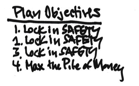
Different decisions lead to the same level of SAFETY for your financial retirement plan.
The top objectives for our financial retirement plan are Safety, Safety, Safety. We don’t want to run out of money if we face HORRIBLE future financial returns. And then at our chosen level of safety, we want to maximize a potential Pile of Money we would have if the sequence of returns we face is more normal, not most horrible.
We all make (knowingly or unknowingly) three key decisions that determine the safety of our financial retirement plan. And these decisions also affect the Pile of Money. The decisions we make interrelate, and different decisions can result in the EXACT SAME level of safety. The purpose of this post is to show how they interrelate.
These are the three key decisions:
• Spending Rate
• Investing Cost
• Mix of stocks and bonds
Safety of your financial retirement plan can be defined terms of the probability of never depleting your portfolio. The most important part of Safety is a guarantee of many years of no chance of depleting your portfolio. A Retirement Withdrawal Calculator (RWC) tells us the fewest number of years before our portfolio would deplete based on the worst sequence of future returns that it assembles. After that first point of depletion, an RWC counts of the number of sequences that deplete each year and calculates the year-by-year probability of failure.
The plot of the year-by-year probabilities looks like a hockey stick. The shaft is the number of years of no chance for depletion. You are safe when you LOCK DOWN the number of years you want with no chance of depleting your portfolio. You LOCK DOWN with your three key decisions.

Your decisions to LOCK DOWN safety also affect the Pile of Money, the amount of money that you would accumulate if you faced a more normal sequence of return. I display the size of the potential Pile of Money in the tables in this post. I’ll cover how I got to the Pile of Money in the next post. You objective is to LOCK DOWN safety and then maximize the Pile of Money at that safety mark.

========
The simplest way to understand the three decisions is to first fix the length we want for the shaft of the hockey stick: our desired level of safety. For this post I’m setting the length of the shaft at 19 years. That’s what Patti and I picked at the start of our plan for our spending in 2015. (See Chapters 3 and 4, Nest Egg Care (NEC).) (It’s fewer years now; we’re older!)
How will we understand the effect of the decisions? 1) We’re going to see how changes in Investing Cost affect the spending rate that gives us a 19-year shaft length. The spending rate that gives us the 19-year shaft length is our Safe Spending Rate (SSR%). 2) We repeat by changing Mix for the cases that again have the same 19-year shaft length.
This spreadsheet (pdf file) is a baseline for reference. This shows the results for the decisions for our plan (Patti and me). You see the 19 years of no chance for depletion on the most horrible historical sequence of returns I can find. The SSR% shown is 4.5%.*
You can download this actual spreadsheet and input the numbers I use in this post and confirm the results I cite. You likely have a different number of years you want for no chance for depletion; you can input the decisions you’ve made for your plan. I’d always refer to FIRECalc before making any final decisions, though.
========
I first show what happens to SSR% from increased Investing Cost. I show two other levels of Investing Cost: .9% is about the average Expense Ratio for Actively Managed mutual funds; the 1.5% is likely closer to the average Investing Cost incurred by retirees when one adds in the percentage who incur advisor fees. You can see two effects of greater Investing Cost:
1) Greater Investing Cost always lowers the SSR% and therefore would lower the amount of money that Patti and I would be able to spend on ourselves. See Table below. Because of our low Investing Cost and therefore greater SSR%, Patti and I can spend 10% more each year relative to someone who decides on 1.5% Investing Cost.
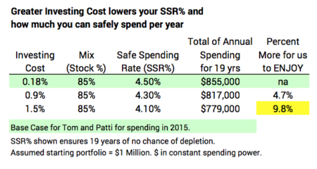
2) Greater Investing Cost always shrinks the Pile of Money that would accumulate at more normal returns. See Table below. At our low Investing Cost, Patti and I would have +$600,000 MORE per starting $1 million over the 19 years than someone who incurred 1.5% Investing Cost. Wow. That is an average of $32,000 MORE per year over the 19 years relative to our first year of spending of $45,000. Again, these numbers are in constant spending power.
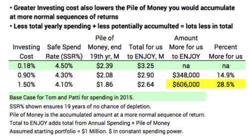
It should be obvious. The first decision you want to make for your retirement plan is to COMMIT TO REALLY LOW INVESTING COST: you just lose BIG TIME from high Investing Cost.
========
We next must understand what you get (and give up) from different Mixes of stocks vs. bonds. I’m going to display the results assuming you’re going to build your plan on really low Investing Cost. Let’s stick with .18% for this although it’s easy to be lower. The baseline is our plan of Mix of 85% stocks.
A lesser mix of stocks gives a small boost to your Safe Spending Rate (SSR%). See Table below. The other three cases in the table result in the same 19 years of stick length. In all those cases the SSR% increases to 4.6% from 4.5%. This translates to a 2% increase in spending. That first increase in SSR% comes at Mix of 75% stocks, and then that’s it. You get no more improvement with lower mixes of stocks.
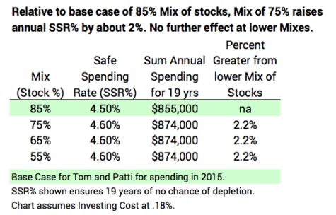
For the same level of Safety (stick length), you are always better off with a greater Mix of stocks. See Table below. The tradeoff for Patti and me was easy. The question we faced was, “Can we accept 4.5% spending rate rather than 4.6%? Can we accept $80 per month less spending ($1,000 per year) with the prospect of perhaps $130,000 more in total for us over time?” That’s trading off $1,000 per year vs. the potential of $7,000 per year at the same level of safety. Answer: “YOU BET!!!” That’s what led to our Mix of 85% stocks. (Hey, I’m Okay with a decision of 75% stocks, but less than this . . . what are you thinking?)
Conclusion: Three key decisions lock in safety of your financial retirement plan: spending rate, investing cost, and mix of stocks vs. bonds. You can first decide on safety in terms of the number of years you want with no chance of depleting your portfolio in the face of the most HORRIBLE sequence of future financial returns. Then your decisions on Investing Cost and Mix will determine your spending rate that guarantees the number of years you choose.
You want to commit to a really low Investing Cost; you get NOTHING from high costs. At your desired level of safety (years of no chance for depletion), you are always better off with a greater Mix of stocks.
* I use 4.5% as the spending rate for this spreadsheet. As I state in NEC, we started at 4.4%. As I mentioned in the last post, my spreadsheet gives slightly better results – e.g., a slightly greater SSR% for 19 years – than FIRECalc.
FIRECalc vs. the 4% Rule: Which One Wins?
FIRECalc wins. FIRECalc gives us retirees the right data for the key decisions we must make for our retirement plan. My independent calculations agree with FIRECalc’s and not with those from the 4% Rule. I am more confident that Patti and I have a solid financial retirement plan. I am not going to use any information or recommendations from the 4% Rule.
Why did I want to independently verify FIRECalc? Hey, my name is Tom, so I’m naturally a doubting Thomas. I like to dig and see the evidence to understand and verify things for myself. But the real impetus was an article (Sorry: you may face a paywall.) and interview that more specifically described something called the Updated 4% Rule. (Here’s the wikipedia entry on this.) The statements for the Updated 4% Rule were these (my summary):
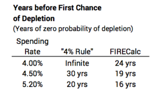
• A 4% spending (or withdrawal) rate is forever: no chance of ever depleting a portfolio
• A 4.5% spending rate is zero chance of depletion for 30 years
• A 5.2% spending rate is zero chance of depletion for 20 years.
NONE OF THOSE STATEMENTS ARE TRUE when I use FIRECalc (or the Vanguard RWC). Those spending rates are too high for safety – the stated years of zero chance of depletion. For example, FIRECalc would show 4.5% spending rate results in no chance for depletion for 19 years (not 30) and a 16% probability of depletion at the 30-year mark (not 0%).* That’s a wide disagreement. Which one is correct?
=======
I wanted to confirm the results of FIRECalc. Specifically, I wanted to confirm the decisions Patti and I made at the start of our retirement plan in late 2014. That was for our first spending year of 2015. Patti and I then chose 19 years as the number of years we wanted for zero probability of depleting our portfolio. (Chapters 3 and 4, Nest Egg Care [NEC], explain why we chose 19 years.)
FIRECalc told me the spending rate for 19 years of zero chance of depletion is 4.40% given two other plan inputs. A 4.40% rate translates to an annual, constant-dollar withdrawal for spending of $44,000 per $1 million Investment Portfolio; see Chapters 1 and 7, NEC. FIRECalc’s 4.4% is not close to 5.2% that the Rule would say. Who’s right? [Read here if you want to use FIRECalc to confirm those 19 years.]
========
How did I independently verify that FIRECalc’s 4.40% spending rate gave Patti and me 19 years with no chance of depleting?
First I built a spreadsheet with the correct logic or calculation steps of how a Retirement Calculator should work. I describe the logic of how an RWC works in Chapter 2 NEC and here.)
Next I had to get the historical annual return rates for stocks and bonds. A book in my library gives real (inflation adjusted) returns for stocks and bonds from 1926. Using real returns makes the calculations and math of an RWC (and my spreadsheet) much easier. Also, the RWC and my spreadsheet then calculates future portfolio value in constant spending power, and that’s what we want to understand.
I then had to find the most horrible sequence of returns ever. I could eyeball all the years and sequences, but it was easier to see return patterns by first plotting cumulative returns for stocks and bonds. (See here and below.)
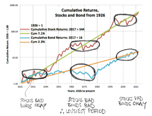
You can see three periods of lousy stock returns. The trend line heads northeast, but the actual generally wanders directly east for a number of years (0% cumulative return) with a number of years of steep declines heading deep south. The worst and longest period started in the mid-1960s. That period contains the second worst two-year return for stocks in history: the cumulative, real decline was -49% for 1973 and 1974. It took 17 years for cumulative stock returns to get back to the January 1, 1966 level.
Bonds were also lousy (their lousiest) for that period. They turned southeast in 1965 and continued southeast. Returns improved dramatically starting in 1982, but cumulatively returns did not get back to the 1965 level until 1986.
Finally, I needed to find the specific, worst-start year. To do that I pasted 30-year series for returns for stocks and bonds for each start-year in the 1960s and early 1970s into the spreadsheet. I could see the effect using 4.40% spending rate. I found the stinker year for the start was 1969. The start gave the fewest years to the first chance of depletion. That is the very bad starting point for both stocks and bonds: 1969 was start of the worst six-year cumulative stock return in history, and bond returns for the next 12 years contain four of the worst ten since 1926.

========
With FIRECalc’s default .18% Investing Cost and our decision on Mix, the resulting spreadsheet gives 20 years of zero chance of not being able to take a full withdrawal for next year’s spending (See here for full view.) I judge the spreadsheet’s 20 years vs. FIRECalc’s 19 years is of no consequence. The spreadsheet supports the Safe Spending Rate I get from FIRECalc. It does not support what I’d get from the 4% Rule.
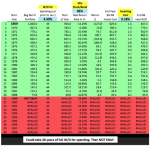
I like the fact that my spreadsheet calculates one year more of no chance of depletion for our starting 4.40% spending rate. That indicates our plan might be a shade more conservative than I thought. (When I use our actual Investing Cost of .07%, I increase portfolio value by enough at the end 20th year to tip the result to an added year of full withdrawal for spending [See here]. I did not include the impact of using our off-the-top Reserve in a year of horrible returns (See Chapter 7); that would add several more years [I don’t display this result].)
This spreadsheet gives me more confidence in our retirement plan. I’m pleased I based our plan on FIRECalc. I reject any use of the rules of thumb from the Updated 4% Rule. (Why are the statements of the Updated 4% Rule so far off? Read here for my views.)
========
The spreadsheet is a simple, dynamic tool to see the effect of Spending Rate, Investing Cost, and Mix of stocks and bonds. In an upcoming post I’ll provide the actual spreadsheet you can download. Some may want to use it to validate their plan decisions and play with it to explore the effect of different inputs.
Conclusion. We retirees can trust the results from FIRECalc for our retirement financial plan. We can set any number of years we desire for zero chance of depleting our portfolio. We input our decisions on Mix of stocks vs. bonds and Investing Cost into FIRECalc, and it leads us to the Safe Spending Rate (SSR%) that meets our choice of years. Most retirees are in the dark as to even knowing what the three key decisions are. Generalizations like the Updated 4% Rule aren’t helpful, and that Rule is just not correct in my view: follow that Rule at your peril.
* Buried in the details of the 4% Rule is the exact investment mix used, and I tried my best to match it exactly in FIRECalc. I used a mix of 55% stocks and 45% bonds. Stocks are 35% Large Company Stocks and 20% Smaller Company Stocks (an overweight). Bonds are as close to Intermediate Government Bonds as I can get in FIRECalc. We’ll find in other posts that this low mix of stocks is off the mark for your financial retirement plan.

Can you pick a winning Actively Managed fund based on its past results?
The SPIVA® report, “Does Past Performance Matter? The Persistence Scorecard” answers the question. Don’t count on an excellent track record of performance of an Actively Managed fund to extend into the future. Excellent performance does not persist. Only a very small percentage of funds with good performance in one year repeat in each of the next two or four years. A significant percentage of funds that are top performers in one year (top quartile) transition to bottom performer in a few years (bottom quartile). I summarize the SPIVA report in this post.
========
This SPIVA report is a companion to another SPIVA report I discussed here and here. We found the following in that report:
• Over a three-year period, the cumulative return of 85% of Actively Managed funds did not match their benchmark index. On the same basis, 94% did not match their benchmark over 10 years.
• Over the past 15-years, the average Actively Managed fund underperformed its benchmark by about 1.2 percentage points per year. That’s about 1/6th lower real return rate for stocks. Over a ten-year period, that difference compounds to lower real spending power equal to about 20% of an initial portfolio.
• Over 15 years, Actively Managed funds that performed well – at the 75th percentile of peer Actively Managed funds – underperformed their benchmark by .5 percentage points per year.
========
We have a human bias that tends to fight what we’d conclude and do with this information. We believe we have better than average skills in recognizing patterns, and we (or someone we hire) can find the few Actively Managed funds that can beat the odds. I’ve heard this expressed in the following way, “Just don’t pick the funds that will underperform. Only pick the ones that will outperform.” Can we do that? This SPIVA report says, “No”.
1. We can’t judge the future based on historical results. Excellent performance does not persist. SPIVA measures persistence of better performance for Actively Managed funds over two and four-year periods.
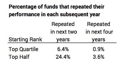
• Funds in the Top Quartile (better performance than 75% of all funds): 6% of 560 Actively Managed funds in the top quartile of performance for the year ending September 2015 repeated that performance in each of the next two years. (Only 18% of the 560 repeated to be in the top quartile the next year; data not shown in the table above.) The fall off in persistence continued: only 1% of top quartile funds in the year ending September 2013 repeated that performance in each of the next four years.
• Funds in the Top Half: 24% of those funds in the top half of performance for the year ending September 2015 repeated that performance over each of the next two years. About 4% of top half funds in the year ending September 2013 repeated that performance in each of the next five years. (The report says that 6% would outperform following a general pattern of randomness; the actual results were worse than expected random results.)
2. The SPIVA report tracks the movement of funds to different quartiles of performance over time: a significant percentage of funds that perform in the top rank in one-year drop to the bottom rank in a few years. And a significant number of funds that perform in the bottom rank in a year rise to top rank in a few years.
• Over five years, 28% of those that started in the top quartile in a year wound up in the bottom quartile in the year five years later. 18% of those in the bottom quartile for a year wound up in the top quartile five years later.
Conclusion: Two prior posts summarized a SPIVA® report on cumulative performance of Actively Managed fund relative to their benchmark index (e.g., Large Cap Growth funds vs. the Large Cap Growth Index). That report concluded that, over time, 94% of Actively Managed funds underperformed their index. (Given the low, low Investing Costs [Expense Ratio] of Index funds, this means that Index funds will be about the 94th percentile rank of all Active + Index funds.)
But despite those low odds of success, we’d all like to think we are smart enough to be able to pick the funds (or hire someone to pick the funds) that will outperform. We all look to past performance as the guide and think that works. The SPIVA report summarized here says that there is almost no predictability of future performance based on past results. You’re really betting against the odds when you invest in Actively Managed funds.
Hard core Nest Eggers only invest in Index funds. We stick with a predictable, very small Investing Cost that’s a deduction from Market Returns. (Mine is less than .07% cost in total.)

What are your mid-year To-Do’s for your Retirement Plan?
I read this article this week, “6 Portfolio To-Do’s for Retirees at Midyear”. I don’t do ANY of the six. This post describes what I don’t do mid-year and why.
Here are the steps in the article:
1. Check your year-to-date spending rate. I don’t need to check this. I already know where Patti and I stand, almost on a daily basis. I calculated our Safe Spending Amount (SSA) last December. Our spending rate now is 4.75% up from 4.40% at the start of our plan (January 1, 2015). Our 2018 SSA is $54,000 relative to $1 million Investment Portfolio at our start. (The terrific returns in 2017 gave most of the boost from our initial $44,000.)
Since we pay ourselves 1/12th the annual total (direct deposit from our Fidelity account into checking), all I really need to look at is our checking account: Have I had to advance a paycheck because we’ve run out of money in a month? (No.) Do I get close to zero at the end of every month? (No.) Am I building cash this time of year that tells us we should work harder to spend to ENJOY or start thinking about gifts at the end of the year? (Yes)
The article says a retiree starting their plan should use 4% as his or her spending rate. Nest Egg Care (NEC), Chapter 2 is far more precise. The percentage changes with age: for once it’s better when you are older. That 4% rate applied to our Investment Portfolio would have been 10% too low for Patti and me at the start of our plan and would be about 20% too low now.
2. Check the asset allocation of your portfolio. The article says allocation of stocks and bonds is the second most important decision after spending rate. It’s really a distant third. Clearly your decision on Investing Cost is a very close second to Spending Rate to maintain long-term health of your portfolio. (I could argue that it’s the essential starting point of any retirement plan. You find out that in NEC, Part 2.) I set our stock and bond mix at the start of our plan, and that allocation does not change.
The article also says that a retiree should have two years of spending in cash. NEC recommends a 5% Reserve or basically one year of spending, but Patti and I chose two years in Reserves (Part 2), and I invest that in a Short Term Bond fund. (And I’m now including the value of 529 Plans that we “own” as part of our Reserve.)
3. Take a closer look at your cash. Again, I don’t need to do this. The only cash we have (Money Market or Checking) is the unspent balance of our 2018 SSA.
The article says one might want to increase cash because money market rates are increasing. This makes no sense to me. Rates are increasing because inflation is increasing. I’d guess the real return on Money Market is below 0%.
The article suggests “opportunistic” retirees might want to boost cash so they could bargain hunt if stocks or bonds fall. That makes no sense to me. We retirees should not be betting that we can boost returns by timing market moves. I don’t think anyone can do that successfully over what we all hope is a decades long retirement period.
4. Take a fresh look at IRA conversions. The conversion is Traditional IRA to Roth IRA. For most all of us we’d be considering how much we might save in taxes by incurring a 22% tax rate now (Traditional) for the conversion to, maybe, avoid 24% tax rate later (Roth). The tax brackets are pretty wide. I suspect the marginal rate for most of us is 22%, starting at $77,400 for married filers; that marginal rate runs to $165,000 before the 24% rate kicks in. You’ve got to be at the edge of one bracket to even give this a thought. Predicting your future taxable income is really tough. (The change in value of your retirement accounts and Required Minimum Distribution (RMD) will be the biggest consideration.) Predicting how much of your RMD income might tip you into a higher marginal bracket is tough. The two-percentage-point difference is small. Converting would make zero sense for all but a rare few of us.
5. Develop an action plan for your RMD. I don’t need to figure that out now, since my process steps and calendar were set when Patti and I started our plan. (See Chapter 13 Nest Egg Care.) Our process is to take RMD the first week of December. We calculate our Safe Spending Amount (SSA) for the upcoming year. SSA certainly is greater than RMD, not just for Patti and me but for all retirees. So all retirees are going to take their RMD, but need to sell more securites to get to thier SSA. Largely because the lower tax bite on capital gains, most all will sell securities in their Taxable Account to get to their total SSA for the upcoming year.
The article gives some advice to those who don’t spend their RMD. Why wouldn’t you spend (or gift) all your RMD and more? Why so little? Pay yourself your full SSA!!! Spend and gift it ALL in the year.
6. Revisit your Charitable Giving Strategy. We don’t rethink our strategy. That’s set. In October we have to figure out if we will spend our full 2018 SSA by the end of the year. If not, we will gift to those we love and donate the balance to charities we really like.
We really like gifts to 529 College Savings Plans. For donations, our process is to first donate as Qualified Charitable Distributions (QCDs) from my IRA account. (I’m over 70½ and can do that; Patti hit 70½ this year.) It never hurts (and could help) by donating directly from your Retirement accounts (see Chapters 10 and 13). Our retirement accounts are at Fidelity, and it’s pretty painless to execute the QCDs.
If I donate from our taxable account, I always donate my most highly appreciated securities to our account at the Fidelity Charitable Gift Fund (FCGF) – a donor advised fund. (Others, like Vanguard or Schwab, have similar funds.) And then I ask it to make the donations to those on the list I’ve given them. This is a big time saver for me. Fidelity makes it very easy to find the securities in our taxable account with the lowest cost basis and move them over to FCGF (Donating securities with lowest cost basis give best tax advantage.)
Conclusion. If you set up your plan and process as suggested in Nest Egg Care, you really have very little to do during the year. You certainly do not have 6 Midyear To-Do’s. Your real work is concentrated over a few days after your calculation date. The work for Patti and me starts right after November 30.

Can you lose 20% of your nest egg and feel good about it?
Unfortunately, the answer is Yes. What? Lose 20% of your nest egg and feel good about it? Well, most investors effectively lose 20% of their nest egg or the biggest portion of their nest egg (stock portfolio) over time and feel good about it. This post describes why that is true and how we avoid doing that in the future. We Nest Eggers don’t want to fall into this trap.
I am on an Investment Committee for a local foundation. We hired Vanguard as Investment Advisor about five years ago. We invest in the Vanguard Funds they recommend: 97% of our total is in Index funds; about 3% is in two Actively Managed bond funds they recommend. We get an excellent comparison report, and all the funds we own perform very close to, if not identical to, their benchmark index. As information for the committee, I recently sent a short memo summarizing the recent SPIVA® report. That report compares the performance of Actively Managed funds to their benchmark index. I included these points:
Actively Managed funds in aggregate returned about 1.2 percentage point less per year than their benchmark index over the last 15 years.
The 1.2 percentage point difference would have compounded over a decade (as an example) to less for an investor – the amount less is about 20% of the initial portfolio. An investor either wins or loses the investing game relative to market returns, and in this case the investor in Actively Managed funds lost (really did not gain) 20% of his or her initial portfolio.
That second paragraph is a slightly different take on what I said here, here, and here. How did I get that 20% loss of the initial nest egg? Why to do most all investors pay no attention to that loss?
========
How did I calculate the loss of about 20% of one’s nest egg over the last decade? I’m comparing the expected return from Actively Managed funds to the expected return from Index funds.
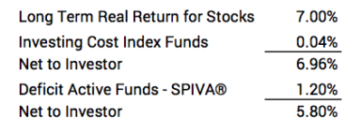
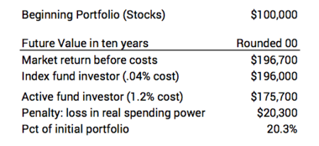
I start with a portfolio value of $100,000 in this example. I’m showing the effect if this was invested in US stocks only. That’s going to be the largest single holding in your portfolio. I use 7% real return. That’s the average annual real return rate for stocks since 1926. (The average real return was 9% over the last decade; that’s an amplifying effect we’ll ignore for now.)
You have two alternative investment approaches. 1) You can invest in a stock Index fund at an investment cost of .04%, meaning you net on average 6.96% per year. 2) You can invest in Actively Managed funds, and, using the SPIVA data, the expected return from these funds will be 1.2 percentage points less than market return rate or 5.8% per year. (Even the Active funds that perform at the 75th percentile underperform their benchmark index by about .5 percentage points per year.) Here are the return rate assumptions.
Now for the future value calculation. Actively Managed funds return roughly $20,000 less in real spending power – about 20% of the original nest egg. You either win or you lose relative to what you easily could have achieved, and Actively Managed funds lost $20,000. (If I used the actual returns over the decade, the loss would be 25% of the original portfolio value; that’s the amplifying effect of greater than average returns.)
========
Why don’t we grasp this? We fail to exert the slow, thinking part of our brain, the part that requires thought and calculations to understand reality.* We miss two measures of reality.
1. We only look at our absolute results and judge we did just great with Actively Managed funds (+$76,000 increase in real spending power). We never compare our results relative to what it should have been (+$96,000).
2. Inflation distorts our view. If I include 1.6% inflation per year (It averaged that over the ten year period ending December 2017.), the future value of Actively Managed funds would have been more than twice as many dollar bills (a $100,000 dollar increase from a $100,000 start). We think we’re REALLY doing great. We lose sight of our results in terms of real spending power, and that has to be our measure of performance.
=========
My friend, Betty, told me that her (prior!) investment advisor told her, “You’ll never notice” when she asked about the high fees she was incurring with him. That’s right. Over the last decade, her portfolio would have increased nicely even with those high fund and advisor fees. But not by nearly as much as it could have. Kudos to Betty: she made the switch to be self-reliant and invest in just a few Index funds: she’ll be WAY AHEAD in the future.
Conclusion: It’s easy to delude ourselves and think we are just doing great by investing in Actively Managed funds in our attempt to outperform the market. But, based on history, the expected result from Actively Managed funds is to lose about 20% of your initial nest egg over a decade relative to what it should be. Don’t do that! Stick with Index funds.
* I liked the book, Thinking. Fast and Slow. Daniel Kahneman.