All posts by Tom Canfield

I can plan for the amount and where I need to sell for our SSA for 2024.

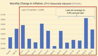
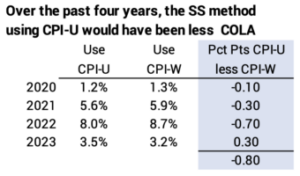
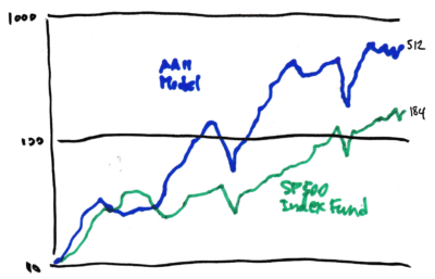
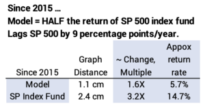
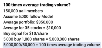
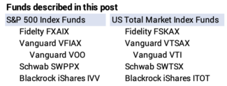
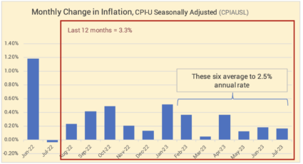
I did my initial plan for our Safe Spending Amount for calendar 2024 the first week of August. I finalize the plan this month, and I can do that now. I have the two items of new information since August: 1) the 3.2% COLA for Social Security and the Medicare Premium tripwires that I want to avoid for our 2023 tax return.


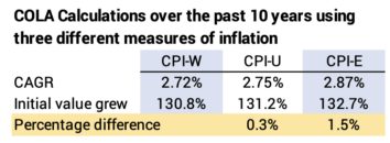
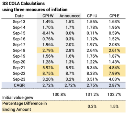
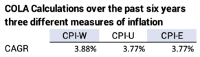
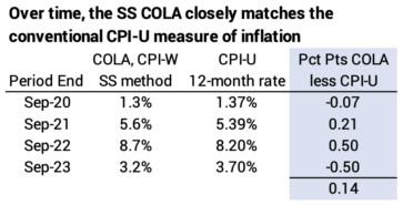
This isn’t new or revised information: it is OBVIOUS that Patti and I – you, too – adjust last year’s Safe Spending Amount (SSA; see Chapter 2, Nest Egg Care [NEC]) for 3.2% inflation. We are FAR AWAY from being able to calculate to a real increase for the upcoming year. Armed with this information, I know how much securities I need to sell in a few weeks to get our 2024 spending into cash and where to sell for lowest taxes.


Tripwires will almost certainly adjust for inflation next year, but to be sure, I’ll use these as the limits of MAGI in my tax plan for my 2023 return.


Details:


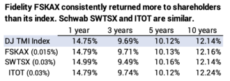
I keep track of the progress of our portfolio return throughout the year. I get the return data for our four funds from Morningstar. The last two months have been stinkers. My chart for the first 11 months of my 12-month year shows about -2% real return. That’s on top of the -18.4% real return for our portfolio last year.


== If we just thought about this year ==


We clearly won’t have the returns over the last year to calculate to a real increase in our SSA. It will simply adjust for inflation. Even though the first days of November have been terrific, I can conceive of the results by the end of November changing this basic story if I only had this year to consider.


To earn a real increase in our SSA (I’m ignoring the fact that our Safe Spending Rate [SSR%, also Chapter 2] increases over time.), we need to earn back what we withdrew for spending in the year. Assume I withdraw $45,000 from our portfolio in December for our spending in the upcoming year. If returns that next year are such that I earn back more than $45,000 in real spending power, I am guaranteed to calculate to a greater SSA the next year. If I don’t earn back enough, I can only adjust for inflation – no real increase.


I have more for the next calculation for SSA than I had the prior year. Even if SSR% is unchanged, I’ll calculate to slightly greater SSA in this example.


I could state this differently. Assume I withdraw 4.5% as our Safe Spending Rate. If I earn back a shade more than 4.5% real return. If I do that, I am guaranteed to calculate to a real increase in our SSA.


== We also have the prior year to overcome ==


It’s MUCH tougher this year, since we all have to overcome the prior year as well as for the withdrawal last year. Our portfolio declined by -18.4% real return last year. Our withdrawal stayed the same in real spending power. That worked out of 6.5% of our starting portfolio value. We would need for this year 32% real portfolio return to earn back the amount to get to our prior peak portfolio value in November 2021.


We all still have BIG HILL to climb to get back on track to see a real increase in our SSA.


== Where to sell to get our SSA into cash ==


I can decide where I will get the cash for our SSA this coming year.


$SSA is always greater than $RMD, so I always play with our tax return to decide where I will sell the added amount I need for our SSA that results in the lowest taxes. That’s a simple task if I just think about this year, but it is more complex if I think about taxes over time, especially when just one of us is alive.


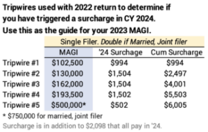
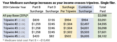
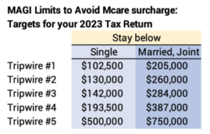
My tax planning for this year is fairly simple: our AGI – Adjusted Gross Income – will not be that close to a Medicare tripwire. I don’t need to jiggle – consider using my Roth – to get our cash to avoid a Medicare Tripwire. I hoard my Roth to be able to avoid a Medicare tripwire, and I don’t have to use it this year.


Overall, our taxes for 2023 will be lower than in 2022 because our RMD is less for 2023 than it was for 2022. This year I’m getting a greater portion of our SSA from sales of taxable securities that have a lower tax bite.


Conclusion: I finalize my tax plan for each year in November. It will be very similar to my first draft that I prepared the first week of August, but now I have the final details. Our SSA ­gross sales of securities that I’ll essentially withdraw from our portfolio is last year’s SSA + 3.2% for inflation. RMD is a significant part, but not all our SSA. I’ll sell the balance I need to add to our SSA from our taxable account. I can project our AGI and know that we won’t be close to a Medicare tripwire that we could otherwise avoid.

Have we licked the inflation monster?

A final data point for inflation in September was issued this morning. That was for the important chart below for Personal Consumption Expenditures less Food and Energy components. This is the measure of inflation that the Federal Reserve favors. The last six months point to 2.8% annual rate, and the rate for the last four months tracks to a 2.4% annual rate. These are the lowest rates in several years.


Going deeper: below I display a table and the same six graphs that I’ve use to follow the trends in inflation.


The two most widely-reported measures of inflation are Seasonally-adjusted inflation and Core inflation. These and most all other measures of inflation are reported at about the two-week point in the following month.


Seasonally-adjusted inflation increased by 0.40% in September. August and September were greater than the prior six months. The rate over the last six months aim at an annual rate of 3.8%.


Core inflation excludes volatile energy and food components. This is similar to the measure favored by the Federal Reserve. The last six months aim at an annual rate of 3.6%, and the last four track to 2.8% annual rate.


Personal Consumption Expenditures (PCE) excluding Food and Energy is the measure of inflation that the Federal Reserve Board favors. It’s a chain-type index meaning the weights of components are revised during a year to more accurately reflect changes in purchasing patterns. It’s the measure reported near the end of the following month. The last six months aim at an annual rate of 2.8%. The last four months aim at 2.5%. These are the lowest in several year.


== History of 12-month inflation ==


Full-year inflation measured by CPI-U shows that inflation for the last 12 months has been 3.7%.


== Producer’s Price Index ==


The change in producer prices will impact consumer inflation. PPI over the last six months is at a -2.7%. annual rate.


== Services ==


The last six months aim at an annual rate of 4.7%.


Conclusion: The last six months of the most widely reported measure of inflation – CPI Seasonally Adjusted – aims at 3.8% annual inflation. The Federal Reserve’s favorite measure of inflation, Personal Consumption Expenditures excluding Food and Energy alters the weights of the components several times during the year to more accurately reflect consumer buying patterns. The last six months aims at 2.8% annual inflation, and the last four aim at 2.5% inflation.

Is Social Security using the right index to measure inflation for retirees?

Since 1982 the Bureau of Labor Statistics (BLS) has tracked what they call an experimental index for Americans age 62 and older, CPI-E. This index weights components of inflation differently than the index that Social Security (SS) uses to calculate its annual Cost of Living Adjustment (COLA) – CPI-W. This post compares what SS COLA would be if SS used used CPI-E rather than CPI-W. In summary, COLA would have accumulated to about 1.5% more over the last ten years had SS used CPI-E rather than CPI-W. Don’t hold your breath: I do not see strong support for changing the calculation to CPI-E rather and CPI-W.


Details:


BLS tracks a number of inflation indices. I’ve shown several in recent months (See most recent here). SS uses a measure CPI-W (Consumer Price Index for Wages and Clerical Workers) to calculate COLA. Medicare premium tripwires announced in September and IRS tax brackets for 2024 that will be announced this month adjust based on CPI-U (Consumer Price Index for all Urban Consumers). Here’s the data for CPI-E.


== CPI-W and CPI-E differ ==


The CPI indices are based on inflation of a market basket of components – 460 of them – and a percentage weight for each component; weights for an index are updated every year or so. Each index differs in their weights of the components. CPI-E differs from CPI-W primarily by the weight of healthcare costs. It’s 11.3% weight in CPI-E and 5.6% of the weight in CPI-W. Since healthcare costs have increased faster than many other components of inflation over time, the index for CPI-E has increased faster than CPI-W.


Over the last 30 calendar years, CPI-E has increased more than CPI-W for 23 years. See detail on some of differences in components and a graph showing calendar year difference in inflation here.


SS calculates COLA based on the annual change in CPI-W for average for the July, August, and September. It then rounds the annual change to the nearest .1 percentage point. I show the calculations for COLA for the last 10 years for CPI-W, CPI-U and CPI-E:


• Even though actual COLA is rounded to the nearest .1 percentage point, it matches COLA when calculated to .01 percentage point over the past 10 years – 2.72% Compound Annual Growth Rate (CAGR).


• COLA using CPI-W has been greater than COLA using CPI-E in three years of the past 10 years and less than CPI-E in seven. Those three years fall in the last six.


• COLA over 10 years using CPI-W calculates to 2.72% CAGR. COLA calculates to 2.87% CAGR if SS had used CPI-E. That’s .15 percentage point difference per year.


• The .15 percentage point per year means COLA would have been 1.5% greater in 10 years had SS used CPI-E. If you started SS ten years ago and your SS next year is $30,000, it would have been $30,480 if SS had used CPI-E.


• CPI-W has been greater than CPI-E in three of the last six years. CPI-W calculates to greater about .1 percentage point greater COLA per year that CPI-E. If you started SS six years ago, your 2024 benefit is more because SS used CPI-W and not CPI-E.


    Conclusion: Every now and then I see an article stating the adjustment for inflation in Social Security benefits is not accurate for retirees. This is true when one compares the index that is used – CPI-W – vs. an index that is geared to folks over age 62 – CPI-E. Over the last 10 years, the difference in total SS benefits is about 1.5%. If you’ve received SS for 10 years and your benefit this next year is $30,000, it would have been $30,450 if the calculation had been based on CPI-E.


    In the last six years, it’s the reverse. CPI-W has been greater than CPI-E in three of those years. If you’ve received SS for six years, your benefit now is greater than it would be if the calculation used CPI-E.

    Why will Social Security (SS) increase by 3.2% when inflation was 3.7%?

    I’m sure you saw this news this week: SS benefits will increase by 3.2% for 2024. At the same time, the news was that 12-month inflation was 3.7%. Why the difference? This post is a refresher: SS uses a different measure of inflation than is commonly reported, and it calculates its Cost-of-Living Adjustment (COLA) differently. Over time, the SS COLA increases very closely match the more common measure of inflation. Adding up the last four years shows COLA to be a bit greater than the conventional way to look at inflation.


    Detail:


    == CPI-U and CPI-W ==


    The inflation rate commonly reported is the past 12-month rate based on the measure CPI-U (Consumer Price Index for all Urban Consumers) or CPI-U Seasonally adjusted. Over 12 months, these two are essentially the same.


    By law Social Security uses CPI-W (Consumer Price Index for Urban Wage Earners and Clerical Workers). You find the data for the past ten years for each here. Data for a month is added roughly by the second Thursday of the following month.


    CPI-U and CPI-W don’t exactly track each other. The 12-month rate ending September for CPI-U Seasonally adjusted was 3.69%. The 12-month rate for CPI-W was 3.56%.


    == The math for COLA ==


    SS calculates the increase in COLA using the increase over the average of three months in Q3 of each year: July, August, and September. For this year, it averaged the index for those three months for 2023 and compared that to the average of those months for 2022. That average – 3.20% – is less than if it had used just the 12-months ending in September – 3.56% – because the 12-month rates for July and August were lower.


    If SS had used CPI-U in its calculation, COLA would have been greater for this year but less in prior three years and for the past four years.


    Conclusion: Social Security uses the average inflation increase over the three months in the third quarter in the calendar year to calculate the Cost-of-Living Adjustment (COLA) in benefits for the upcoming calendar year. This year, its measure of inflation, CPI-W, resulted in less COLA than the 12-month rate of inflation for the more commonly used CPI-U measure of inflation.


    Over time, the COLA increases should be almost identical if it had used CPI-U; over the past four years, CPI-W has resulted in greater COLA than if the calculation used CPI-U.

    Do institutional fund managers outperform mutual fund managers?

    A SPIVA report that I summarize in this post shows that nearly 90% of institutional fund managers return less to the owners of their fund than their benchmark index over 10 years. I recently summarized a prior SPIVA report on active mutual fund managers: it showed that 15 of 16 underperform their peer index funds over 20 years. Combining the two, SPIVA data shows that ~90% of all professional, active fund managers return less to their shareholders than their benchmark index. This underperformance is not simply due to greater fees: before consideration of fees, SPIVA reports than roughly 85% of professional fund managers fail to match the returns of their peer benchmark index.


    Details:


    == Data on Performance ==


    You and I invest in regulated mutual funds or Exchange Traded Funds (ETFs). Most ETFs track an index like the S&P 500 or a total market index. SPIVA has tracked the performance of actively managed funds as compared to their peer, benchmark indices for 20 years. The data for this comes from CRSP, which maintains a database of the performance data that all 8,700 regulated funds submit. The Investment Company Institute, the trade association for regulated mutual funds and ETFs, also relies on this data for its annual Factbook. I summarized the most recent SPIVA and ICI reports here.


    Institutional investors are pension funds, insurance companies, university endowments, foundations, and others who hire fund managers to try to beat the market. The managers invest directly in stocks and build stock portfolios. They are not regulated by the same Acts as mutual funds as ETFs. They are not required to submit annual performance data. SPIVA uses self-reported data to show performance over ten years; it hasn’t reached the 20-year market for this data.


    == Performance ==


    The first chart above shows that, over ten years, 88% of institutional managers fail to return market returns to their investors over their peer index over ten years. That’s a bit better than the 93% of mutual fund managers who fail.


    The second chart above shows the results before costs: SPIVA reports add back a fund’s expense ratio or manager fees. Before costs, 80% to 90% of active fund managers fail to beat their benchmark index fund.


    SPIVA reports than active fund and institutional managers return about about 0.7 to 1.0 percentage point lower than market returns. That difference cumulates over 10 years to about 6% to 8% less from active managers than from an index fund.


    Conclusion: SPIVA is the best source of performance of active mutual fund and institutional managers. The results show that about 90% of these managers fail to match their benchmark index or index fund. They return about 0.70 to 1.0 percentage points lower return and over the last 10 years, the lower return rate compounded to 6% to 8% less than the benchmark index.

    You now have your target for 2023 MAGI to avoid a Medicare surcharge (IRMAA).

    We now know the tripwires of income that trigger surcharges we retirees could pay to Medicare in 2024.  About 15% of those on Medicare have high enough income to result in surcharges. If you are in that category now or might be in the future, you want to use the tripwires formally announced this year to plan your MAGI – modified adjusted gross income – on your 2023 tax return. You don’t want to unnecessarily cross a tripwire. The cost is roughly $1,000 or maybe $1,500 per taxpayer. Ouch.


    The details:


    == Medicare Parts B+D ==


    For 2024, Medicare calculates ~$10,490 per person as its total cost of “Part B” coverage – the cost of physician services, testing, hospitalization, and other. It calculated its cost for “Part D,” which helps to lower your drug costs.


    All of us pay Medicare 20% of the estimated cost for Part B coverage. None of us pay a base amount to Medicare for Part D. Most of us see our payments to Medicare as a reduction in monthly Social Security benefits. The standard payment for Part B this coming year will be about $175 per month – about $2,100 per year. That’s about $10 per month or 6% more than the amount we are paying in 2023.


    == IRMAA surcharge ==


    IRMAA = Income Related Monthly Adjustment Amount. It’s the surcharge – an added tax – you pay back to Medicare if your income crosses a tripwire or threshold. I show the calculation of surcharges for calendar 2024 for the five tripwires. The first tripwire costs a single filer about $1,000. The next three cost about $1,500. The total for all five costs about $6,000 per taxpayer. Double those amounts if you file a married, joint return.


    == MAGI triggers your surcharge ==


    Your MAGI, Modified Adjusted Gross Income, determines if you’ve crossed a tripwire and pay a surcharge. The greater your MAGI, the more tripwires you cross. MAGI for most of us is all taxable income + interest not federally taxed. The triggers adjust for inflation each year unless Congress overrides the adjustment; it’s overridden in about half of the last 15 years.


    == The two-year lag ==


    The tripwires announced now use the MAGI from your 2022 return that you filed this past April to determine if you pay a surcharge in 2024.


    You will file your 2023 return by April 2024, and that MAGI will be used with the tripwires issued a year from now to determine if you will pay surcharges in 2025.


    Use the current tripwires to plan your MAGI on your 2023 tax return. I would not plan assuming an inflation adjustment to the tripwires next year; if there is one, I think it will be small.


    == Why this is important? ==


    We need to pay attention to – plan – our MAGI each year. We also need to think about future years, because our MAGI increases in real terms for many years in retirement. We all should expect to get closer and closer to a tripwire over time. That’s because RMD becomes a growing part of our total income. At expected return rates for stocks and bonds, RMD will double in real spending power from the value at age 72.


    Why? Our retirement portfolio grows in real spending power because the RMD% that we withdraw is less than the expected real return rate on our portfolio for at least the first ten or so years. At age 72 the RMD percent of 3.65% is about 60% the expected real return rate of 6.4% on my portfolio of 85% stocks and 15% bonds. And the RMD% roughly increases by 70% from age 72 to 85 (3.65% to 6.25%).


    MAGI is of most concern to married filers: once a spouse dies, the survivor faces tripwires half the amount they were when married. Too much MAGI – out of kilter with your cash needs for spending – is not a good thing. Too much income tax paid. Too many tripwires crossed.


    == Your control over your MAGI ==


    I’ve discussed what I do to plan MAGI each year in early August. Patti and I have wiggle room on our MAGI. I can get the same cash for spending but at a bit lower MAGI.


    We have no control over Social Security Income. We have no control of dividends from our taxable investment account. We do have some control over the taxable portion of withdrawals from our Traditional retirement account. For example, I can use QCD as part of RMD to lower taxable income and use other lower tax cost sources for our Safe Spending Amount (SSA; see Chapter 3, Nest Egg Care) or the cash we want for spending if that’s less than our SSA. Sales of securities from my Roth are 0% taxable income. Sales of taxable securities are about 6% taxable income depending on the percentage gain.


    It’s a puzzle to solve each year if you are too near a tripwire. It a tougher puzzle when you project the future and want to avoid tripwires in then.


    Conclusion: We know the tripwires of income that result in $1,000 or $1,500 surcharges that you pay to Medicare; double those surcharges if you are a married, joint filer. Tripwires just announced are about 6% greater than than last year. I use the current tripwires to plan our 2023 tax return: I do my best to plan our total taxable income so that I don’t cross a tripwire that I could otherwise avoid.


    I can lower our taxable income – MAGI – to get under a tripwire that looks to be too close for comfort. I’ll do that by selling securities with no or low taxable income to get the cash we need for spending rather than using taxable withdrawals from our Traditional IRAs.

    How closely do International Stocks Funds mirror the index they attempt to mimic?

    My post two weeks ago addressed US funds. This post looks how closely four international stock index funds match the benchmark they are attempting to match. Two Vanguard funds very closely track their benchmark index. Two other funds don’t do as well. The return rates for these funds are very similar: over ten years, the best returned about $10 per year more per year relative to the worst per $10,000 initial investment. The best return rate over the last three, five and ten years has been VXUS, the Vanguard Total International Stock ETF.


    Details:


    I only find four funds that are Total International Stock funds that attempt to match an index for all international stocks in the world: 24 developed countries; 22 emerging economies; large, mid, and small cap stocks. The universe is about 16,000 stocks.


    The funds aim at two different benchmarks. Neither has all 16,000 stocks in its index. The MSCI Index holds 6,700 stocks. The FTSE index holds about 9,000 stocks. Both represent 99% of the value of all international stocks.


    The two benchmarks show different returns. Returns for the MSCI index are greater than those for the FTSE index. On this basis, I would expect Blackrock and Fidelity to have higher returns than the two Vanguard funds.


    The highest returns, however, are from the two Vanguard funds. The dollar return differences among the four are small about $10 per year per $10,000 invested.


    A difference is that the Vanguard funds do the best job of tracking their benchmark. I add back the 0.11% expense ratio to VTIAX. I find that before costs, the fund performs better than its benchmark. VTIAX, in essence, is the underlying fund for VXUS ETF.


    Blackrock and Fidelity don’t track their index nearly as well and underperform their index by about .3 percentage points in return per year.


    Note: I picked VXUS for our portfolio in 2014. This was the first time I owned an international stock index fund. FTIHX formed two years later. Our portfolio is at Fidelity. My fee to buy VXUS was $5 as I recall ($0 now), and it was and is $75 to buy VTIAX – Vanguard funds are not part of Fidelity’s No Transaction Fee network. In 2017 I purchased some FTIHX (called FTIPX then): it’s easier for me to rebalance to my design mix of US vs. International stocks each December. I do a simple exchange between FSKAX and FTIHX, and I don’t have to sell FSKAX, wait until it settles, and then buy VXUS.


    Conclusion: I find few – ­four – funds that are Total International Stock index funds aiming at the return for all traded International stocks in the world. Vanguard, before deduction of expense ratio, outperforms its benchmark index by about 0.03 percentage points per year: excellent. The two others, before cost, underperform their benchmark index by about .3 percentage points per year.

    The dollar return difference over ten years between these funds is small. VXUS – Vanguard International Stock index ETF – had the highest returns over three, five, and ten years.

    Are you lured by AAII’s claim that you can make three times more in the stock market?

    I was a member of AAII a number of years ago, but dropped my subscription. This week I got a slick packet enticing me to join that says, “AAII Members Make Nearly 3 Times More Profit than Most in the Stock Market.” “Join 150,000+ AAII members in outperforming the market!” “AAII Beats the Market!” The evidence: over the last 30.5 years an investment in the AAII Shadow Stock Portfolio grew 51 times compared to 18 times for an S&P index fund: you’d have +$3 million more relative to an initial $100,000 investment. AAII says they are your “guide to consistently beating the market.” This post tells you: don’t be lured. The Model has WILDLY outperformed in the distant past and BADLY underperformed in the recent past. Do not pay the money to follow the AAII Model. You will most reliably be FAR BETTER OFF by sticking with a stock index fund.


    == Don’t be lured: stick with Index Funds ==


    Yes, the AAII Model far outdistanced an SP 500 index fund over the past 30.5 years. But was it from “consistently beating the market?” NO. NOT CLOSE. I’d guess the Model would rank as almost the WORST performing stock mutual fund over the past five and ten years.


    You can see the graph of the results of the AAII Model vs. two index funds here. I’ll focus on the Model vs. the SP 500 index fund. I spent the time this week doing my best to read the semi-log graph display. I printed the graph and annotated it here.


    • The Model had one six-year period that spells the complete difference in the two end points. The model results soared relative to the SP 500 index fund fore six years from 2002 through 2007. Returns for the nine years to 2002 and the 15.5 years from 2008 have been the same.


    From 1993 to 2002, the Model and the SP 500 index fund had the same cumulative return: the two lines touch in 2002. Then the two lines depart. The slope of the line for the Model is much steeper than that for the SP 500 fund; steeper up is greater return; the distance between the two lines is growing; the Model’s cumulative return is more than the SP 500 index fund.


    From 2007 to the present the model and the SP 500 index fund have had the exact same results. I can tell that by looking at the distance between the two lines starting in 2008 and the distance between the two today. It’s 2.4 cm at both points. If the lines are the same distance apart at two points in time, the returns are the same.


    I can describe this differently. I could draw a line connecting the point for 2008 to the present for each line. The lines would be parallel. Therefore, the return rates over that period were the same and the total returns were the same.


    • The Model has underperformed the SP 500 index fund by about HALF since 2015. I calculate that as underperforming by an average of nine percentage points per year. If the Model were a mutual fund, I think it would rank as perhaps the WORST of all stock mutual funds.


    The Model had another sharp rise from 2008 through 2014: that steeper upward climb for the Model increased the distance between the two. But since 2015, the distance narrowed.


    I can measure the vertical change in distance from 2015 to the present. That distance translates to a growth multiple: a doubling of return = 1.5 cm on my graph. The change in distance for the Model from 2015 to the present is 1.1 cm; that translates to 1.6 times total return or 5.7% per year. The change for the SP 500 index fund from 2015 to the present is 2.4 cm; that translates to 3.2 times total return or 14.7% per year.


    == Problem: No independent verification ==


    I find no independent verification of the AAII model. The Hulbert Financial Digest has tracked the performance of many portfolio models and stock picking newsletters for over 30 years. Hulbert measures performance by determining the price a subscriber would really pay to buy and get to sell. Results were not nearly as good as the data provided by the newsletter.


    The problem was that a newsletter would issue a Buy signal, and subscribers would buy that day or the next, but the trading volume drove up the price. Almost no one obtained the price the newsletter used for its tracking of performance at both Buy and Sell signals. The methodology that Hulbert uses corrects for these potential distortions. He used the prices a subscriber would get. See “Methodology” under “Performance Scoreboards” on his web site.


    The AAII Model likely suffers from the same effect. Why haven’t they subjected this model to Hulbert’s independent analysis?


    I can see a partial list of the 35 stocks in the Model here. I look the few up on MarketWatch. I’m guessing that they have an average market capitalization of $100 million: this is a portfolio of micro-cap stocks. I see the typical trading volume might be 50,000 shares in a day.


    I can imagine that AAII posts a Buy signal for a company at $10 per share (That’s likely what they use as the acquired price for the Model.). But those following the model can’t buy at $10 because the trading volume that day might be extraordinary and drive up the price. It would be the opposite effect on a Sell signal.


    Conclusion: Rising to be in the top ranks of all investors is pretty easy. Stick with index funds. Over time, 15 of 16 actively managed funds fail to match the performance of their peer index funds. I think NO portfolio model of individual stocks from a stock-picking newsletter reliably outperforms an index fund.


    The AAII Shadow Portfolio has outperformed over the past 30 years. It soared mightily for a six-year period 2002 through 2007. It did not outperform before 2008, and it did not outperform from 2008 to the present. It has badly underperformed recently: the cumulative return for the Model is roughly HALF that of an SP 500 index fund since 2015. It lags by about nine percentage points per year. The Model is not a mutual fund, but I think it would rank at the VERY BOTTOM if it were.


    Don’t buy into the claim that 150,000+ “AAII Members Make Nearly 3 Time More Profit that Most in the Stock Market? Don’t think you will do better than an index fund by following AAII’s recommended Shadow Stock Model.

    How closely do Index Funds mirror the US index they attempt to mimic?

    Ideally, before costs, index funds exactly match the index they attempt to mimic. Returns for shareholders of the fund should be the returns for the index less the fund’s expense ratio. This doesn’t always hold true because of tracking errors – the funds inability to exactly match the performance of the index before costs. This post shows the tracking errors are VERY SMALL for index funds that try to mimic to broad indices of US stocks. A surprise to me: several funds offset all of their expense ratio and return more than the market index returns to fund shareholders.


    I conclude that any of these index funds in this post are terrific investments whether they are perfect in tracking their index or not. They all return +99.4% of their benchmark index to their shareholders. The difference in the dollar returns between the index funds is small – at most on the order of $5 per year per $10,000.


    The +99.4% returned to investors should be compared to about 91% returns to shareholders from actively managed funds. That 91% is the result of the average expense ratio of about 0.66% for the average actively managed funds.


    == S&P 500 index funds ==


    I recommend you hold a US Total Market index fund. But S&P 500 funds are the most popular index funds. The S&P 500 index accounts for about 85% of the value of all stocks. Over the past decade or so, S&P 500 stocks have outperformed the remaining 15% of the market – the remaining 3,600 or so mid and small cap stocks. That trend will likely change in time.


    S&P 500 index funds come VERY CLOSE to the simple math of Shareholder Return = Index Return less the funds Expense Ratio. A fund’s expense ratio is its administrative, operating and management expenses charged as a percentage of the fund’s average assets under management. A fund’s trading or transaction fees are not included in fund’s expense ratio. You can view the fund’s expense ratio as a direct deduction of the fund’s annual return before costs; the fund’s trading fees would add to the deduction.


    The expense ratio for the S&P funds I looked at range from a low of 0.015% to a high of 0.04%. Using 7.1% as the long run average or expected return for stocks, that roughly means all these funds should – and do – return more than 99.4% of the index return to shareholders.


    I show the performance of five S&P 500 index funds: Fidelity’s FXAIX; Vanguard’s VFAIX and its sister ETF, VOO; Schwab’s SWPPX; and Blackrock’s iShares ETF IVV.


    • FXAIX has the lowest expense ratio (0.015%). It consistently returns to shareholders the index return less 0.10%. That’s the lowest net reduction from the index and the highest net return to shareholders of the five.


    • Vanguard’s 500 fund VFIAX is the first index fund, formed in 1976. Its expense ratio is 0.04%. Returns are fairly consistently 0.04% less than the index. VFIAX also accurately tracks the index before consideration of costs, and returns about 0.03% less than FXAIX – the difference in their expense ratios. The sister ETF from Vanguard, VOO, is 0.01% lower expense ratio. The price of VOO over time reflects this lower expense, and it returns roughly 0.01% more than VFAIX over time.


    • Schwab’s SWPPX has an expense ratio of 0.02% that almost matches that of FXAIX and is half that of VFIAX. Its returns to shareholders are about the same Vanguard’s VFIAX. The fund, before costs, is not tracking the S&P 500 as precisely as the other two.


    • Blackrock’s iShares ETF IVV has an expense ratio of 0.03%. The returns to shareholders fairly consistently track the index less 0.03%.


    The differences in dollar return from these funds is small – on the order of $5 per year per $10,000 invested.


    The difference in dollar return for five years between the highest and lowest return rate is less than $25 in total per $10,000 invested – less than $5 per year.


    == US Total Market funds ==


    Patti and I own a US Total Market fund as our only US stock market fund. I recommend the same kind of fund for your US stocks.


    The data below shows that Vanguard Funds return more to shareholders than the other funds. The reason for the difference in return isn’t from tracking errors. All but Vanguard in my sample use Dow Jones S&P Total Market Index (DJ-TMI) as their benchmark. Vanguard uses the Center for Research on Security Prices Total Market Index (CRSP-TMI) as its benchmark. The returns for CRSP-TMI are greater than that for DJ-TMI over three, five, and ten years. I have no explanation as to why or if this will continue in the future.


    • The four that aim at the DJ-TMI generally return more than the benchmark index over five and ten years. Before costs, they earn more than the index. FSKAX has consistently returned more than the index. Funds lend securities to shortsellers and generate income that offsets their expense ratio. I think all these funds invest a portion of their assets in derivatives – options – try to help returns, and FSKAX may have consistently done a good job.


    All three own fewer stocks than the total in the index. FSKAX owns 95% of the total of 4,150 stocks in the DJ index. ITOT owns 78%. The sampling method used for the stocks not owned may also be a source of the outperformance.


    • Vanguard’s VTSAX returns about 0.02% less than the CRSP Index relative to its 0.04% expense ratio. It, too, performs better than the index before costs. I show the sister ETF for this fund, VTI, that has 0.03% expense ratio. It performs about 0.02% better in return per year than VTSAX and has returned the benchmark index.


    The differences in dollar return from all these funds is small – also on the order of $5 per year per $10,000 invested.


    Conclusion: Ideally the return for shareholders for an index fund is the return for index less the expense ratio for the fund. This is almost exactly true for all index funds that track the S&P 500. The most consistent in my sample is Fidelity’s FXAIX which fairly consistently returns 0.01% less than the S&P 500 index returns.


    It’s a bit harder to compare funds for US Total Stock funds, since funds don’t use the same index for the benchmark. Vanguard uses a benchmark index that has had greater returns than the benchmark used by other funds in my sample. The Vanguard fund VTSAX and ETF VTI have provided the greatest return to investors.


    All these funds return +99.4% of the index return to their shareholders. Some manage to return more than the index return to their shareholders. The dollar difference in returns to shareholders for these funds are in the range of $5 per year per $10,000 invested. I conclude any of these funds is a terrific investment.

    July was the second month of low inflation.

    A final data point for inflation in July was issued Thursday morning. The important chart below is the one for Personal Consumption Expenditures, a measure the Fed favors. The rate for both June and July were about half that of the average of the prior two years and aim at 2.4% annual inflation.


    Going deeper: below I display a table and the same six graphs that I’ve use to follow the trends in inflation.


    The two most widely-reported measures of inflation are Seasonally-adjusted inflation and Core inflation.


    Seasonally-adjusted inflation increased by 0.17% in July. The rate over the last six months translates to an annual rate of 2.5%. Inflation over the past 12 months has been 3.3%.


    Core inflation excludes volatile energy and food components. This is similar to the measure below favored by the Federal Reserve. June and July are markedly lower than prior months. Inflation increased 0.16% in June and July. These two aim at an annual rate of 1.9% per year, less than half that of the prior 10 months.


    Personal Consumption Expenditures (PCE) excluding Food and Energy is the measure of inflation is one that the Federal Reserve Board favors. The increase this month was 0.22%, almost the same rate in June. These two aim at 2.6% annual inflation.


    The past 12 months of 3.2% inflation is an uptick from last month: this July ’23 replaced an abnormally low July ’22.


    == History of 12-month inflation ==


    Full-year inflation measured by CPI-U shows that inflation for the last 12 months has been 3.2%. This is slightly greater than the historical results in June: July 2023 was positive while July 2022 was a negative rate.


    == Producer’s Price Index ==


    The change in producer prices will impact consumer inflation. PPI over the last six months is at a -5.5%. annual rate.


    == Services ==


    Inflation for services is trending lower. The last four months are at 2.7% annual rate as compared to 6.1% for the past 12.


    Conclusion: The Core rate of inflation in July was 0.16%, the same as June; these two months aim at less than 2% annual inflation. The low inflation for July was repeated in the index of Personal Consumption Expenditures, the inflation measure favored by the Federal Reserve; June & July aim at 2.6% annual inflation.