All posts by Tom Canfield

How badly did actively managed funds perform relative to index funds in 2018?

The answer: it looks very bad for funds and fund families that pride themselves on being better than average. That’s what I conclude as I look over the results of Fidelity funds and the flagship fund from American Funds. This post highlights the poor performance of a number of popular actively managed mutual funds in 2018 and over the last decade. My conclusion is that you just can’t afford the poor performance of actively managed funds. If you haven’t done so, immediately switch to index funds in your retirement accounts. You have no tax consequences to do so.


==== Active must underperform ====


The simple math says that in aggregate actively managed funds have to underperform by their higher costs (expense ratio). I subscribe to a newsletter that shows results of Fidelity funds. (I’ve had my money at Fidelity for decades; I own only two Fidelity index funds now, FSKAX and FTIHX.) The January newsletter showed the 2018 performance of 44 actively managed US stock funds and summarizes the fact that these funds averaged -7.5% in 2018 as “sobering”.


Compare this to FSKAX (US total stock market index) at -5.5%. Those 44 averaged two percentage points worse; that’s more than the average expense ratio of those funds – less than one percentage point. That means the active managers were very poor stock pickers. I’d call the performance of those actively managed funds “disastrous.”


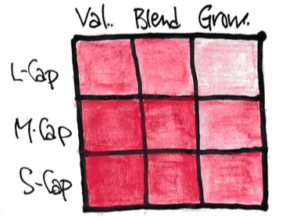
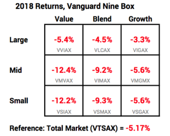
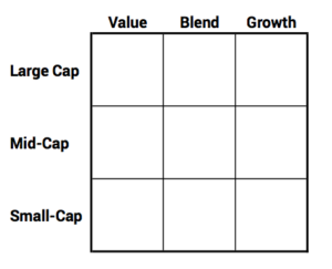
I counted the funds that failed to outperform their peer benchmark index. Each fund can be categorized to fall into one of these cells in the nine-box. Each cell has an index (Several companies construct indices like these.) and index fund. We can then used the peer index fund as the benchmark for performance.


I found that 34 of 44 or 77% of actively managed funds failed to beat their peer index. I also added up investors’ assets in these funds, and that also translated to 77% performing worse than their peer index. Wow. Basically three of four investors in Fidelity actively managed funds underperformed by two full percentage points for 2018. That’s biggly ugly.


==== Two popular funds underperform ====


How did the two most popular, actively managed mutual funds in the US fare? These two, both in the Large Cap Growth category, are in the top ten of all mutual funds ranked by assets and are the flagship fund of their fund family. The other eight in the top ten are index funds. I really like that.


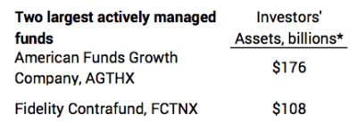
I get the following information from Morningstar* that compares performance of these funds to their peer Large Cap Growth index. I show the percentage point difference in performance to an ETF that mirrors the peer index that Morningstar uses. The ETF (IWF) performs at .2% below the index, basically its expense ratio.


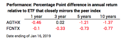
With the exception of AGTHX over three years, both funds consistently lag the peer index fund. Over ten years, AGTHX lagged by about 1.4 percentage points per year and FCNTX by about .8 percentage point.


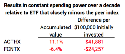
These percentage point differences seem small. This was THE segment of the market to be in for the past decade. On an absolute scale over a decade, an investor would have seen more than a three-fold increase in spending power of an initial investment from both these funds. You can bet that Fidelity and American Funds point that out.


But I think its best to look at the relative performance to the peer index fund over a decade. On that basis AGTHX’s annual shortfall of 1.4 percentage points meant its accumulated value fell short of its peer index fund by 11%. That cost the investor more that $41,000 in spending power relative to a $100,000 initial investment. (This ignores the 5.75% front-end load or commission to purchase AGTHX; had I included that, AGTHX would have fallen short by 16% and would have costed the investor a whopping $61,000). FCNTX fell short by 6% and that cost the investor more than $24,000. You can bet that Fidelity and American Funds don’t point out these facts.


In fairness, both AGTHX and FCNTX had good performance, above their peer index, in the years 2003-2008. But that’s a long time in the past for me to think that kind of performance will be repeated.


Conclusion. More than 3/4s of actively managed funds at Fidelity failed to match their peer index fund in 2018. The average performance was two percentage points worse than the market as a whole.


The two most popular actively managed funds in the US failed to match their peer index fund in 2018. These two have trailed their index fairly consistently over a decade. Relative to holding an ETF that mirrors the peer index, an investor who put $100,000 into these two funds a decade ago “lost” as much as $60,000 in real spending power.


This post reinforces the message in Nest Egg Care. Stick with index funds. Switch now in your retirement accounts. You have no tax consequences to do so.


* The mobile site on my phone shows the comparison of a fund to its peer index. The site on my computer does not compare each fund to its peer index. I think Morningstar is in transition to correctly compare a fund to its peer index on the desktop site.


$2,000 saved and invested in 1983. It’s $81,000 now. Lots to ENJOY!

I contributed $2,000 to my IRA each year for many years. IRAs that gave a tax deduction for that $2,000 started in about 1981, and I jumped on board. I invested $2,000 each year, the allowable maximum at the time.


I thought of each increment as an amount that would grow and then Patti and I could spend it in a future year in our retirement. I like to think of it as putting each $2,000 in an envelope that sits there until I open at the start of a future year to fully spend in that year. Whatever that $2,000 grows to is what we get to spend in the year. If I start early and make enough investments like that each year, the compounding of each annual amount results in a very significant series of payments to us in retirement. That’s due to the basic math of 7% real annual return stocks and growth that follows the Rule of 72.


Patti and I opened a Gift Envelope on January 1. This was the envelope from 1983: I put $2,000 in my IRA on Jan 2, 1983 when I was 38; I invested in a stock index fund on that date and it sat there for 36 years. Patti and I ripped open the opened the envelope this January 1 and emptied its contents on the kitchen island counter: $81,000!* “Spend it all this year! We’re going to ENJOY.”


Here’s the history of our last three envelopes: I display results in nominal dollars meaning they include the effect of inflation. Each year, money went into my IRA on Jan 2 for 1981, 1982, 1983. You can read prior posts here and here.


Why do I keep repeating this story? Two reasons.


1. To build a nest egg (and continue to have it be healthy in the future) we have to invest heavily in stocks, even with their annual variability in return. Where else will we find roughly 7% real annual rate of return? Where else can you expect to have a real increase of 10X of your investment (10X is about 25 years following the Rule of 72)? Some friends of mine love bonds; some love gold; some love real estate. I just don’t get it. They can’t expect to average anywhere close 7% per year real annual return over many years.


2. We all want to help make our family successful. We like the idea of them having more money in the future. Patti and I also want them to be savers and investors like we were. We think it’s much better to give them money NOW in ways that encourage them to save and to be smart investors. Let them see and get the benefit of compound growth NOW. Patti and I don’t want to wait to see how big a pile of money we could accumulate to leave them in 15 or 20 years from now (Hopefully it’s this many years!).


The gift I like best is gifts to their IRA accounts. The best recent gift we made was $5,500 to our nephew’s Roth IRA. He’s 23. I just think: at age 63, one could expect that investment in a broad-based stock index fund would have four doublings in real spending power. That’s 16 times the $5,500 or $88,000 tax-free in today’s spending power. I can’t think of another gift that will grow 16 times over time. I hope to heck he contributes year after year.


Why the variation in the amounts in the three envelopes? Relative to the prior envelope, we lop off a year and add a year. The envelope I opened this January 2 was a lot less than the one I opened last year. That’s because it dropped the return for 1982 return (20.4%) and added the return for 2018 (-4.5%). Those annual returns are a combination real return and inflation.


====


I get a better picture of what really happened when I eliminate the effect of inflation. I always like to look at real results – dollars stated in the same spending power. I adjust the $2,000 invested in 1983 to be in the same spending power as now: a $1 bill in 1983 purchased about 2.6X more that a $1 bill now. Our multiple was 15.7X in real spending power.


We see a similar variability in real returns. That’s because returns over any period differ from the +90 year average of about 7% real return. You can see this from the graph from this post and below. I’d expect a 16X multiple in 40 years following the Rule of 72 and I averaged more than that for the three 36-year periods. That’s because a line drawn from 1983 to the present is steeper than the long-term 7% trend line: the average annual return from 1983 has been greater than 7%. A staight line that starts from “below the line” that is drawn “to the line” will continue for a few more years.


You can also see the line for bonds from 1983 to the present is much steeper than its 2.3% trend line and is almost as steep as the line for stocks from 1983. That is very unusual and happened because the cumulative return for bonds fell far below their trend line. Bonds had a 50-year funk of zero cumulative return from about 1935 to 1985. What’s this say? If I had invested in bonds and not stocks, the multiple on my $2,000 would have compounded to close to the 41X of stocks! That “below the line” drawn “to the line” will continue for quite a few years for bonds.


Conclusion. We retirees have ridden a very favorable sequence of returns starting in the early 1980s through the 1990s. Those years were “below the line” and therefore it’s steeper than 7% real return to today. Our savings compounded savings by many multiples with a simple investment plan in either stocks or bonds. The 36-year envelope Patti and I just opened increased nearly 41X in purchasing power.


We don’t know the future sequence of returns. But the chances are that a similar, relatively small gift – not to ourselves but to those we love – will compound to many multiples of purchasing power. You can dramatically improve lives of those you love.


* Source. Morningstar. VFINX’s “Growth of 10K” graph. Change the start date to 01/02/1983 and the end date to 01/01/2019. You will see $10,000 grew to $405,700 or just about 40.5X. $2,000 * 40.5 = $81,000.


Inflation data from here.

What segments of US stocks outperformed in 2018?

I like looking at the Vanguard Style Box (I call it a Nine Box.) at the end of the year to get a snapshot of what segments of stocks outperformed and underperformed the US stock market as a whole. This post discusses the 2018 snapshot. You can see 2017 here.


I display 2018 returns for Vanguard index funds that focus on segments of the total US market. The returns shown are very close to the appropriate index for each constructed by an independent third-party. Each fund performs very close to its index less the fund’s expense ratio, no greater than .07% for these funds.


The columns are Value, Blend, and Growth stocks and rows are Large-Capitalization (Cap), Mid-Cap, and Small-Cap stocks. I also display for reference the return for VTSAX, the index funds that holds all +3,600 US stocks: VTSAX declined in total market capitalization value by -5.17% in 2018.


All segments were in negative territory. Large-Cap Growth had the least decline in 2018. (It had the biggest gain in 2017.) Mid-Cap and Small-Cap Value had the biggest decline. (Small-Cap Value was the clear laggard in 2017.)


====


I show the percentage point difference in each box relative to VTSAX.


Two of the nine boxes were better than VTSAX and seven were worse. Large-Cap Growth beat VTSAX by 1.8 percentage points. Mid-Cap Value was the worst at -7.3 percentage points. Small-Cap Value was right behind it at -7.1 percentage points. Large-Cap Growth outperformed those two by about nine percentage points. All funds in the Growth column were significantly better than those in the Value column. All funds in the Large-Cap row were significantly better than the Small-Cap row.


====


Common wisdom is that you can tilt your portfolio to outperform the average (VTSAX). The thinking is that Value will outperform Growth given enough years, and Small Cap will outperform Large or Mid Cap. Tilting these ways clearly did not pay off for 2018 or 2017 and has not for the last five years (See below). I put the Small Cap tilt permanently out of my mind here. We retirees hopefully have decades to go. I can’t see how anyone could conclude that a tilt will clearly result in better performance than a fund like VTSAX over that many years. That’s why I hold total market funds.


For reference for 2018: total world market stock index MSCI All Cap World Index = -8.93%. Total International Stocks (VTIAX) = -14.43%

What did Nest Eggers score in calendar 2018?

Market returns were not good for the calendar year. This is clearly the worst year in decade. Here are the annual returns for stocks and bonds for the past four years following the recommendations in Nest Egg Care – using the specific mutual funds and ETFs that I own. See detail here.


For this past year my stocks declined by about -8%. Bonds were slightly positive. The -8% return for stocks is my combination (my weights) for US and International. Returns for International stocks were well below those of US stocks.


The real return for US stocks was about -7.9% (-5.3% nominal adjusted for 2.8% inflation). Statistics tells us this is about a one in five-year event: based on the historical variability in return rates for stocks, it’s 20% probable that we would experience a real return of -7.9% or worse in a year.


US stocks had their head above water for the first 11 months in the year. December was the worst December for stocks since the Great Depression, more than 85 years ago. My fund for total US stocks declined by -9.3% in the month.


If you invest in the same types of funds that I do, you could have slightly different returns: you may own, a total US stock fund or ETF from Vanguard or Blackrock, and not the one I own from Fidelity, for example.


My year to recalculate our Safe Spending Amount (SSA) runs from December 1 through November 30. That’s what I watch. You can see my returns for the last four years – not always based on November 30 – here.


Returns this year are above the average of other investors, but not wildly so: my largest holding – total US stock market – falls in the 46th percentile of similar funds (lower  is better).  The difference will come from cumulative returns. Based on history, the cumulative returns for Patti and me will be in the top 5% or so relative to those who invest in actively managed funds. See here.

This is the season for giving. What are our priorities?

It’s that time of year that Patti and I make sure we’ve given what we want to give to those we care about. We always spend and give our annual Safe Spending Amount (SSA). As in the several past years we have not spent it all, so in October we figure out who we want to give to and how much. The purpose of this post is to discuss some of our thinking. I mention some priorities for us in Chapter 10 and in the Tom and Patti file at the end of Part 3, Nest Egg Care.


==== Our SSA for 2018 was more ====


As background, our SSA for spending in 2018 was $54,000 relative to an initial $1 million Investment Portfolio in December 2014. That was 20% more that our SSA for 2015, the first year of spending in our plan. We did not have that much more for gifts this year. We spent more to enjoy on travel than in any year of our lives. The big trip for us was Africa in September: we saw parts of the world we have never seen and likely will not see again. We loved the trip. Africa deepens our understanding of and connection to the natural world.


==== Our priorities for giving ====


1. Family. We all want our children and grandchildren to be successful in life. Helping them now is a lot better than helping them after we are dead – a date that Patti and I hope is in the distant future. Patti and I don’t have children. We have siblings, nieces, nephews and their children. We decided on a general amount we want to give our nieces and nephews before we are both dead. We’re not far from that total now.


We give them some mad money this time of year, but we think of our serious gifts as something they will invest, let compound and grow, and use in the future. As an example, we gave directly to their IRAs in 2017; in one case, our gift will compound by a factor of 16 following the Rule of 72. Nice!


We also like gifts to UTMAs or 529 plans that the parents (nieces or nephews) have opened for their children, often at our request. These were our primary gifts for 2018. Our annual gifts will compound but for not as many years as the gifts to retirement accounts. The money we put in this year for Luc, age now 2½  months, might be 4X in spending power by the time he is 20; the money we put in next year might be 4x by the time his is 21. And so on.


2. Helping Others: reduce human suffering now. This is the highest priority for our gifts. The main focus is on actions that can save lives. An example is that our gift can do something that reduces death from a disease. We like three organizations, and we judge them to be very effective. I’ve worked with a number of non-profits here, and some have a great mission but are not efficient and effective. Effectiveness is a key criterion for me. Here are our top three.


GiveWell’s evidence-based approach estimates the impact of a donation in terms of lives saved. GiveWell also follows up on the effectiveness of programs they have recommended; they had a change or two in programs they recommend for support this year based on their evaluation of effectiveness. I really like the evidenced-based approach. I also like that 100% of what we donate goes directly to a first-line organization.


We both like Doctors Without Borders. I don’t think we can go wrong on the mission of reducing human suffering or its effectiveness.


We like Oxfam America’s work with partners in the countries they serve to build capacity to solve problems themselves. We gave an extra amount in 2017 and again in 2018 for Oxfam’s initiative in Puerto Rico after hurricane Maria. Patti spent two years in Puerto Rico from age 9 to 11 when the Navy stationed her father there. We spent about two days in Boston last year to learn more about Oxfam’s programs and effectiveness, and we’ll spend more time in 2019 to learn more.


I conclude that climate change – global warming – has the biggest potential future impact on human suffering and on life in the natural world. The impacts will adversely affect 100s of millions and dramatically change the natural world. I find it very strange and discouraging that we humans have difficulty agreeing that CO2 and similar molecules discharged by man’s use of fossil fuels are raising temperatures and that none of the consequences are favorable for our future. I liked this recent video that shows that we are making progress, but just not fast enough. I am struggling to figure out how our gifts might help solve this problem.


3. Helping Others: help the disadvantaged live a better life. Our largest single gift provides better educational opportunities and life experiences for children from poor families. I’m on the board of the Propel Schools Foundation which supports its 4,000 students in 13  charter schools generally located in poorer performing school districts in this region. Students at Propel’s schools academically perform about 30% better than their peers.


4. The balance of our other donations is mostly for organizations that are the fabric of our local community. Our biggest donation is to our local United Way. They have identified and evaluated organizations that have the greatest impact.


Here’s a display of how it all shakes out for us in 2018. It took time to sort our donations so I can see the percentages. I need to do this every so often to make sure our giving follows our priorities. I like the ~90% for the top two categories, but I’m not sure that 57% toward our number one priority is enough. We’ll work though this for next year.


Conclusion: If you are like Patti and me, you didn’t spend all your Safe Spending Amount for 2018. You had some left over. Patti and I will always gift what we don’t spend. We don’t plan to throw any unspent back into our investment pool. I try to think about our donations “strategically.” Reducing suffering is a top priority for us. I’m refining how much to give and to whom we should give.

I’m really liking finishing barrels right now!

I look at my imagined wine barrels and large vat every December 15, but it’s good for me to take a snapshot of what has happened since my sale of securities on December 3 for our 2019 Safe Spending Amount. (That has turned out to be THE DAY in December to have sold. Lucky me.)


You can see the volume change in the finishing barrels from December 4 through yesterday. A decline of -1.5% is not good, but it doesn’t look horrible.


The large vat is uncomfortable to look at. It’s 100% stocks, but I won’t touch any of that for a decade. That vat is out back, down a bit of steep path that is difficult to walk this time of year. I want to avoid going out and measuring its volume.


Conclusion. When it gets a bit uncomfortable, go out and look at your finishing barrels. Don’t look at the large vat or all of your nest egg as one big lump.


(Data from December 4: my Bonds +0.8% and my Stocks -10.4%.)

What happened on December 15, my day bottling the wine I’ll drink next year?

This is my imagined workday every December 15. I even mark this day as “Bottling Day” on my calendar. I imagine that I dress warmly for my annual work task out in our garage. The high was 46this year, warmer than in recent years, but rainy. I described my workday in some detail in my post last year.


What really is happening this day? At this time of the year, I rearrange the display of our portfolio returns. I don’t want to view our portfolio as one big pile of money that goes up or down with market returns: that can cause unneeded stress and worry. I clearly keep stocks in separate accounts from bonds, so I see how those two individually perform. That helps. But I also want to view the total grouped by holding period. Holding period is the number of years one holds an investment before selling it for spending. The purpose of this post is to display our portfolio results by my imagined grouping of holding periods.


Why do I do this imaginary task each year? I want to reinforce in my brain that I have the least variation in returns or risk in the money I will spend over the next several years. That’s because that pile of money is mostly bonds. Focusing on the results in this short holding period helps to isolate my brain from concern, worry, and panic when the market declines.


The pile of money that has the longest holding period will have the greatest variation returns, because that pile is all stocks. I know I won’t touch any of that money for at least a decade. Whatever happens to that pile – steep dives or soaring takeoffs – will be tempered over time. I have plenty of time to recover when disaster strikes.


==== Wine barrels and the large vat ====


I imagine that our portfolio is in ten wine barrels in the garage and a large vat out back. Each barrel holds about one year of spending and the large vat holds the rest.


The barrels are grouped into two mixes of stocks and bonds. The first three barrels are the Finishing Barrels, and they’re invested at 80% bonds and 20% stocks. The means their volume should not change much year to year. The barrel marked “December 2018” sat with that mix for three years: it first was in the 80%-20% mix in December 2015. The next seven barrels are the Aging Barrels, and they’re invested in 60% stocks and 40% bonds. The barrel in the #4 position has aged at that mix for seven years now. Here’s what the labels on the barrels say as I start my task this year.


The Large Vat out back is 100% stocks. Patti and I won’t touch the first drop of that for a decade. We started putting money in that vat more than 40 years ago. I don’t exactly know the average age of what’s in there, but perhaps the wine we drink in any year has aged for a total of  20 years. That’s well-aged wine!


==== My task today ====


My task this December 15 was to open the barrel marked “December 2018” that is closest to the bottling line and to bottle its contents (sell its securities) for our consumption (spending) in 2019. After doing that, I then must roll the nine full tasks forward in position; I adjust the mix in the #3 barrel to 80-20 from 40-60. I move the barrel I just emptied to the #10 position and fill it with its correct 40-60 mix. When I’m finished, everything looks very similar to when it did when I walked in this year. The labels are now set for next December 15.


==== Volume changes over time ====


What were the volume changes this past year? This summary table shows this past year and the history over the past for years for the three groups of barrels. You’ll find more detail here.


This was the first year that volume in the two groups of barrels and in the vat decreased. This year follows two years of very good gains in volume. The variation in volume changes over time are in the order one would expect: least for finishing barrels and most for the large vat. Over the last four years, the average annual volume gain has ranged from +2% per year for the finishing barrels to +6% for the large vat.


Conclusion. We shouldn’t view our portfolio as one big lump that rises and falls with market returns. That tends to make us too sensitive and too emotional when we are hit with bad variability in returns.


It helps to imagine our portfolio in parts related to different holding periods. That’s easy to do when one separately tracks stock and bond returns. Each holding period should have an appropriate mix of stocks and bonds. This example is three holding periods starting with 80% bond and 20% stock and ending with 100% stocks.


The money invested in the shortest holding period will have more stable returns. The money invested for the longest holding period – it will be more than ten years before you will spend one dime of it – will have more variable returns but almost always much higher average returns over time. We know that if we’re hit (or when we’re hit) with bad variability of stock returns, we have a decade or more to recover.


What do we do to lower risk in our financial retirement plan?

The calculation year for Patti and me ended November 30. I sold securities the next business day – Monday, December 3 – to get our total Safe Spending Amount (SSA) for 2019 into cash. Then my portfolio took a sudden, steep hit. My stocks declined by more than 5% in five trading days, and as of this morning they are down more than 5%. It’s a good time to remind myself what to do to lower risk in our financial plan during our retirement. I think a recent article looks at risk the wrong way and gives the wrong advice for us retirees. The purpose of this post is to describe how I’m thinking about this decline and the priority of actions to reduce risk in our portfolio.


==== What is risk? ====


Let’s make sure we agree on the definition of risk. Risk is variability or uncertainty of a future result. The uncertainty we nest eggers are worried about is the point of time (years) in the future where we have the first possible chance of depleting our portfolio. That’s completely different from the weekly, monthly or quarterly change in the value of our portfolio. This five-day decline is a small blip on the path that we are concerned about – a most horrible sequence of annual returns that stretches for perhaps 15 or more years and sinks our portfolio.


Patti and I have no risk or uncertainty in our plan before December 2035. We have zero probability of depleting our portfolio before then. That’s Patti’s age 88 and my age 91. We’re operating on the same plan – the same Safe Spending Amount (SSA) derived from the Safe Spending Rate (SSR%) that we updated and set last year. Our plan – the plot of the probability of depleting our portfolio – looks like a hockey stick with the exact same shaft length before its inflection point as last year: it’s December 2035 before our plan budges off zero probability of depleting.


I know that 2035 is locked in because I used the most horrible sequence of market returns to get to our Safe Spending Rate (SSR%); I also had to lock down two other key decisions: investing cost and mix of stocks and bonds. But if we need to or want to, Patti and I can always change those decisions during our retirement to extend past 2035.


==== I have years to recover ===


Right now I have three years before I have to worry about what happens to stock returns. I can wait three full years before selling any stocks for our spending. Why is this? I executed all the transactions to get to our SSA into cash and to rebalance our portfolio on Monday, December 3. (The market was up that day, so that was a good day to sell.) It’s now about 50 weeks before I recalculate and sell for our SSA for 2020.


Patti and I also have two years of off-the-top Reserve in short-term bonds. Patti wanted what I consider an extra year of spending in Reserve at the start of our plan. (See The Tom and Patti File for Part 2, page 63, Nest Egg Care). That decision on our Reserve effectively lowered our initial Investment Portfolio (our total less our Reserve) and therefore our Multiplier that we use for the calculation for our annual SSA.


==== Lower risk while retired ====


The priority of actions to further lower risk are clear.  It is not difficult to add more years of zero probability of depleting after we have started on our plan. We can add years to the shaft length of our plan. (You always lower risk and extend time to the shaft of your hockey stick when you lower your Investing Cost. I don’t think this makes the list of advice from any financial advisors, though. If you are a true nest egger, you’re already at rock bottom Investing Cost.)


How do I extend shaft length? First, if I’m faced with horrible returns next November 30 I’ll tap our off-the-top reserves for our spending for 2020 – not our Investment Portfolio. (See Chapter 7, NEC.)


Skipping a year extends shaft length by at least one year. You can see that effect yourself by playing with FIRECalc. (You’ll have to input a manual spending plan; you can do that if you are a supporter of FIRECalc.) Alternatively, you can use the spreadsheet I provide in this post. That spreadsheet uses the most horrible return sequence for stocks and bonds that I could find – the one that results in the shortest time to depletion for any spending rate. Just change spending in a future year to zero to see the effect – you’d be skipping that year of spending from your Investment Portfolio because you are using your Reserve. Obviously, using the second year of the Reserve that Patti and I have – to again avoid tapping our Investment Portfolio – pushes that date even further into to the future.


Finally, we can always simply spend less over our complete retirement period. A small change in spending has a big effect. Our 2019 spending of $55,500 relative to an initial $1 million Investment Portfolio value is 20% more than we started with. It would not be hard for us to go back to our initial spending level – $46,300 in today’s dollars. We would not be limited in what we want to do to enjoy. As explained in this post, dropping back to that spending level now adds another three years of zero probability of depleting.


We also have other deep, deep Reserves that I rarely think about. The chance that I’ll reach into these reserves is pretty remote: we started 529 plans for heirs with Patti as the “owner”; we can always pull that money back for our spending. I have a home equity line of credit I could borrow against. I have taxable securities that provide borrowing power (marginable securities). We have growing equity in our home that I can convert to cash through an increased home equity line of credit or reverse mortgage.


Conclusion: Our Recalculation date is November 30. I sold securities to get our 2019 SSA into cash the next trading day. Then I was hit a five-day bump in the road – more than 5% decline in stocks. I don’t feel worried, since it’s almost a year before I have to sell securities for spending. With our added two-years of spending in Reserve, we really don’t need to worry about selling stocks or bonds for three years. And in worst case, we can drop back and spend less. That would not be a hardship for us.

What’s our calculation of Safe Spending for 2019?

I knew this before entering our 12-month returns ending November 30 into our calculation sheet: our Safe Spending Amount (SSA) – the amount that results in zero probability of depleting our portfolio through 2034 (Patti’s age 87) – is unchanged in spending power for 2019. It just adjusts for inflation to a total of $55,500 relative to $1 million initial Investment Portfolio value – an assumed base case – in December 2014. I’ll use our Multiplier (the one we set at the very start of our plan) to get to our total. The purpose of this post is to show our detailed calculation sheet and add comments. (You find a similar calculation sheet you can use in the Resources section above.) Here’s a summary table. In the discussion below I’m referring to the detailed calculation sheet.


==== Inputs I entered ====


I entered 2.8% for inflation for 2018. That’s the highest in four years. Inflation distorts our understanding of what’s really happening to our portfolio and what we can safely withdraw for spending. Inflation is not our friend; historically many of the worst real annual returns for stocks and bonds have been in periods of high and increasing inflation. I don’t consider 2.8% high, and I don’t read that inflation is running away from us.


I entered our return rates for stocks (+1.40%) and bonds (-.99%). (You can read more detail here.) The spreadsheet calculates our 1.04% total portfolio return for the year. This is the second lowest nominal return in four years, but the real return of -1.71% is the lowest. I calculate that Patti and I have experienced 5.9% compound real average annual return. That’s less than our expected return of 6.4% given our mix of stocks and bonds and based on expected 7.1% real return for stocks and 2.3% for bonds.


All of us have avoided the bombshell of a year with big negative returns. A bombshell by my yardstick is a one-in-ten-year bad event – a bad return rate that is 10% probable in any year. (See Chapter 7, Nest Egg Care.) Bombshells – large negative stock returns in particular – can really hurt since we are also withdrawing for spending each year. All of us have dodged a bombshell for more than  a decade now. That’s why we all should be happy campers: we all have avoided the emotional stress that comes with bombshells; we all have larger portfolios than we otherwise would.


You may note that the SSR% is unchanged for this year’s calculation (4.75%). Our SSR% is based on Patti’s life expectancy. Every year we live, the number of years of our remaining life expectancy decreases, but the decrease isn’t a full year. The probability of living calculator that I use rounds the years of remaining life expectancy to whole years. That means in most years life expectancy decreases by one year for each year one lives, but in some years life expectancy doesn’t decrease at all. The effect means our years for zero probability of depleting our portfolio is now through 2034. It was 2033. (The next time we’ll see this effect is in 2025.)


==== Calculations and Results ====


Our portfolio returns over the past four years translated to two years where our SSA increased for inflation (NO) and two years where it increased by more than inflation (YES). All nest eggers would have seen the same pattern. Our $55,500 SSA for spending in 2019 is 20% greater in spending power than it was when we started our plan.


We’ve withdrawn four years of spending and have more than we started with. On the basis of an assumed $1 million Investment Portfolio at the start of our plan, Patti and I have withdrawn $186,700 in spending power in four years – spending years 2015 through 2018. Right before this upcoming withdrawal the spending power of our portfolio is $1,041,000. We started with $1 million. We’ve withdrawn $186,700. We have more than $1 million. Ooooh, I like that. That’s a very good starting pattern for a retirement plan and the obvious reason why we can spend more now than we could at the start.


That $1,041,000 means that if we now reduced spending back to our original SSA ($44,000 in constant spending power per starting $1 million – and this would not be hard for us to do), we would have a plan that would stretch the first possible year for depletion to almost 20 years from now – to the end of 2038. That would be to Patti’s age 91 and my age 94.


Conclusion: Our plan marches on. The calculation, based $1 million initial Investment Portfolio four years ago, tells Patti and me to withdraw $55,500 for spending in 2019; that’s the same amount as in 2018 adjusted for inflation. It’s still 20% more spending power than at the start of our plan. Over the last four years, we’ve withdrawn $186,700 in spending power. Before this upcoming withdrawal for 2019 spending, our portfolio has more total spending power than at start of our plan. We are happy about that.