Ages ago – over a year ago, I think – the links broke under the Resources tab on this web site. Nothing downloaded when you clicked on the resource. Reader Jeff asked me for replacements. I emailed them to him after I had updated a few. I got the links fixed, but, shame on me, I never added the updates to the web site. The purpose of this post is to simply inform you: I posted in the Resources section my latest spreadsheet to help for your annual Rebalancing task. I think it’s simpler to understand than the one I had there before.
== Why Rebalance? ==
You Rebalance your portfolio once a year to get back to your design Mix of Stocks and Bonds. (See Chapter 8, Nest Egg Care.) Throughout the years – not every year – you will be selling stocks to buy bonds as your final rebalancing task. That’s because over time stocks most certainly will outperform bonds. You’re doing this to renew your insurance coverage. You want to have enough bonds to sell much more of them for your spending when stocks crater: when stock crater, bond returns have always been MUCH better. You can also think of it this way: you are selling more bonds than stocks to give stocks time to recover.
== Rebalancing: not like falling off a log ==
I struggled when I first tackled the task to Rebalance. I thought this was trivial math and steps. I had to think through the steps and go through it a couple of times to get the hang of it. Follow the spreadsheet, and it will be a lot easier for you than it was for me when I first started to figure out how do this.
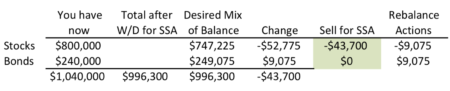
The simple key for the Rebalancing task is to first subtract your withdrawal for your upcoming spending in the year – your annual Safe Spending Amount (SSA; Chapter 2, Nest Egg Care) and then rebalance the remainder. I think you get the picture of this logic in the display here (The SSA withdrawal is $43,700.), but you can follow the detail I describe for this example in the spreadsheet.
Sample of calculation steps to get back to mix of 75%/25%.
As the last step – or near the last step – you decide how much Stocks or Bonds to sell for your SSA. After you sell, you still may have transactions to get to your desired Mix of Stocks and Bonds.
== It can get more complex ==
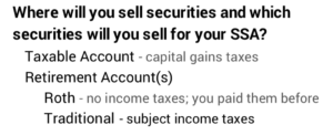
Each year you will sell securities from one of three sources: 1) your Traditional IRA accounts (You’ll definitely be selling from here if you are subject to RMD.); 2) your Roth IRA account(s), or 3) your Taxable account(s). Each has its tax implications, and each sale of an individual security within your Taxable account will its own tax implications.
When you work hard to minimize taxes to keep the most after taxes for your spending, you’ll make your Rebalancing task more complex.
For example, one year it was clear that I should sell stocks out of our taxable account, but bonds were much lower in capital gains and therefore lower tax cost. I decided to sell bonds to give us a greater net for our spending.
I’m not really saving on taxes. I’m deferring taxes to a later year when I’ll have to sell those stocks with greater capital gains. But my thinking was that I wanted the most net from my SSA now; my SSA will be greater in the future; our ability or desire to spend will be less then; the effect paying somewhat higher taxes later won’t have as much effect on the net amount we will have to spend to enjoy.
That move to sell bonds meant I was going the wrong way on my Rebalancing. To get back into balance I had to shift more dollars from stocks to bonds in our Retirement accounts – the final Rebalancing step. This may sound strange. You’ll likely just have to go through this a time or two to get the hang of this.
Conclusion: I assume you’ve decided to take your withdrawal for your Safe Spending Amount (SSA) for the upcoming calendar year in early November or December (like Patti and me). After you’ve your withdrawn your SSA, you should Rebalance your portfolio to your Mix (Stocks vs. Bonds) and Weights (US vs. International) that you set at the start of your plan. Rebalancing may be easy to describe, but it was a bit confusing for me for a couple of years. My advice is to use the spreadsheet I provide in Resources to help you with this task.
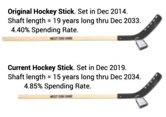
My friend Dan sent Patti and me an invitation (Hey, real mail!) and underneath our names in the address it said, “The Hockey Stick Masters.” I laughed. Dan knows I have our hockey stick imprinted in my brain. He’s seen my orange painted hockey stick. I look back over the past year or so, and see that I have not written any reminders to reinforce the Hockey Stick in our brains. This purpose of this post is to tell you how to SQUASH RISK in your financial retirement plan. It’s all about LOCKING IN the shape of your Hockey Stick. Do that, and you are the Master of your Hockey stick.
Dan’s photo of me and my hockey stick before I added the lock at the point of bend. At the coffee shop, Nov. 2017.
== Financial risk of your retirement plan ==
The Hockey Stick is a picture of the financial risk of your retirement plan. It’s taken from the graph of the year-by year risk or chance that your portfolio isn’t healthy enough to allow you to take a full annual withdrawal for your spending. The shaft length is the number of years with ZERO CHANCE of failing to be able to take a full withdrawal. Thereafter, the blade angle represents increasing chances that you can’t take a full withdrawal.
Patti and I started with a stick with shaft length of 19 years. The stick we use now is shorter with a greater Safe Spending Rate (SSR%; See Chapter 2, Nest Egg Care). The calculations told us we could use that shorter stick now that we’re older. That means have ZERO concern about the amount we can spend every year through December 2034. I’d turn 90 within a month.
== It’s the correct picture of risk ==
The Hockey Stick is the correct picture of financial risk in my view. You want to control how long your money will last. My friend Steve shouts, “DON’T RUN OUT OF MONEY.” That’s the risk you want to avoid. I say that a bit differently, “DON’T DEPLETE YOUR FINANCIAL PORTFOLIO.” I say that because most all of us exclude a big non-financial asset from our retirement plan. That’s the equity in our home that we could tap if we needed to or wanted to. (See Chapter 1, Nest Egg Care.)
If you control the years for ZERO CHANCE of depleting your portfolio, you’ve beaten financial risk to a pulp. You can do this.
The financial industry doesn’t like the that image of a Hockey Stick. They want you to think about risk as a Roller Coaster – the ups and downs of the market and of your portfolio. They want you to decide that you need to hire them to smooth the ups and downs in your portfolio. And they want you to think that’s a complex task. You gotta own LOTS of securities. It’s better for them if you think that way: more worry means you’re less inclined to take a safe, healthy, annual withdrawal to ENJOY in retirement. You take less; they manage more; they earn more fees.
Here’s what I think you need to do to be a Master of your Hockey Stick. It’s a simple checklist.
• Keep that image of the Hockey Stick in your brain as the financial risk for your portfolio. Wipe the roller coaster out of your brain. That should not be your picture of financial risk. You have NO control over the ups and downs. Don’t think you should try to control them.
• Understand that YOU TOTALLY CONTROL the shaft length of your stick. You LOCK IN shaft length at the start of your plan. That’s the number of years you want for ZERO CHANCE of depleting your portfolio.
You can be assured the math that determines the shape of the stick is correct, because it uses a planning trick. The calculations ALWAYS assume you will face the MOST HORRIBLE sequence of stock and bond returns in history. Believe me: that most horrible is MOST HORRIBLE. And I independently verified that the math that calculates the shaft length and blade angle of a Hockey Stick is correct.
• Make just two key decisions that LOCK IN the shaft length of your stick. There’s a third. You’re a master when you make these three decisions, write them down, and stick with them year after year. You wind up with a very dull, unchanging, and highly effective portfolio.
== 19 years ==
Let’s make the assumption that 19 years is your choice for the number of years you want as ZERO CHANCE for depletion. You want to LOCK IN 19. That was the shaft length Patti and I decided on for our plan that started on January 1, 2015. You can read about our logic on that choice in Chapter 3, NEC.
== TWO (basically) LOCK IT IN ==
How do you LOCK IN 19 years? You make two key decisions.
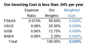
• Decide to invest at rock-bottom cost. This a fundamental and simple starting point. You can only reliably be low cost – or reliably keep most all that the market gives – by investing in index funds. I targeted no more than 0.1% weighted averageExpense Ratio for our plan. (See Chapter 6 and Appendix B, NEC.) I picked four funds/ETFs at the start of our plan. We’ll stick with those four for the rest of our lives.
Over the past five years the Expense Ratio of several of the four has declined, and Patti and I now pay less than .04% per year. That’s down from about .07% five years ago. That’s less than $40 per $100,000 portfolio value or less than $400 per $1 million invested.
Most retirees totally overlook the importance of investing costs. The financial industry loves this, of course. The typical retiree pays 20 times what we pay and adds uncertainty to the net they get to keep out of total market returns. That flaw means they can’t really LOCK IN the shape of their stick. (High costs also BADLY hurt how much they’ll have when returns aren’t MOST HORRIBLE.) Masters of the Hockey Stick know to NEVER MAKE DECISIONS THAT ADD UNCERTAINTY to the shape of your Hockey Stick.
• Pick a spending rate that gives you the shaft length you want. This should be obvious: when you withdraw less for your spending, your portfolio will last longer – the shaft length is longer. When you spend more, the shaft length is shorter.
You can calculate the spending rate for 19 years in this example after you’ve committed to low, low investing cost. That was 4.40% ($44,000 per $1 million portfolio) for Patti and me the start of our plan: we withdrew that amount – adjusting for the size of our portfolio relative to $1 million – for our spending in 2015. (See Chapter 2, NEC.)
The good news is that as we age, we’ll most likely be able to play our game with a shorter hockey stick, one that has a greater spending rate. That’s why Patti and I now play the game with a $48,500 Hockey Stick and not the $44,000 one we started with.
• Finally, you decide on your mix of stocks vs. bonds and stick with that decision over the years. This decision has a lot less to do with the shaft length of your hockey stick and more to do with than amount of money you will have in future years if your portfolio return is not on the track of MOST HORRIBLE. I envision a pile of money next to my stick. How big might that pile of money be in the future? You want to maximize that pile after you’ve LOCKED IN the shape of your hockey stick.
Hockey Stick: shaft length LOCKED IN. And the pile of money when returns aren’t MOST HORRIBLE.
Your decision on the mix of stocks also has to do with your ability to shift your thinking and emotions from the Roller Coaster to the Hockey Stick. Folks who stick with the Roller Coaster wind up with far too low mix of stocks. They think of bonds, for example, as a means to smooth the ups and downs. Masters of the Hockey Stick know that bonds are insurance: sell more bonds when stock are down to buy time for them to recover. Masters of the Hockey stick have a greater mix of stocks than those who look obsess about the Roller Coaster.
Most folks I know start their plan at 75% mix of stocks. I’m fine with that. But less than that just does not make math mathematical sense. (See Chapter 8, NEC.) After a few years at 75%, most folks get more comfortable and move toward the 85% mix of stocks that Patti and I have.
It sounds strange, but 85% mix of stocks is NO LESS RISK than 75% mix of stock, but that’s because Patti and I RIGIDLY maintain a Reserve, which means we can delay having to sells stocks for a long time. We RIGIDLY stick with our Safe Spending Amount based on that mix: we won’t spend one dime more. We have really low investing cost: we get to keep almost all that the market will give.
Conclusion: It is surprisingly straightforward to squash financial risk in your retirement plan. We want to squash the risk of depleting our portfolio to the point where we can’t take a healthy withdrawal for our annual spending. A plot of the year-by-year chance of depleting our portfolio looks like a Hockey Stick. The shaft is the years of ZERO CHANCE of depleting. This is a different view of risk: risk is not the Roller Coaster of daily, weekly, or annual changes to our portfolio value. You can be a Master of your Hockey Stick. Firmly implant that image in your brain; forget the roller coaster. Lock in the years with NO CHANCE with just two key decisions. 1) You MUST be a low-cost investor. 2) Withdraw an annual Safe Spending Amount each year; you can spend (or gift) it ALL, but you can’t spend one dime more.
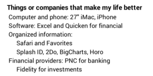
Why do I think about making my life more productive when I’m retired? I want to keep simplify the routine, take away stress, and try to be effective every day. I’ve mentioned a few of these before, but this post describes my checklist of things that I like. You might adopt a few.
Hardware. I have an Apple iMac with a big screen – 27”. Someone advised me years ago, “Get the biggest screen you can afford,” and that was good advice. My bigger screen added $500 to my purchase last year. I kept my last iMac for seven years, and I may keep this one forever. (I’m hoping forever is more than seven years!) I look the extra cost as maybe $75 per year. Well worth it.
I switched to Macs decades ago. I find them intuitive and easy to use. I particularly like that it is very easy to organize files so I can find anything I’ve worked on. (I always put the month and day as the lead to every file name, so I can find it by remembering when I wrote it if all else fails. I stored the Word file for this post in a subject file for this week’s blog post, but the file name begins “0625,” the day I started on it.)
My friend David retired last year. He was a lawyer and didn’t use a computer much in his work(!). He purchased a portable PC after he retired. I’m sure the user interface has improved, but I’d hate to think of trying to get up to speed on that computer and screen size.
My iPhone syncs with my computer so all the bookmarks, etc. are the same. It’s a bigger screen, too. I read a lot on it, and it’s a helpful productivity tool.
My computer is in a room right off the kitchen. I’m usually close when I want to look up something but I’ve left my phone somewhere not convenient. (That’s more often than I like.) Or, I’ll be working on something and want coffee. That’s less than 15 feet away.
Software. I use Safari, Quicken, Excel, Word, Apple Mail and Calendar most often. I think I’d classify myself as an advanced user of Excel and Word. I’ve used both for decades.
== Quicken ==
My use of Quicken changed last year. I had to switch from Quicken 2007 for Mac. I likely paid $25 for it more than a decade ago. It was simple and clean. I HATED most all Quicken versions that were meant to replace it. Quicken announced they were no longer going to support Quicken 2007, and it won’t work on the most recent operating system for my iMac. I had to bite the bullet. Quicken Starter at $35 per year turned out to be a very good replacement – it’s far better than other versions that I tried. I don’t want the bells and whistles of more expensive versions.
Most of my friends don’t use Quicken or similar software to schedule or track their spending. I’d be lost without it. I have three checkbooks that I have to track: ours, one for a Trust set up by Patti’s brother (I’m trustee.), and one for a small non-profit that I co-founded. I need good information for the accountants who prepare the tax returns for each. But I’d want Quicken if it was just for our personal checkbook.
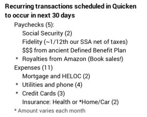
I particularly like the ability to schedule recurring deposits and payments and see what is coming in as paychecks and what’s going out as expenses for the next 30 days. I get a rough picture of our cash balance over the next 30 days.
I’ve set most all our routine vendors to ACH debit. I can’t be late in paying a routine bill and incur late fees or interest. Yesterday I got an email for the electric bill that will be deducted July 15; I entered that amount as a future payment; I can easily compare it to the payment of July 2019 to see if I think it is in line. Today I have 16 possible recurring transactions in the next 30 days; two are credit cards we rarely use.
I have a simple chart of accounts for our home spending that I set up years ago. Most all recurring transactions are already in categories, e.g., “Utilities”. The only bill with any complexity is our credit card bill; I have to detail the categories for important expenses to track, primarily those that could be tax deductible if we ever itemize.
I don’t use turbotax to prepare our tax return. I’m more than happy to turn that responsibility and drudgery over to someone else.
== Other Software ==
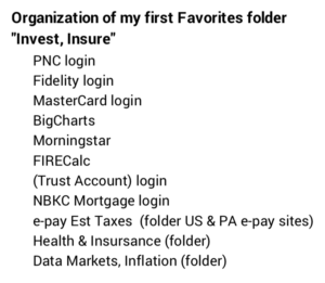
I like Safari and the Favorites bar in particular. My first Favorite is a folder labeled “Invest, Insure.” It has all the links to anything that has to do with money, insurance or health. I click on that folder and get quite a list. These sites and folders hold 90% of the sites I use in a year.
SplashID securely keeps all our important numbers: social security, checking accounts, investment accounts, credit cards, loans, numbers; VINs; insurance contracts; frequent flyer; other memberships. And many user names and passwords. I have 402 entries in my SplashID. Hmmm. I likely have some clutter in that that I should clean out; I’ll tackle that 10 minutes at a time – see below.
I use 2Do for reminders. I especially like my breakdown of the recurring series of small tasks I complete week by week in January and February to gather all the information for the tax returns. I dreaded this as one, complex task before. Not so now.
Banking, Investment Accounts and Information. I have the three checking accounts at PNC. I find its display of accounts is excellent. I use PNC’s BillPay for folks who can’t ACH our personal account. I haven’t written or printed a paper check to mail in the last 12 months. I deposit any paper checks we receive with mobile deposit. I rarely go into the big, beautiful bank building or its ATM.
Google street view
Our investments are in one place at Fidelity. Our account structure is simple. (See Nest Egg Care, Chapter 12.) I log on or Patti logs on and we both can see the total that we have. A friend of mine still has his investments scattered at many institutions and has never consolidated many retirement accounts from employers over the years. I don’t get it.
I find most folks who don’t keep it simple don’t know their mix of stocks vs. bonds, and that’s one of the four key decisions for any retirement plan. I think it’s impossible for them to rebalance at the end of each year.
Fidelity’s user interface and capabilities are terrific, but they should be comfortable to me since I’ve used the web site for many years. Maybe others are just as good, but I’d never change. I particularly like that I’ve linked our taxable account to our checking account and have automated our monthly “paychecks” from Fidelity.
I think I should be paying SOMETHING to Fidelity for the use of the web site, the tax reporting, and the free help whenever I call. I can even schedule a Zoom with Ryan, my assigned, no-fee advisor and fantastic information source if I ever get stumped. I only own one Fidelity security, FSKAX, and pay Fidelity a whopping $15 per $100,000 invested in FSKAX. (Expense ratio of .015%.) That adds up to very little compared to what I’m getting.
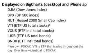
I’ve organized Big Charts for my desktop and the Stocks ap on my iPhone to track what’s happening during the day or at the end of the day. I can’t get away from checking at least once a day. Here’s the list of markets and securities that I see when I look at these two.
Other organizing tools. I like the clock function on my iPhone for alarms and the countdown timer in particular. I try to remember to use the countdown time when I pay for an hour of parking; I need to know when I have a few minutes left so I can use the Go Mobile PGH parking ap to extend my minutes. I HATE having to pay a $25 parking ticket because I forgot to extend my time for $.25. I messed up and paid two of those in 2019.
I added a simple countdown timer, Horo, for my desktop. I have two set timers, but can add more. One is for 10 minutes to work on tasks I really hate doing, like spending time to clean up the papers on my desk. Another is for 25 minutes to discipline myself to work uninterrupted on a project; I’m trying to use the Pomodoro Technique. My mind can wander and jump to something else too easily. As I write this, I see I have 13 minutes left on the current Pomodoro.
Conclusions. We all need to make our lives simpler when we are retired. I find the right hardware and software – computer and mobile phone – are important. For financial matters I rely on Quicken and Excel. I’ve automated most all monthly payments with ACH and BillPay at PNC. Our investment accounts are all at Fidelity and linked to our checking at PNC. I like my Favorites folder in Safari for all things “Invest, Insure”. SplashID is our secure place for important account numbers and logon information. I use a countdown timer many times a day. I’ve started to use the Pomodoro Technique. You may find some of these helpful.
I looked online at our credit card balance, and I can see that we currently have a big NEGATIVE balance. That’s due to refunds on airline tickets for trips we had planned. It looks like our credit card payments for April, May and June will average roughly $1,500 per month – far less than normal. We keep paying ourselves our annual Safe Spending Amount (SSA) in monthly installments, and obviously the paychecks from Social Security roll in like clockwork. That means we are PILING UP cash in our checking account. Our plan is to spend or give all our SSA every year. We don’t save one dime. The purpose of this post is to describe our thinking of what we’ll be doing with the extra we will have.
== Retirees ain’t suffering. Yet. ==
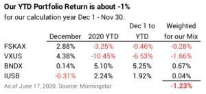
We retirees are not financially suffering in any way – or in any significant way – so far. If you’ve followed the plan in Nest Egg Care (NEC), you have no reason to think your future annual Safe Spending Amount is in jeopardy. (See NEC, Chapter 2.) You’ve planned for the worst, and unless things really turn south, we aren’t remotely close what I would consider a poor year of returns. Our year-to-date return is about -1.2%. (Our calculation year runs December 1 – November 30.) The current 12-month inflation rate is about .1%, so that -1.2% or so is close to our real return.
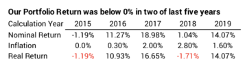
That’s well within the normal range of returns. Real returns for stocks have been below 0% about 30% of the years since 1926. Bonds below 0% for about 35% of the years. Our total portfolio declined in 2015 and 2018 by more than -1% real return, and I just took those years in stride.
Yep, it could get much worse, but I think I covered that risk. I sold enough bonds in March – very near their all-time high – such that I now have all our SSA for 2021 in cash. I don’t have to sell any stocks in early December. I can give stocks lots of to time to recover if they nosedive from here. If returns roughly stay where they are, it will be a normal December sale of stocks and bonds for our SSA for 2021.
== Who’s suffered? ==
The folks who are suffering are those with no savings and dim job prospects. That’s millions. Many were hurting before the checks for $600/week arrived. Cars lined up for miles here at our food bank. Some did not qualify and are still hurting.
Spending drives the economy, and spending has tanked. Spending has tanked largely because folks in our general category of income – with discretionary dollars to spend – account for about 50% of the decline in spending. This NYT article and this 3-minute NPR listen explain. And we retirees won’t suddenly get back to our spending habits: we know to hide from it UNTIL VACCINE.
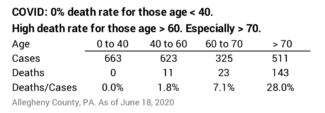
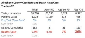
Those who have suffered have sacrificed for older folks like Patti and me. Our county isn’t representative of the US as a whole, but it’s useful to look at our data: no one under age 42 has died here. 0% death rate for those under age 40. The the death rate for those infected at 40 < age < 60 is 1.8%. The death rate gets to be very high for those age > 70. Oops, that’s Patti and me!
== Spend it. Somehow. ==
My conclusion: we’ve got to start spending, but we can’t really spend it on ourselves. Patti and I decided we should donate to help those who are hurting here. Get money to them. Let them spend it.
We decided to donate significantly to three organizations or programs over the last few months. We plan on giving more, since we won’t increase spending on ourselves for many months.
Food Bank. Our food bank is the big, central distribution center for about 400 food pantries in this region. In normal times it also provides direct distribution of fresh produce about 15 times a month at different sites in the county.
With COVID, the Food Bank opened an emergency pantry at their main location. The line of cars stretched miles the first time it opened. It opened 30 other drive-up distribution points.
The web site says $100 provides 500 meals. That’s $.20/meal. I think that’s what they pay for the fresh produce for a meal; the rest is free food delivered to them – food surplus that Department of Agricultural bought to stabilize farm prices.
Patti and I normally donate each December, but we donated again in March. I don’t know about the true math of $ and meals, but we may have provided one hell of a lot of meals!!!
Local Food Pantry. Pantries are the locations where those in need go to get food. I view the 400 pantries in SW PA as the retail grocery stores for the food bank. The food bank delivers to the relatively few larger pantries. The smaller ones drive to the distribution center to pick up dry goods they will pass out. A more established pantry has some financial capacity and spends for fresh fruits and vegetable.
Patti and I visited our local food pantry late last year to understand how it works. We were impressed. The food bank and pantries supplement what the Federal SNAP program doesn’t provide to qualifying poor households. SNAP helps with about three weeks of food for poor families; food banks and pantries generally provide about one week of food. Most pantries are totally volunteer run with very limited number of days and hours of operation.
Our local pantry is in the highest tier of quality in this region. It has staff – a terrific leader and employees. It’s open five days a week on a set schedule. It’s a small store. Clean. A volunteer helps every shopper. We could see that there’s a real, human connection there. This pantry provides far more than food: it’s clearly about self-sufficiency and helping to move a household out of poverty. Experienced staff engage their customers to understand their problems. Staff know the network of other social service agencies that provide help on employment, housing or other needs. Patti and I really like that aspect.
We donated for the first time this last December and donated again in March knowing they would see many more with needs. They told me that their parent organization received added Emergency Basic Needs fund from United Way and in nine weeks it helped 98 households get about $50,000 of financial support.
United Way and its Emergency Basic Needs fund. Our local United Way operates a call center that is part of Pennsylvania’s 211 help line. Most requests ask for help with housing (avoid eviction and foreclosure), utilities, and food. (Those three add to 60% of all requests in PA.) Recently calls are related to healthcare, food, and employment. (Those three add to 83% of all requested for help over the last 90 days.)
Our United Way has an Emergency Basic Needs fund to provide financial help to those suffering during this time. The fund is typically abour $1 million for the year, but donations during COVID raised that to $3 million, and the added $2 million is flowing our quickly.
Requests come directly from the public – their 211 calls – or requests are fulfilled by eight other selected/partner local agencies, like the parent organization for our local food pantry. We donated to this fund, adding a bit to the $2 million recently raised. Our donation will flow out soon and be spent by those with greatest need.
Conclusion. COVID: many older lives have been spared by the collective action of younger folks. Younger folks suffered economically and their prospects for good jobs are poor. Retired folks have not financially suffered. We retirees who have a nest egg likely are spending very few of our discretionary dollars and our collective spending is important to drive the economy. If you follow the process in Nest Egg Care, you pay yourself you Safe Spending Amount in monthly paychecks, and your checkbook is swelling. What will you do with it? Patti and I decided to use that excess cash to help those who have been helping us. We’ve donated to three local agencies over the last three months and will continue to do so.
Vanguard’s Probability of Living Calculator has disappeared. It’s an important tool for decisions for our financial retirement plan. Vanguard removed it as publicly available on the web and put it on their web site for their customers. Now they’ve removed it from there. I’ve not found a good substitute. This post describes my thoughts to develop and provide a Probability of Living Calculator to help folks think through their decisions for their financial retirement plan..
== It’s an important tool ==
A Probability of Living Calculator gives you the the percentage chance of living a specific number of years in the future. You get year-by-year probabilities of being alive. That’s much more detail than the calculation of the number of years to reach 50% probability of being alive – your expected life expectancy. See Nest Egg Care (NEC), Chapter 3. I used the Vanguard calculator to decide the number of years Patti and I wanted for ZERO CHANCE of depleting our portfolio. We picked 19 years as our ZERO YEARS. I like thinking we could be worry free for that many years.
FIRECalc is the second essential calculator – a Retirement Withdrawal Calculator (RWC) – that then leads us to three decisions that LOCK IN the number of ZERO YEARS that we pick. One of those three decisions is our Safe Spending Rate (SSR%) and therefore our Safe Spending Amount (SSA) – the dollar amount in constant spending power we could withdraw each year for our spending with no risk for the next 19 years. To me, the worry comes after that point. The monthly, quarterly, or annual ups and downs of the market are not the worry. None of us can control those variations. But we can assure the 19 years of no worry.
It’s time to pull out the image of the hockey stick again as a reminder of that distant point for worry! The future financial risk in our retirement plan looks like a hockey stick, and if you follow the logic in NEC, your financial risk also looks like a hockey stick.
The shaft length is the many years of ZERO CHANCE of failing to be able to take a full withdrawal for our annual spending. That’s the 19 years through 2034 at the start of our plan five years ago. The elbow of the stick is a transition point. That’s the point we want to control. We definitely don’t want it to get shorter. We learn from NEC that we can actually LOCK IN that point and even extend it while we’re retired.
The blade represents increasing year-by-year chances that we can’t take a full withdrawal for spending. Patti and I have a small chance that we can’t take a full withdrawal for spending in 2035; it’s a slightly greater chance in 2036 and so on. But the blade and its angle is not a big worry point in my mind. We’ll know many years in advance if we’ve been riding on a sequence of returns that remotely gets close to that point. (It’s not been close over the last five years.) We can act many years in advance to extend shaft length.
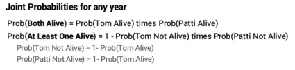
== Both Alive and At Least One Alive ==
The decision of the number future years you want for ZERO CHANCE is straightforward if you are planning for yourself. In my view, it’s your life expectancy, but you can decide differently. The decision is more complex decision if you are planning for two. More probabilities figure in to your thinking: the probability that Both will be alive and the probability that At Least One will be alive. You can only understand these year-by-year probabilities from a Probability of Living Calculator.
Those two are joint probabilities because they’re the product of the probabilities of living or dying for each of us. (See Chapter 3 and Appendix E, NEC.)
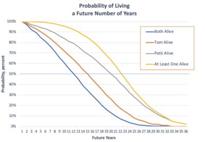
I’ve gotten better with Excel than when I drew Graph 3-3 by hand in NEC. This graph uses the same data for I obtained in late 2014 for our ages then from the Vanguard calculator.
== What number of years for ZERO CHANCE? ==
Patti and I looked hard at the expected number of years that Both of us would be alive. Just 11 years at the start of our plan. That’s where the blue line cross 50% probability. That had a big impact. We thought about that for days. “This says we have a 50-50 chance of both being alive in 11 summers from now. WE HAVE TO GET BUSY TO FIGURE OUT HOW TO ENJOY LIFE WHILE WE CAN.” We knew we wanted to withdraw enough for our spending so that we would be fully enjoying the years we have together. Holding back on spending made no sense.
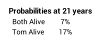
In the final analysis we gravitated toward the expected 21 years that At Least One of us would be alive. That’s where the yellow line crosses 50% probability. But our choice of 19 years made more sense to us. Our thinking was that the survivor would spend much less than when it was the two of us; the chances of depleting a portfolio are much lower with less spending. And the time when it would be just one of us is likely a lot earlier than 21 years: the chance that both of us would be alive in 21 years was just 7%. It was just 17% chance that Tom would be alive.
Our choice of 19 years gave us a beginning SSR% of 4.4% (See NEC Graph 2-7 and Appendix D.). That’s 5% better than the 4.2% for 21 years. That doesn’t sound like that much more, but the added annual dollar amount in our case was a very good mental boost: I translated the amount in my head to mean that we should not worry about how much more we might spent on a nice room when on vacation. Patti bought a few more pairs of shoes and that made her happier. I did not complain. I was happy that she was happy.
== My generalization ==
My rule of thumb is that your SSR% should be based on your life expectancy or the longest life expectancy year if you are planning for two. Social Security’s Life Expectancy Calculator is a good source for life expectancy. The note on your results page states that you may want to think about using a shorter or longer life expectancy for your retirement plan based on your health status, lifestyle – which includes your social-economic status, and family history.
== My first draft of a Probability of Living Calculator ==
I’m in the early planning to produce an easy to understand Probability of Living Calculator so that folks can think through the probabilities of the number of years they have left and how they want to spend them. I think couples need to understand Both Alive and At Least One Alive. “How many more years might we have together? How do we want to spend those years? What are our plans to spend to ENJOY NOW?” My draft of how the output might look on a web site is very similar to the graph I drew above. I’ll post updates on this project.
Conclusion: I used the Vanguard Probability of Living Calculator to decide the number of years Patti and I wanted for ZERO CHANCE of depleting our portfolio – to the point we ran a risk of not being able to take a full withdrawal for our annual spending. I think that’s a critical decision for your financial retirement plan. But Vanguard no longer provides a calculator that helps you think through the number of years you want. I’m in the early planning to produce a replacement calculator.
Value stocks – departing from conventional wisdom – provided ZERO relative downside protection in this recent decline. The conventional wisdom is that value stocks with lower price-to-earnings ratios and higher dividend yield are safer to own when the market hits a rough patch: they will decline less the market as a whole. This post looks at the performance of different styles of stocks since the first of the year. Value stocks declined MUCH MORE – about 9 percentage points more – than the market as a whole and performed much worse than growth stocks. It’s really hard to figure out what segment of the market will outperform. I conclude you should stick with a broad-based, total stock market fund.
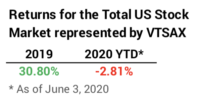
I’m sure we are all surprised at the year to date (YTD) return of about -2.8% for US stocks given that nearly 40 million are now unemployed. Last year’s return was +30.8%. This decline now looks like a small correction. Of course, we’ll just have to see how this unfolds over the next year or so.
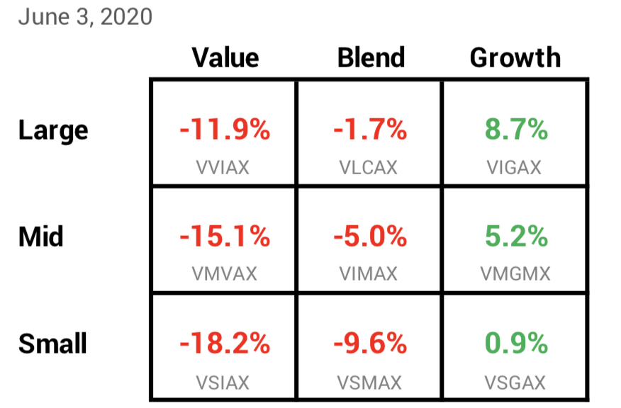
== Style box ==
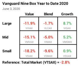
Morningstar popularized the style box shown below. The style box divides the total stock market into a matrix of Large, Mid and Small Capitalization stocks and by Value, Blend, and Growth stocks. Vanguard has a low cost, passively managed fund that tries to match an independently assembled index for each box by The Center for Research in Security Prices (CRSP). I show the Vanguard fund for each box and its YTD performance.
You can see that Value stocks have been the big loser YTD. Growth stocks, thought to be more volatile during a market decline, have been the winner. Large Cap has been better than Mid Cap, and Mid Cap has been better than Small Cap. Looking at two corners shows Large Growth has been ~27 percentage points better in return than Small Cap Value [8.7% – (-18.2%)]. Wow.
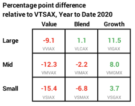
== Performance Relative to the Market ==
I use VTSAX (or FSKAX which we own) as the benchmark for the US stock market. In the matrix below, you can more clearly see the boxes that are better than the market as a whole and ones that are worse. VTSAX and similar US Total Stock Market index funds and ETFs own almost all traded securities in the US. The fund owns a percentage of each company in proportion to its market value to the total market value of all stocks. The market value of Microsoft (total shares times price/share) is about 4.8% of the total value of all stocks, so these funds own 4.8% of Microsoft.
Most of us are going to own much more of Large Cap stocks than Mid Cap or Small Cap stock, because Large Cap stocks are roughly 75% of the total value of all stocks. In this display, you can see that Large Growth is 11.5 percentage points better in return than VTSAX and the Large Value is 9.1 percentage points worse. That’s a +20 percentage point difference in return [8.7% – (-11.9%)]. If you bet on Large Growth, you are very happy. If you bet on Large Value, you are unhappy.
I prefer not to bet to tilt or overweight to one or several of those boxes in the matrix. A US Total Market Stock fund or ETF isn’t trying to pick the box that will be better than others over time. I could look over the past few years and ask, “Why didn’t I own more growth stocks? I’d have more than from my neutral, Total Stock Market fund.” But I could have just as easily decided to bet on value stocks and had less. Or more Mid Cap. Or more Small Cap.
I’ll always be able to look in hindsight and find I could have done better had I tilted our portfolio to own more of one or several style boxes. But I won’t second guess. Patti and I are doing just fine with our total US market stocks.
Conclusion: Most investors – and I’d bet even more retired investors – think Value stocks will offer greater downside protection when the stock market hits a rough patch. That certainly has not panned out in the decline for US stocks so far this year. Year to date, Large Cap Value stocks declined about nine percentage points more – about three times more – than the market as a whole. It’s impossible to predict which style of stocks – grouped by capitalization value or by type of stocks – will outperform in the future. I’ll stick with my broad-based US stock market fund.
We all make personal decisions about risk every day. Driving is a risk. Walking on an uneven sidewalk is a risk that I pay attention to. You’ve already made decisions that decide the financial risk of your retirement plan. You’ve decided – with or without logic and thought – the three things that set risk: your spending rate; your mix of stock and bonds; and how much you choose to pay the financial industry. But our daily risks and our financial risk pale relative to the risk of getting COVID-19, and – if you are a certain age – dying from IT. This post summaries two very good articles that helped clarify my actions to sharply lower our risks UNTIL VACCINE.
== Three excellent articles ==
I mentioned the first article I list below in my May 1 post. This post has a summary of the latter two that you can download here. The remaining text of this post is my summary of the summary!
Most all transmissions of infections are from family members: one member gets IT in the community and then infects other family members. How do you and your family members avoid getting IT in the community?
You must acquire an infectious dose to become infected. Successful infection = intake of an infectious dose = about 1000 viral particles. Example: Infectious dose that you breathe in = Viral Load in air x Time you are breathing IT in – the number of breaths it takes to suck in a viral load.
The most infectious period is BEFORE someone has symptoms. This is not unlike normal, seasonal flu, except most think those with COVID-19 are more infectious before symptom than than those with seasonal flu. People are out and about who feel fine or maybe a bit peaked, but they are highly contagious. They sneeze, cough, or breathe out respiratory droplets that you then breathe. They sneeze or cough and get respiratory droplets on their hands and then they touch something else, depositing virus there.
You basically have to breathe IT in to get IT. This accounts for maybe 94% of all transmissions.
Your WORST RISK would be, without a mask on, to breathe in some of the near-by sneeze cloud of an infectious person. Your one breath = infectious dose. Just as bad: accumulate 1,000 viral particles from touching an elevator button or door handle several times and then rub your eyes or nose. A single cough can be bad. But it’s much longer exposure – many more breaths – in other cases. Less than 15 minutes spent with an infected person – with no sneeze or cough – means low chance of transmission. Out of 445 traced contacts within six feet and 10 minutes or more with an infectious person, only two became infected and both had had an infected person in their household.
Touching something with enough virus on it and then touching your eyes, nose or mouth is much lower risk of getting an infectious dose. The CDC says it’s hard to get IT this way. Don’t ignore this risk, and wash your hands often. But put this risk in perspective.
Your mask protects others; it blocks perhaps 99% of your exhaled respiratory droplets so they don’t get an infectious dose if you have IT. Your mask also protects you; it blocks perhaps 50% of inhalation of respiratory droplets.
The viral load in air is dispersed and diluted with greater distance distance from an infected person and with air circulation. Six feet is a good physical distance, but it’s a choice guided by practicality. A forceful sneeze (no mask) can propel respiratory droplets 20 feet.
Masks + distance + big open spaces + short time exposure = very low chance of breathing in viral load. What’s this mean?
Smaller indoor spaces are highest risk. Too little air volume and possibly poor air circulation. Small respiratory droplets hang in the air. Your risk of an infectious dose increases 1) as the size of space decreases; 2) as the number of people increase; 3) as their activity increases with no masks: breathing quietly; speaking, speaking loudly; shouting; yelling; 4) as your time of exposure increases.
The conclusions for Patti and me are similar to those I stated in the prior post. We say NO to dine-in restaurants. NO to airplanes. NO to indoor social gatherings.
Outdoors and outdoor activities are lowest risk accounting for perhaps 0.3% of transmissions. Infinite air volume and mixing means the viral load is very small. So far, almost people we encounter when we are out walking wear a mask or pull it up when they get near us. Those who are not wearing a mask give way to those wearing a mask – they make sure the distance is much more than six feet. Joggers really go the extra distance to stay away. But the risk is tiny even if you pass someone within six feet who is not considerate enough to wear a mask. The contact time is fleeting.
I still say NO to outdoor crowds; I can’t count on all wearing a mask. Crowds I like will be shouting and yelling: that means no Pitt football or basketball games. I’ll miss them!
The risk is small in stores with big air space. For Patti and me those safer spaces are the grocery and the nearby Home Depot. The air volume is large; all customers and staff wear masks; the stores we go to limit the number of shoppers; we can figure out the times when they are not crowded; shoppers are very good about sticking to the six feet rule; we’re not there long.
Rules and culture are important. New York has lower percentage of cases for hospital workers than the general public. Hospitals follow rules that we can follow:
• Know the symptoms and stay home if you experience any of them; immediately throw away whatever you sneeze or cough into and wash or sanitize your hands; don’t give it by touching something with your virus-laden hands.
• ALWAYS wear a mask indoors. All others in the store should be wearing a mask.
• Keep the six-foot rule, especially indoors. Mask + six feet + short time exposure + big air space = really low risk.
• Hygiene: before you go into and as you leave a group or store, wash or sanitize your hands.
• Culture: hospitals have created a culture of not being the one to infect another. It’s the culture of a hospital operating room. It’s a disgrace if you give IT to someone else.
We each can do our part on reinforcing the proper culture. We need to reinforce use of masks, distancing and hygiene. We should be examples of doing the right things. Here are my thoughts.
I will focus on stores that fail to require masks for employees or customers and fail to enforce the six feet rule. I’ll complain to management and refuse to shop there in the future.
I will always wear my mask indoors. That’s a requirement here. I hope it remains. Some areas of the US just suggest use of masks indoors. That’s CRAZY!
I now have less concern about others outdoors. I always have my mask with me, but I’m not comfortable wearing a mask 100% of the time when Patti and I are out walking, especially up the hills here. I typically have it half on, mostly under my chin. I will always put it on or pull up my mask if I walk by someone outside. But after reading the information in the articles, I’m less upset with folks out walking or jogging with no mask. I will assume those not wearing a mask will give us a wide berth; if they don’t, we move – even to walk in the street. But I’m not going to call them out unless I judge them as purposely inconsiderate.
Conclusion: We all need to know how to minimize the risks of COVID. This post summarized two excellent articles. I conclude you basically have to breathe IT in to get IT. Masks + Distance + Short Exposure Time greatly lower risk. I’ll wash my hands like crazy, too. We all need to be examples that others see to reinforce a culture of not infecting others. Number one in my book is always having my mask on when I might come within six feet of someone.
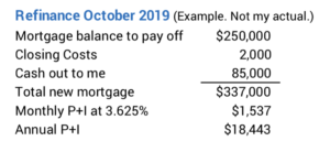
Mortgage rates are now the lowest in history – or at least for the last 100 years. This site says the average rate on a 30-year mortgage is 3.15%, and you can get a rate lower than this. This fall I refinanced our mortgage at a stated rate of 3.625%, and I just pulled the trigger on Thursday to refinance the mortgage balance at a stated rate of 2.99%. I don’t think it will ever drop enough to consider refinancing ever again. If you have a mortgage, this is the time to refinance. If you think you have too much tied up in non-financial assets that you may want to convert to financial assets, this is the time to get a mortgage. The purpose of this post is to describe steps I took to refinance; they’d be the same if you want a mortgage.
== Recent history and 3.625% ==
I most recently refinanced in October, just six months ago, and now I’m doing it again. My purpose of refinancing then was to convert some of our net worth trapped in our non-financial asset – our home – to get more into financial assets: money that we can spend, give away or keep in a bigger emergency reserve. That equity in our home is almost a dead asset; I can’t use it until I figure out how to turn it into cash; in fact, it just consumes more and more of our financial assets over time.
I refinanced this fall at 3.625% and received about $85,000 in cash a day or so after closing. I view the 3.625% I pay on that as cheap relative to the option of having to pay 22% marginal tax to get that same added amount into our taxable account.
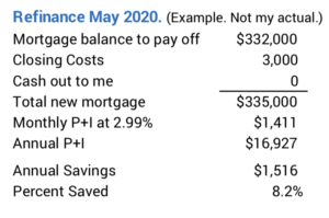
== Now 2.99% ==
In September I refinanced through one of the lenders listed with Costco, NBKC. I got a big break on the closing costs by being an Executive Member at Costco.
Thursday I went to the Costco site and clicked to get bids from NBKC and one other listed as having the lowest rates. Both responded within hours. We talked (Our prior loan officer at NBKC was our point of contact there.), and they both sent me a quote about 30 minutes later. The proposals were within spitting distance of each other, so I stuck with NBKC. I called our loan officer back and locked in on the stated rate, 2.99%. All done in less than four hours. I’ll get the official proposal today, Friday.
Paperwork that I had to submit the last time was straightforward. I have the file folder of what I sent, but I’m guessing our NBKC loan officer may be able to pull it all from the file he has for us from October. I’m sure he’d like a 2019 tax return, but I don’t have that to send him. I’m missing one tax reporting statement – a K-1 due from a local accounting firm – and I can’t totally complete it.
== Next steps ==
I’ll submit whatever they need, but I will likely have to wait 45 to 60 days for everything to be complete and to start paying the new mortgage. It will be longer than normal. After the close of the mortgage in early November I obtained a HELOC – Home Equity Line of Credit – from my bank, PNC. Getting the HELOC approved was much more time consuming than the much bigger first mortgage with NBKC. PNC now has to re-subordinate their HELOC to the new mortgage. I can imagine PNC isn’t going to be quick in doing their thing. They’ll also charge me a couple of $100 to re-subordinate.
== 8% Lower P+I = $1,500 per year ==
I’ve paid off some principal on our current mortgage. After I’ve paid that off and rolled our closing costs into a new mortgage, I’ve lowered our monthly payments by about 8%. That’s more than $1,500 per year. Since I rolled the closing costs into the new mortgage, the final proceeds from the sale of our home will be less, relative to our current mortgage, by those added costs. That amount is small potatoes relative to the $1,500 less we’ll pay per year in principal + interest.
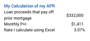
== We really don’t pay 2.99% ==
Our proposal quotes a stated rate of 2.99%; that’s the rate I pay on the total mortgage. And it states an APR – annual percentage rate – of 3.027% for the option I picked; that includes the effect of closing costs. I calculate my APR is slightly higher – 3.07%. I’m not sure why there is a difference.
Conclusion: It was a very good time to consider refinancing our mortgage last fall, and Patti and I did that in October. Mortgage rates now are at an all-time low, and on Thursday I pulled the trigger to refinance at a stated rate that was about .6 percentage points lower than the rate I obtained last October. Our principal + interest payments are about 8% less than we have been paying. That works out about $1,500 per year for us. This is a simple process: go for it if you have a mortgage and want to lower payments or think you have too much sunk into your big non-financial asset: your home.
I hope you DO HAVE what would seem to others as a cookie-cutter portfolio. Patti and I have been watching more TV in the evenings and less Netflix or Prime Video. I’m seeing many more ads than usual. Almost every night I see an ad from Fisher Investments that touts, “We’re different. We tailor a portfolio to your needs. We do not recommend a cookie-cutter portfolio.” I listen and shout to myself, “YOU WANT A COOKIE-CUTTER PORTFOLIO!” You want a simple portfolio; you need only three or four basic securities. You want to pay rock-bottom fees to the financial industry. DO THAT AND YOU’LL BE IN THE TOP SIX PERCENT OF ALL INVESTORS. This post shows an example of what a tailored portfolio might look like and explains why SIMPLE is better.
== What’s a tailored portfolio? ==
My friend, Sam (not his real name), asked me to look over his portfolio. He has an investment advisor. He sent me a copy of his monthly statement. I didn’t save it, but I think it was 48 pages. Looking at it, you’d have to judge it was tailored to Steve and his wife, because it is long and complex. Something this detailed and complex must be well thought out. To my eyes, it looks like thoughtless mishmash.
I think one objective of his advisor, and perhaps the firm who trained her, is to purposely make the choice of securities seem to be a complex and sophisticated task. Sam has to look at a statement and say, “Wow. Look at all that detail! Look at all the different securities I own! I’ve never heard of most of these. It must have taken hours and hours to pick them. My advisor and firm must have the inside track with boutique fund companies and managers.”
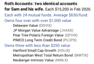
Sam and his wife own almost 50 securities: 10 stocks and 39 mutual funds or ETFs. It took me more than an hour to lay it all out on a spreadsheet to understand. That’s the only way I could summarize all the securities they owned; get an idea of Steve’s mix of stocks vs. bonds; his weights of US vs. International; and his fund expenses. I don’t understand their advisor fees, and neither do they; fees usually are charged quarterly and this statement wasn’t at the end of a quarter. I’d need to see more statements to figure out how well he performs against two simple benchmarks for stock returns and bond returns.
The Roth accounts killed me. Sam has one and his wife has one; ~$15,000 value each and the same securities in each: 24 mutual funds in each account! Ten funds have less than $500 value; two have less than $150 value. Fund expense ratio ranges from .44% to 2.33% with a weighted average of .93%. WHAT IS THIS? How could someone actually design a $15,000 retirement account with 24 mutual funds and high expense ratio and think this was in the best interest of the client?
When I look at the details of each fund on the Morningstar site, I can see that some of the 24 have performed better than average; they’ve overcome their high expense ratio and beaten their peer index fund; and some performed below. Without looking at Sam’s statement over the past year or so, I can’t get the complete picture. But the chances are – with this many funds – that account will underperform a general market index fund by the difference in expense ratio: basically by .9% per year.
== It’s Worse ==
I calculate that Steve and his wife, both retired and in their 70s, have a mix of 87% stocks and 13% bonds/cash. Their statements don’t show those percentages but should have. I asked if they knew their mix of stocks vs. bonds, and they didn’t. Maybe they discussed that years ago with their advisor, but I’d bet that is not a topic that comes up in an annual review. Most retirees would shudder at that high mix of stocks.
I don’t shudder at 85% for an Investment Portfolio because I fully understand the dynamics of spending rate, mix of stocks, and investing cost. That’s what Patti and I decided on. But 85% isn’t really 85%. Our Investment Portfolio excludes five percent of our total taken – roughly one year of spending – off the top as a Reserve. (See Chapters 1 and 7, Nest Egg Care [NEC],) That means we’re really at about 80% mix of stocks on the total we have: 85% times 95% = ~80%. I’d would NOT APPROVE of Sam’s 87% on that same basis.
Patti and I have gone over this so many times that Patti can repeat the logic! We have locked-in to ZERO CHANCE of depleting our portfolio through 2034; that’s Patti’s life expectancy. We’re locked in because we know our Safe Spending Rate (SSR%) and do not exceed the Safe Spending Amount (SSA) we calculate using that. We’ve picked rock-bottom Investing Cost of less than .05%. (See Chapters 2 and 6, NEC and here). We also know a greater mix of stocks means we’ll have much more if returns don’t turn out to be MOST HORRIBLE. We see it this way: no added risk, but greater potential return from a greater mix of stocks.
== What does cookie cutter mean? ==
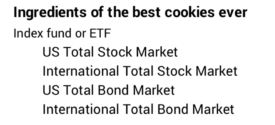
A cookie cutter portfolio to me means you hold four funds that cover the universe of traded securities as in this matrix. (See Chapter 11, NEC.) Own these and you will be in the top six percent of all investors over time. Boring, boring, boring. Easy to understand. Easy to track. And highly effective.
Conclusion: We all have an urge to have a fairly complex portfolio of stocks and bonds. Our brains think more complexity is better for something as important as our financial future. Financial firms understand this. They are going to tell you they can structure a portfolio that is tailored to your needs. They know you’ll judge that they’re doing a good job if you own many securities, securities from mutual fund companies you’ve never heard of and present them in a report that is difficult to understand. Don’t buy it. YOU WANT A COOKIE-CUTTER PORTFOLIO! You want a very simple, low-cost portfolio. You need only three or four basic index funds to win the game.
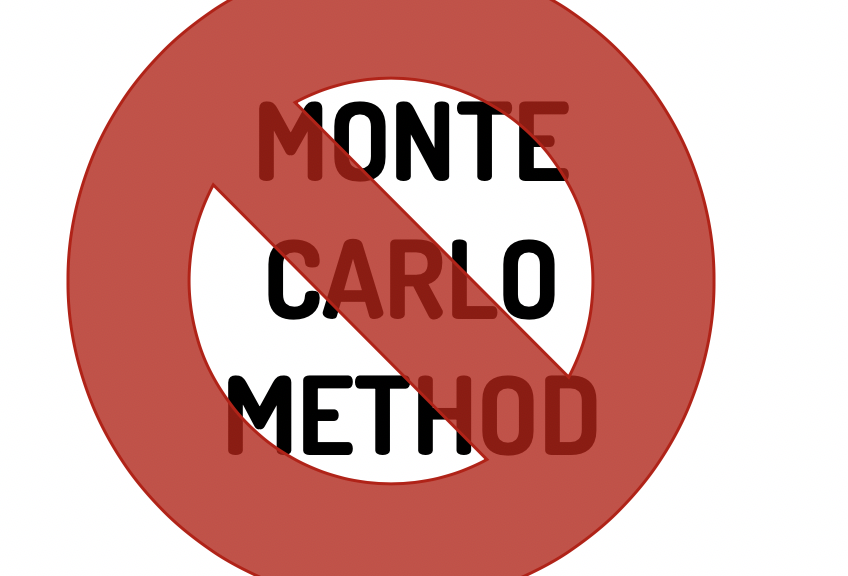
No, you should not trust Retirement Withdrawal Calculators (RWCs) that use the Monte Carlo method. DON’T EVEN LOOK AT THEM. Two basic types of RWC differ in the way they build and test sequences of returns. For the exact same planning decisions, they give very different results – particularly for a key measure of the number of years of ZERO CHANCE of depleting a portfolio. When I go under the hood to see how they track changes to portfolio value over time, I conclude the numbers the Monte Carlo method calculates give no valuable understanding of how a portfolio may fare in the future. The purpose of this post is to describe how I get to that conclusion. In summary, you want to rely on the method best represented by the FIRECalc RWC.
== Two RWCs and the mystery ==
We use an RWC to show how a portfolio could fare over time for the three key decisions we make for our financial retirement plan: spending rate, mix of stocks vs. bonds, and investing cost – fundamentally the annual fees we pay the financial industry. The two types of RWC, described last week, are best represented as tools available on the internet by FIRECalc and the Vanguard Retirement Nest Egg Calculator.
The mystery presented last week: for the exact same inputs, the two methods – FIRECalc and the Vanguard RWC – differ wildly in the number of years for ZERO CHANCE of depleting a portfolio. This is a key, simple-to-understand yardstick for any plan. In the example last week, the years of ZERO CHANCE of depleting was 19 years for FIRECalc but was 12 years for Vanguard for the exact same inputs. Big difference. That should not be. Something’s amiss with one of them.
== Order of returns in a sequence ==
I’m reviewing what I described last week: Each sequence of returns that FIRECalc tests is a series of annual returns in the historical order they actually occurred. One sequence would be the stock and bond returns for 1969, 1970, 1971, … as an example. The implicit assumption is that the worst of these returns – ones that occurred in periods of recession, depression, and in some cases also high inflation – represent the MOST HORRIBLE set of returns you could expect in the future. In Nest Egg Care I focus on the absolute worst of these: your future results won’t be worse than those you get from FIRECalc; your results will only be better.
Vanguard’s RWC uses the Monte Carlo method to build sequences to test. Each sequence is a series of nominal returns – not inflation-adjusted returns – in random order. A sequence could have returns starting with 1943, 2011, 1952, 1987, 1931, … as an example. The implicit assumption is that annual returns are random, independent events. I mention last week and here and here that that assumption makes little sense to me: the worst actual series of returns are much worse that what the statistics say they could be. But this is not the fundamental problem with the Monte Carlo method.
== Testing the sequence of returns ==
For both calculators, you input a spending rate (This really is an amount per initial portfolio value.) and a mix of stocks and bonds. (You can input your decision on Investing Cost into FIRECalc – that’s essential to understand – but not in the Vanguard RWC; I exclude investing cost in the calculations for this post.)
The calculator uses annual returns based on the mix of stock and bonds you’ve picked. The annual return for a mix of 75% stocks and 25% bonds would be 75% of the stock return in that year and 25% of the bond return for that year. In effect, the model rebalances your portfolio back to your chosen mix right at the start of each year. The RWC calculates and tracks the end-of-year value right before you take your next withdrawal for spending in the upcoming year.
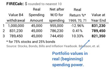
FIRECalc: Annual returns are inflation-adjusted. You maintain the same, real spending amount into the future. (In practice, you’d adjust the spending amount by inflation – similar to the way your Social Security benefit changes – to maintain the same spending power. See Nest Egg Care, Chapter 9.) I show an example of three years: 1969, 1970, and 1971. This is easy math.
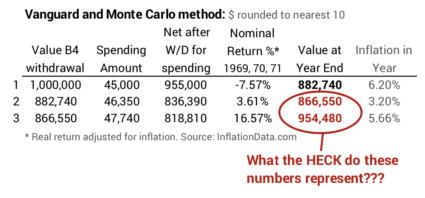
Vanguard: Annual returns are nominal returns – returns that include the effect of inflation. Vanguard tracks what happens to an initial portfolio, assuming your initial spending amount increases at ~3% inflation per year – that’s the average annual inflation rate from 1926 to the present; that’s basically an attempt to maintain the same, real spending power over time as with FIRECalc. (An earlier version of Vanguard site had the detailed description of inputs and mechanics; the revised site no longer provides that same detailed description.) I show the example for the same three years below.
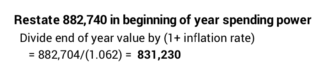
What is Vanguard tracking and plotting at the end of each year? At the end of year #1 it’s calculated what you would have in nominal dollars: $882,740. As a check, we could inflation-adjust that by the 6.2% inflation in the year, and the result would match FIRECalc’s portfolio value stated in real spending power.
But what is the meaning of the end of year values in years #2 and #3? NOTHING that relates to reality! They won’t adjust back to real spending power. The number at the end of all years with the exception of #1 can only be described as, “A number at the end of each year that assumes you adjust spending by 3% each year, even though actual annual inflation can vary wildly from that.” How does that help you in your planning? You have no idea if those numbers mean you are gaining or losing real spending power over time. Vanguard calls these values as “portfolio savings balance.” That’s not an correct label in my opinion.
== Why the distortion? ==
Vanguard’s math distorts what happens to a portfolio in real spending power when it uses nominal returns and a fixed 3% increase in spending each year. In essence, Vanguard is assuming nominal returns are always adjusted by 3% inflation to get its picture of what happens to a portfolio over time. It effectively calculates an amount that is worse than reality for years with inflation less than 3% or better than reality for years with inflation greater than 3%.
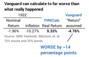
Here’s an example result in a year of deflation: In 1932 the nominal return for a portfolio at 75% stocks and 25% bonds was -1.9%. Inflation was -10.3%. (Yes, 10% deflation!) The real, inflation-adjusted return was 9.3%. With its 3% assumption, Vanguard effectively calculates a return that is worse than the real change in portfolio value by 14 percentage points.
The series of returns in the Monte Carlo method will be mixes of years with below average of inflation and above average inflation. Those series with more years of below-average inflation will have future year-end values will be far worse than they really should be. The opposite is true: series of returns with more years of above-average inflation will have future year-end values that will be far better than they really should be. You see this effect when you look at Vanguard’s projections of future “portfolio savings balances.” The range of future results from high to low is so great that it defies logic.
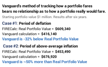
== Six-years of distortion ==
The distortions each year can add to wild distortions over time. Let’s just nail this down as to how FIRECalc and Vanguard display the results for two identical return sequences of six years. It’s fair to compare the two on these same series of annual returns. The Vanguard calculator will build 1000s of sequences that exactly match these six-year series of returns – and trillions and trillions that don’t.
I pick the returns in order that they occurred starting in 1929 and in 1969. Both are bad, among the four worst six-year periods ever. The six starting in 1929 were in a period of deflation. We’d expect Vanguard to make the results look much worse than they really were. The six in starting in 1969 were a period of above average inflation. We’d expect Vanguard to make the results look much better than they really were.
Does this happen and to what degree? Yes, and it’s a very big difference. I summarize the results in after six years below. You can follow the year-by-year detail here.
In the first case – the period of deflation – the Vanguard method calculates a number that is 32% less than the total change in real portfolio value. Much worse than reality. In the second case – the period of above average inflation – the Vanguard method calculates a number that is nearly 50% greater. Much better than reality.
Conclusion: We retirees must use a Retirement Withdrawal Calculator (RWC) to make key decisions for our financial retirement plan. Two RWCs differ in the way they build and test sequences of return. They give different results – especially on a key measure of the number of years of ZERO CHANCE for depleting a portfolio. One finds the reason for the difference when one goes under the hood to see how they track how a portfolio fares over time. FIRECalc tracks the real change in a portfolio’s spending power. Vanguard is calculating a number that at best is a tongue-twister to explain. It’s distorts reality; it isn’t giving you a picture of what really can happen to your portfolio over time. My conclusion is DON’T EVEN LOOK at results that use the Monte Carlo method. You can trust FIRECalc’s inputs and method to track how a portfolio really would fare over time.